With the App composition model in ModularStartup we want to enable features to be able to have deep integration with your App for instant utility and to reduce the effort required to integrate it with your App.
A problem with being able to add an integrated feature that combines both UI and functionality is the large variety of different kind of Apps that can be created with ServiceStack. To give you some idea, the World Validation contains 10 different client/server rendered Web App development strategies - which doesn't even cover all the major SPA that ServiceStack has first-class support for, not including any native Desktop or Mobile Apps.
To be able to provide higher-level functionality with instant utility we need a standard navigation API that all Apps can use to register functionality that all ServiceStack Apps can make use of.
To support this, we use the new NavItem below to capture hierarchical Navigation information about a single Navigation Item:
/// NavItem in View.NavItems and View.NavItemsMap
public class NavItem : IMeta
{
    /// Link Label
    public string Label { get; set; }

    /// Link href
    public string Href { get; set; }

    /// Whether NavItem should only be considered active when paths
    /// are an exact match otherwise checks if ActivePath starts with Path
    public bool? Exact { get; set; }

    /// Emit id="{Id}"
    public string Id { get; set; }

    /// Override class="{Class}"
    public string ClassName { get; set; }

    /// Icon class (if any)
    public string IconClass { get; set; }

    /// Only show if NavOptions.Attributes.Contains(Show)
    public string Show { get; set; }

    /// Do not show if NavOptions.Attributes.Contains(Hide)
    public string Hide { get; set; }

    /// Sub Menu Child NavItems
    public List<NavItem> Children { get; set; }

    /// Additional custom Metadata to attach to this Nav Item
    public Dictionary<string, string> Meta { get; set; }
}
There's also 2 built-in collections you can add Navigation Items to:
public static class View
{
    // The App's main navigation
    public static List<NavItem> NavItems

    // Maintain any other number of custom Navigation lists
    public static Dictionary<string, List<NavItem>> NavItemsMap
}
Simply View.NavItems can be used to maintain your App's primary navigation whilst NavItemsMap lets you maintain any number of additional
navigation item groups.
For example ServiceStack uses NavItemsMap to maintain Navigation items for each OAuth provider in the auth NavItem collection
which is now able to generate an auto dynamic list of Auth Sign In Options from the existing list of Auth Providers registered
in your App's AuthFeature, e.g:
Plugins.Add(new AuthFeature(() => new AuthUserSession(),
    new IAuthProvider[] {
        new CredentialsAuthProvider(AppSettings),
        new FacebookAuthProvider(AppSettings),
        new GoogleAuthProvider(AppSettings),
        new MicrosoftGraphAuthProvider(AppSettings),
        new TwitterAuthProvider(AppSettings),
        new GithubAuthProvider(AppSettings),
    }));
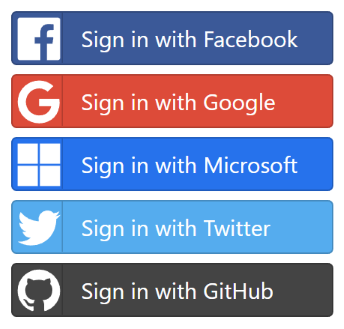
Will render the following list of OAuth Sign In buttons in new ServiceStack Project Templates:
This is enabled by each OAuth Provider defining their own Navigation Item which is used to populate the auth NavItems collection,
here's an example from FacebookAuthProvider:
NavItem = new NavItem {
    Href = "/auth/" + Name,
    Label = "Sign in with Facebook",
    Id = "btn-" + Name,
    ClassName = "btn-social btn-facebook",
    IconClass = "fab svg-facebook",
};
Load from Configuration
To start with, the NavItems collections can be initialized from appsettings.json by populating the NavItems and NavItemsMap collections, e.g:
{
"NavItems": [
{ "href":"/", "label":"Home", "exact":true },
{ "href":"/about", "label":"About" },
{ "href":"/services", "label":"Services" },
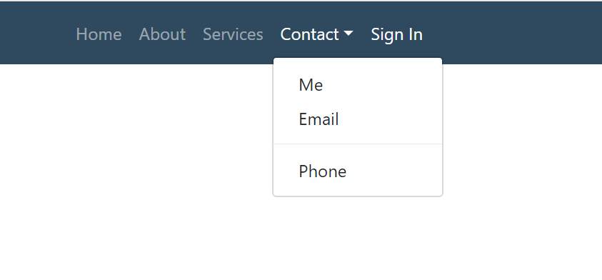
{ "href":"/contact", "label":"Contact",
"children": [
{ "href": "/contact/me", "label":"Me" },
{ "href": "/contact/email", "label":"Email" },
{ "label":"-" },
{ "href": "/contact/phone", "label":"Phone" }
]
},
{ "href":"/login", "label":"Sign In", "hide":"auth" },
{ "href":"/profile", "label":"Profile", "show":"auth" },
{ "href":"/admin", "label":"Admin", "show":"role:Admin" }
],
"NavItemsMap": {
"aside": [
{ "href":"/faq", "label":"FAQ" }
],
"footer": [
{ "href":"/terms", "label":"Terms" },
{ "href":"/privacy", "label":"Privacy" }
]
}
}
Populate from Code
Or if preferred you can create the navigation in code:
View.NavItems.AddRange(new List<NavItem>
{
    new NavItem { Href = "/",         Label = "Home",    Exact = true },
    new NavItem { Href = "/about",    Label = "About" },
    new NavItem { Href = "/services", Label = "services" },
    new NavItem
    {
        Href = "/contact", Label = "Contact",
        Children = new List<NavItem>
        {
            new NavItem { Href = "/contact/me", Label = "Me" },
            new NavItem { Href = "/contact/email", Label = "Email" },
            new NavItem { Label = "-" },
            new NavItem { Href = "/contact/phone", Label = "Phone" },
        }
    },
    new NavItem { Href = "/login",    Label = "Sign In", Hide = "auth" },
    new NavItem { Href = "/profile",  Label = "Profile", Show = "auth" },
    new NavItem { Href = "/admin",    Label = "Admin",   Show = "role:Admin" },
});
Which when used to render your main menu navigation in a Bootstrap Web App, looks something like:
UI Feature Integration
The NavItems generic collections can be further extended programmatically which allows UI plugins to register their functionality with the App's UI.
Here are some examples that the new
feature-authrepo and
feature-mq mix features
use to register their pages with the running Web App:
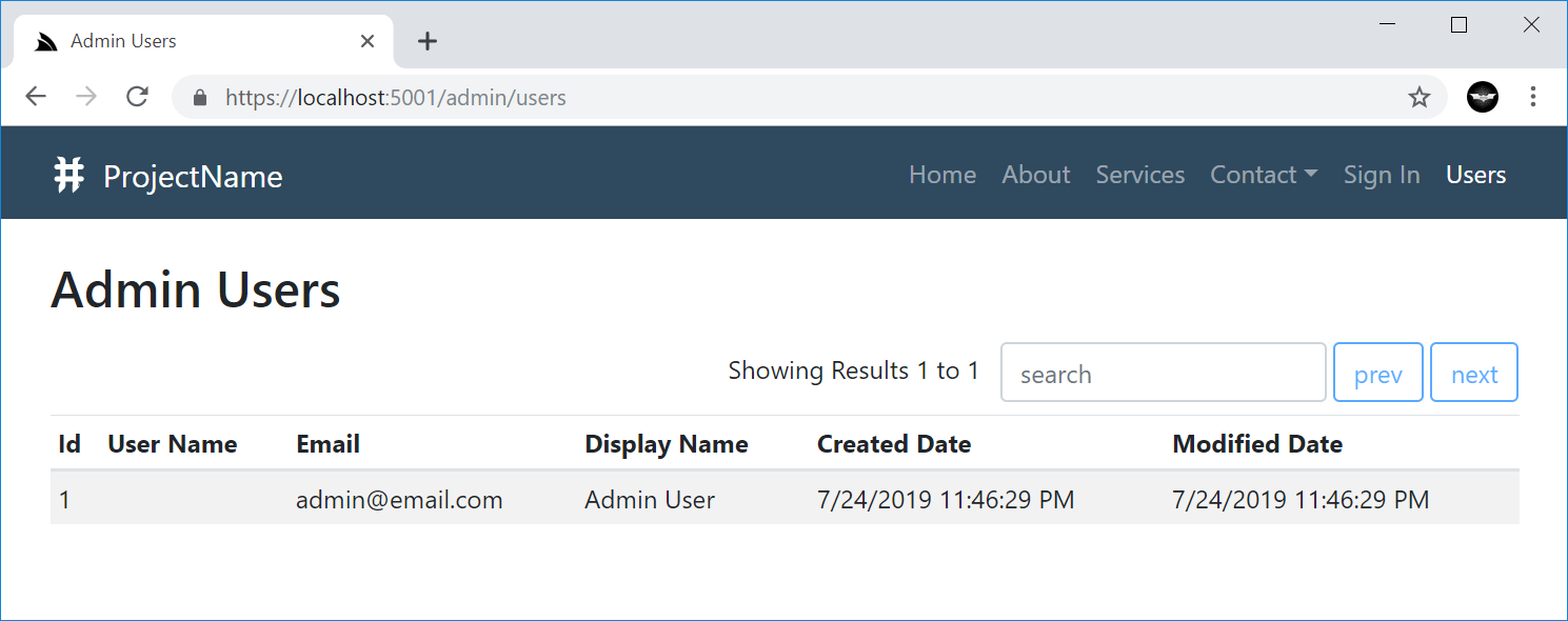
Feature.UserAuth.cs
public void AfterPluginsLoaded(IAppHost appHost)
{
    View.NavItems.Add(new NavItem {
        Label = "Users",
        Href = "/admin/users",
        // Show = "role:Admin" // Uncomment to only show menu item to Admin Users
    });
}
Which adds the Users Menu Item linking to the /admin/users.html page:
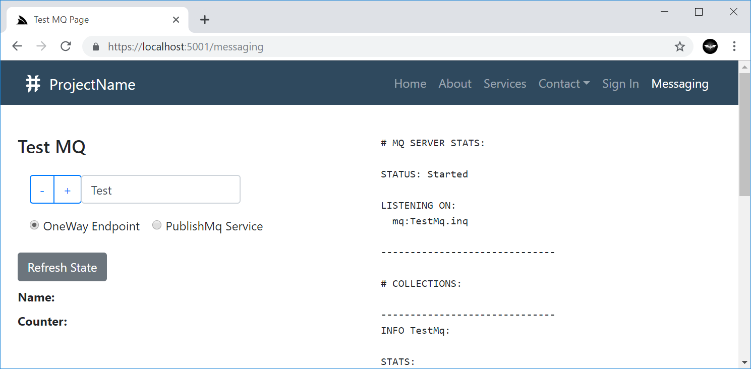
Feature.Mq.cs
public void AfterPluginsLoaded(IAppHost appHost)
{
    View.NavItems.Add(new NavItem {
        Label = "Messaging",
        Href = "/messaging",
    });
}
Which adds the Messaging Menu Item linking to its messaging.html page:
Navigation Renderers
The NavItem classes capture the Navigation information which is used together with the NavOptions class below:
public class NavOptions
{
    /// User Attributes for conditional rendering, e.g:
    ///  - auth - User is Authenticated
    ///  - role:name - User Role
    ///  - perm:name - User Permission
    public HashSet<string> Attributes { get; set; }

    /// Path Info that should set as active
    public string ActivePath { get; set; }

    /// Prefix to include before NavItem.Path (if any)
    public string BaseHref { get; set; }

    // Custom classes applied to different navigation elements (defaults to Bootstrap classes)
    public string NavClass { get; set; }
    public string NavItemClass { get; set; }
    public string NavLinkClass { get; set; }

    public string ChildNavItemClass { get; set; }
    public string ChildNavLinkClass { get; set; }
    public string ChildNavMenuClass { get; set; }
    public string ChildNavMenuItemClass { get; set; }
}
To customize how navigation items are rendered using the new navigation controls available for each of ServiceStack's most popular Project Types.
All components are customizable in the same way and render the same markup, apart from Angular due to how it renders components where it includes additional "wrapper" HTML tags around each component.
#Script Pages
In #Script Pages you can use render the navbar and navButtonGroup methods to render NavItems:
Navbar
You can render the main menu navigation using the navbar script method:
{{ navbar }}
Which by default renders the View.NavItems main navigation, using the default NavOptions and User Attributes (if authenticated):
You can also render a different Navigation List with:
{{ navbar(navItems('submenu')) }}
Which can be customized using the different NavOptions properties above, in camelCase:
{{ navbar(navItems('submenu'), { navClass: 'navbar-nav navbar-light bg-light' }) }}
Rewritten using #Script Extension methods
Thanks to #Script new ability to be able to call any script methods as extension methods, this can also be rewritten as:
{{ 'submenu'.navItems().navbar({ navClass: 'navbar-nav navbar-light bg-light' }) }}
Button group
The navButtonGroup script can render NavItems in a button group, e.g. the
OAuth buttons
are rendered with:
{{ 'auth'.navItems().navButtonGroup({ navClass: '', navItemClass: 'btn btn-block btn-lg' }) }}
Which renders a vertical, spaced list of buttons which look like:
Razor Pages
The same server controls are available in ServiceStack.Razor Apps as HTML Helper extension methods:
Navbar
@Html.Navbar()

@Html.Navbar(Html.GetNavItems("submenu"))

@Html.Navbar(Html.GetNavItems("submenu"), new NavOptions {
    NavClass = "navbar-nav navbar-light bg-light"
})
NavButtonGroup
@Html.NavButtonGroup(Html.GetNavItems("auth"), new NavOptions {
    NavClass = "",
    NavItemClass = "btn btn-block btn-lg",
})
SPA Component Libraries
To lay the foundation for richer and more tightly integrated UI controls, we've created UI and common component libraries for the 3 most popular JS frameworks:
@servicestack/vue
@servicestack/react
@servicestack/angular
All Single Page App Project Templates have been pre-configured to use these libraries which will make it a lot easier to deliver new UI components and updates to existing SPA Apps with just an npm upgrade.
Navigation Components
All navigation components are populated the same way for all JavaScript FX's where it embeds the navigation data structure in the page by
serializing the response of the GetNavItems Service to JSON that's embedded in the layout page where it's only loaded once
upon the initial page request (immediately, without an Ajax network request):
{{#script}}
NAV_ITEMS = {{ 'GetNavItems' |> execService |> json }};
AUTH = {{ 'Authenticate' |> execService({ ifErrorReturn: "null" }) |> json }};
{{/script}}
The navigation items data structure is used with new Navigation Components for each JavaScript FX to render the menu navigation which is initially captured in a state object containing the NavItems data structure, the Users Session and the list of User Attributes generated from the Authenticated Users Session (if any), e.g:
Vue
In Vue the Nav and User Information is maintained in a global store object which uses UserAttributes.fromSession() from the
@servicestack/client library to generate the list of User Attributes:
export const store: State = {
  nav: global.NAV_ITEMS as GetNavItemsResponse,
  userSession: global.AUTH as AuthenticateResponse,
  userAttributes: UserAttributes.fromSession(global.AUTH),
};
The built-in list of User Attributes include:
auth- Authenticated Userrole:TheRole- Authenticated User withTheRolerole.perm:ThePermission- Authenticated User withThePermissionpermission.
This list can be further extended to include your own custom User Attributes, these are used to control whether to display the navigation item
based on if the attribute is an exact match for the Show and Hide properties of the NavItem. E.g. Navigation Items populated with:
  "NavItems": [
    { "href":"/login",      "label":"Sign In", "hide":"auth" },
    { "href":"/profile",    "label":"Profile", "show":"auth" },
    { "href":"/admin",      "label":"Admin",   "show":"role:Admin" }
  ],
Will hide the Sign In and show the Profile nav items to Authenticated Users and only show the Admin nav item to Admin Users.
The navbar component uses these data structures to render the main menu:
<navbar :items="store.nav.results" :attributes="store.userAttributes" />
The rendering of the component can be further customized using any of the NavOptions properties, in camelCase.
Which also applies to the list of registered OAuth provider buttons
rendered with <nav-button-group>:
<nav-button-group :items="store.nav.navItemsMap.auth" :attributes="store.userAttributes"
                  :baseHref="store.nav.baseUrl" block lg />
In addition to NavOptions properties, new Bootstrap UI Controls (in each JavaScript FX) can also use these common bootstrap attributes
to stylize their components:
export declare class BootstrapBase extends Vue {
    primary?: boolean;
    outlinePrimary?: boolean;
    secondary?: boolean;
    outlineSecondary?: boolean;
    success?: boolean;
    outlineSuccess?: boolean;
    info?: boolean;
    outlineInfo?: boolean;
    warning?: boolean;
    outlineWarning?: boolean;
    danger?: boolean;
    outlineDanger?: boolean;
    light?: boolean;
    outlineLight?: boolean;
    dark?: boolean;
    outlineDark?: boolean;
    lg?: boolean;
    md?: boolean;
    sm?: boolean;
    xs?: boolean;
    block?: boolean;
    vertical?: boolean;
    horizontal?: boolean;
}
camelCase properties like
outlinePrimaryare exposed as kebab-case in components, e.g.outline-primary
React
These same components are
available in React
from the new @servicestack/react library, except the JSX Components use PascalCase, e.g:
<Navbar items={state.nav.results} attributes={state.userAttributes} />
Likewise for NavButtonGroup:
<NavButtonGroup items={state.nav.navItemsMap.auth} attributes={state.userAttributes}
                baseHref={state.nav.baseUrl} block lg />
Angular
Likewise for Angular from the new @servicestack/angular package where the main menu is rendered using the
navbar component:
<navbar [items]="nav.results" [attributes]="userAttributes"></navbar>
And the OAuth Button list is rendered using the nav-button-group component in kebab-case:
 <nav-button-group [items]="nav.navItemsMap.auth" [attributes]="userAttributes"
                   [baseHref]="nav.baseUrl" block lg></nav-button-group>
Mobile and Desktop Apps
Whilst there are no native components developed for different Mobile and Desktop UI's, the same navigation information can be accessed
by calling the GetNavItems Service, e.g:
var response = await client.GetAsync(new GetNavItems());