ServiceStack.Blazor high-productivity components enable rapid development in Blazor Server and WASM Apps:
Blazor Gallery
Discover ServiceStack.Blazor Rich UI Components and Integrated Features
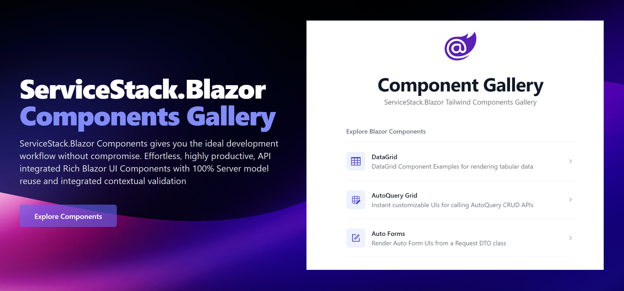
As our components support both hosting models we're maintaining identical Gallery sites running on both Blazor Server and WASM:
For a closer look at ServiceStack.Blazor Components in action, download & run them to see how good they'll run in your Environment:
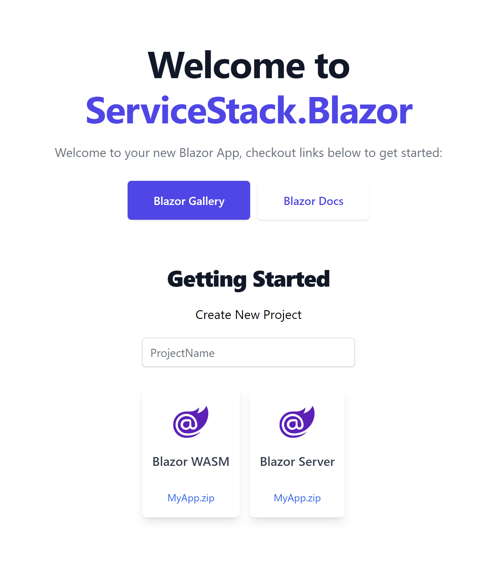
Dark Mode
All ServiceStack.Blazor components take advantage of Tailwind DarkMode support to include full support for Dark Mode.
Tailwind has revolutionized how we style our Web Apps with its mobile first design system that's dramatically simplified creating maintainable responsive Web Apps. It also excels at adding support for Dark Mode with its first-class dark: modifier allowing the use of standard tailwind classes to specify what elements should look like when viewed in Dark Mode, e.g:
Light mode
Writes Upside-Down
The Zero Gravity Pen can be used to write in any orientation, including upside-down. It even works in outer space.
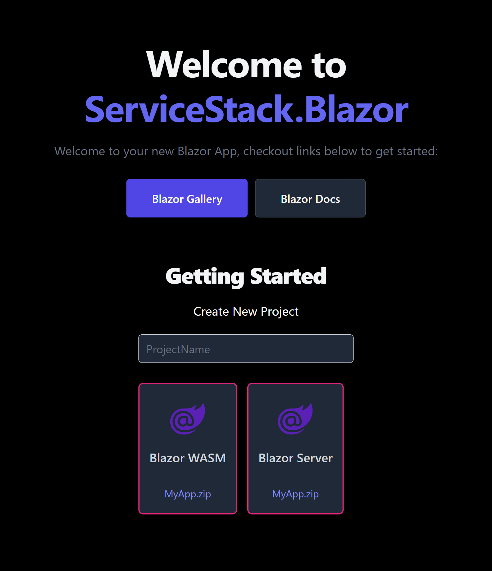
Dark mode
Writes Upside-Down
The Zero Gravity Pen can be used to write in any orientation, including upside-down. It even works in outer space.
<div class="bg-white dark:bg-slate-800 rounded-lg px-6 py-8 ring-1 ring-slate-900/5 shadow-xl">
  <div>
    <span class="inline-flex items-center justify-center p-2 bg-indigo-500 rounded-md shadow-lg">
      <svg class="h-6 w-6 text-white" xmlns="http://www.w3.org/2000/svg" fill="none" viewBox="0 0 24 24" stroke="currentColor" aria-hidden="true"><!-- ... --></svg>
    </span>
  </div>
  <h3 class="text-slate-900 dark:text-white mt-5 text-base font-medium tracking-tight">Writes Upside-Down</h3>
  <p class="text-slate-500 dark:text-slate-400 mt-2 text-sm">
    The Zero Gravity Pen can be used to write in any orientation, including upside-down. It even works in outer space.
  </p>
</div>
View ServiceStack.Blazor in Dark Mode
We're happy to announce that Dark Mode support is included in all ServiceStack.Blazor components and all Blazor Tailwind project templates where you'll be able to toggle on/off Dark Mode with the new <DarkModeToggle> component. Checkout this video to see how beautiful Dark Mode looks like in the latest ServiceStack.Blazor Components and Tailwind project templates:
For a more interactive view, use the right Dark Mode toggle to turn on/off Dark Mode in the embedded Blazor Gallery Contacts Page:
Dark Mode is all implemented with CSS, controlled by toggling the dark class on the <html class="dark"> element, <DarkModeToggle> also saves this user preference in localStorage where it's preserved across browser restarts.
View in Dark Mode
The Blazor Tailwind templates also include the ability to override the users color scheme preference and open a page in dark or light mode with the
?dark and ?light query params:
Force Dark Mode
If your App is best viewed in Dark Mode you can force it to use Dark Mode with JS.init() when initializing ServiceStack.Blazor's JS library in Blazor Server's _Layout.cshtml or Blazor WASM's index.html, e.g:
<script src="_framework/blazor.server.js"></script>
<script src="/js/servicestack-blazor.js"></script>
<script>JS.init({ colorScheme:'dark' })</script>
Blazor Tailwind Components
Blazor Tailwind Components
We encourage you to explore to the Blazor Gallery websites for the full preview, but we'll look at some of the Components here to give you some idea of the functionality available.
DataGrid
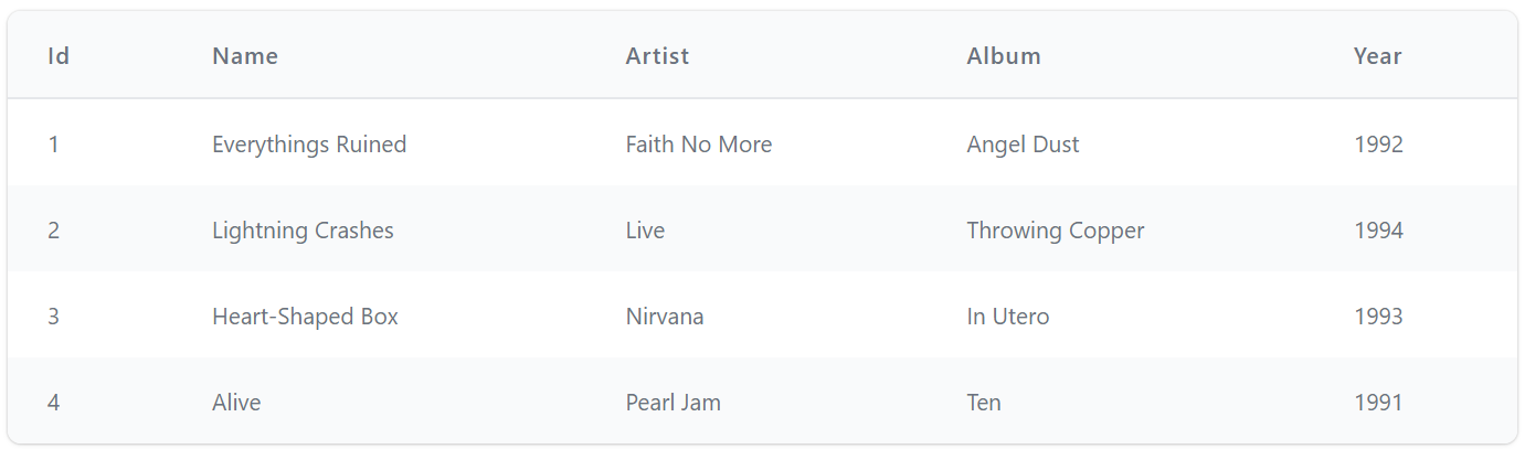
DataGrid is a versatile Component we expect to be heavily used for rendering any typed collection:
<DataGrid Model="Track" Items=@Track.Results />
Which by default renders results in a striped Tailwind Table:
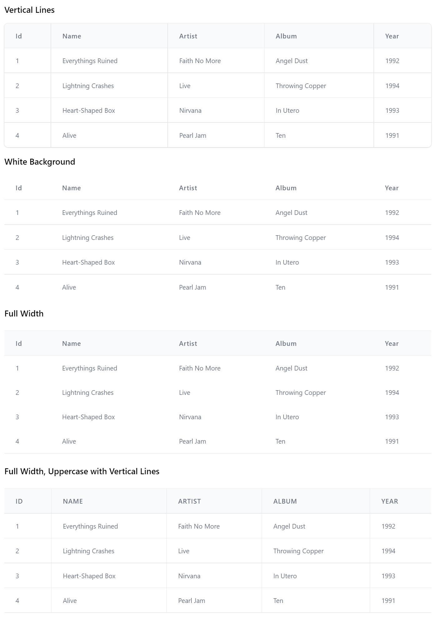
Whose appearance can be styled to support many of the Tailwind Table Styles with the TableStyles Flag enum, e.g:
<DataGrid Model="Track" Items=@Track.Results TableStyle="TableStyle.VerticalLines" />

<DataGrid Model="Track" Items=@Track.Results TableStyle="TableStyle.WhiteBackground" />

<DataGrid Model="Track" Items=@Track.Results TableStyle="TableStyle.FullWidth" />

<DataGrid Model="Track" Items=@Track.Results
          TableStyle="TableStyle.UppercaseHeadings | TableStyle.FullWidth | TableStyle.VerticalLines" />
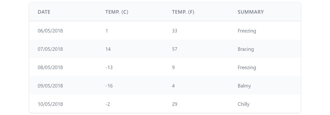
It's a highly versatile component where you'll be able to control which columns are displayed and how they're formatted using <Column> definitions, e.g. here's how we can customize the table to look like Blazor's FetchData.cshtml tabular results:
<DataGrid Items=@forecasts class="max-w-screen-md" TableStyle="TableStyle.StripedRows | TableStyle.UppercaseHeadings">
    <Column Field="(WeatherForecast x) => x.Date" Format="dd/MM/yyyy" />
    <Column Title="Temp. (C)" Field="(WeatherForecast x) => x.TemperatureC" />
    <Column Title="Temp. (F)" Field="(WeatherForecast x) => x.TemperatureF" />
    <Column Field="(WeatherForecast x) => x.Summary" />
</DataGrid>

@code {
    List<WeatherForecast> forecasts = new();

    protected override async Task OnInitializedAsync()
    {
        forecasts = await Http.GetFromJsonAsync<List<WeatherForecast>>("data/weather.json") ?? new();
    }
}
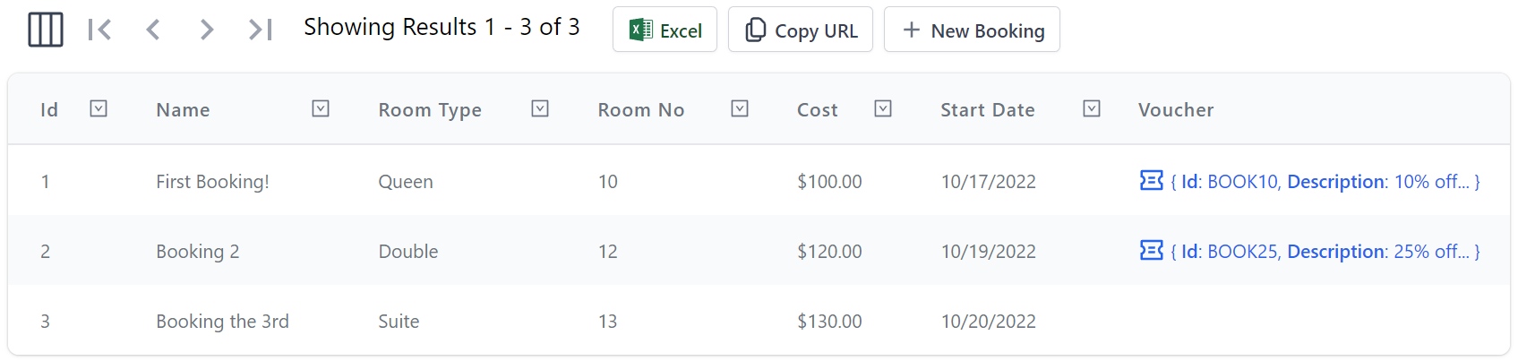
Here's a more advanced example showing how to implement a responsive DataGrid by utilizing custom Header and Table Cell templates to define what columns and Headers are visible at different responsive breakpoints and how to enable different features like Row Selection and Filtering and examples of handling the Row and Header selected events App's can use for executing custom logic:
<DataGrid Model="Booking" Items=@Items AllowSelection="true" AllowFiltering="true"
          HeaderSelected="HandleSelectedHeader" RowSelected="HandleSelectedRow">
    <Column Field="(Booking x) => x.Id" class="text-gray-900" />
    <Column Field="(Booking x) => x.Name" VisibleFrom="Breakpoint.ExtraLarge" />
    <Column Field="(Booking x) => x.RoomType">
        <Header>
            <span class="hidden lg:inline">Room </span>Type
        </Header>
    </Column>
    <Column Field="(Booking x) => x.RoomNumber">
        <Header>
            <span class="hidden lg:inline">Room </span>No
        </Header>
    </Column>
    <Column Field="(Booking x) => x.Cost" Format="C" />
    <Column Field="(Booking x) => x.BookingStartDate" Formatter="FormatDate" VisibleFrom="Breakpoint.Small">
        <Header>
            Start<span class="hidden lg:inline"> Date</span>
        </Header>
    </Column>
    <Column Field="(Booking x) => x.BookingEndDate" Formatter="FormatDate" VisibleFrom="Breakpoint.ExtraLarge">
        <Header>
            End<span class="hidden lg:inline"> Date</span>
        </Header>
        <Template>@{ var booking = context as Booking; }@booking.BookingEndDate?.ToString("D")
        </Template>
    </Column>
    <Column Title="Employee" Field="(Booking x) => x.CreatedBy" VisibleFrom="Breakpoint.Medium" />
</DataGrid>

@code {
    public List<Booking> Items { get; set; } = new() {
        Create.Booking("First Booking!",  RoomType.Queen,  10, 100, "employee@email.com", "BOOK10"),
        Create.Booking("Booking 2",       RoomType.Double, 12, 120, "manager@email.com",  "BOOK25"),
        Create.Booking("Booking the 3rd", RoomType.Suite,  13, 130, "employee@email.com", "BOOK50"),
    };

    string FormatDate(object o) => o is DateTime d ? d.ToShortDateString() : "";

    public async Task HandleSelectedHeader(Column<Booking> item)
    {
        await JS.Log(item.Name);
    }

    public async Task HandleSelectedRow(Booking x)
    {
        await JS.Log(x);
    }
}
TIP
Resize webpage to preview its responsive appearance and different resolution breakpoints
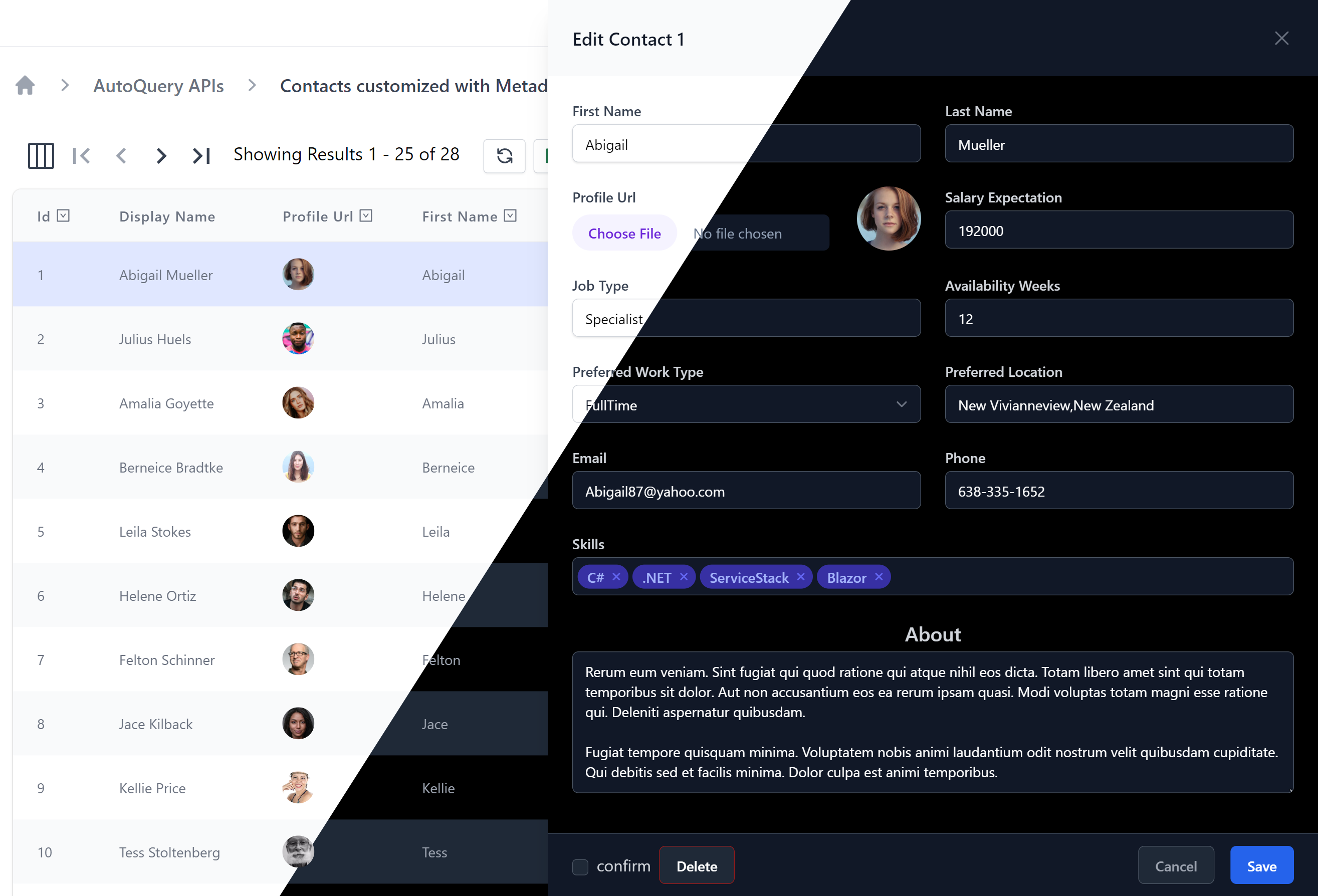
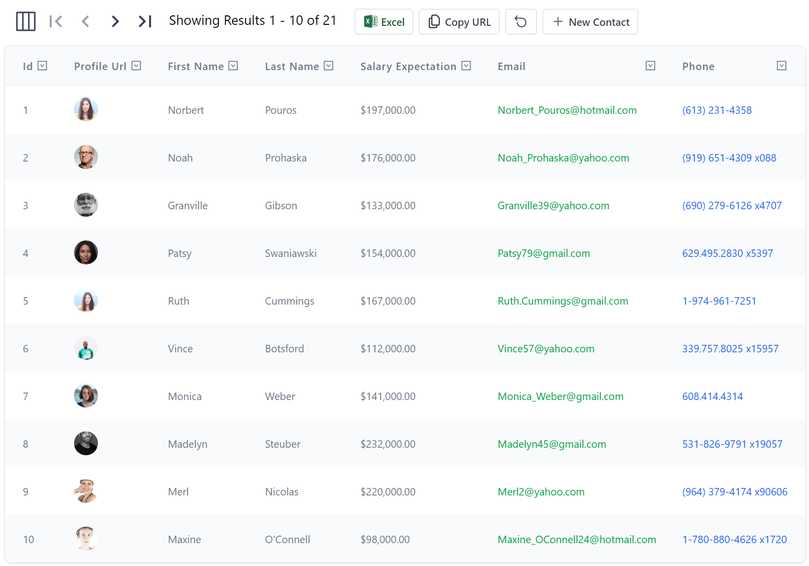
AutoQueryGrid
The functionality and extensibility in DataGrid lays the foundation for higher-level components like AutoQueryGrid which makes use of it to enable its Auto UI around AutoQuery CRUD Services.
AutoQueryGrid Read Only
At a minimum AutoQueryGrid requires the AutoQuery APIs it should call to implement its functionality, so you can implement a read-only grid by only specifying the AutoQuery API to query a data model, e.g:
<AutoQueryGrid Model="Booking" Apis="Apis.AutoQuery<QueryBookings>()" />
This one AutoQuery API is enough to power a functional read-only UI enabling multi flexible querying capabilities, paging, custom column selection and the ability to export the desired filtered resultset to .csv which can be open in Excel or copy the API URL Apps can use to consume the JSON API results:
AutoQueryGrid CRUD
Full CRUD functionality can be enabled by specifying the AutoQuery CRUD APIs for a specified data model, e.g:
<AutoQueryGrid Model="Booking" Apis="Apis.AutoQuery<QueryBookings,CreateBooking,UpdateBooking,DeleteBooking>()" />
Customizable Columns
As AutoQueryGrid builds on DataGrid it also inherits its customizable option allowing for customizable responsive columns, e.g:
<AutoQueryGrid Model="Booking" Apis="Apis.AutoQuery<QueryBookings,CreateBooking,UpdateBooking,DeleteBooking>()"
               AllowSelection="true" AllowFiltering="true"
               HeaderSelected="OnSelectedHeader" RowSelected="OnSelectedRow">
    <Columns>
        <!-- Custom class -->
        <Column Field="(Booking x) => x.Id" class="text-gray-900" />
        <!-- Only show from Tailwind's xl responsive Breakpoint -->
        <Column Field="(Booking x) => x.Name" VisibleFrom="Breakpoint.ExtraLarge" />
        <!-- Custom Header collapsing 'Room' below 'lg' responsive breakpoint -->
        <Column Field="(Booking x) => x.RoomType">
            <Header>
                <span class="hidden lg:inline">Room </span>Type
            </Header>
        </Column>
        <!-- Custom Header collapsing 'Room' below 'lg' responsive breakpoint -->
        <Column Field="(Booking x) => x.RoomNumber">
            <Header>
                <span class="hidden lg:inline">Room </span>No
            </Header>
        </Column>
        <!-- Custom string Format -->
        <Column Field="(Booking x) => x.Cost" Format="C" />
        <!-- Custom C# Formatter -->
        <Column Field="(Booking x) => x.BookingStartDate" Formatter="FormatDate" VisibleFrom="Breakpoint.Small">
            <Header>
                Start<span class="hidden lg:inline"> Date</span>
            </Header>
        </Column>
        <!-- Custom Header and Cell Value -->
        <Column Field="(Booking x) => x.BookingEndDate" VisibleFrom="Breakpoint.ExtraLarge2x">
            <Header>
                End<span class="hidden lg:inline"> Date</span>
            </Header>
            <Template>
                @context.BookingEndDate?.ToString("D")
            </Template>
        </Column>
        <!-- Custom Title and Complex Type Cell with Reference Link -->
        <Column Title="Voucher" Field="(Booking x) => x.Discount" VisibleFrom="Breakpoint.ExtraLarge">
            <Template>
@if (context.Discount != null)
{
    <TextLink class="flex items-end" href=@($"/gallery/autoquerygrid/coupons?Id={context.Discount.Id}")>
        <PreviewFormat Value=@context.Discount />
    </TextLink>
}          </Template>
        </Column>
    </Columns>
</AutoQueryGrid>
Customizing how and when columns are rendered at different breakpoints using different formatting options and custom table header and cell templates:
Declarative Customizations
The columns can also be customized declaratively using the [Format] Metadata Attribute on the Model type:
public class Contact : AuditBase
{
    [AutoIncrement]
    public int Id { get; set; }

    [Format(FormatMethods.IconRounded)]
    public string ProfileUrl { get; set; }

    public string FirstName { get; set; }
    public string LastName { get; set; }

    [Format(FormatMethods.Currency)]
    public int? SalaryExpectation { get; set; }

    [Format(FormatMethods.LinkEmail, Options =
        @"{target:'_self',subject:'New Job Opportunity',
           body:'We have an exciting new opportunity...', cls:'text-green-600'}")]
    public string Email { get; set; }

    [Format(FormatMethods.LinkPhone)]
    public string Phone { get; set; }
}
Which can change how results are formatted in the data grid results:
Whilst the [Input] and [FieldCss] attributes on the AutoQuery CRUD DTOs:
public class UpdateContact : IPatchDb<Contact>, IReturn<Contact>
{
    public int Id { get; set; }

    [ValidateNotEmpty]
    public string? FirstName { get; set; }

    [ValidateNotEmpty]
    public string? LastName { get; set; }

    [Input(Type = "file"), UploadTo("profiles")]
    public string? ProfileUrl { get; set; }

    public int? SalaryExpectation { get; set; }

    [ValidateNotEmpty]
    public string? JobType { get; set; }

    public int? AvailabilityWeeks { get; set; }
    public EmploymentType? PreferredWorkType { get; set; }
    public string? PreferredLocation { get; set; }

    [ValidateNotEmpty]
    public string? Email { get; set; }
    public string? Phone { get; set; }

    [Input(Type="textarea")]
    [FieldCss(Field="col-span-12 text-center", Input="h-48", Label="text-xl text-indigo-700")]
    public string? About { get; set; }
}
Can customize how forms are rendered, e.g:
ToolbarButtons
The <ToolbarButtons> element can be used to customize the AutoQueryGrid to add your own custom Toolbar buttons, e.g:
<AutoQueryGrid>
  <ToolbarButtons>
    <div class="pl-2"><button>1</button></div>
    <div class="pl-2"><button>2</button></div>
  </ToolbarButtons>
</AutoQueryGrid>
Enabling complete control over the Toolbar as all existing toolbar buttons can be removed with AutoQueryGrid parameters.
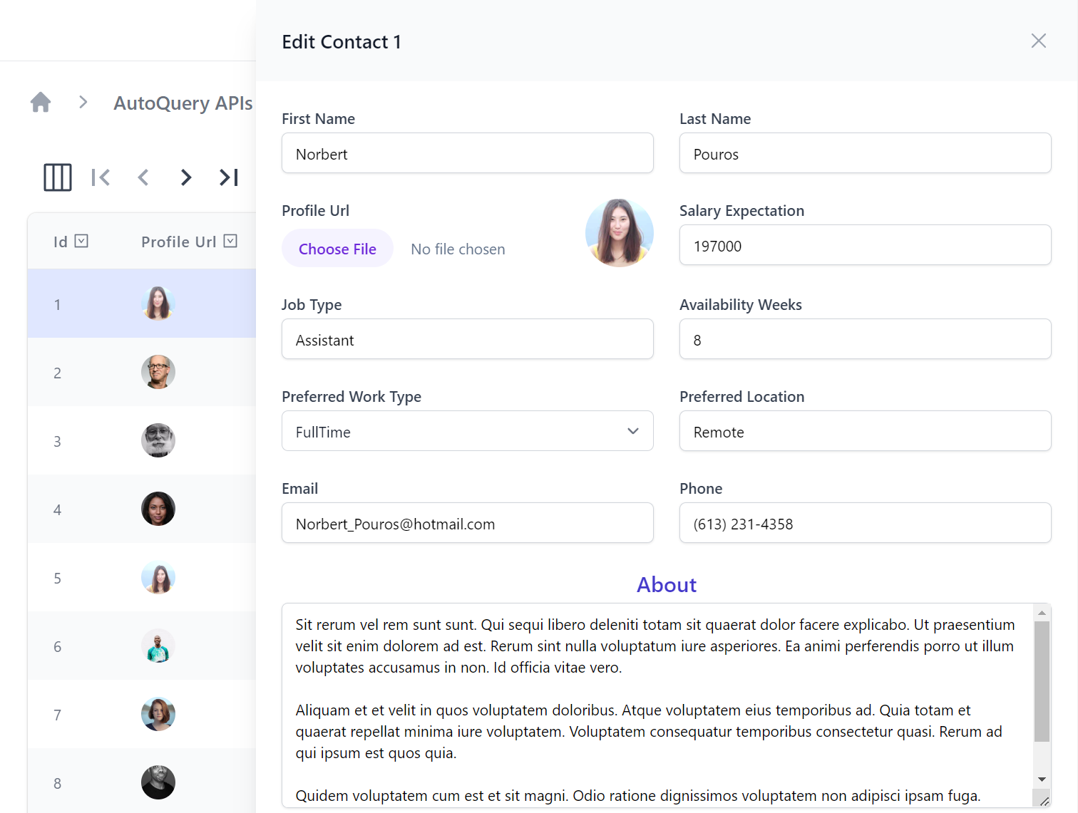
Custom Edit and Create Forms
The <CreateForm> and <EditForm> elements can be used to replace the default Auto Forms used in creating and editing rows when more advanced or customized functionality is needed.
With this feature we can create a Custom AutoQueryGrid component that uses Custom Edit & Create Forms when selecting and adding new records and also customize the Grid results displayed with the new ConfigureQuery parameter to ensure results are filtered to the selected Tenant records:
<AutoQueryGrid @ref=@grid Model="Item" Apis="Apis.AutoQuery<QueryItems,NewItem,EditItem>()" ConfigureQuery="Configure">
    <CreateForm>
        <div class="relative z-10">
            <div class="pointer-events-none fixed inset-y-0 right-0 flex max-w-full pl-10 sm:pl-16">
                <CustomCreateItem OnClose="grid!.OnEditDone" />
            </div>
        </div>
    </CreateForm>
    <EditForm>
        <div class="relative z-10">
            <div class="pointer-events-none fixed inset-y-0 right-0 flex max-w-full pl-10 sm:pl-16">
                <CustomEditItem Item="context" OnClose="grid!.OnEditDone" />
            </div>
        </div>
    </EditForm>
</AutoQueryGrid>

@code {
    AutoQueryGrid<Creative>? grid;
    [Parameter, SupplyParameterFromQuery] public int? TenantId { get; set; }

    void Configure(QueryBase query)
    {
        query.AddQueryParam("TenantId", TenantId);
    }
}
Managing Filters & Preferences
By default the AutoQueryGrid displays the user's selected columns and query limit preferences which are persisted in localStorage. They can be overridden with the new Prefs attribute which has different ergonomic methods for configuration within an attribute:
To limit the Query Results Limit:
<AutoQueryGrid @ref=@grid Model="Contact" Apis="Apis.AutoQuery<QueryContacts,CreateContact,UpdateContact>()"
               Prefs="ApiPrefs.Create(take:10)" />
To limit which columns are displayed in the Query Results:
<AutoQueryGrid @ref=@grid Model="Contact" Apis="Apis.AutoQuery<QueryContacts,CreateContact,UpdateContact>()"
               Prefs="ApiPrefs.Columns(nameof(Contact.Id), nameof(Contact.LastName))" />
<AutoQueryGrid @ref=@grid Model="Contact" Apis="Apis.AutoQuery<QueryContacts,CreateContact,UpdateContact>()"
               Prefs="ApiPrefs.Columns<Contact>(x => new { x.Id, x.LastName, x.Email })" />
To configure both Query Limit and Selected Columns:
<AutoQueryGrid @ref=@grid Model="Contact" Apis="Apis.AutoQuery<QueryContacts,CreateContact,UpdateContact>()"
               Prefs="ApiPrefs.Create(take:10, columns:new(){ nameof(Contact.Id), nameof(Contact.LastName) })" />
<AutoQueryGrid @ref=@grid Model="Contact" Apis="Apis.AutoQuery<QueryContacts,CreateContact,UpdateContact>()"
               Prefs="ApiPrefs.Configure(x => { x.Take = 5; x.SelectedColumns=new() { nameof(Contact.LastName) }; })"/>
In addition the new methods below can be used to clear any user-defined query filters and column preferences:
| Method | Description |
|---|---|
| grid.ClearFiltersAsync() | Remove user-defined Filters |
| grid.ResetPreferencesAsync() | Remove user-defined Filters and Column Preferences |
Disable Column Filtering
By default Filtering and Sorting are disabled for complex type columns, they can also be explicitly disabled per column with AllowFiltering, e.g:
<AutoQueryGrid>
    <Column Field="(Contact x) => x.Phone" AllowFiltering="false" />
<AutoQueryGrid>
Changing AutoQueryGrid Defaults
A lot of AutoQueryGrid's UI is customizable allowing you to easily toggle on/off UI features as needed, if you have a consistent style you wish to enforce you can change the defaults of every AutoQueryGrid component with BlazorConfig, e.g. you can remove Copy URL button and change the default Table style to use Uppercase Headings with:
BlazorConfig.Set(new() {
    //...
    AutoQueryGridDefaults = new() {
        TableStyle = TableStyle.StripedRows | TableStyle.UppercaseHeadings,
        ShowCopyApiUrl = false,
    }
});
Which will change the appearance of every AutoQueryGrid Component used in the App unless overridden.
AutoQueryGrid Gallery
As AutoQueryGrid is a core component for the rapid development of Apps we're maintaining a dedicated section showcasing their different features at blazor-gallery.servicestack.net/grid:
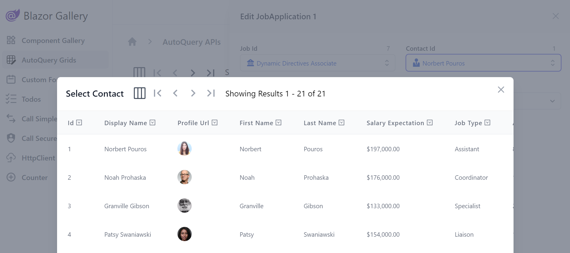
Modal Lookups
To provide an optimal UX for relational fields AutoQueryGrid utilizes Modal Lookups for searching and selecting referential data that's automatically inferred from your OrmLite data model relationships, e.g:
public class JobApplication : AuditBase
{
    [AutoIncrement]
    public int Id { get; set; }

    [References(typeof(Job))]
    public int JobId { get; set; }

    [References(typeof(Contact))]
    public int ContactId { get; set; }
    //...
}
Where it will display an enhanced LookupInput instead of a plain Text Input for the relational JobId and ContactId fields:
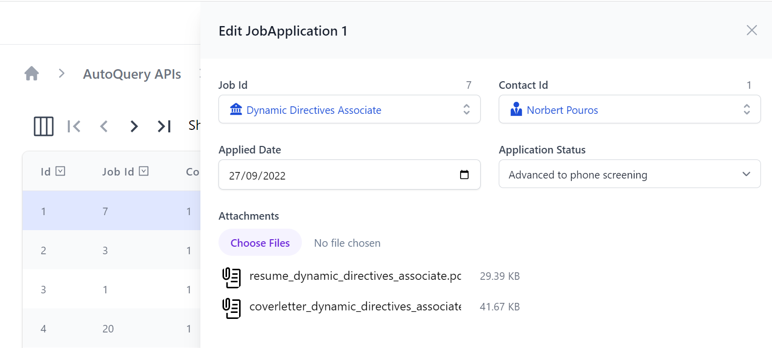
Which users can use to quickly search for the related record instead of manually inserting Foreign Key Ids:
File Uploads
Another feature showcased in the above screenshots is support for Managed File Uploads which can be declaratively added with the [Input(Type="file")] to render the FileInput Component and [UploadTo] attribute to specify which File Upload location it should use:
public class UpdateJobApplication : IPatchDb<JobApplication>, IReturn<JobApplication>
{
    public int Id { get; set; }
    public int? JobId { get; set; }
    public int? ContactId { get; set; }
    public DateTime? AppliedDate { get; set; }
    public JobApplicationStatus? ApplicationStatus { get; set; }

    [Input(Type = "file"), UploadTo("applications")]
    public List<JobApplicationAttachment>? Attachments { get; set; }
}
For a quick primer on using Managed File Uploads to Upload files from Blazor checkout:
Auto Forms
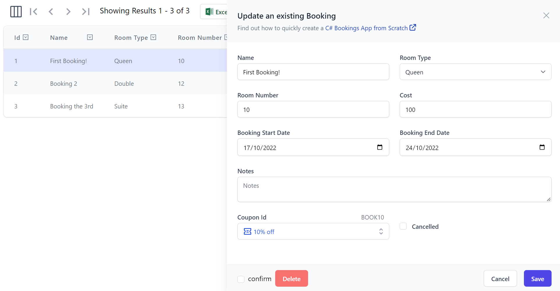
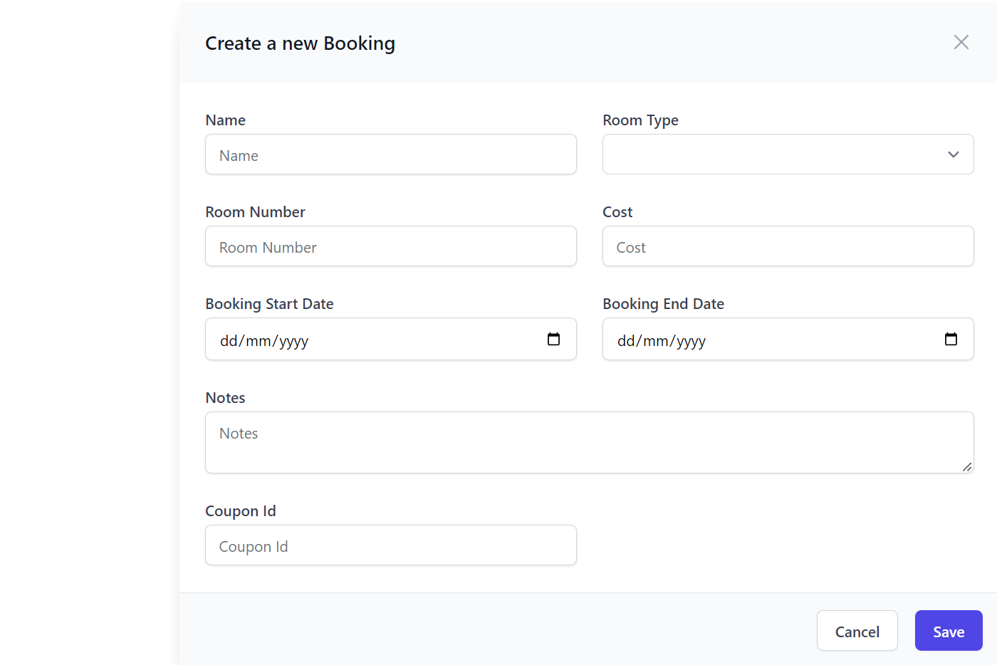
The Auto Form components are other high productivity components which can be used to create an automated form based from a Request DTO definition:
<AutoCreateForm Model="Booking" ApiType="typeof(CreateBooking)" />
AutoEditForm
Whilst AutoEditForm can be used to render an automated form based to update and delete an AutoQuery CRUD API:
<AutoEditForm Model="Booking" Edit="Model" ApiType="typeof(UpdateBooking)" DeleteApiType="typeof(DeleteBooking)" />

@code {
    Booking Model = Create.Booking("First Booking!", RoomType.Queen, 10, 100, "employee@email.com");
}
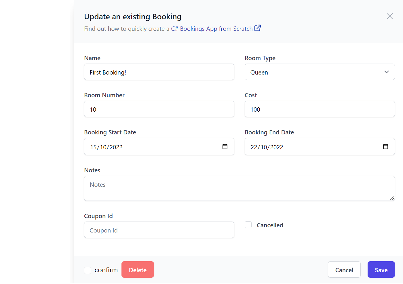
The forms behavior and appearance is further customizable with the API annotation, declarative validation and the custom Field and Input attributes, e.g:
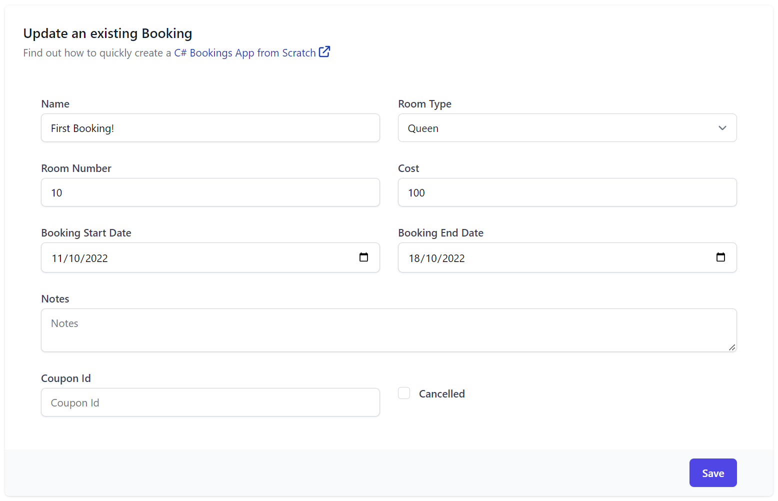
[Description("Update an existing Booking")]
[Notes("Find out how to quickly create a <a class='svg-external' target='_blank' href='https://youtu.be/rSFiikDjGos'>C# Bookings App from Scratch</a>")]
[Route("/booking/{Id}", "PATCH")]
[ValidateHasRole("Employee")]
[AutoApply(Behavior.AuditModify)]
public class UpdateBooking : IPatchDb<Booking>, IReturn<IdResponse>
{
    public int Id { get; set; }
    public string? Name { get; set; }
    public RoomType? RoomType { get; set; }
    [ValidateGreaterThan(0)]
    public int? RoomNumber { get; set; }
    [ValidateGreaterThan(0)]
    public decimal? Cost { get; set; }
    public DateTime? BookingStartDate { get; set; }
    public DateTime? BookingEndDate { get; set; }
    [Input(Type = "textarea")]
    public string? Notes { get; set; }
    public bool? Cancelled { get; set; }
}
Both AutoForm components will render the Forms UI in a Slide Over dialog and includes built-in support for calling the API to update or edit the record with integrated contextual validation, reporting any field validation errors alongside their Input controls.
AutoFormFields
If more advanced customization of a Forms appearance and behavior is required, you can use AutoFormFields to just render the Form's fields (including Validation binding) that can be used to populate a Request DTO that your App can handle sending, e.g:
<form @onsubmit="submit" @onsubmit:preventDefault>
    <div class="shadow sm:overflow-hidden sm:rounded-md max-w-screen-lg">
        <div class="space-y-6 bg-white py-6 px-4 sm:p-6">
            <div>
                <h3 class="text-lg font-medium leading-6 text-gray-900">@(ApiType.GetDescription())</h3>
                <p class="notes mt-1 text-sm text-gray-500">
                    @((MarkupString)ApiType.GetNotes())
                </p>
            </div>

            <AutoFormFields Type="typeof(Booking)" Api="Api" FormLayout="FormLayout" ModelDictionary="ModelDictionary"/>

        </div>
        <div class="bg-gray-50 px-4 py-3 text-right sm:px-12">
            <PrimaryButton type="submit" onclick="submit">Save</PrimaryButton>
        </div>
    </div>
</form>

@code {
    [Inject] public JsonApiClient? Client { get; set; }
    IHasErrorStatus? Api { get; set; }
    Type ApiType = typeof(UpdateBooking);
    List<InputInfo>? FormLayout { get; set; }
    Dictionary<string, object> ModelDictionary { get; set; } = new();
    MetadataType MetadataType => ApiType.ToMetadataType();

    Booking Edit = Create.Booking("First Booking!", RoomType.Queen, 10, 100, "employee@email.com");

    protected override async Task OnParametersSetAsync()
    {
        await base.OnParametersSetAsync();
        Api = null;

        ModelDictionary = Edit.ToModelDictionary();
        FormLayout ??= MetadataType.CreateFormLayout<Booking>();
    }

    async Task submit()
    {
        var request = ModelDictionary.FromModelDictionary<UpdateBooking>();
        Api = await Client!.ApiAsync(request);
    }
}
Autocomplete
The <Autocomplete> component provides a user friendly Input for being able to search and quickly select items, that includes support for rich templated content, custom matching and infinite scrolling that avoids pre-loading the entire bound list of items.
Instead of being populated with a fixed List of strings or Key Value Pairs the Autocomplete component can bind directly to a list of POCOs to render its templated content where you'll be able to specify a custom Match filter to control which filtered items are displayed, that it can fuzzy match on single or multiple POCO properties.
Single Contact
Here's a simple Autocomplete example that binds to a simple Contact from a List<Contact> in allContacts:
<Autocomplete T="Contact" Options="allContacts" @bind-Value="simple" Label="Single Contact"
    Match="(x, value) => x!.DisplayName.Contains(value, StringComparison.OrdinalIgnoreCase)"
    placeholder="Select Contact">
    <Item>
        <span class="block truncate">@context!.DisplayName</span>
    </Item>
</Autocomplete>
Single Contact with Icon
The item content is templated allowing for rich content which can be used to display a Contact's profile picture and name:
<Autocomplete T="Contact" Options="allContacts" @bind-Value="contact" Label="Single Contact with Icon"
    Match="(x, value) => x!.DisplayName.Contains(value, StringComparison.OrdinalIgnoreCase)"
    placeholder="Select Contact">
    <Item>
        <div class="flex items-center">
            <Icon class="h-6 w-6 flex-shrink-0 rounded-full" Src=@context.ProfileUrl />
            <span class="ml-3 truncate">@context!.DisplayName</span>
        </div>
    </Item>
</Autocomplete>
Multiple Contacts with Icon
It also supports multiple selection by using @bind-Values to bind to the List<Contact> in contacts instead, e.g:
<Autocomplete Options="allContacts" @bind-Values="contacts" Label="Multiple Contacts with Icon"
    Match="(x, value) => x!.DisplayName.Contains(value, StringComparison.OrdinalIgnoreCase)"
    placeholder="Select Contacts">
    <Item>
        <div class="flex items-center">
            <Icon class="h-6 w-6 flex-shrink-0 rounded-full" Src=@context.ProfileUrl />
            <span class="ml-3 truncate">@context!.DisplayName</span>
        </div>
    </Item>
</Autocomplete>
and here's a working example of what they look like together in the same form (example source code):
TagInput
The TagInput component is useful for when you want to manage a list of strings like words or tags - an input that's notably lacking in HTML Forms.
Best of all <TagInput> functions like any other input where it can be included and customized in declarative forms.
For example this Update AutoQuery Request DTO:
// Customize Edit Forms with [Input] and [FieldCss] attributes
public class UpdateContact : IPatchDb<Contact>, IReturn<Contact>
{
public int Id { get; set; }
[ValidateNotEmpty]
public string? FirstName { get; set; }
[ValidateNotEmpty]
public string? LastName { get; set; }
[Input(Type = "file"), UploadTo("profiles")]
public string? ProfileUrl { get; set; }
public int? SalaryExpectation { get; set; }
[ValidateNotEmpty]
public string? JobType { get; set; }
public int? AvailabilityWeeks { get; set; }
public EmploymentType? PreferredWorkType { get; set; }
public string? PreferredLocation { get; set; }
[ValidateNotEmpty]
public string? Email { get; set; }
public string? Phone { get; set; }
[Input(Type = "tag"), FieldCss(Field = "col-span-12")]
public List<string>? Skills { get; set; }}
[Input(Type="textarea")]
[FieldCss(Field="col-span-12 text-center", Input="h-48", Label="text-xl text-indigo-700")]
public string? About { get; set; }
}
is all that's needed to render an instantly working API-enabled Form with validation binding using Auto Form components:
<AutoEditForm class=@Class Model="Contact" ApiType="typeof(UpdateContact)" Edit=@contact />
Which by default renders the form in a SlideOver dialog as seen when editing a row in the Contacts AutoQueryGrid component:
Alternatively it can be rendered in a traditional "card" form layout with the new FormStyle.Card option:
<AutoEditForm class=@Class FormStyle="FormStyle.Card" Model="Contact" ApiType="typeof(UpdateContact)" Edit=@contact />
Where it functions the same as other Input components where it can be bound directly to a List<string> Request DTO property:
<form @onsubmit="submit" @onsubmit:preventDefault class=@Class>
<CascadingValue Value=@apiQuery.Error>
    <div class="shadow sm:rounded-md bg-white dark:bg-black">
        <div class="relative px-4 py-5 sm:p-6">
            <fieldset>
                <ErrorSummary Except=@VisibleFields />

                <div class="grid grid-cols-12 gap-6">
                    <div class="col-span-6">
                        <TextInput @bind-Value="request.FirstName" />
                    </div>

                    <div class="col-span-6">
                        <TextInput @bind-Value="request.LastName" />
                    </div>

                    <div class="col-span-12">
                        <TagInput @bind-Value="request.Skills" />
                    </div>
                </div>
            </fieldset>
        </div>
    </div>
</CascadingValue>
</form>
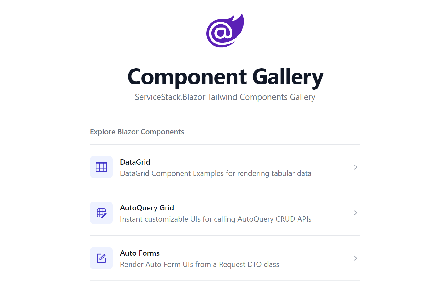
NavList
The NavList component encapsulates Tailwind's beautiful List component which is used extensively in Blazor Gallery's Navigation:
<div class="max-w-screen-sm">
    <NavList Title="Explore Blazor Components">
        <NavListItem Title="DataGrid" href="/gallery/datagrid" IconSvg=@Icons.DataGrid>
            DataGrid Component Examples for rendering tabular data
        </NavListItem>
        <NavListItem Title="AutoQuery Grid" href="/gallery/autoquerygrid" IconSvg=@Icons.AutoQueryGrid>
            Instant customizable UIs for calling AutoQuery CRUD APIs
        </NavListItem>
    </NavList>

    <h2 class="mt-8 text-base font-semibold text-gray-500 dark:text-gray-400 flex">
        <span title="Requires Auth"><Icon class="h-6 w-6 mr-2" Svg=@Icons.Padlock /></span>
        Booking APIs
    </h2>
    <NavList>
        <NavListItem Title="Bookings" href="/grid/bookings" Icon=@typeof(Booking).GetIcon()>
            Create and manage Bookings
        </NavListItem>
        <NavListItem Title="Coupons" href="/grid/coupons" Icon=@typeof(Coupon).GetIcon()>
            Create and manage discount Coupons
        </NavListItem>
    </NavList>
</div>
Where it will render a list of navigation links with descriptions and icons:
Colored Buttons
The ButtonStyle on PrimaryButton component can be used to render buttons into Tailwind's different primary colors:
<div class="grid gap-4 grid-cols-3">
    <PrimaryButton>Default</PrimaryButton>
    <PrimaryButton Style="ButtonStyle.Blue">Blue</PrimaryButton>
    <PrimaryButton Style="ButtonStyle.Purple">Purple</PrimaryButton>
    <PrimaryButton Style="ButtonStyle.Red">Red</PrimaryButton>
    <PrimaryButton Style="ButtonStyle.Green">Green</PrimaryButton>
    <PrimaryButton Style="ButtonStyle.Sky">Sky</PrimaryButton>
    <PrimaryButton Style="ButtonStyle.Cyan">Cyan</PrimaryButton>
</div>
Select Input
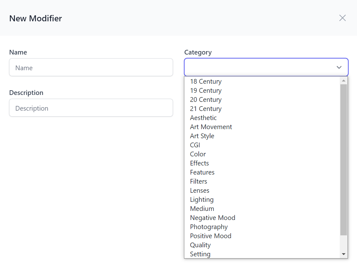
The <SelectInput> Values and Entries parameters can be used to populate options from an array of string's or KeyValuePair's, it also includes declarative features enabling more capable declarative forms which are typically restricted by the compile-time constant expression limitation of .NET attributes.
The EvalAllowableValues and EvalAllowableEntries attribute properties overcomes this limitation by letting you define the Select options with a #Script Expression whose great .NET scriptability lets you reference your App's .NET instances from a string expression. This feature can then be used to populate declarative Select options from a .NET Instance, e.g:
public class CreateModifier : ICreateDb<Modifier>, IReturn<Modifier>
{
    [ValidateNotEmpty]
    public string Name { get; set; }

    [ValidateNotEmpty]
    [Input(Type="select", EvalAllowableValues = "AppData.Categories")]
    public string Category { get; set; }

    public string? Description { get; set; }
}
That we register as a global variable in our AppHost's ScriptContext which we can populate from a dynamic source like a DB Table, e.g:
using var db = container.Resolve<IDbConnectionFactory>().Open();
ScriptContext.Args[nameof(AppData)] = new AppData
{
    Categories = db.Column<string>(db.From<Category>().Select(x => x.Name))
};
Where it will populate the Select input in all CreateModifier Auto Form components:
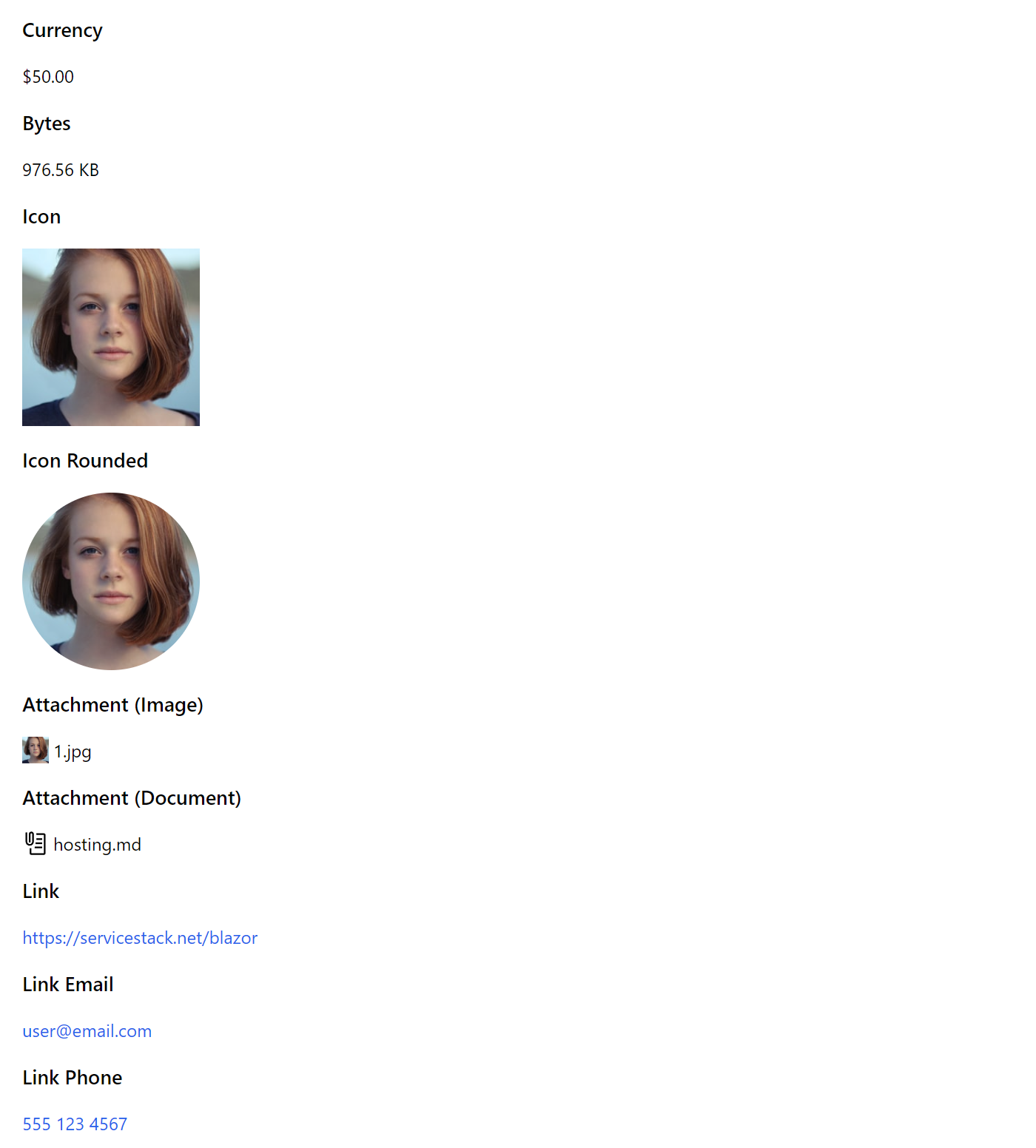
PreviewFormat
The <PreviewFormat> component is useful for rendering Table Cell data into different customizable formats, e.g:
<PreviewFormat Value="50" Format=Formats.Currency />

<PreviewFormat Value="1000000" Format=Formats.Bytes />

<PreviewFormat Value=@Url Format=Formats.Icon IconClass="w-40 h-40" />

<PreviewFormat Value=@Url Format=Formats.Icon IconClass="w-40 h-40 rounded-full" />

<PreviewFormat Value=@Url Format=Formats.Attachment />

<PreviewFormat Value=@Path Format=Formats.Attachment />

<PreviewFormat Value=@Url Format=Formats.Link />

<PreviewFormat Value=@Email Format=Formats.LinkEmail />

<PreviewFormat Value=@Phone Format=Formats.LinkPhone />
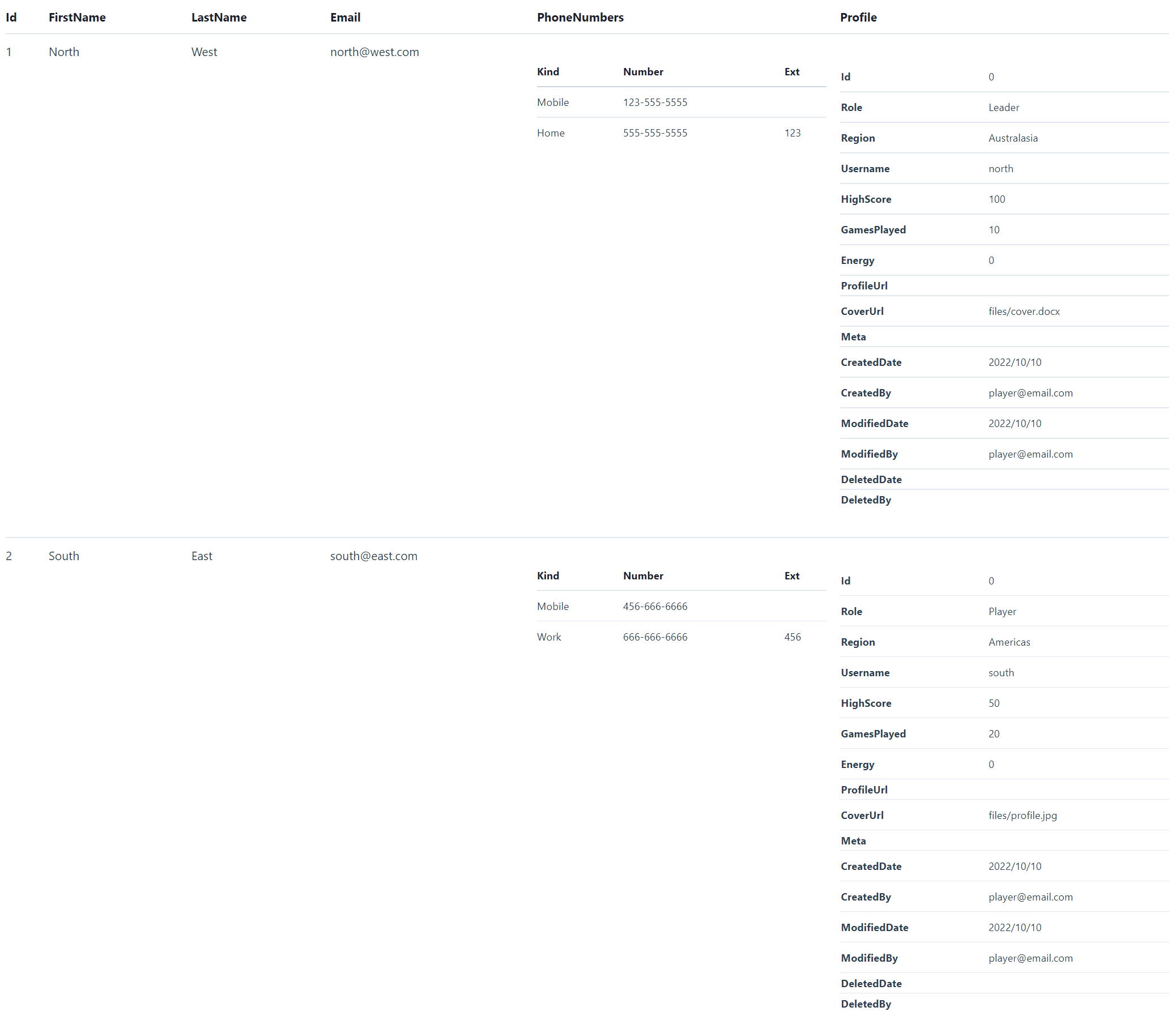
HtmlFormat
Whilst the versatile <HtmlFormat> component can be used to render any Serializable object into a human-friendly HTML Format, e.g:
Single Model
<div class="max-w-screen-sm">
    <HtmlFormat Value=@Track.Results[0] />
</div>

Item Collections
<div class="max-w-screen-sm">
    <HtmlFormat Value=@Track.Results />
</div>

Nested Complex Types
<HtmlFormat Value=@Create.Players />
For more info about the Blazor Components available checkout the Component Gallery:
Blazor Config
A lot of the default conventions used by the Blazor Components are overridable with BlazorConfig initialized in Program.cs, where Blazor WASM projects configured with something like:
BlazorConfig.Set(new BlazorConfig
{
    IsWasm = true,
    Services = app.Services,
    FallbackAssetsBasePath = apiBaseUrl,
    EnableLogging = true,
    EnableVerboseLogging = builder.HostEnvironment.IsDevelopment(),
});
Asset and Fallback Paths
Where FallbackAssetsBasePath allows you to specify a fallback path for Images which is useful when there's a delay for syncing uploaded assets to the CDN that the Blazor WASM client is deployed to, as it can fallback to referencing the asset from the .NET App Server that handled the file upload.
Alternatively AssetsBasePath can be used for specifying a different primary CDN location that's different from the Blazor WASM App CDN or AssetsPathResolver and FallbackPathResolver can be used when more a advanced custom strategy is required.