New React Templates 🚀
We're excited to announce our new collection of React Templates specifically optimized for AI-first development, designed to accelerate your development workflow with modern tooling and best practices.
First-Class React + Tailwind for AI-First Development
We're witnessing a fundamental shift in how applications are built. AI code generation has evolved from a novelty to a productivity multiplier that's become too significant to ignore. While AI models still require oversight for production backend systems, they excel at generating frontend UIs—compressing development timelines that once took months into days.
The Rise of Vibe Coding
AI can now generate complete, production-ready UI code. This enables an entirely new development workflow that Andrej Karpathy has termed "Vibe Coding"—where developers iteratively guide AI agents to implement features through natural language instructions, where features can be iteratively prototyped, refined and improved within seconds instead of hours.
This AI-first approach is rapidly maturing, with tools like Cursor, Claude Code, and Codex becoming the preferred platforms for this new paradigm with new tools designed to get maximum effectiveness of AI models with sophisticated planning tools, focused models optimized for code generation and edits and agentic workflows that's able to solidifying each new feature iteration with tests, along with detailed documentation, planning, migrations and usage guides.
React & Tailwind: The AI Development Standard
React and Tailwind have emerged as the de facto standards for AI-generated UIs. Every major platform for generating applications from prompts has converged on this stack including Replit, Lovable, Google's AI Studio, Vercel's v0 and Claude Code Web.
TypeScript
Whilst TypeScript is often excluded in one-prompt solutions catering to non-developers, it's still a critical part of the AI development workflow. It provides a type system that helps AI models generate more accurate and maintainable code and TypeScript's static analysis also helps identify errors in the generated code which AI Models have have become really good at correcting—as such it's an integral part in all our React templates.
How ServiceStack Excels in AI-First Development
Context is king when developing with AI models. The better the context, the higher the quality of generated code and ServiceStack's architecture is uniquely suited for AI-assisted development:
Declarative Typed APIs
All ServiceStack APIs follow a flat, declarative structure—The contract is explicit and consistent and LLMs don't need to guess what APIs accept or return.
End-to-End Type Safety
Context quality directly impacts generated code quality. ServiceStack's TypeScript integration provides complete static analysis of what APIs accept, return, and how to bind responses—giving AI models the full context they need. The static analysis feedback also directs models to identify and correct any errors in the generated code.
Zero-Ambiguity Integration
AI models thrive on consistency. ServiceStack removes guesswork with a single pattern for all API calls:
- One generic
JsonServiceClientfor all APIs - Consistent methods used to send all requests
- Consistent Typed Request DTO → Response DTO flow
- Uniform error handling
Intuitive Project Structure
ServiceStack's physical project structure provides clear separation of concerns, with the entire API surface area contained in the ServiceModel project—making codebases easy for AI models to navigate and understand.
Minimal Code Surface
Less code means fewer opportunities for errors. ServiceStack's high-productivity features minimize the code AI needs to generate:
- AutoQuery APIs - Flexible, queryable APIs defined with just a Request DTO
- AutoQueryGrid Component - Complete CRUD UIs in 1 line of code
- Auto Form Components - Beautiful, validation-bound forms in 1 line of code
These components are ideal for rapidly building backend management interfaces, freeing developers to focus on differentiating customer-facing features.
Seamless fusion of .NET APIs, Razor Pages and React UIs
Another benefit of this architecture of the .NET App handling all Requests and only proxying unknown requests to the Node server is that it enables a seamless fusion of .NET Razor Pages and React UIs. As many customers have customized Identity Auth flows we've included the Tailwind Identity Auth Razor Pages from the razor template into all new .NET React Templates.
This ability to seamlessly integrate React components within Razor Pages enables a gradual migration strategy, allowing teams to incrementally modernize legacy ASP.NET websites by progressively replacing individual pages or sections with React UIs without requiring a complete rewrite or disrupting existing functionality.
.NET React Templates with Static Exports
All existing SPA Templates have only used static exports, where at deployment a production build of the Node App is generated and published together with the .NET App in its /wwwroot folder, utilizing static file serving to render its UI:
This continues to be the case for 4/5 of the .NET React Templates, starting with 2x new react-static and next-static minimal starting templates - perfect base for your next Vibe Coding project, starting with the simplest template:
Vibe Codable .NET React Templates
When your App needs the features from a full-featured Web Framework like Next.js with file-based routing and SEO you choose from the Next.js templates starting with:
Like React Static, Next.js Static is a static export of a Next.js App, but what about when you need the full power of Next.js? For that you can use:
Next.js in Production
Using full Next.js does mean we also need to have a Next.js runtime at production, which looks like:
Fortunately Docker simplifies managing both .NET and Node servers as a single deployable unit, with the next-rsc custom Dockerfile handling the orchestration.
Full-Featured React Templates
In addition to the minimal starting templates above, we've also created 2 full-featured React Templates providing a good reference implementation for integrating several React features including Blog, MDX, Todos and shadcn/ui components alongside .NET features like API Keys, AI Chat & Swagger UI.
Comprehensive React Component Library
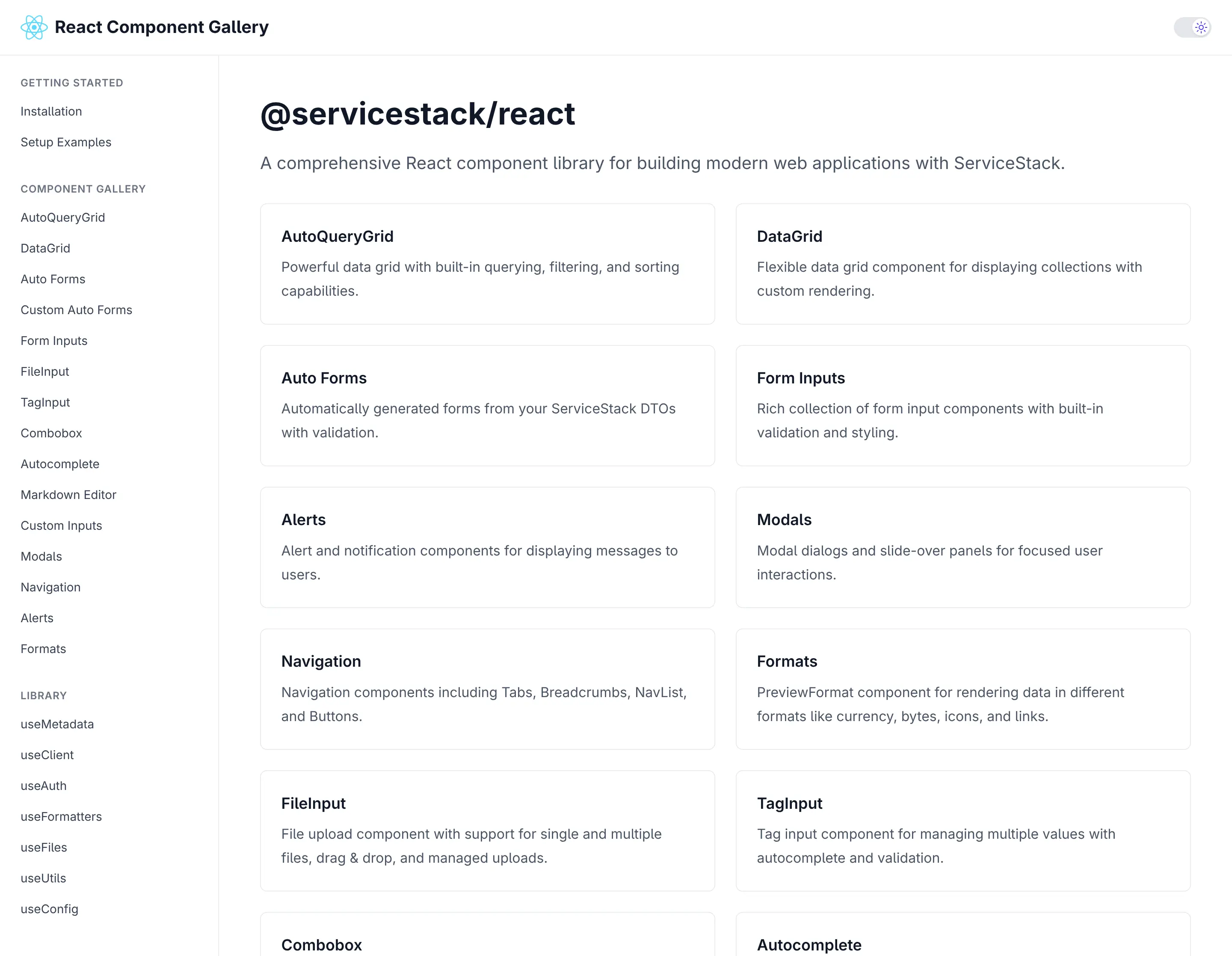
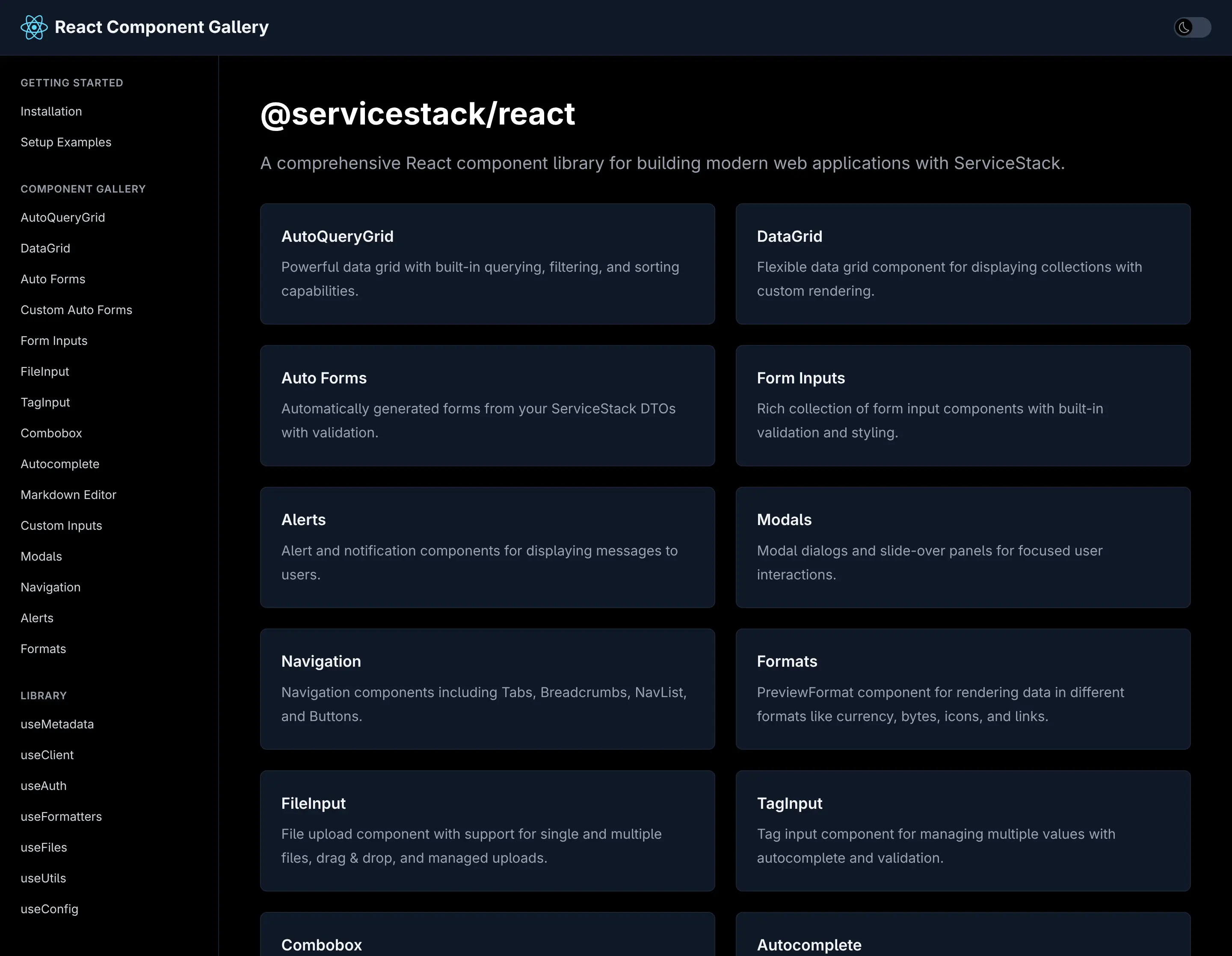
All three templates leverage our new React Component Gallery—a high-fidelity port of our proven Vue Component Library and Blazor Component Library. This comprehensive collection provides everything needed to build highly productive, modern and responsive web applications.
ServiceStack's first-class React support positions your applications at the forefront of AI-assisted development. With declarative APIs, complete type safety, and minimal boilerplate, you can leverage AI code generation with confidence while maintaining the quality and maintainability your production systems demand.
TypeScript Data Models
As AI Models are not as adept at generating C# APIs or Migrations yet, they excel at generating TypeScript code, which our TypeScript Data Models feature can take advantage of by generating all the C# AutoQuery CRUD APIs and DB Migrations needing to support it.
With just a TypeScript Definition:
We can generate all the AutoQuery CRUD APIs and DB Migrations needed to enable a CRUD UI with:
npx okai Bookings.d.ts
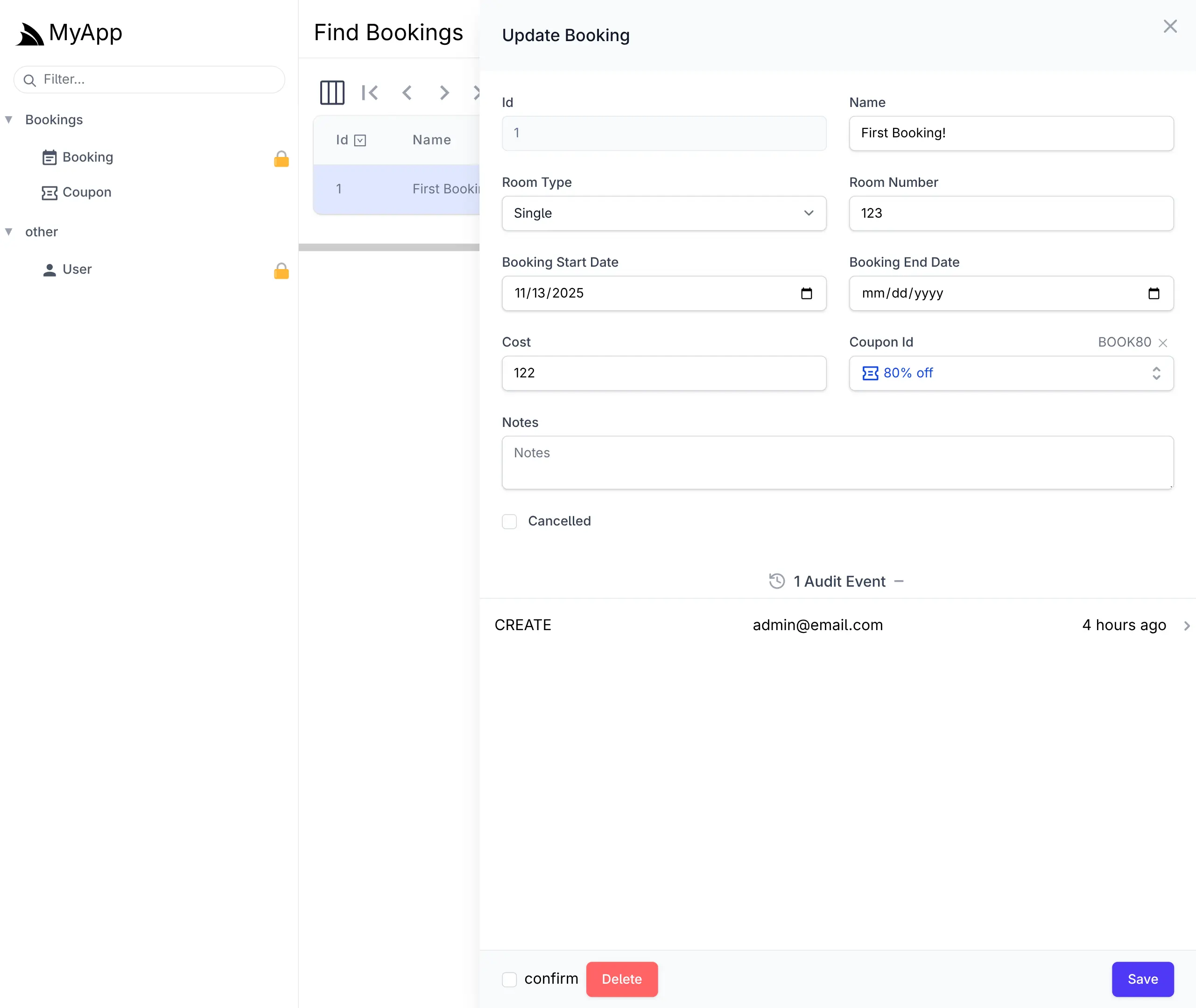
This is enough to generate a complete CRUD UI to manage Bookings in your React App with the React AutoQueryGrid Component. or with ServiceStack's built-in Locode UI:
Cheat Sheet
We'll quickly cover the common dev workflow for this feature.
To create a new Table use init <Table>, e.g:
npx okai init Transaction
This will generate an empty MyApp.ServiceModel/<Table>.d.ts file along with stub AutoQuery APIs and DB Migration implementations.
Regenerate AutoQuery APIs and DB Migrations
After modifying the TypeScript Data Model to include the desired fields, you can re-run the okai tool to generate the AutoQuery APIs and DB Migrations
(which can be run anywhere within your Solution):
npx okai Transaction.d.ts
After you're happy with your Data Model you can run DB Migrations to run the DB Migration and create your RDBMS Table:
npm run migrate
Making changes after first migration
If you want to make further changes to your Data Model, you can re-run the okai tool to update the AutoQuery APIs and DB Migrations, then run the rerun:last npm script to drop and re-run the last migration:
npm run rerun:last
Removing a Data Model and all generated code
If you changed your mind and want to get rid of the RDBMS Table you can revert the last migration:
npm run revert:last
Which will drop the table and then you can get rid of the AutoQuery APIs, DB Migrations and TypeScript Data model with:
npx okai rm Transaction.d.ts
AI-First Example
There are a number of options for starting with an AI generated Application, with all the Instant AI App Generators like Google's App Studio able to provide a great starting point. Although currently Professional Developers tend to use Cursor, Claude Code or Codex as their day-to-day tools of choice.
Use GitHub Copilot when creating a new Repository
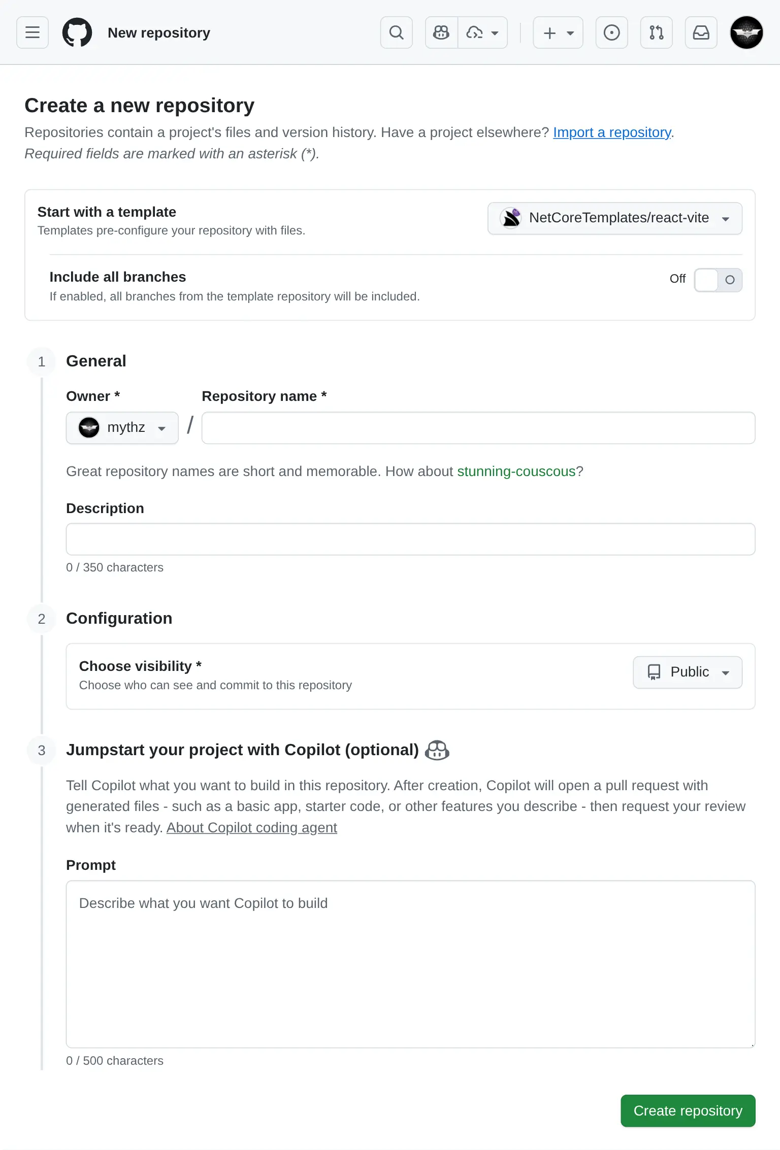
If you're using GitHub Copilot you can also use it to generate a new App from the Vite React template :
For the example, I've started with a useful App that I've never created before, a Budget Planner App, using the prompt:
Budget Planner Prompt
- React 19, TypeScript, TailwindCSS v4
- Persistence in IndexedDB/localStorage
- Recharts
- Vitest with React Testing Library

## Features
Dashboard
- Overview of total income, expenses, and remaining budget
- Monthly summary chart (line graph)
- Expense categories (pie chart)

Transactions
- Add/Edit/Delete income or expenses
- Date filtering/sorting

Budgets
- Set monthly budget goals per category
- Progress bars for spending vs. budget

Reports
- View past months
- Export
The generated source code for the App was uploaded to: github.com/mythz/budgets.apps.cafe
Budgent Planner App
After a few minutes Copilot creates a PR with what we asked for, even things that we didn't specify in the prompt but could be inferred from the Project Template like Dark Mode support where it made use of the existing <DarkModeToggle />.
Prompt AI to add new Features
AI Assistance doesn't end after the initial implementation as AI Models and tools are more than capable to create 100% of the React UI now, including new features, fixes and other improvements. For this example I used Claude Code to Implement Category Auto-Tagging with this prompt:
Implement Category Auto-Tagging

Allow specifying tags when creating a new transaction.
When users add a transaction, try to predict the tag from the Description, e.g:

Input: “Starbucks latte” → Suggests category: Food & Drinks
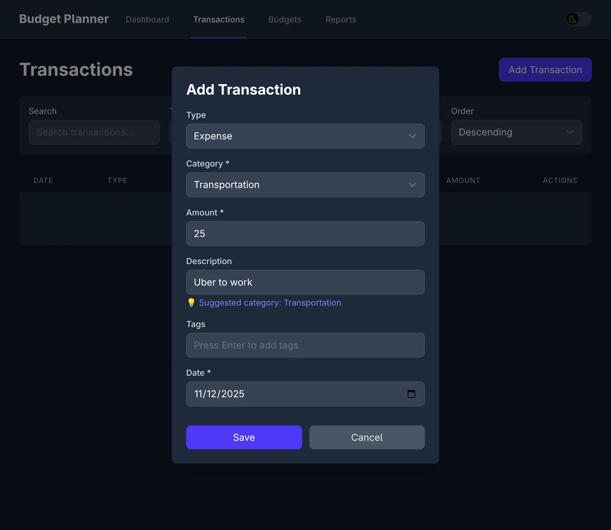
Input: “Uber to work” → Suggests category: Transport

Implementation:

Maintain a small local list of common keywords + categories.
Pre-fill category in the transaction form as the user types in the Description.
Which resulted in this commit which sees the feature available in the UI:
Along with different seed data, tailored for Income and Expenses:
And 19 passing tests to verify a working implementation:
Combined with Vite's instant hot-reload, this creates a remarkably fluid development experience where we get to watch our prompts materialize into working features in real-time.
All this to say that this new development model exists today, and given its significant productivity gains, it's very likely to become the future of software development, especially for UIs. Since developers are no longer the primary authors of code, our UI choices swing from Developer preferences to UI technologies that AI models excel at.
So whilst we have a preference for Vue given it's more readable syntax and progressive enhancement capabalities, and despite the .NET ecosystem having a strong bias towards Blazor, we're even more excited for the future of React and are committed to providing the best possible support for it.
