SPA Component Libraries
To lay the foundation for richer and more tightly integrated UI controls, we've created UI and common component libraries for the 3 most popular JS frameworks:
@servicestack/vue
@servicestack/react
@servicestack/angular
All new Single Page App Project Templates have been pre-configured to use these libraries which will make it a lot easier to deliver new UI components and updates to existing SPA Apps with just an npm upgrade.
UI Component List
Currently the component libraries include common Bootstrap UI Form Controls, Navigation Components and a generic Forbidden page
to handle when users don't have access to a protected route.
Side-by-side comparison displaying the names for the different Component Type in each JS Framework:
| Control | vue | react | angular |
|---|---|---|---|
| Forbidden | Forbidden | Forbidden | ForbiddenComponent |
| ErrorSummary | error-summary | ErrorSummary | error-summary |
| Input | v-input | Input | ng-input |
| Select | v-select | Select | |
| CheckBox | v-checkbox | CheckBox | ng-checkbox |
| Button | v-button | Button | ng-button |
| SvgImage | v-svg | SvgImage | |
| Link | v-link | ALink | ng-link |
| LinkButton | link-button | LinkButton | link-button |
| Nav | v-nav | Nav | |
| Navbar | navbar | Navbar | navbar |
| NavLink | nav-link | NavLink | nav-link |
| NavButtonGroup | nav-button-group | NavButtonGroup | nav-button-group |
| NavLinkButton | nav-link-button | NavLinkButton | nav-link-button |
Bootstrap UI Form Controls
The Bootstrap UI form controls include built-in support for validation where they can render validation errors from ServiceStack's
ResponseStatus object, e.g the SignIn.vue
page used in all Vue project templates:
<form @submit.prevent="submit" :class="{ error:responseStatus, loading }" >
    <div class="form-group">
        <error-summary except="userName,password" :responseStatus="responseStatus" />
    </div>
    <div class="form-group">
        <v-input id="userName" v-model="userName" placeholder="Username" :responseStatus="responseStatus"
                 label="Email" help="Email you signed up with" />
    </div>
    <div class="form-group">
        <v-input type="password"  id="password" v-model="password" placeholder="Password"
                :responseStatus="responseStatus" label="Password" help="6 characters or more" />
    </div>
    <div class="form-group">
        <v-checkbox id="rememberMe" v-model="rememberMe" :responseStatus="responseStatus">
            Remember Me
        </v-checkbox>
    </div>
    <div class="form-group">
        <button type="submit" class="btn btn-lg btn-primary">Login</button>
        <link-button href="/signup" lg outline-secondary class="ml-2">Register New User</link-button>
    </div>
</form>
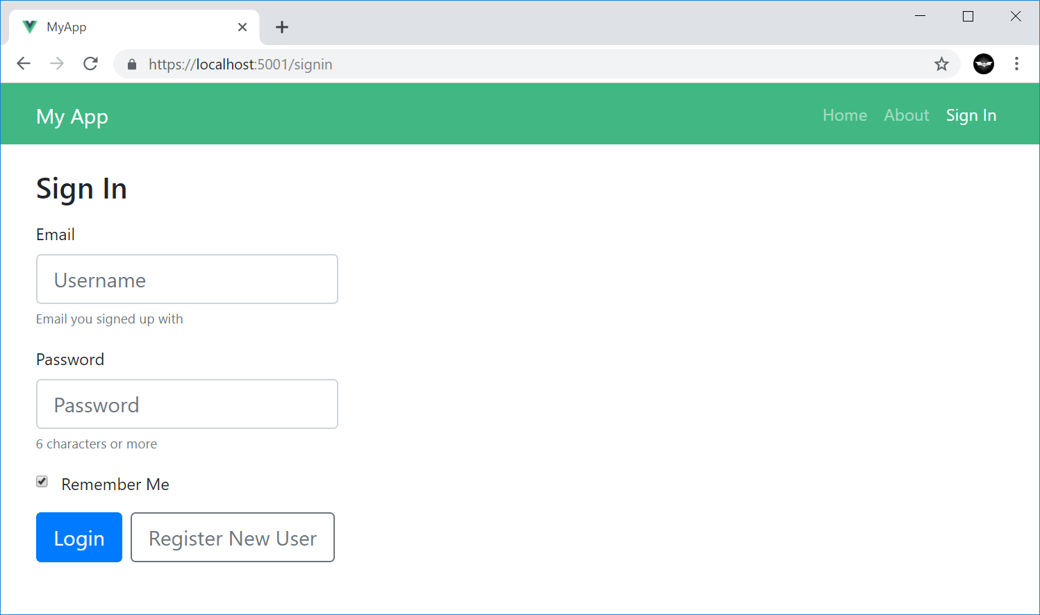
Initially renders the following UI:
All form validation is typically performed the same way, by sending a populated ServiceStack Request DTO and capturing any
Service Client exceptions in the components responseStatus property, e.g:
protected async submit() {
    try {
        this.loading = true;
        this.responseStatus = null;
        const response = await client.post(new Authenticate({
            provider: 'credentials',
            userName: this.userName,
            password: this.password,
            rememberMe: this.rememberMe,
        }));
        bus.$emit('signin', response);
        redirect(this.$route.query.redirect as string || Routes.Home);
    } catch (e) {
        this.responseStatus = e.responseStatus || e;
    } finally {
        this.loading = false;
    }
}
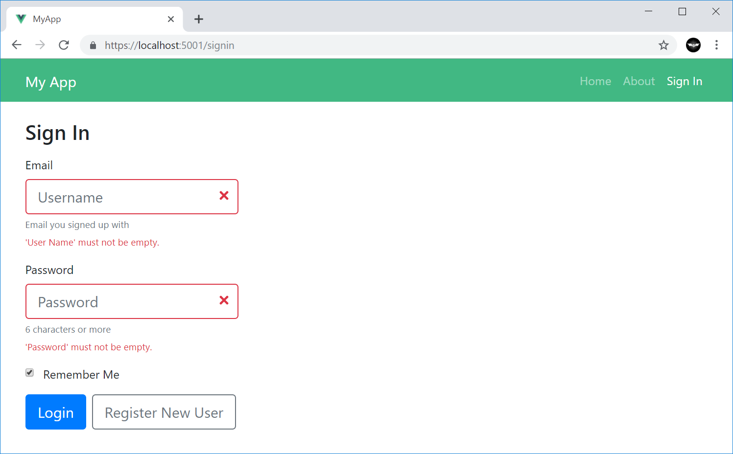
Where it automatically applies the field validation error next to their respective control:
Conversely you can unset the responseStatus to reset all form validation errors:
this.responseStatus = null;
Navigation Components
All navigation components are populated the same way for all JavaScript FX's where it embeds the navigation data structure in the page by
serializing the response of the GetNavItems Service to JSON that's embedded in the layout page where it's only loaded once
upon the initial page request (immediately, without an Ajax network request):
{{#script}}
NAV_ITEMS = {{ 'GetNavItems' |> execService |> json }};
AUTH = {{ 'Authenticate' |> execService({ ifErrorReturn: "null" }) |> json }};
{{/script}}
The navigation items data structure is used with new Navigation Components for each JavaScript FX to render the menu navigation which is initially captured in a state object containing the NavItems data structure, the Users Session and the list of User Attributes generated from the Authenticated Users Session (if any), e.g:
Vue
In Vue the Nav and User Information is maintained in a global store object which uses UserAttributes.fromSession() from the
@servicestack/client library to generate the list of User Attributes:
export const store: State = {
  nav: global.NAV_ITEMS as GetNavItemsResponse,
  userSession: global.AUTH as AuthenticateResponse,
  userAttributes: UserAttributes.fromSession(global.AUTH),
};
The built-in list of User Attributes include:
auth- Authenticated Userrole:TheRole- Authenticated User withTheRolerole.perm:ThePermission- Authenticated User withThePermissionpermission.
This list can be further extended to include your own custom User Attributes, these are used to control whether to display the navigation item
based on if the attribute is an exact match for the Show and Hide properties of the NavItem. E.g. Navigation Items populated with:
  "NavItems": [
    { "href":"/login",      "label":"Sign In", "hide":"auth" },
    { "href":"/profile",    "label":"Profile", "show":"auth" },
    { "href":"/admin",      "label":"Admin",   "show":"role:Admin" }
  ],
Will hide the Sign In and show the Profile nav items to Authenticated Users and only show the Admin nav item to Admin Users.
The navbar component uses these data structures to render the main menu:
<navbar :items="store.nav.results" :attributes="store.userAttributes" />
The rendering of the component can be further customized using any of the NavOptions properties, in camelCase.
Which also applies to the list of registered OAuth provider buttons
rendered with <nav-button-group>:
<nav-button-group :items="store.nav.navItemsMap.auth" :attributes="store.userAttributes"
                  :baseHref="store.nav.baseUrl" block lg />
In addition to NavOptions properties, new Bootstrap UI Controls (in each JavaScript FX) can also use these common bootstrap attributes
to stylize their components:
export declare class BootstrapBase extends Vue {
    primary?: boolean;
    outlinePrimary?: boolean;
    secondary?: boolean;
    outlineSecondary?: boolean;
    success?: boolean;
    outlineSuccess?: boolean;
    info?: boolean;
    outlineInfo?: boolean;
    warning?: boolean;
    outlineWarning?: boolean;
    danger?: boolean;
    outlineDanger?: boolean;
    light?: boolean;
    outlineLight?: boolean;
    dark?: boolean;
    outlineDark?: boolean;
    lg?: boolean;
    md?: boolean;
    sm?: boolean;
    xs?: boolean;
    block?: boolean;
    vertical?: boolean;
    horizontal?: boolean;
}
camelCase properties like
outlinePrimaryare exposed as kebab-case in components, e.g.outline-primary
React
These same components are
available in React
from the new @servicestack/react library, except the JSX Components use PascalCase, e.g:
<Navbar items={state.nav.results} attributes={state.userAttributes} />
Likewise for NavButtonGroup:
<NavButtonGroup items={state.nav.navItemsMap.auth} attributes={state.userAttributes}
                baseHref={state.nav.baseUrl} block lg />
Angular
Likewise for Angular from the new @servicestack/angular package where the main menu is rendered using the
navbar component:
<navbar [items]="nav.results" [attributes]="userAttributes"></navbar>
And the OAuth Button list is rendered using the nav-button-group component in kebab-case:
 <nav-button-group [items]="nav.navItemsMap.auth" [attributes]="userAttributes"
                   [baseHref]="nav.baseUrl" block lg></nav-button-group>
Mobile and Desktop Apps
Whilst there are no native components developed for different Mobile and Desktop UI's, the same navigation information can be accessed
by calling the GetNavItems Service, e.g:
var response = await client.GetAsync(new GetNavItems());