ServiceStack lets you register use built-in and register custom SVG icons from the Svg static API class.
A common performance drain in Web Apps is serving images whose large binary blobs can have a significant impact on your App's Request throughput, and why they're often hosted behind CDN's which can complicate the deployment process and introduce subtle caching issues.
A popular image format that's seen its popularity rise on the Web is SVG - a text vector image format that scales beautifully to support
different resolutions. SVG's are typically small in size and have great support in browsers where they can be optimally cached in .css
style sheets to reduce the number of required image requests.
Unless you're using an npm based build system there hasn't been great support for managing SVG images in .NET beyond treating them
as individual images, that is until now with the new SvgFeature plugin (pre-registered by default) and the Svg class - providing programmatic
access to registering SVG image collections and accessing them in a variety of different formats and colors.
In Memory Bundled CSS files
SvgFeature works by creating an in memory bundled .css file for each "image set" that's registered at the path /css/{image-set}.css,
e.g. it's pre-configured with the svg-auth and svg-icons svg groups:
- /css/svg-auth.css - Vendor Icons for each of the popular 3rd Party OAuth Providers
- /css/svg-icons.css - Generic User Avatars (used as the default profile image)
SVG files are simply stored as strings in regular collections maintained in Svg.CssFiles and Svg.Images dictionaries which can be modified/extended as normal.
Viewing SVG Icons
One thing that sets SVG apart from normal images is the multitude of ways they can be referenced. SVG's are commonly bundled in
.css files and referenced by classes, but they can also be embedded in a native <img> tag and <svg> block element where they
can be displayed in different colors.
To make it as easy as possible to reference SVG images in different contexts we've created the dynamic /metadata/svg page
(also available under the SVG Images link in your /metadata page Debug Links) where you can view
all your App's registered SVG images complete with different usage examples, code fragments and links to access SVG Image .css
collections or individual SVG images:
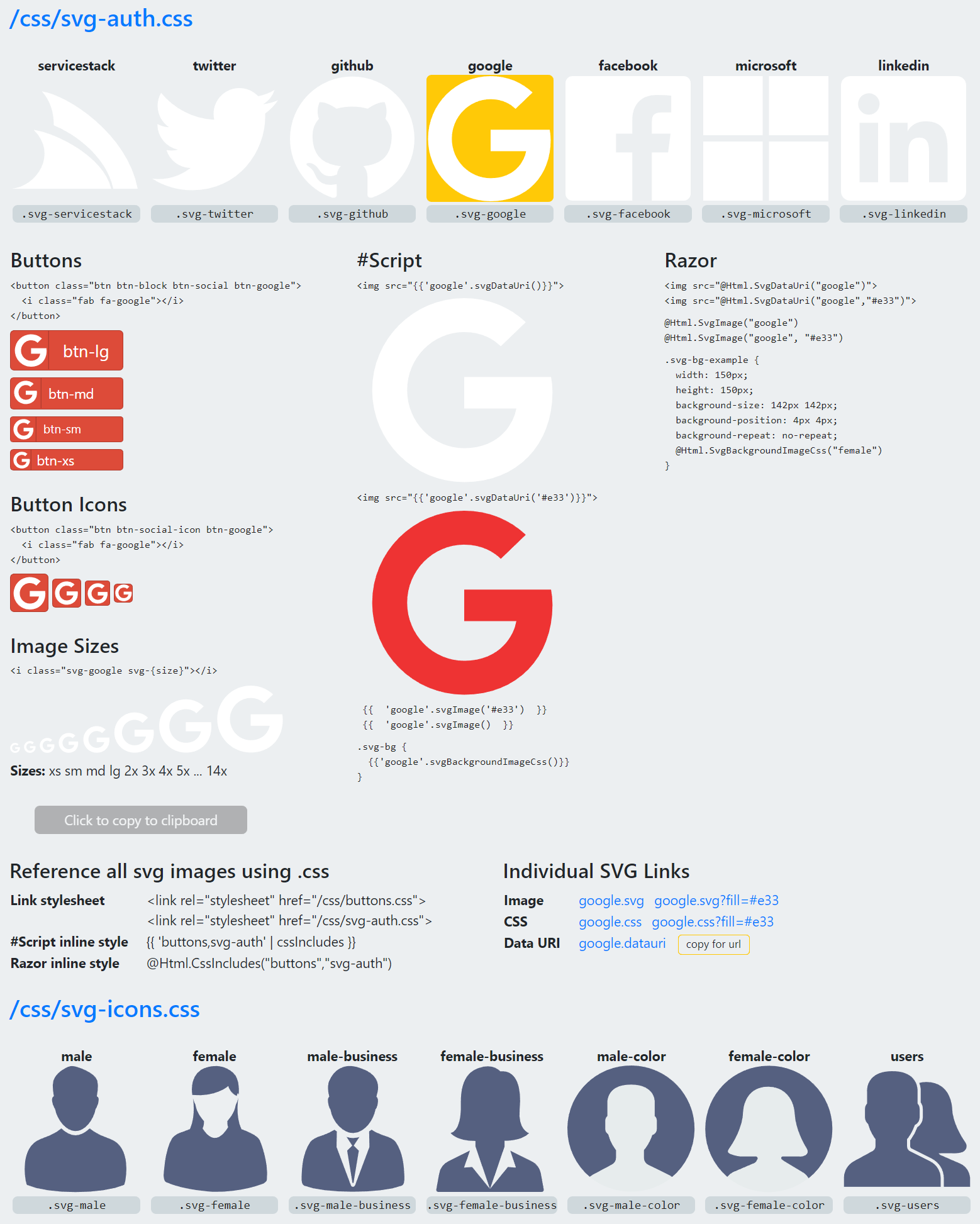
The entire page is clickable where you can first click on the SVG image you want to use then click on any text fragment to copy it, ready for pasting it in your web page.
Loading SVG from FileSystem
The most user-friendly way to load custom SVG images is to load them from a custom directory, e.g:
/svg
    /svg-icons
        vue.svg
        spirals.html
    /my-icons
        myicon.svg
Then in your AppHost you can register all SVG images using Svg.Load():
public override void Configure(Container container)
{
    Svg.Load(RootDirectory.GetDirectory("/svg"));
}
INFO
VirtualFiles is configured to your projects ContentRoot, use VirtualFileSources to use your WebRoot,
RootDirectory uses the FileSystem VFS in VirtualFileSources whereas ContentRootDirectory looks in VirtualFiles
This will load all the SVG images in the /svg directory with the sub directory used for the cssfile (aka image-set)
you want to add them to and the file name (without extension) used as the SVG identifier.
It will also evaluate any .html files in the directory with #Script and add the rendered SVG output,
e.g. we can load the generated SVG from the Spirals Sharp App:
/svg/svg-icons/spirals.html
<svg height="640" width="240">
{{#each range(180) }}
{{ 120 + 100 * cos((5) * it * 0.02827) |> to => x }}
{{ 320 + 300 * sin((1) * it * 0.02827) |> to => y }}
<circle cx="{{x}}" cy="{{y}}" r="{{it*0.1}}" fill="#556080" stroke="black" stroke-width="1"></circle>
{{/each}}
</svg>
and the SVG rendered output will be registered as a normal static SVG Image.
Registering SVGs from _init.html
An alternative way of registering SVG's is to register them in #Script Pages _init.html page that gets executed once on Startup
which will let you register multiple SVG images within 1 file using the #svg Script Block using the format #svg <name> <image-set>, e.g:
{{#svg vue app}}
<svg width="100" height="100" xmlns="http://www.w3.org/2000/svg">
<g>
<path fill="#556080" stroke="null" d="m79.43253,10.80794l0.01231,-0.02461l-18.15085,0l-11.38274,19.68085l0,0.0082l-11.37043,-19.68906l-18.15085,0l0,0.02051l-19.70136,0l49.22265,85.26183l49.22265,-85.25773"/>
</g>
</svg>
{{/svg}}
Which also supports using #Script to create and register dynamically rendered SVG images:
{{#svg spirals svg-icons}}
<svg height="640" width="240">
{{#each range(180) }}
{{ 120 + 100 * cos((5) * it * 0.02827) |> to => x }}
{{ 320 + 300 * sin((1) * it * 0.02827) |> to => y }}
<circle cx="{{x}}" cy="{{y}}" r="{{it*0.1}}" fill="#556080" stroke="black" stroke-width="1"></circle>
{{/each}}
</svg>
{{/svg}}
Register Custom SVG Images via API
You can also register your own SVG images programmatically with:
Svg.AddImage("<svg width='100' height='100' viewBox='0 0 100 100'>...</svg>", "myicon", "my-icons");
Where it will register the SVG under the myicon name and include it in the /css/my-icons.css css file.
The same icon can also be included in multiple stylesheets by adding its name to the Svg.CssFiles collection, e.g:
Svg.CssFiles["svg-icons"].Add("myicon");
SVG APIs
Once added you can access your SVG images from the available Svg APIs:
var svg = Svg.GetImage("myicon");
var dataUri = Svg.GetDataUri("myicon");
All SVG images are also available from the Svg.Images collection if you need to access them programmatically:
foreach (var entry in Svg.Images) {
    var name = entry.Key;
    var svg = entry.Value;
    $"{name}: {svg}".Print();
}
Recommended SVG conventions
All built-in SVG's are 100x100 in size, it's not necessary but for consistency it's good for your SVG icons also retain the same size,
but as they're vector images they can be easily resized when referencing them in your App.
If your icons use the fill colors registered in:
Svg.FillColors = new[] { "#ffffff", "#556080" };
You will be able replace the fill colors with:
var svg = Svg.GetImage("myicon", "#e33");
var dataUri = Svg.GetDataUri("myicon", "#e33");
Using SVG images in CSS
On Startup ServiceStack generates .css files for all SVG icons in Svg.CssFiles so you can import all icons with a single
stylesheet reference with all icons in each CSS file available from /css/{name}.css, e.g:
<link rel="stylesheet" href="/css/svg-icons.css">
Each CSS file includes 2 CSS classes for each SVG image that are both configured with the SVG as a background image:
.svg-myicon, .fa-myicon { background-image: url(...) }
Use the svg-myicon class when you want to set an HTML Element to use your SVG as its background:
<div class="icon svg-myicon"></div>
A good way to set the size of all related icons is to use a shared class, e.g:
.icon {
  width: 50px;
  height: 50px;
  background-size: 50px 50px;
  background-repeat: no-repeat;
  background-position: 2px 2px;
}
The fa-myicon class follows Font Awesome convention which you can use to render SVG icons inside buttons, e.g:
<button class="btn btn-block btn-social btn-light">
  <i class="fab fa-myicon"></i> Label
</button>
You can either use Bootstrap Button colors to select the button color
you want or use a custom btn-myicon class to choose different backgrounds for each SVG, e.g:
.btn-myicon {
  color: #212529;
  background-color: #dae0e5;
  border-color: #d3d9df;
}
The buttons requires the Social Buttons for Bootstrap which is also embedded in ServiceStack.dll
that can be referenced from /css/buttons.css, e.g:
<link rel="stylesheet" href="/css/buttons.css">
<link rel="stylesheet" href="/css/svg-icons.css">
Inline CSS
An alternative to using external stylesheet references above, is to embed them as inline styles in your page which can benefit in reduced network requests as well as provide better isolation than including all CSS your App's use in each page.
You can use cssIncludes to embed the contents of multiple css files in #Script pages with:
{{ 'buttons,svg-icons' |> cssIncludes }}
Or in Razor with:
@Html.CssIncludes("buttons","svg-icons")
Using SVG images in #Script
In #Script Pages you can embed SVG xml with the svgImage and svgDataUri scripts:
{{ 'myicon' |> svgImage }}
{{ 'myicon'.svgImage('#e33') }}
Inside an HTML IMG element using its data URI:
<img src="{{ 'myicon'.svgDataUri() }}">
<img src="{{ 'myicon'.svgDataUri('#e33') }}">
Or as a background image in a custom CSS class:
.myicon {
width: 150px;
height: 150px;
background-size: 142px;
background-position: 4px;
background-repeat: no-repeat;
{{ 'myicon'.svgBackgroundImageCss() }}
}
Where you can use the class name to apply the above CSS to an element:
<div class="myicon"></div>
Using SVG images in Razor
Likewise there are HTML Helpers with the same name available in Razor Pages, where you can embed SVG images directly with:
@Html.SvgImage("myicon")
@Html.SvgImage("myicon", "#e33")
Inside an HTML IMG element using its data URI:
<img src='@Html.SvgDataUri("myicon")'>
<img src='@Html.SvgDataUri("myicon", "#e33")'>
Or inside a CSS class:
.myicon {
  width: 150px;
  height: 150px;
  background-size: 150px;
  background-repeat: no-repeat;
  @Html.SvgBackgroundImageCss("myicon")
}
Server Controls
Use these #Script methods to reference and modify individual SVG images in #Script Pages:
svgImage(string name) => Svg.GetImage(name)
svgImage(string name, string fillColor) => Svg.GetImage(name, fillColor)
svgDataUri(string name) => Svg.GetDataUri(name)
svgDataUri(string name, string fillColor) => Svg.GetDataUri(name, fillColor)
svgFill(string svg, string color) => Svg.Fill(svg, color)

svgBackgroundImageCss(string name) => Svg.GetBackgroundImageCss(name)
svgBackgroundImageCss(string name, string fillColor) => Svg.GetBackgroundImageCss(name, fillColor)
svgInBackgroundImageCss(string svg) => Svg.InBackgroundImageCss(svg)

svgBaseUrl(ScriptScopeContext scope) =>
    req(scope).ResolveAbsoluteUrl(HostContext.AssertPlugin<SvgFeature>().RoutePath);

Dictionary<string, string> svgImages() => Svg.Images;
Dictionary<string, string> svgDataUris() => Svg.DataUris;
Dictionary<string, List<string>> svgCssFiles() => Svg.CssFiles;
The same API's are also available in ServiceStack.Razor pages using the @Html helpers below:
Html.SvgImage(name)
Html.SvgImage(name, fillColor)
Html.SvgDataUri(name)
Html.SvgDataUri(name, fillColor)
Html.SvgFill(svg, color);

Html.SvgBackgroundImageCss(name)
Html.SvgBackgroundImageCss(name, fillColor)
Html.SvgInBackgroundImageCss(svg)

Html.SvgBaseUrl()
Mix in SVG Images
A nice consequence of the SVG support is being able to easily create a customized bundles of hand-picked SVG image assets as opposed to being forced to choose from a limited library in a fixed bundle.
As creating svg bundles just involves dropping SVG images inside your /svg/{group}/ folder, we're also able take advantage of mix
to import SVG image-sets into your App with a single command. You can view the current list of all SVG image-sets on mix with:
npx add-in [svg]
Currently all Material Design Icons are available separately by their logical group names:
Results matching tag [svg]:

   1. svg-action         Material Design Action Icons         to: svg/  by @ServiceStack  [svg]
   2. svg-alert          Material Design Alert Icons          to: svg/  by @ServiceStack  [svg]
   3. svg-av             Material Design Audio Visual Icons   to: svg/  by @ServiceStack  [svg]
   4. svg-communication  Material Design Communication Icons  to: svg/  by @ServiceStack  [svg]
   5. svg-content        Material Design Content Icons        to: svg/  by @ServiceStack  [svg]
   6. svg-device         Material Design Device Icons         to: svg/  by @ServiceStack  [svg]
   7. svg-editor         Material Design Editor Icons         to: svg/  by @ServiceStack  [svg]
   8. svg-file           Material Design File Icons           to: svg/  by @ServiceStack  [svg]
   9. svg-hardware       Material Design Hardware Icons       to: svg/  by @ServiceStack  [svg]
  10. svg-image          Material Design Image Icons          to: svg/  by @ServiceStack  [svg]
  11. svg-maps           Material Design Maps Icons           to: svg/  by @ServiceStack  [svg]
  12. svg-navigation     Material Design Navigation Icons     to: svg/  by @ServiceStack  [svg]
  13. svg-places         Material Design Places Icons         to: svg/  by @ServiceStack  [svg]
  14. svg-social         Material Design Social Icons         to: svg/  by @ServiceStack  [svg]
  15. svg-toggle         Material Design Toggle Icons         to: svg/  by @ServiceStack  [svg]
Once imported, you have the flexibility to further customize them individually to create your App's custom designer bundle.
You also have access to #Script to generate parts of your SVG image dynamically if needed, as seen above in spirals.html.