API Explorer is a Postman & Swagger UI alternative built into every ServiceStack v6+ App that lets you explore, discover & call your APIs with an Auto UI dynamically generated from your APIs typed C# classes.
It's built from the ground up with multiple levels of customizations, supporting both declarative & programmatic models for customizing each properties Input UI control, each APIs form grid layout whilst also providing the ability to provide rich interactive HTML Components to document each of your APIs & their Types.
This video provides a quick overview of API Explorer's v1 featureset:
DEMO
A Live demo is available at /ui in all ServiceStack v6+ Apps, e.g: blazor-vue.web-templates.io/ui
The entire API Explorer UI is driven by the rich metadata around your APIs typed Service Contracts and AppHost's registered plugins.
- The Sidebar - Displaying a list of APIs each user has access to
- The API tab - Providing dynamic form to call & inspect your APIs
- The Details tab - Containing a complete description of your APIs & its dependent types
- The Code tab - Letting API consumers browse API Service contracts in their preferred language (11 languages supported)
Lets learn about each feature with screenshots 📷
If your AppHost has the ServiceStack AuthFeature plugin registered, the home page will display a Sign In dialog based on the its configured Auth Providers.
This is what you'll see in a new Vue Vite project which has Credentials Auth, JWT as well as Facebook, Google and Microsoft OAuth providers registered in Configure.Auth.cs:
Plugins.Add(new AuthFeature(() => new CustomUserSession(),
    new IAuthProvider[] {
        new JwtAuthProvider(appSettings) {
            AuthKeyBase64 = appSettings.GetString("AuthKeyBase64"),
        },
        new CredentialsAuthProvider(appSettings),
        new FacebookAuthProvider(appSettings),
        new GoogleAuthProvider(appSettings),
        new MicrosoftGraphAuthProvider(appSettings),
    })
{
    IncludeDefaultLogin = false
});
Integrated Sign In
Where it will dynamically render the Sign Up form with the App's enabled Auth capabilities.
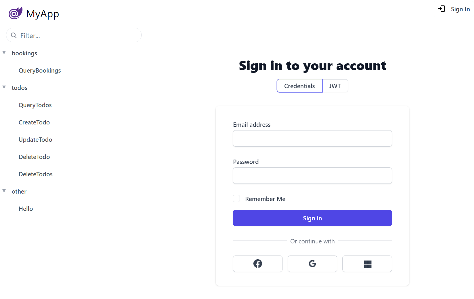
Custom Auth Providers can provide their own Form Layout by overriding the FormLayout, e.g. the above Credentials UI is creatable with:
public class CustomCredentialsAuthProvider : CredentialsAuthProvider
{
    public CustomCredentialsAuthProvider()
    {
        FormLayout = new() {
            Input.For<Authenticate>(x => x.UserName, c =>
            {
                c.Label = "Email address";
                c.Required = true;
            }),
            Input.For<Authenticate>(x => x.Password, c =>
            {
                c.Type = "Password";
                c.Required = true;
            }),
            Input.For<Authenticate>(x => x.RememberMe),
        };
    }
    //...
}
Where the Input utility can be used to configure most HTML Form Input control properties that automatically configures to use the desired Input control for each property Type.
You can Sign In with any of the users in the Vue Vite Sign In page configured in Configure.AuthRepository.cs, i.e:
| Username | Password | Role |
|---|---|---|
| admin@email.com | p@55wOrd | Admin |
| manager@email.com | p@55wOrd | Manager |
| employee@email.com | p@55wOrd | Employee |
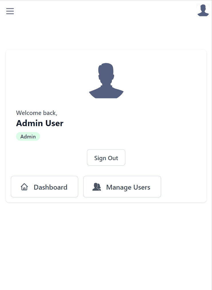
If signed in with the Admin User and the Admin Users plugin is configured:
Plugins.Add(new AdminUsersFeature());
It also displays Admin UI links that only Admin Users have access to.
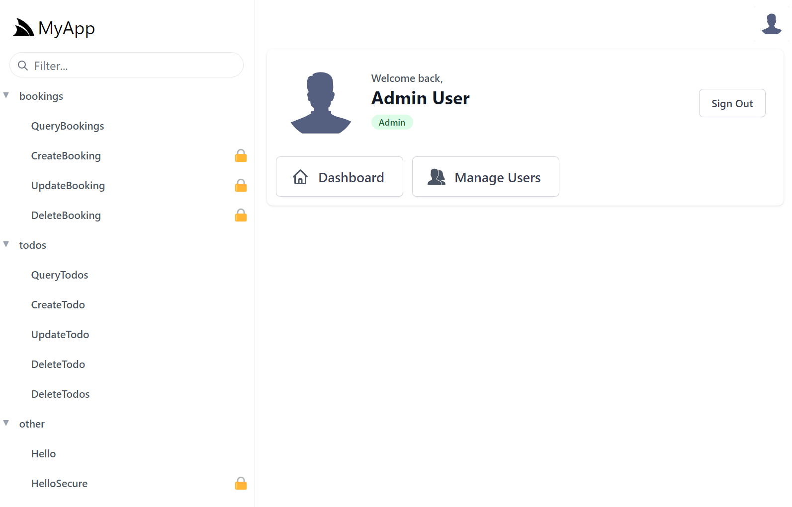
If you'd like to, you can add personalized links for users in different roles, e.g. this is what's used to populate the above UI for Admins:
appHost.AddToAppMetadata(meta =>
{
    meta.Plugins.Auth.RoleLinks[RoleNames.Admin] = new List<LinkInfo>
    {
        new() { Href = "../admin-ui", Label = "Dashboard", Icon = Svg.ImageSvg(Svg.Create(Svg.Body.Home)) },
        new() { Href = "../admin-ui/users", Label = "Manage Users", Icon = Svg.ImageSvg(Svg.GetImage(Svg.Icons.Users, "currentColor")) },
    };
});
Once signed in, API Explorer expands to include all the protected APIs the signed in user has access to, identifiable with the padlock icon.
Disable API Explorer
INFO
API Explorer is powered by the rich API metadata provided by the MetadataFeature and can be customized through the UiFeature plugin.
Removing either plugin disables API Explorer.
Plugins.RemoveAll(x => x is UiFeature);
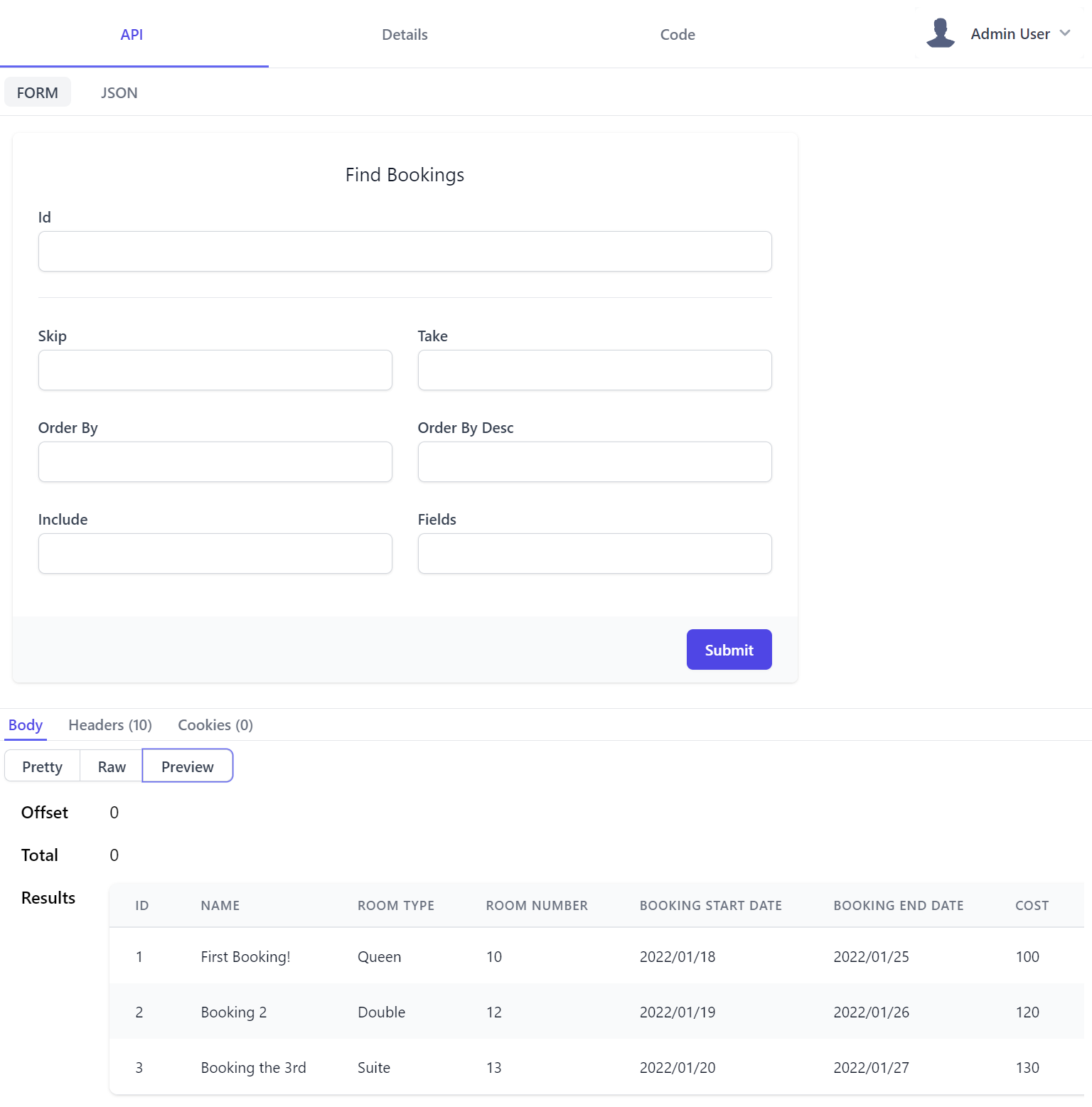
API Tab
After selecting an API to use from the left-hand menu, you will be greeted with a way to call APIs through an Auto UI generated based on the Request DTO schema. Submitting the form returns API results with:
- Body displaying a syntax highlighted JSON response
- Raw showing raw JSON output in a textarea
- Preview tab displaying results in a human-friendly view
INFO
The Raw response forces a CamelCase response since the API Explorer interface needs consistent casing outside your applications default TextCase.
Those using SnakeCase or PascalCase will see a different response outside of API Explorer.
Control types are based on the property types in your DTOs.
| UI Input | Data Types |
|---|---|
<select> |
Enum, Custom Values |
<input type=number> |
Numeric Types |
<input type=date> |
DateTime, DateTimeOffset, DateOnly |
<input type=time> |
TimeSpan, TimeOnly |
<input type=checkbox> |
Boolean |
<input type=text> |
default |
Where the CreateBooking Request DTO defined in Bookings.cs:
[Tag("bookings"), Description("Create a new Booking")]
[Route("/bookings", "POST")]
[ValidateHasRole("Employee")]
[AutoApply(Behavior.AuditCreate)]
public class CreateBooking : ICreateDb<Booking>, IReturn<IdResponse>
{
    [Description("Name this Booking is for"), ValidateNotEmpty]
    public string Name { get; set; }
    public RoomType RoomType { get; set; }
    [ValidateGreaterThan(0)]
    public int RoomNumber { get; set; }
    [ValidateGreaterThan(0)]
    public decimal Cost { get; set; }
    public DateTime BookingStartDate { get; set; }
    public DateTime? BookingEndDate { get; set; }
    [Input(Type = "textarea")]
    public string? Notes { get; set; }
}
Generates the following UI:
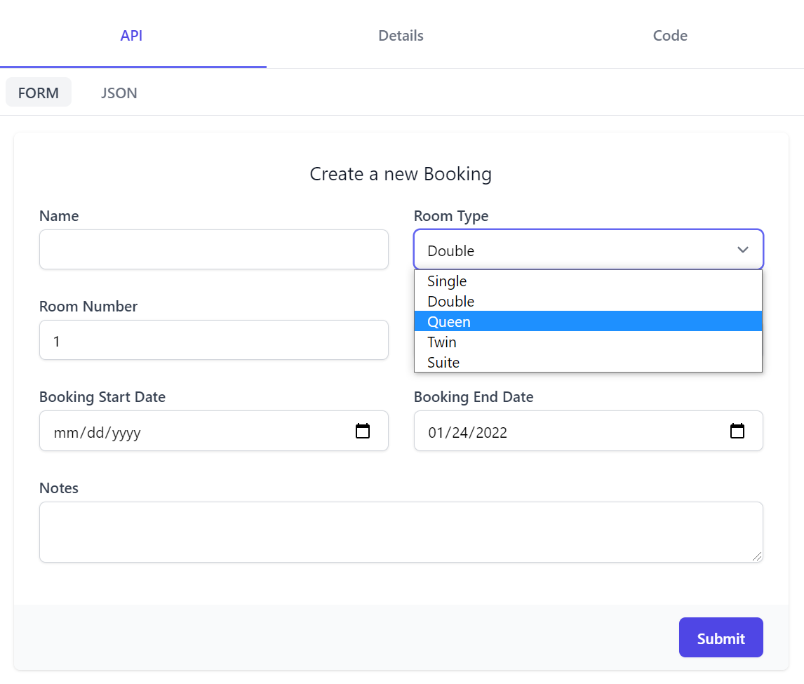
This also shows how we can use the [Input] attribute
to further customize the Input UI control for each property as a declarative alternative to using Input.For<T>() above that the Notes property utilizes to change to use a textarea control instead.
API Form also supports auto binding Argument Exceptions or Fluent & Declarative Validation rules where any validation errors will be contextually displayed next to the invalid property. Here's both the resulting invalid UI & the Error Response DTO that generated it:
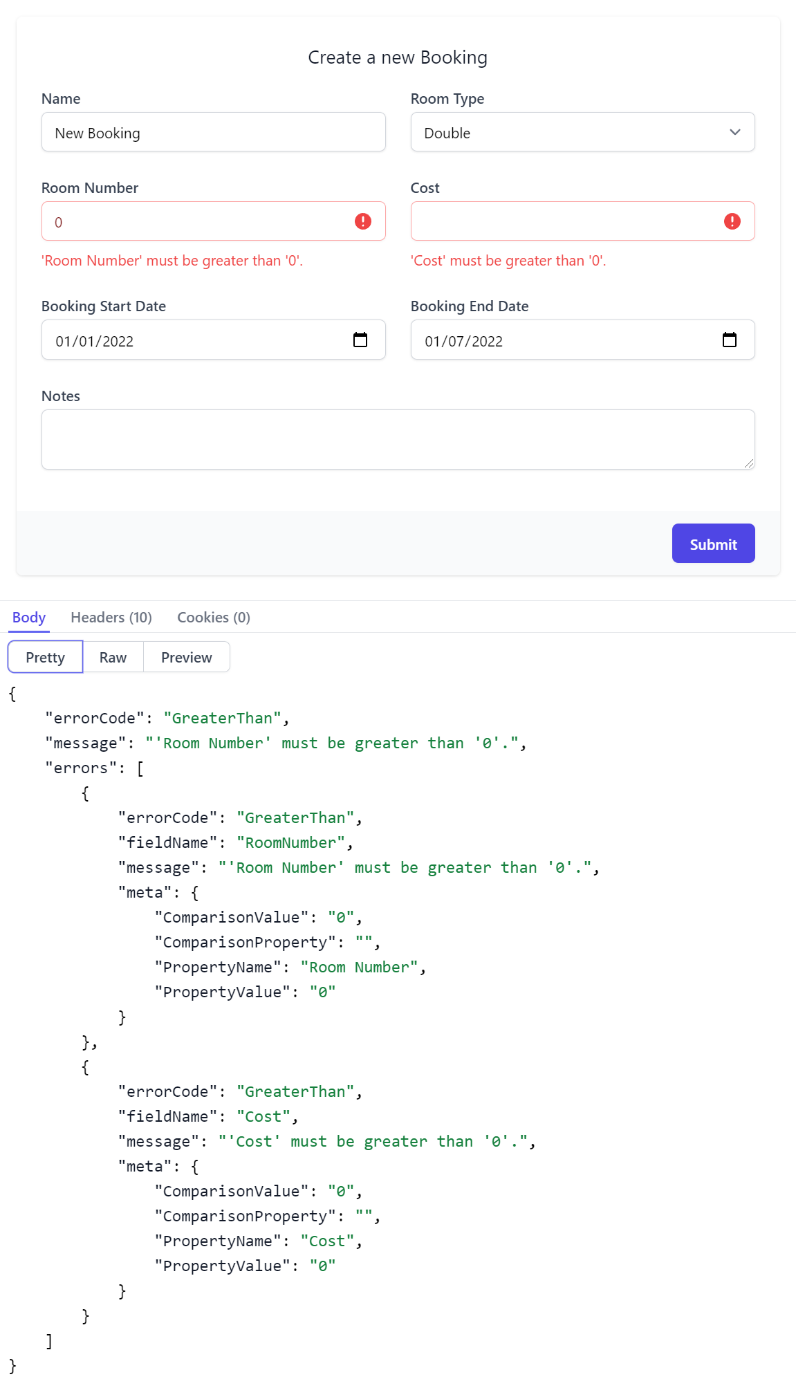
Contextual validation errors is used where possible, otherwise an Error Summary notification is displayed along with the API Response body containing the full API error information.
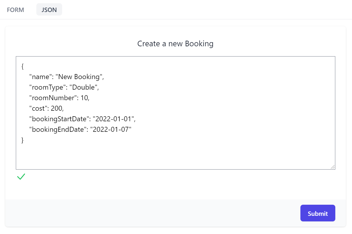
JSON Form
Another useful API form feature is being able to call APIs with a JSON request payload which maintains a 2-way sync with the Form's UI allowing you to quickly cycle between input modes to quickly construct your API request.
Real-time JSON validation is also displayed for added assistance, warning you whenever the JSON is malformed.
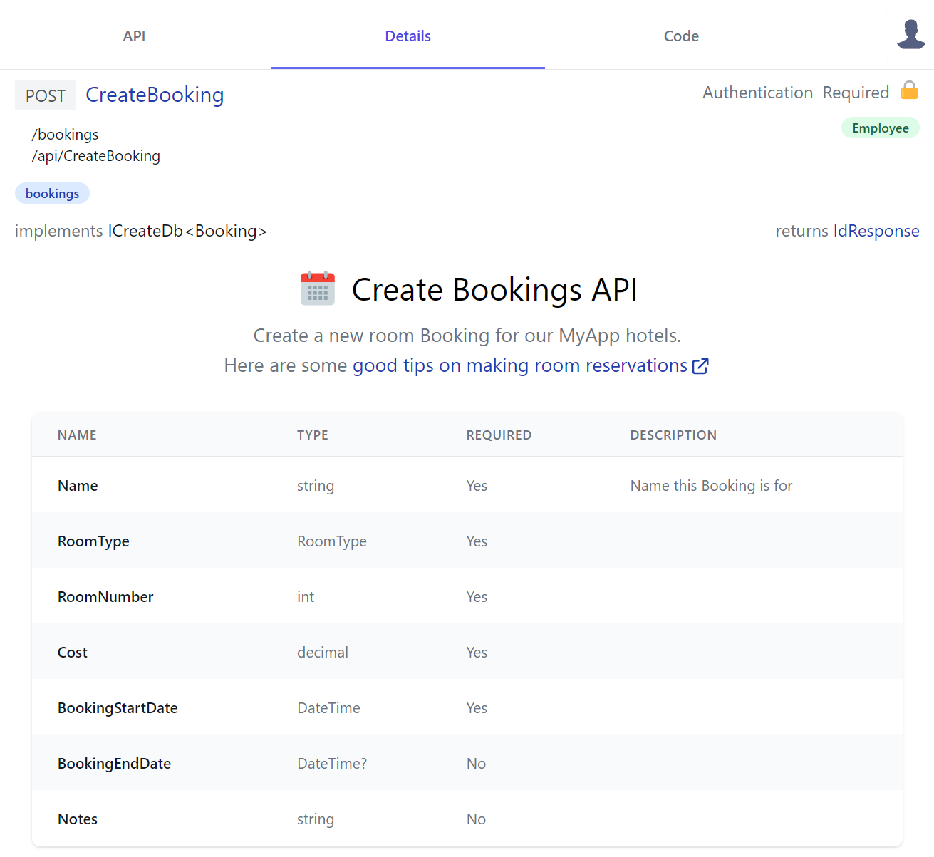
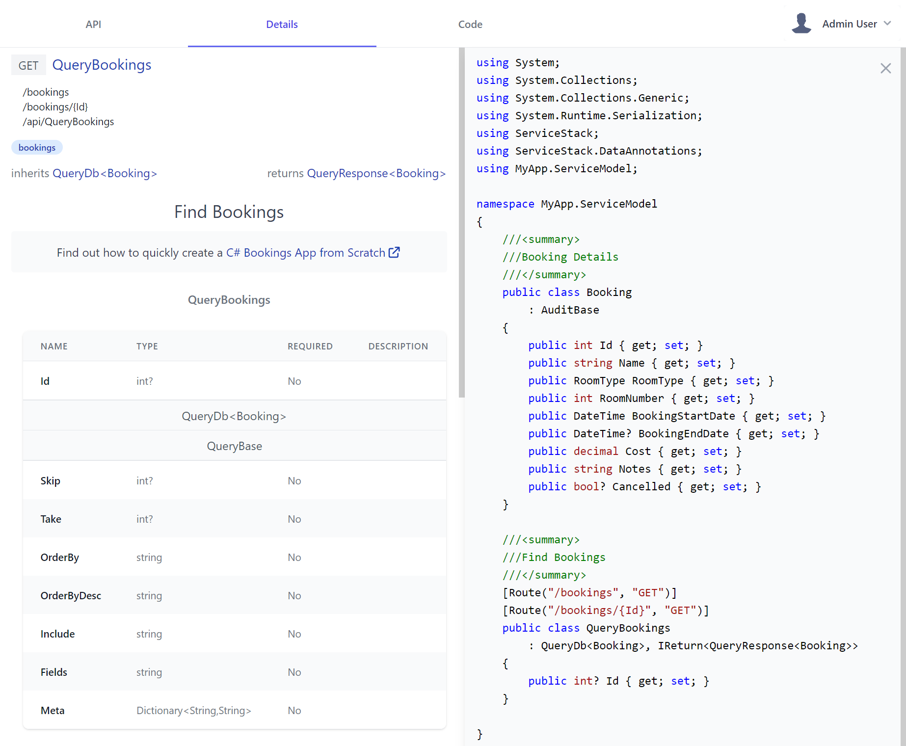
Details Tab
API Explorer also provides a place for users to find out more about your API through documentation generated by metadata about in your API and optionally custom HTML modules to give additional context.
This is where API consumers would go to learn about each API where it displays all relevant information about the API at a glance. For CreateBooking it shows that:
- POST is the APIs preferred HTTP Method
- List its user-defined and pre-defined routes
- It's a protected API limited to Authenticated Users with the Employee role
- It's categorized in the bookings tag group
- It's an AutoQuery CRUD API implementing
ICreateDb<Booking>indicating it creates entries in the Booking RDBMS Table - It returns an
IdResponsewhich we can intuitively infer returns the new Booking Id for successfully created Bookings
This API Definition was generated from the CreateBooking DTO shows that the Required column used to document the APIs required properties is required for all properties except for the nullable Value and Reference Types when #nullable is enabled.
public class CreateBooking : ICreateDb<Booking>, IReturn<IdResponse>
{
    [Description("Name this Booking is for"), ValidateNotEmpty]
    public string Name { get; set; }
    public RoomType RoomType { get; set; }
    [ValidateGreaterThan(0)]
    public int RoomNumber { get; set; }
    [ValidateGreaterThan(0)]
    public decimal Cost { get; set; }
    public DateTime BookingStartDate { get; set; }
    public DateTime? BookingEndDate { get; set; }
    [Input(Type = "textarea")]
    public string? Notes { get; set; }
}
INFO
Importantly Required annotations are only documentative, your API still has to validate required reference types like string using your preferred validation method, e.g. Using the [ValidateNotEmpty] declarative attribute, Fluent Validation or manual verification in your Service C# implementation and throwing ArgumentException for invalid properties
All this data is inferred from your services, with the ability to present data from additional metadata attributes such as:
| Attribute name | Description |
|---|---|
[Description] |
Class and properties text only description. |
[Notes] |
Class only text and HTML description. |
[Tag] |
Class only categorization of services, a way to group services. |
[Input] |
Properties only presentation data for input fields. |
If services require authentication using Authenticate or validation checking for role or permission, services will be shown with a padlock (🔒) signifying requiring authentication.
Request and response names are links to show C# generated code representations of your DTOs and dependent types. Text metadata such as [Description] will also flow down into the generated code as comments for additional context.
Code Tab
The Code tab allows developers consuming your APIs from different programming backgrounds explore each APIs in their preferred programming language - currently supporting 11 different languages.
It includes the necessary steps to call your APIs from client Apps, following the same pattern for each language:
- Copy your API DTOs
- Copy and install the package containing ServiceStack's generic JSON Service Client
- Copy the initial source code pre-configured to call the API they want
At which point without any code-gen or build tools, they'll end up with an Typed API configured to your APIs endpoint. E.g. this is what it looks like to Python developers utilizing our most recently supported language:
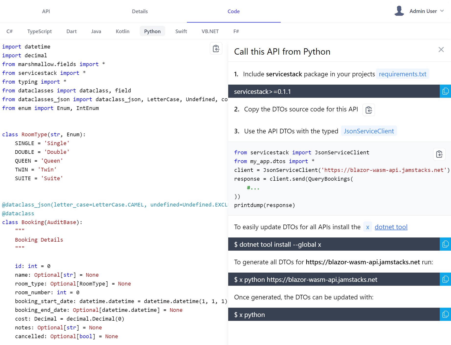
That they can follow to quickly incorporate your API into their existing Apps, in addition Python, C# or F# developers could also copy this source code to their Jupyter Notebooks for an instant typed visual REPL to explore your APIs.
This is driven by the services that power the Add ServiceStack Reference feature. This growing list of support languages shows example code using the specific API as well as required ServiceStack client libraries to use, and how to update the APIs DTOs.
Responsive Design
API Explorer's responsive layout works well in Smart Phones and Tablets letting you comfortably browse and call APIs on the go:
API Customizations
To become the preferred solution to document APIs, API Explorer was designed from scratch to support multiple customization levels, from being able to customize each properties Input control, its Form Grid Layout and further annotating each API or Type with declarative attributes & rich markup.
API Annotations
Whilst the capability of adding rich API Docs is essential when needed, we expect plain C# attributes will often be used to document APIs where [Description] can be used to provide a short summary on a Type and its Properties whilst richer HTML markup can be added to any Type using [Notes]
as done in Bookings.cs:
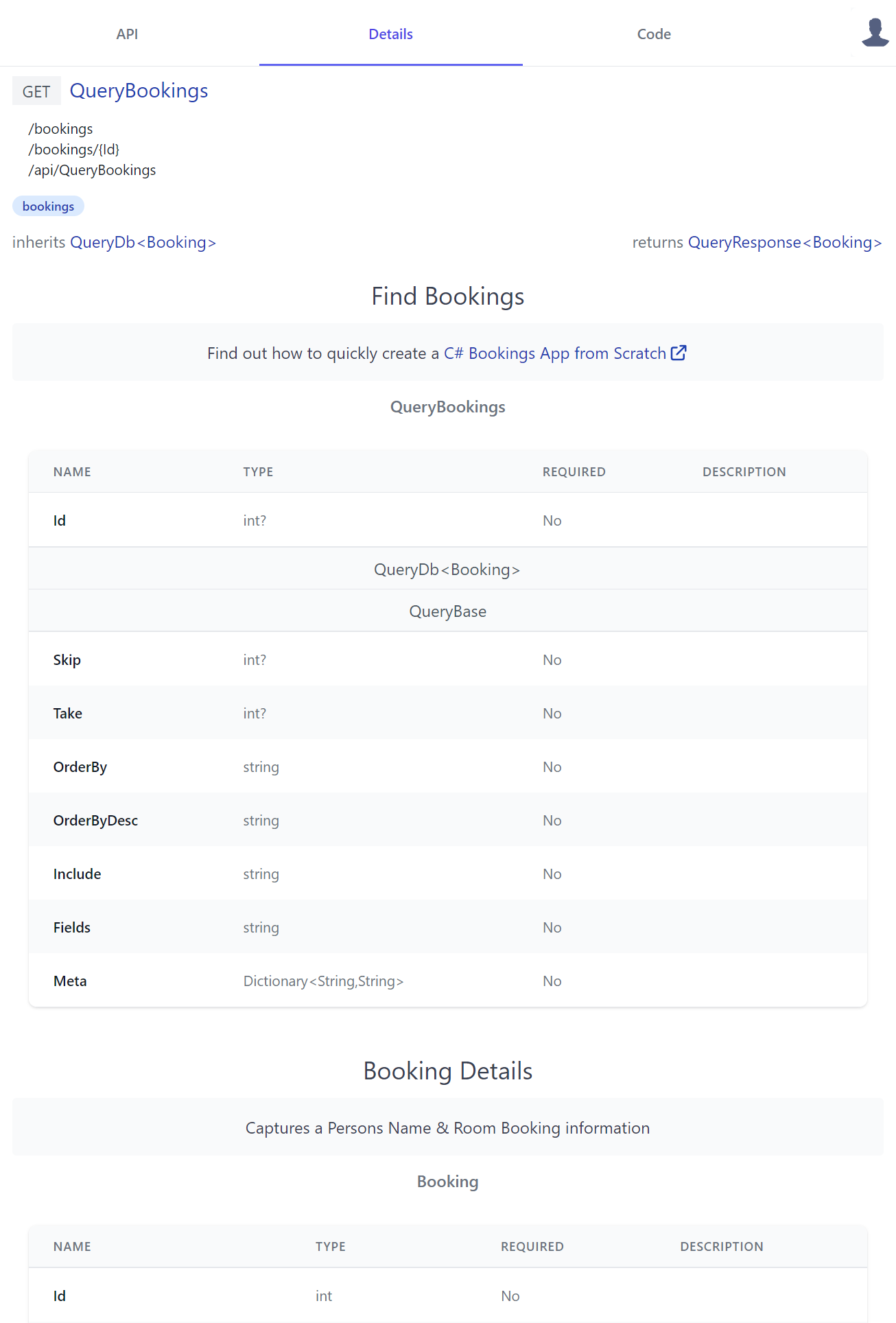
[Tag("bookings"), Description("Find Bookings")]
[Notes("Find out how to quickly create a <a class='svg-external' target='_blank' href='https://youtu.be/rSFiikDjGos'>C# Bookings App from Scratch</a>")]
[Route("/bookings", "GET")]
[Route("/bookings/{Id}", "GET")]
[AutoApply(Behavior.AuditQuery)]
public class QueryBookings : QueryDb<Booking>
{
    public int? Id { get; set; }
}

[Description("Booking Details")]
[Notes("Captures a Persons Name & Room Booking information")]
public class Booking : AuditBase
{
    [AutoIncrement]
    public int Id { get; set; }
    //...
}
Where it generates clean API docs displayed in a human-friendly table layout containing properties of its Request DTO Type and inherited base class properties, starting with the APIs Request DTO followed by all its referenced dependent types - resulting in the details page containing a complete snapshot of all types used in the API:
API Docs
We can further enhance API Explorer with our own custom Vue.js Components by adding them to your Host projects local /modules/ui/docs folder which the Blazor WASM project template utilizes to showcase some customization examples:
-
/modules
- /ui/docs
Where you can enhance any of your APIs or DTOs with rich API docs by adding Vue Components to /modules/ui/docs/*.mjs which gets included together with API Explorers own components in its single file download. API Explorer is built using Vue.js which is a popular
JavaScript framework that's optimal for progressive enhancement that your components can also take advantage of to enhance it with rich dynamic UIs.
For auto registration of components the *.mjs should match the API doc component which needs to be named {Type}Docs.
Here's a simple CreateBookingDocs.mjs component example used to generate API Docs for the CreateBooking API which just references server AppMetadata to access server API info from the /metadata/app.json endpoint:
import { inject } from "vue"
export const CreateBookingDocs = {
template:`
<div class="text-center my-3">
<div class="flex justify-center">
<svg class="w-10 h-10" xmlns="http://www.w3.org/2000/svg" viewBox="0 0 48 48">
<path fill="#CFD8DC" d="M5 38V14h38v24c0 2.2-1.8 4-4 4H9c-2.2 0-4-1.8-4-4z"/><path fill="#F44336" d="M43 10v6H5v-6c0-2.2 1.8-4 4-4h30c2.2 0 4 1.8 4 4z"/>
<g fill="#B71C1C"><circle cx="33" cy="10" r="3"/><circle cx="15" cy="10" r="3"/></g>
<g fill="#B0BEC5"><path d="M33 3c-1.1 0-2 .9-2 2v5c0 1.1.9 2 2 2s2-.9 2-2V5c0-1.1-.9-2-2-2z"/><path d="M15 3c-1.1 0-2 .9-2 2v5c0 1.1.9 2 2 2s2-.9 2-2V5c0-1.1-.9-2-2-2z"/></g>
<g fill="#90A4AE"><path d="M13 20h4v4h-4z"/><path d="M19 20h4v4h-4z"/><path d="M25 20h4v4h-4z"/><path d="M31 20h4v4h-4z"/><path d="M13 26h4v4h-4z"/><path d="M19 26h4v4h-4z"/><path d="M25 26h4v4h-4z"/><path d="M31 26h4v4h-4z"/><path d="M13 32h4v4h-4z"/><path d="M19 32h4v4h-4z"/><path d="M25 32h4v4h-4z"/><path d="M31 32h4v4h-4z"/></g>
</svg>
<h2 class="text-3xl ml-3 mb-3">Create Bookings API</h2>
</div>
<div class="text-gray-500 text-lg">
<p>
Create a new room Booking for our {{serviceName}} hotels.
</p>
<p>
Here are some
<a class="svg-external text-blue-800" target="_blank"
href="https://edition.cnn.com/travel/article/scoring-best-hotel-rooms/index.html">
good tips on making room reservations
</a>
</p>
</div>
</div>
`,
setup() {
const server = inject('server')
return { serviceName: server.app.serviceName }
}
}
Dynamic Components
QueryTodos is a more advanced example that generates a dynamic UI shared by all TODO APIs
that generate its reactive Mini Navigation UI users can use to cycle through all TODO API docs with a v-href="{ op }" custom directive:
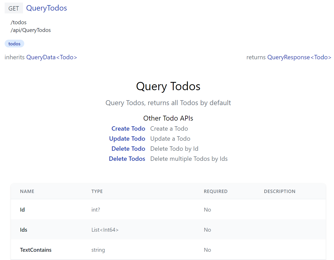
Where instead of registering a single component, it exports a install(app) function to register API Doc components for all TODO CRUD APIs, all registered
with the same TodosDocs component:
import { inject, computed } from "vue"
import { humanize } from "@servicestack/client"
export function install(app) {
const apis = {
QueryTodos: 'Query Todos, returns all Todos by default',
CreateTodo: 'Create a Todo',
UpdateTodo: 'Update a Todo',
DeleteTodo: 'Delete Todo by Id',
DeleteTodos: 'Delete multiple Todos by Ids',
}
const apiNames = Object.keys(apis)
const TodosDocs = {
template:`
<div class="mx-auto max-w-screen-md text-center py-8">
<h2 class="text-center text-3xl">{{humanize(op.request.name)}}</h2>
<p class="text-gray-500 text-lg my-3">{{apis[op.request.name]}}</p>
<div class="flex justify-center text-left">
<table>
<caption class="mt-3 text-lg font-normal">Other Todo APIs</caption>
<tr v-for="(info,name) in otherApis">
<th class="text-right font-medium pr-3">
<a v-href="{ op:name }" class="text-blue-800">{{humanize(name)}}</a>
</th>
<td class="text-gray-500">{{info}}</td>
</tr>
</table>
</div>
</div>`,
setup() {
const store = inject('store')
const op = computed(() => store.op)
const otherApis = computed(() => apiNames.filter(x => x !== store.op.request.name)
.reduce((acc,x) => { acc[x] = apis[x]; return acc }, {}))
return {
op,
apis,
otherApis,
humanize,
}
}
}
const components = apiNames.reduce((acc, x) => { acc[x + 'Docs'] = TodosDocs; return acc }, {})
app.components(components)
}
Built-in App functionality
JavaScript Libraries
Your custom components can utilize built in libraries embedded in ServiceStack.dll where they will have access to the latest Vue 3 reactive fx, @servicestack/client client library and Vue 3 Tailwind Component library which they can import by package name, e.g:
import { ref } from "vue"
import { useClient } from "@servicestack/vue"
import { humanify } from "@servicestack/client"
Static Analysis
As all package dependencies are written in TypeScript you can install them as dev dependencies to get static analysis from its TypeScript definitions at dev time:
npm install -D vue
npm install -D @servicestack/client
npm install -D @servicestack/vue
Your components can access your Apps Typed DTOs directly from the ES6 Module DTO endpoint at /types/mjs, e.g:
import { QueryCoupons } from "/types/mjs"
App functionality
Your components access to most App functionality via the injected dependencies for functionality defined in API Explorer's app.mjs:
const app = inject('app')                  // App for customizing Vue App, register components, providers, plugins, etc
const client = inject('client')            // JsonServiceClient for API Calls
const server = inject('server')            // AppMetadata (metadata for your Server App and APIs)
const store = inject('store')              // API Explorer's Reactive object model
const routes = inject('routes')            // usePageRoutes() Reactive store to manage its SPA routing
const breakpoints = inject('breakpoints')  // useBreakpoints() Reactive store to Tailwind responsive breakpoints
Most of which creates instance of common library features in core.mjs that are documented at api.locode.dev/modules/explorer.html.
You're also not limited with what's in API Explorer, with full access to JavaScript Modules you can import external 3rd Party packages the same way you import built-in packages.
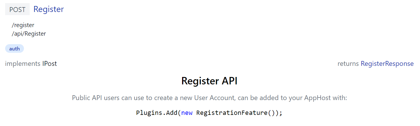
Built-in API Docs
ServiceStack's own built-in APIs uses custom API Doc components itself to document its APIs, e.g. /ui/docs/RegisterDocs.mjs
export const RegisterDocs = {
    template:`
      <div class="max-w-screen-md mx-auto text-center">
          <h2 class="text-2xl font-medium mb-3">Register API</h2>
          <p class="text-gray-500">
            Public API users can use to create a new User Account, can be added to your AppHost with:
          </p>
          <pre class="my-3"><code v-highlightjs="'Plugins.Add(new RegistrationFeature());'"></code></pre>
      </div>`
}
Generates docs for the built-in Register API that includes C# Syntax highlighting using the pre-configured highlightjs directive:
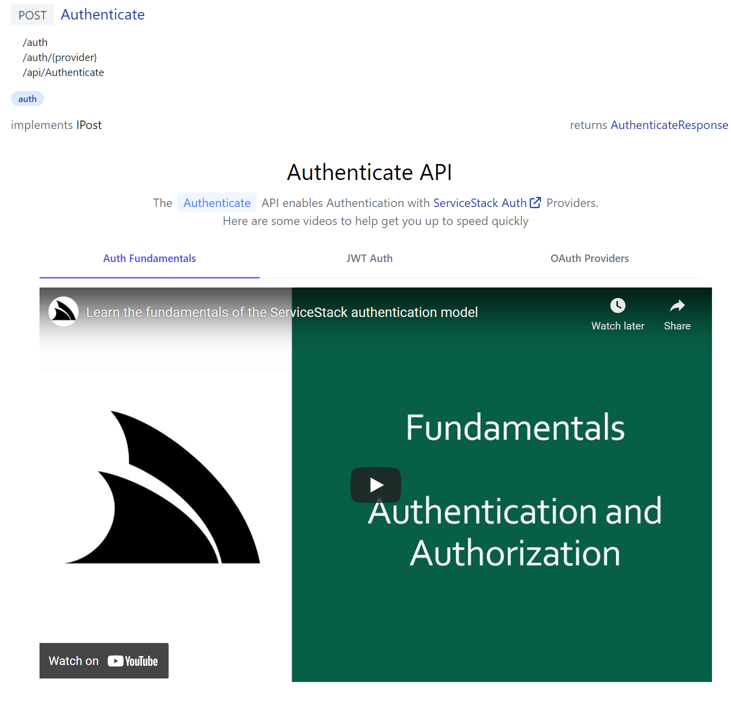
Whilst /ui/docs/AuthenticateDocs.mjs demonstrates a more advanced example in generating a responsive dynamic tab layout containing multiple relevant ServiceStack Auth YouTube videos:
Live Reload
When your App is run with dotnet watch it takes advantage ASP .NET Core's built-in file watcher to enable an instant live reload developer UX when contributing API Docs.
Which results in being more productive then using C# attributes as changes are immediately visible without a restart.
Customizing API Explorer
You can override each built-in Component in API Explorer by maintaining local customized versions in /wwwroot/modules/ui
where each API can be documented by adding Custom API Docs to /docs/*.mjs,
whilst existing components can be overridden in
/components/*.mjs
and custom UI added to custom.*
The custom.html and custom.js allows for further customization by including custom scripts and HTML fragments at the bottom of
API Explorer which will let you modify API Explorer after it's loaded.
Override built-in Components
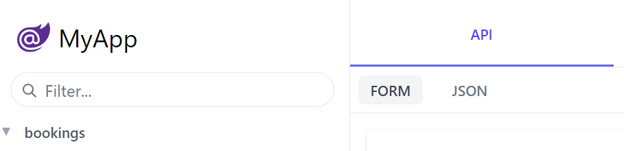
The built-in UIs also lets you override existing components by adding custom versions in /js/components, e.g:
const Brand = {
    template:`
    <div class="flex items-center flex-shrink-0 max-w-sidebar">
        <a title="My App" v-href="{ $page:'' }"
           class="text-2xl whitespace-nowrap overflow-x-hidden flex items-center">
           <svg xmlns="http://www.w3.org/2000/svg" class="w-8 h-8 ml-1 mr-2" viewBox="0 0 24 24">
               <path d="M23.834 8.101a13.912 13.912 0 0 1-13.643 11.72a10.105 10.105 0 0 1-1.994-.12a6.111 6.111 0 0 1-5.082-5.761a5.934 5.934 0 0 1 11.867-.084c.025.983-.401 1.846-1.277 1.871c-.936 0-1.374-.668-1.374-1.567v-2.5a1.531 1.531 0 0 0-1.52-1.533H8.715a3.648 3.648 0 1 0 2.695 6.08l.073-.11l.074.121a2.58 2.58 0 0 0 2.2 1.048a2.909 2.909 0 0 0 2.695-3.04a7.912 7.912 0 0 0-.217-1.933a7.404 7.404 0 0 0-14.64 1.603a7.497 7.497 0 0 0 7.308 7.405s.549.05 1.167.035a15.803 15.803 0 0 0 8.475-2.528c.036-.025.072.025.048.061a12.44 12.44 0 0 1-9.69 3.963a8.744 8.744 0 0 1-8.9-8.972a9.049 9.049 0 0 1 3.635-7.247a8.863 8.863 0 0 1 5.229-1.726h2.813a7.915 7.915 0 0 0 5.839-2.578a.11.11 0 0 1 .059-.034a.112.112 0 0 1 .12.053a.113.113 0 0 1 .015.067a7.934 7.934 0 0 1-1.227 3.549a.107.107 0 0 0-.014.06a.11.11 0 0 0 .073.095a.109.109 0 0 0 .062.004a8.505 8.505 0 0 0 5.913-4.876a.155.155 0 0 1 .055-.053a.15.15 0 0 1 .147 0a.153.153 0 0 1 .054.053A10.779 10.779 0 0 1 23.834 8.1zM8.895 11.628a2.188 2.188 0 1 0 2.188 2.188v-2.042a.158.158 0 0 0-.15-.15z" fill="#5C2D91"/>
            </svg>
           My App
        </a>
    </div>
    `
}
export default Brand
Which override's the built-in Brand component to replace the Logo on the top-right of API Explorer, Locode and the Admin UI with the custom version below:
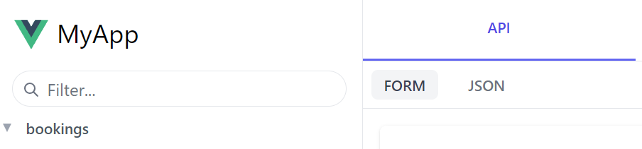
Although a less invasive option if you just want to use your own logo is to configure the UiFeature plugin to override the default BrandIcon as the other Jamstack templates do in their Configure.AppHost.cs:
ConfigurePlugin<UiFeature>(feature => {
    feature.Info.BrandIcon.Uri = "/assets/img/logo.svg";
    feature.Info.BrandIcon.Cls = "inline-block w-8 h-8 mr-2";
});
Custom Form Layouts
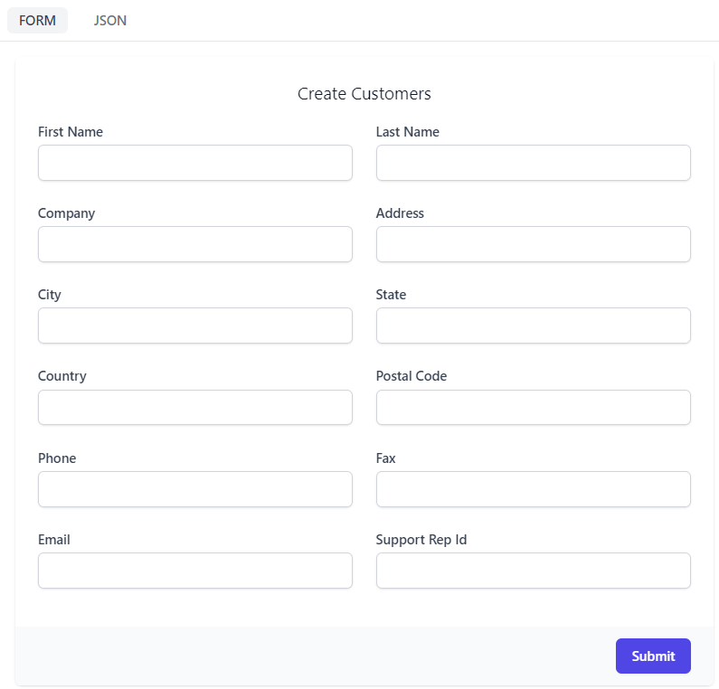
Generated forms default to a two column layout, but this can be controlled using FormLayout for a specific operation.
The appHost.ConfigureOperation<T> method can be used to change the layout and order of the form used in API Explorer.
For example, a CreateCustomer operation by default has the following properties.
[Route("/customers", "POST")]
public class CreateCustomers
    : IReturn<IdResponse>, IPost, ICreateDb<Customers>
{
    public string FirstName { get; set; }
    public string LastName { get; set; }
    public string Company { get; set; }
    public string Address { get; set; }
    public string City { get; set; }
    public string State { get; set; }
    public string Country { get; set; }
    public string PostalCode { get; set; }
    public string Phone { get; set; }
    public string Fax { get; set; }
    public string Email { get; set; }
    public long? SupportRepId { get; set; }
}
Default Form UI
And is presented in API Explorer using the following generated form by default.
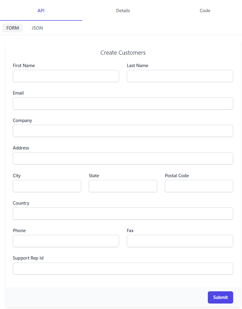
Custom Form Layout
Customizing this layout using ConfigureOperation, we can control the placement and other attributed of each InputInfo.
When overriding the FormLayout, it is in the structure of Rows, then columns in the nested list. So grouping controls like City, State and PostalCode in the same row allows us to control the presentation.
appHost.ConfigureOperation<CreateCustomers>(operation => operation.FormLayout = new() {
    Input.For<CreateCustomers>(x => x.FirstName,    c => c.FieldsPerRow(2)),
    Input.For<CreateCustomers>(x => x.LastName,     c => c.FieldsPerRow(2)),

    Input.For<CreateCustomers>(x => x.Email),
    Input.For<CreateCustomers>(x => x.Company),
    Input.For<CreateCustomers>(x => x.Address),

    Input.For<CreateCustomers>(x => x.City,         c => c.FieldsPerRow(3)),
    Input.For<CreateCustomers>(x => x.State,        c => c.FieldsPerRow(3)),
    Input.For<CreateCustomers>(x => x.PostalCode,   c => c.FieldsPerRow(3)),

    Input.For<CreateCustomers>(x => x.Country),

    Input.For<CreateCustomers>(x => x.Phone,        c => c.FieldsPerRow(2)),
    Input.For<CreateCustomers>(x => x.Fax,          c => c.FieldsPerRow(2)),

    Input.For<CreateCustomers>(x => x.SupportRepId),
});
Gives us the updated layout in API Explorer.
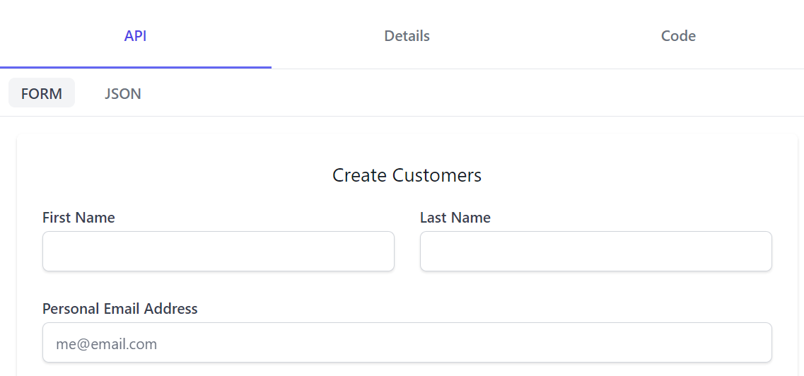
Custom Input Controls
Each input field can be customized with client side visual and behavioural changes by using InputInfo when customizing FormLayout.
Input.For<CreateCustomers>(x => x.Email, info => {
    info.Label = "Personal Email Address";
    info.Placeholder = "me@email.com";
    info.Type = "email";
})
Now our label and placeholder changes are visible and trying to submit a value without an @ we get a client side warning.
Values for InputInfo are merged with the [Input] attribute that can be used on Request DTO class properties.
This allows you to keep the default layout while still controlling Input options directly on your Request DTO class.
public class CreateCustomers : IReturn<IdResponse>, IPost, ICreateDb<Customers>
{
    [Input(Placeholder = "me@email.com", Type = "email", Label = "Personal Email Address")]
    public string Email { get; set; }
}
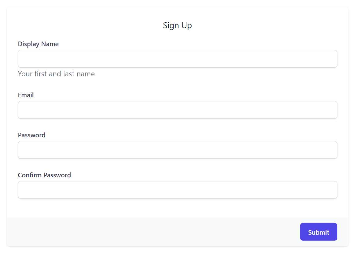
Register Form Layout
The built-in RegistrationFeature also uses a custom Form layout to mask its password fields:
appHost.ConfigureOperation<Register>(op => op.FormLayout = new()
{
    Input.For<Register>(x => x.DisplayName,     x => x.Help = "Your first and last name"),
    Input.For<Register>(x => x.Email,           x => x.Type = Input.Types.Email),
    Input.For<Register>(x => x.Password,        x => x.Type = Input.Types.Password),
    Input.For<Register>(x => x.ConfirmPassword, x => x.Type = Input.Types.Password),
});
Which overrides the default Auto UI Form to use this custom layout: