Deprecated. Moved to #Script Pages UI Controls and Razor UI Controls dedicated docs.
Both #Script Pages and ServiceStack.Razor Share the same implementations for their Server Controls which are utilized in ASP.NET Core Project Templates and World Validation Application.
UI Component List
Currently the component libraries include common Bootstrap UI Form Controls and Navigation Components, here's a side-by-side comparison displaying the names for the different Control for each Server Control:
| Control | #Script Pages | ServiceStack.Razor |
|---|---|---|
| ErrorSummary | validationSummary | @Html.ValidationSummary |
| ValidationSuccess | validationSuccess | @Html.ValidationSuccess |
| Input | formInput | @Html.FormInput |
| TextArea | formTextarea | @Html.FormTextarea |
| Select | formSelect | @Html.FormSelect |
| CheckBox | formInput({type:'checkbox'}) | @Html.FormInput(new ) |
| HiddenInputs | htmlHiddenInputs | @Html.HiddenInputs |
| SvgImage | svgImage | @Html.SvgImage |
| Nav | nav | @Html.Nav |
| Navbar | navbar | @Html.Navbar |
| NavLink | navLink | @Html.NavLink |
| NavButtonGroup | navButtonGroup | @Html.NavButtonGroup |
Bootstrap UI Form Controls
The Bootstrap UI form controls include built-in support for validation where they can render validation errors from ServiceStack's
ResponseStatus object, e.g the Login Page in World Validation:
#Script Pages
<form action="/auth/credentials" method="post" class="col-lg-4">
<div class="form-group">
{{ ['userName','password'] | validationSummary({class:'alert alert-warning'}) }}
{{ { continue: qs.continue ?? '/server/', errorView:'/server/login' } | htmlHiddenInputs }}
</div>
<div class="form-group">
{{ {id:'userName'}
| formInput({label:'Email',help:'Email you signed up with',size:'lg'}) }}
</div>
<div class="form-group">
{{ {id:'password',type:'password'}
| formInput({label:'Password',help:'6 characters or more',size:'lg',preserveValue:false}) }}
</div>
<div class="form-group">
{{ {id:'rememberMe',type:'checkbox',checked:true} | formInput({label:'Remember Me'}) }}
</div>
<div class="form-group">
<button type="submit" class="btn btn-lg btn-primary">Login</button>
</div>
<div class="form-group">
<a class="lnk" href="/server/register">Register New User</a>
</div>
</form>
ServiceStack.Razor
The equivalent implementation in Razor:
<form action="/auth/credentials" method="post" class="col-lg-4">
    <div class="form-group">
        @Html.ValidationSummary(new[]{ "userName","password" },
            new { @class = "alert alert-warning" })

        @Html.HiddenInputs(new {
            @continue = Html.Query("continue") ?? "/server-razor/",
            errorView = "/server-razor/login"
        })
    </div>
    <div class="form-group">
        @Html.FormInput(new { id = "userName" }, new InputOptions {
            Label = "Email",
            Help  = "Email you signed up with",
            Size  = "lg",
        })
    </div>
    <div class="form-group">
        @Html.FormInput(new { id = "password", type = "password" }, new InputOptions {
            Label = "Password",
            Help  = "6 characters or more",
            Size  = "lg",
            PreserveValue = false,
        })
    </div>
    <div class="form-group">
        @Html.FormInput(new {
            id   = "rememberMe",
            type = "checkbox",
            @checked = true,
        },
        new InputOptions { Label = "Remember Me" })
    </div>
    <div class="form-group">
        <button type="submit" class="btn btn-lg btn-primary">Login</button>
    </div>
    <div class="form-group">
        <a class="lnk" href="/server-razor/register">Register New User</a>
    </div>
</form>
Login Page UI
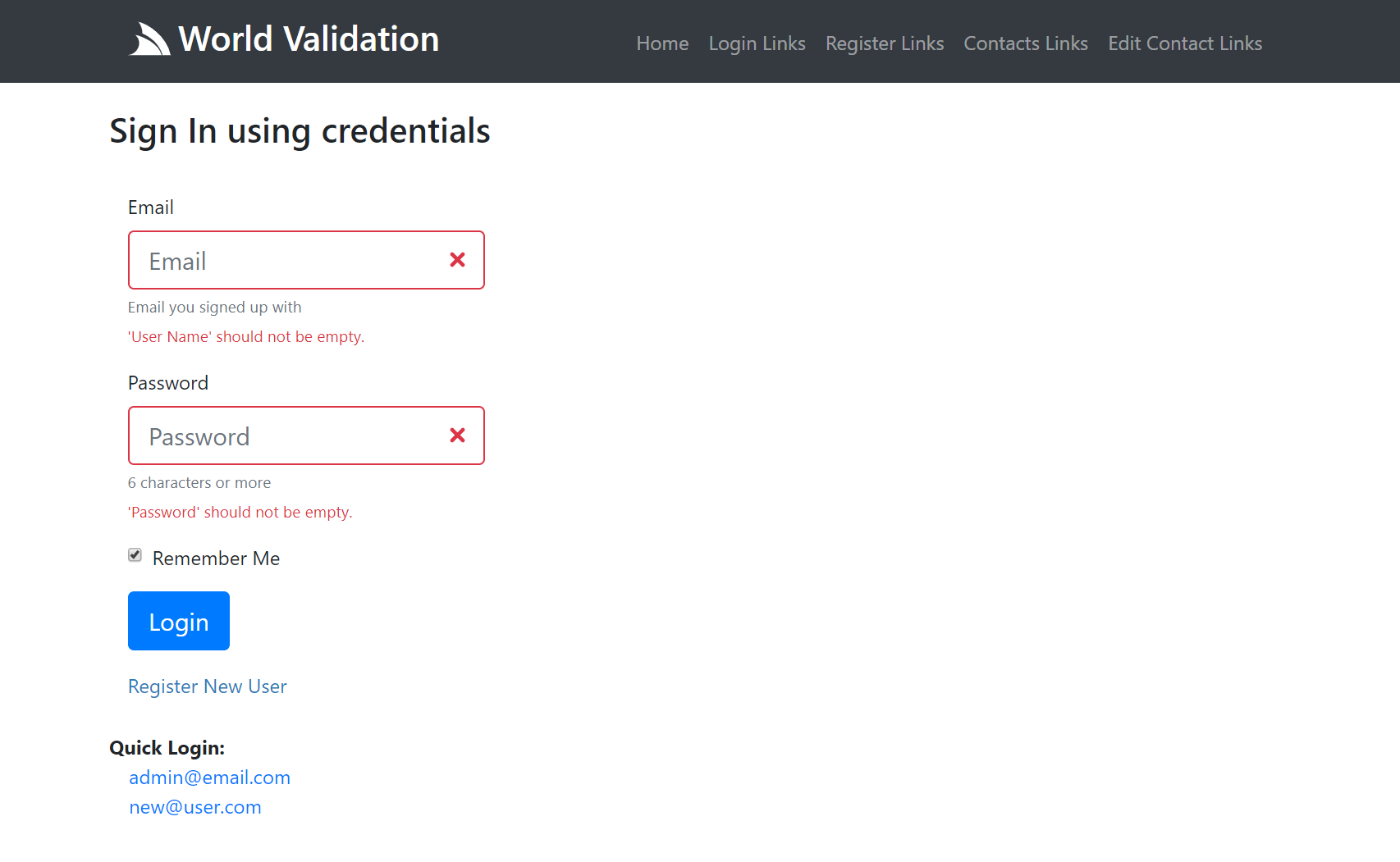
The Login Page contains a standard Bootstrap Username/Password form with labels, placeholders and help text, which initially looks like:

What it looks like after submitting an empty form with Server Exception Errors rendered against their respective fields:
Form Control Properties
Essentially both #Script and Razor have identical properties but implemented idiomatically for each control where #Script uses
camelCase names and JS Object literals. The first (aka target) argument is for attributes you want to add to the HTML <input/> Element
whilst the 2nd Argument is used to customize any of its other high-level features:
/// High-level Input options for rendering HTML Input controls
public class InputOptions
{
    /// Display the Control inline
    public bool Inline { get; set; }

    /// Label for the control
    public string Label { get; set; }

    /// Class for Label
    public string LabelClass { get; set; }

    /// Override the class on the error message (default: invalid-feedback)
    public string ErrorClass { get; set; }

    /// Small Help Text displayed with the control
    public string Help { get; set; }

    /// Bootstrap Size of the Control: sm, lg
    public string Size { get; set; }

    /// Multiple Value Data Source for Checkboxes, Radio boxes and Select Controls
    public object Values { get; set; }

    /// Typed setter of Multi Input Values
    public IEnumerable<KeyValuePair<string, string>> InputValues
    {
        set => Values = value;
    }

    /// Whether to preserve value state after post back
    public bool PreserveValue { get; set; } = true;

    /// Whether to show Error Message associated with this control
    public bool ShowErrors { get; set; } = true;
}
Contacts Page
The Contacts Page shows a more complete example with a number of different UI Controls.
#Script Pages
<form action="/contacts" method="post" class="col-lg-4">
<div class="form-group">
{{ 'title,name,color,age,filmGenres,agree' | validationSummary }}
</div>
<div class="form-group">
{{ {id:'title',type:'radio'} | formInput({values:contactTitles,inline:true}) }}
</div>
<div class="form-group">
{{ {id:'name',placeholder:'Name'} | formInput({label:'Full Name',help:'Your first and last name'}) }}
</div>
<div class="form-group">
{{ {id:'color',class:'col-4'}
| formSelect({label:'Favorite color',values:{'', ...contactColors}}) }}
</div>
<div class="form-group">
{{ {id:'filmGenres',type:'checkbox'}
| formInput({label:'Favorite Film Genres',values:contactGenres,help:"choose one or more"}) }}
</div>
<div class="form-group">
{{ {id:'age',type:'number',min:13,placeholder:'Age',class:'col-3'} | formInput }}
</div>
<div class="form-group">
{{ {id:'agree',type:'checkbox'} | formInput({label:'Agree to terms and conditions'}) }}
</div>
<div class="form-group">
<button class="btn btn-primary" type="submit">Add Contact</button>
<a href="/server/contacts/">reset</a>
</div>
</form>
Whereas Razor uses anonymous objects for properties that can be unbounded like a HTML Element Attribute List and a Typed Class
like InputOptions to specify the controls other high-level features, e.g:
ServiceStack.Razor
<form action="/contacts" method="post" class="col-lg-4">
    <div class="form-group">
        @Html.ValidationSummary(new[]{ "title","name","color","age","filmGenres","agree" })
        @Html.HiddenInputs(new { @continue = Continue, errorView = Continue })
    </div>
    <div class="form-group">
        @Html.FormInput(new {
            id = "title",
            type = "radio",
        }, new InputOptions {
            Values = Html.ContactTitles(),
            Inline = true,
        })
    </div>
    <div class="form-group">
        @Html.FormInput(new {
            id = "name",
            placeholder = "Name",
        }, new InputOptions {
            Label = "Full Name",
            Help  = "Your first and last name",
        })
    </div>
    <div class="form-group">
        @Html.FormSelect(new {
            id = "color",
            @class = "col-4",
        }, new InputOptions {
            Label  = "Favorite color",
            Values = new StringDictionary { {"",""} }.Merge(Html.ContactColors()),
        })
    </div>
    <div class="form-group">
        @Html.FormInput(new {
            id = "filmGenres",
            type = "checkbox",
        }, new InputOptions {
            Label  = "Favorite Film Genres",
            Help   = "choose one or more",
            Values = Html.ContactGenres()
        })
    </div>
    <div class="form-group">
        @Html.FormInput(new {
            id = "age",
            type = "number",
            min = 13,
            placeholder = "Age",
            @class = "col-3",
        })
    </div>
    <div class="form-group">
        @Html.FormInput(new {
            id   = "agree",
            type = "checkbox",
        },
        new InputOptions { Label = "Agree to terms and conditions" })
    </div>
    <div class="form-group">
        <button class="btn btn-primary" type="submit">Add Contact</button>
        <a href="/server-razor/contacts/">reset</a>
    </div>
</form>
Both Server UI Controls provide auto Validation Form Binding for any validation rules specified on the CreateContact Validator:
public class CreateContactValidator : AbstractValidator<CreateContact>
{
    public CreateContactValidator()
    {
        RuleFor(r => r.Title).NotEqual(Title.Unspecified).WithMessage("Please choose a title");
        RuleFor(r => r.Name).NotEmpty();
        RuleFor(r => r.Color).Must(x => x.IsValidColor()).WithMessage("Must be a valid color");
        RuleFor(r => r.FilmGenres).NotEmpty().WithMessage("Please select at least 1 genre");
        RuleFor(r => r.Age).GreaterThan(13).WithMessage("Contacts must be older than 13");
        RuleFor(x => x.Agree).Equal(true).WithMessage("You must agree before submitting");
    }
}
As well as any ArgumentException thrown within the Service Implementation:
public object Any(CreateContact request)
{
    var newContact = request.ConvertTo<Data.Contact>();
    newContact.Id = Interlocked.Increment(ref Counter);
    newContact.UserAuthId = this.GetUserId();
    newContact.CreatedDate = newContact.ModifiedDate = DateTime.UtcNow;

    var contacts = Contacts.Values.ToList();
    var alreadyExists = contacts.Any(x => x.UserAuthId == newContact.UserAuthId && x.Name == request.Name);
    if (alreadyExists)
        throw new ArgumentException($"You already have contact named '{request.Name}'",nameof(request.Name));

    Contacts[newContact.Id] = newContact;
    return new CreateContactResponse { Result = newContact.ConvertTo<Contact>() };
}
Contacts Page UI
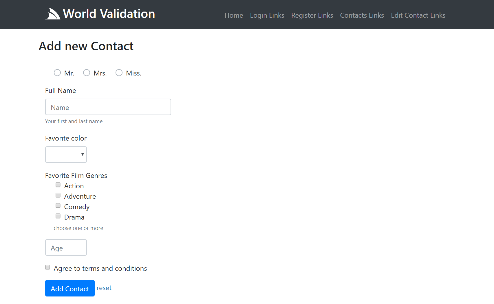
The Contacts Page is representative of a more complex page that utilizes a variety of different form controls where the same page is also responsible for rendering the list of existing contacts:
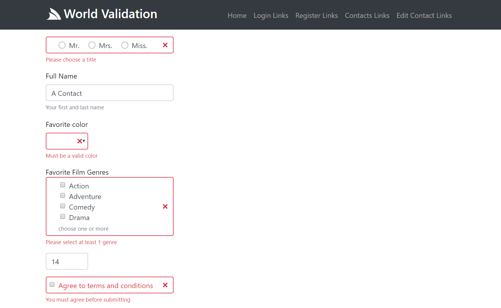
Here's an example of what a partially submitted invalid form looks like:
To view the complete implementation in context checkout World Validation Server Implementation.
Navigation Controls
The Server Navigation Controls are used to render your Apps Unified Navigation
#Script Pages
In #Script Pages you can use render the navbar and navButtonGroup methods to render NavItems:
Navbar
You can render the main menu navigation using the navbar script method:
{{ navbar }}
Which by default renders the View.NavItems main navigation, using the default NavOptions and User Attributes (if authenticated):
You can also render a different Navigation List with:
{{ navItems('submenu').navbar() }}
Which can be customized using the different NavOptions properties above, in camelCase:
{{ navItems('submenu').navbar({ navClass: 'navbar-nav navbar-light bg-light' }) }}
Button group
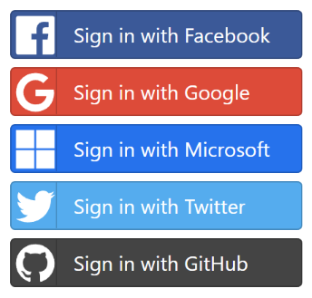
The navButtonGroup script can render NavItems in a button group, e.g. the
OAuth buttons
are rendered with:
{{ 'auth'.navItems().navButtonGroup({ navClass: '', navItemClass: 'btn btn-block btn-lg' }) }}
Which renders a vertical, spaced list of buttons which look like:
Razor Pages
The same server controls are available in ServiceStack.Razor Apps as HTML Helper extension methods:
Navbar
@Html.Navbar()

@Html.Navbar(Html.GetNavItems("submenu"))

@Html.Navbar(Html.GetNavItems("submenu"), new NavOptions {
    NavClass = "navbar-nav navbar-light bg-light"
})
NavButtonGroup
@Html.NavButtonGroup(Html.GetNavItems("auth"), new NavOptions {
    NavClass = "",
    NavItemClass = "btn btn-block btn-lg",
})
NavOptions Properties
The NavItem classes capture the Navigation information which is used together with the NavOptions class below:
public class NavOptions
{
    /// User Attributes for conditional rendering, e.g:
    ///  - auth - User is Authenticated
    ///  - role:name - User Role
    ///  - perm:name - User Permission
    public HashSet<string> Attributes { get; set; }

    /// Path Info that should set as active
    public string ActivePath { get; set; }

    /// Prefix to include before NavItem.Path (if any)
    public string BaseHref { get; set; }

    // Custom classes applied to different navigation elements (defaults to Bootstrap classes)
    public string NavClass { get; set; }
    public string NavItemClass { get; set; }
    public string NavLinkClass { get; set; }

    public string ChildNavItemClass { get; set; }
    public string ChildNavLinkClass { get; set; }
    public string ChildNavMenuClass { get; set; }
    public string ChildNavMenuItemClass { get; set; }
}
Use camelCase when specifying nav options in #Script controls.