We're excited to showcase the advancements in our comprehensive Vue 3 Tailwind Components library which is now embedded inside of ServiceStack.dll, paving the way for exciting new modern UI's we can now deliver inside of ServiceStack.
Auto API HTML Page
The first feature to benefit from this feature is the HTML 5 Auto HTML page that's been much loved feature in ServiceStack for 10+ years which provided a HTML fallback page for your APIs when called from a browser (i.e. requesting a text/html Content-Type) which would return a human-friendly snapshot allowing developers to quickly visualize all the data returned by the API Response in a glance:
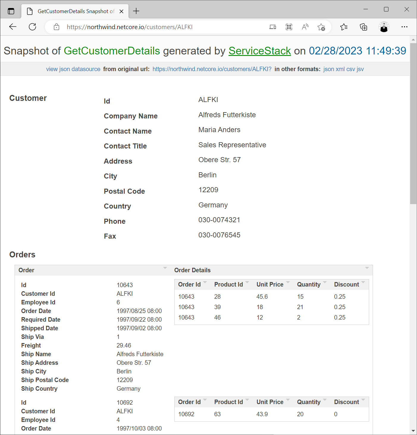
The new Auto HTML Page retains the same objective as the previous Auto HTML page it replaces, but with access to modern JavaScript, full Vue 3 and @servicestack/vue rich component library we can do much better - meet the new Auto HTML API v2!
Auto HTML API v2
The best way to visualize, inspect and integrate with your APIs in an instant!
Where now the fallback HTML page of each API gets its very own API Visualizer, JSON syntax highlighting, integrated Postman UI and API SDK integration all-in-one! Lets take a quick tour through each of these features:
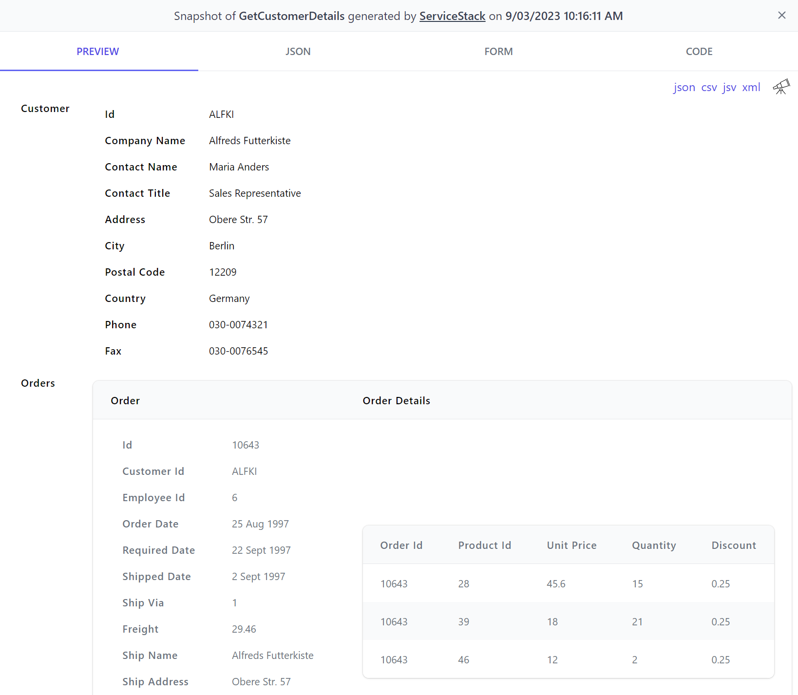
PREVIEW
Calling our APIs in a browser will greet us with the Preview page which uses the HtmlFormat to display the API response in a beautiful Tailwind style with links to different Content-Type Formats and direct links to view it in API Explorer and Locode for AutoQuery APIs:
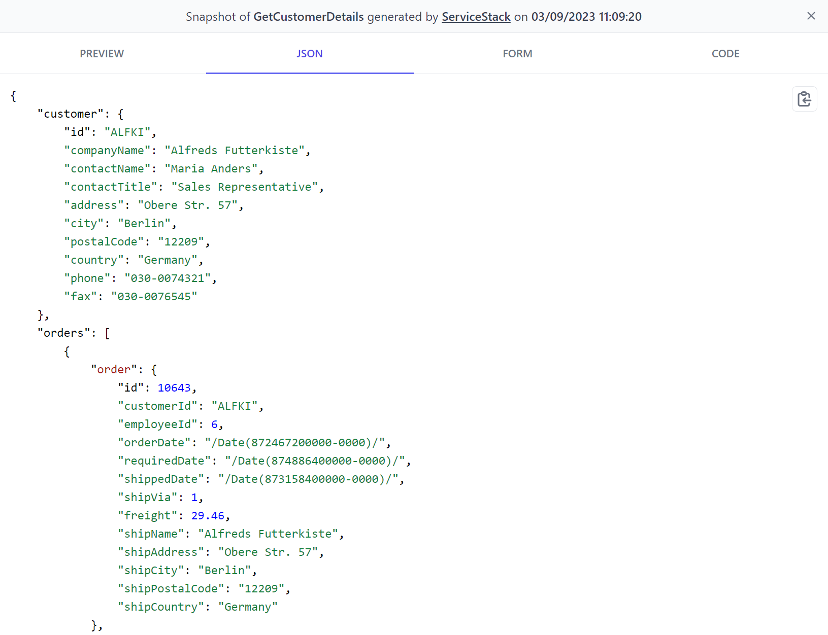
JSON
Developers who wish to view the actual JSON API Response can click on the JSON tab to view the JSON in pretty-formatted syntax-highlighted form with a 1-click button to copy:
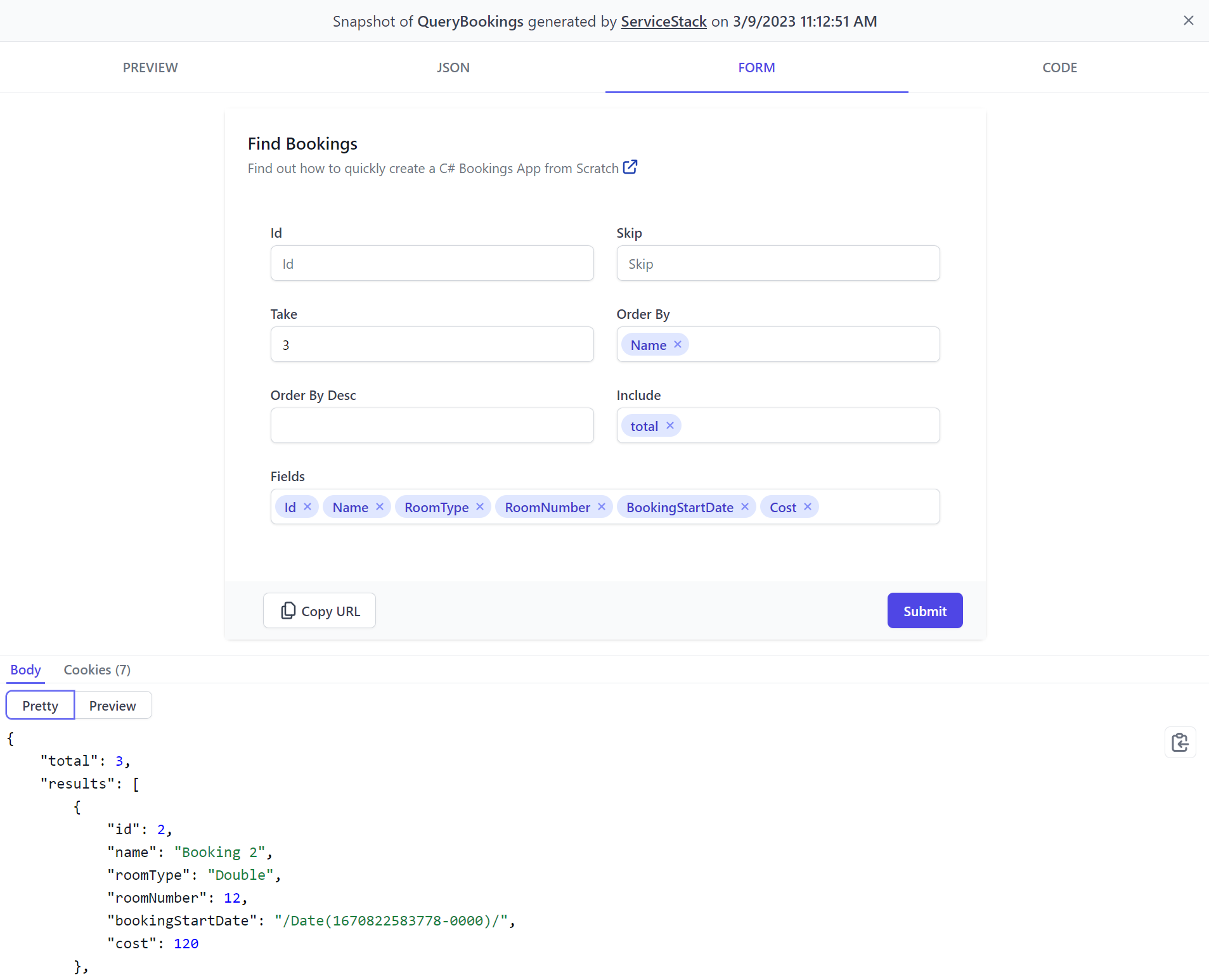
FORM
You don't need to build UIs before non-developers can access your APIs with the FORM tab which uses the new AutoForm component to render an optimal UI to call an API that you can further customize from your C# Request DTOs:
CODE
The CODE tab gives you an appealing API docs page you can immediately share with any 3rd Party Developers that want to consume your APIs, with simple step-by-step instructions for how to call your APIs from their preferred programming language:
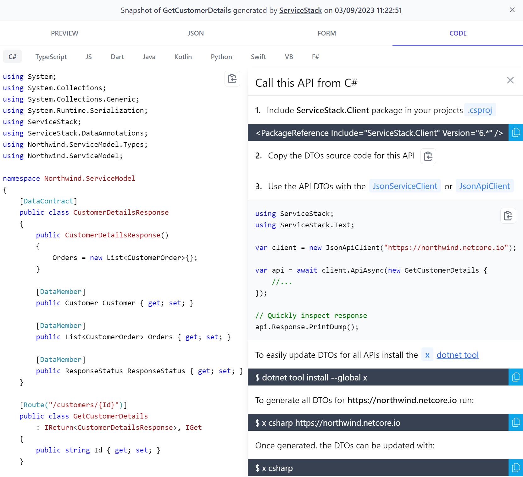
A nice benefit of ServiceStack's API Design is that consuming APIs are fundamentally all done the same way in all languages, which just requires adding a dependency containing a generic ServiceClient which can be used to call any ServiceStack API using the typed DTOs copied directly from the API docs page to enable an end-to-end typed API without any external tooling or build steps.
API Fallback HTML Page
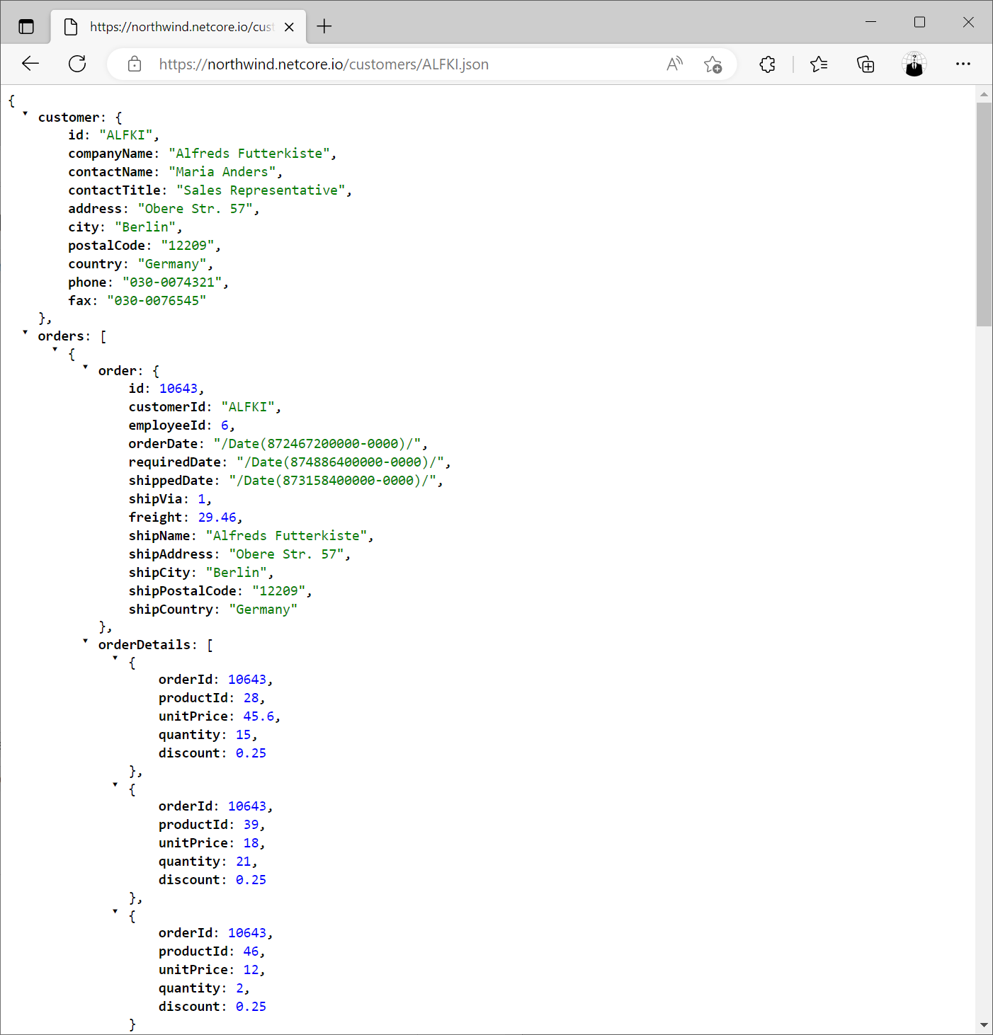
The Auto HTML API is the fallback HTML page returned for APIs when calling user-defined routes from a browser (i.e. Accept: text/html):
https://northwind.netcore.io/customers/ALFKI
When calling the /api pre-defined route with the .html extension:
https://northwind.netcore.io/api/GetCustomerDetails.html?Id=ALFKI
When calling the /api pre-defined route with ?format=html:
https://northwind.netcore.io/api/GetCustomerDetails?Id=ALFKI&format=html
AutoQueryGrid
The new AutoQueryGrid component is the last high-productivity component missing from the Vue Tailwind Component Library to reach feature parity with Blazor Tailwind Component Library.
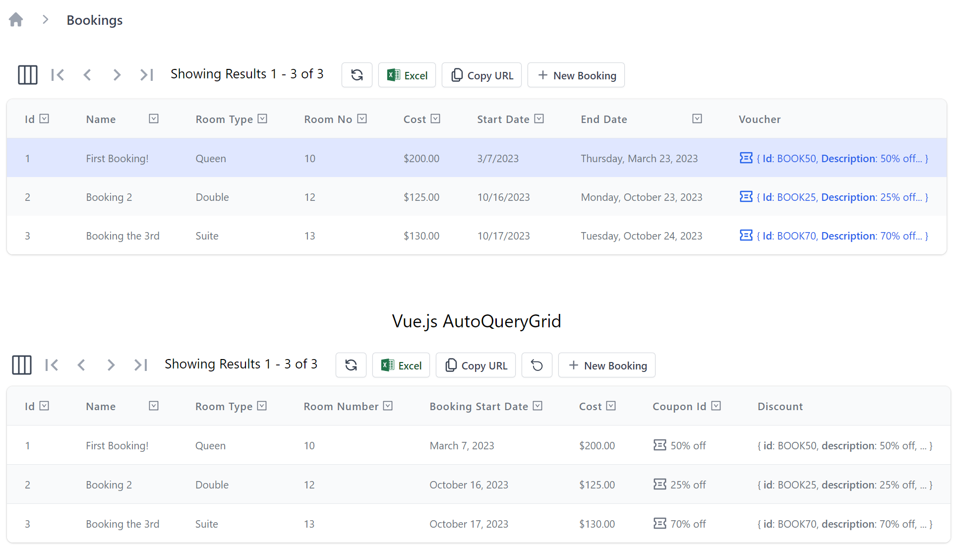
Blazor & Vue AutoQueryGrid side-by-side
Despite being implemented with completely different UI technologies, both AutoQueryGrid components offer identical functionality where either can be used to enable instant CRUD functionality for your AutoQuery Services in either Blazor Tailwind WASM or Server or Vue Tailwind project templates.
Thanks to Vue's progressive enhancement abilities we can easily compare them running side-by-side. In the last v6.6 release we demonstrated
the power of JS Modules by loading a Vue DataGrid inside a running Blazor Server App.
We can now do a lot more with less, where we can completely replicate Blazor Server AutoQuery Crud functionality with a single <AutoQueryGrid/> component.
For a live demonstration of this in action, head over to the Bookings page and Sign In:
blazor.web-templates.io/secure/bookings
Then press F12 to open the dev console again to paste and run the code below:
const im = document.createElement('script');
im.type = 'importmap';
im.textContent = JSON.stringify({
    "imports": {
        "vue": "/js/vue.mjs",
        "@servicestack/client": "/js/servicestack-client.mjs",
        "@servicestack/vue": "/js/servicestack-vue.mjs"
    }
});
document.body.appendChild(im)

const [Vue, ServiceStack, ServiceStackVue, dtos] = await Promise.all([
    import('vue'),
    import('@servicestack/client'),
    import('@servicestack/vue'),
    import('/types/mjs')
])

const BookingsApp = {
  template:`<div class="mt-4 p-4 m-4"><h3 class="py-4 text-2xl text-center">Vue.js AutoQueryGrid</h3>
   <AutoQueryGrid type="Booking" selectedColumns="id,name,roomType,roomNumber,bookingStartDate,cost,couponId,discount"/>
  </div>`
}

const app = Vue.createApp(BookingsApp)
const client = new ServiceStack.JsonServiceClient()
app.provide('client', client)
app.use(ServiceStackVue.default)
ServiceStackVue.useMetadata().loadMetadata()
client.api(new dtos.Authenticate()).then(api =>
    ServiceStackVue.useAuth().signIn(api.response))

document.querySelector('main').insertAdjacentHTML('beforeend',`<div id="app"></div>`)
app.mount('#app')
After the modules and Vue App have loaded you should see the shiny new Vue.js AutoQueryGrid running inside a Blazor Server App!
An Effortless CRUD UI
Specifically this is a full Vue.js CRUD App running without any external dependencies, utilizing built-in Typed ES6 APIs without any tooling or build steps, generating a capability-based UI for the currently authenticated user, enabling full CRUD functionality through the App's auth-protected AutoQuery APIs, validated by the APIs Declarative Validation Rules utilizing optimal Form Inputs for each C# property type with contextual validation binding, that displays its results in a rich formatted data grid customized with APIs Declarative UI Attributes.
All this functionality is encapsulated in the new AutoQueryGrid component, which at a minimum just requires the AutoQuery Data Model:
<AutoQueryGrid type="Booking" />
Feature Rich without trade-offs
Whilst the Blazor and Vue AutoQueryGrid components might be functionally equivalent, they differ greatly in implementation. With Blazor having well-known trade-offs requiring either complex build tooling with slow iteration cycles and large multi megabyte downloads to get C# running in the browser with WASM or requiring a stateful rendering circuit with frequent disconnections and poor UX over laggy Internet connections with Blazor Server.
By contrast Vue.js being built with native web technologies doesn't have any of these trade-offs, where it can be used without any build tooling to yield instant dev iteration times. Like Blazor WASM performs its rendering on the client enabling a responsive UX without a stateful server circuit, but unlike Blazor WASM its cacheable assets loads instantly where all JavaScript libraries weighs in at a light 140kb:
| gzip | none | |
|---|---|---|
| vue.mjs | 58kb | 129kb |
| servicestack-vue.mjs | 63kb | 174kb |
| servicestack-client.mjs | 19kb | 53kb |
AutoQueryGrid Component
Despite it's small size, AutoQueryGrid is a highly customizable and versatile component allowing for multiple levels of customizations - documented with Live Examples in the new AutoQueryGrid Docs:
Read Only
Where apis can be used to restrict which APIs are used, where Read Only can be enabled by specifying to only use the Query API:
<AutoQueryGrid type="Booking" apis="QueryBookings" />
Table Styles
The same DataGrid Table Styles can also be used to style AutoQueryGrid using tableStyle, e.g:
<AutoQueryGrid type="Booking" tableStyle="verticalLines,uppercaseHeadings" />
Custom Styles
The AutoQueryGrid's appearance is further customizable with the property classes & functions below:
defineProps<{
  toolbarButtonClass: string
  tableStyle: "simple" | "fullWidth" | "stripedRows" | "whiteBackground" | "uppercaseHeadings" | "verticalLines"
  gridClass: string
  grid2Class: string
  grid3Class: string
  grid4Class: string
  tableClass: string
  theadClass: string
  tbodyClass: string
  theadRowClass: string
  theadCellClass: string

  rowClass:(model:any,i:number) => string
  rowStyle:(model:any,i:number) => StyleValue
}>()
Custom AutoQueryGrid
AutoQueryGrid features can be hidden with hide or its functionality disabled with deny, e.g:
<AutoQueryGrid type="Booking" hide="pagingNav,copyApiUrl,downloadCsv" deny="filtering" />
Global Configuration
These features can also be disabled at a global level, applying to all <AutoQueryGrid> components with useConfig(), e.g:
const { setAutoQueryGridDefaults } = useConfig()

setAutoQueryGridDefaults({
  hide: ['pagingNav','copyApiUrl','downloadCsv']
})
Selected Columns
By default AutoQueryGrid displays all public properties returned in its AutoQuery API which can be further restricted with selectedColumns:
<AutoQueryGrid type="Booking" selectedColumns="id,name,roomType,roomNumber,cost" />
Simple Responsive Columns
Using visibleFrom is a simple way to enable a responsive DataGrid by specifying at which Tailwind breakpoints columns should be visible from and headerTitles to use friendlier aliases for different columns, e.g:
<AutoQueryGrid type="Booking"
  selectedColumns="id,name,roomType,roomNumber,cost,bookingStartDate,bookingEndDate"
  :headerTitles="{ roomNumber:'Room', bookingStartDate:'Start', bookingEndDate:'End' }"
  :visibleFrom="{ bookingStartDate:'lg', bookingEndDate:'xl' }" />
Custom Responsive Columns
Which columns are displayed and how they're formatted are further customizable with <template #column> slots:
<AutoQueryGrid type="Booking" :visibleFrom="{ name:'xl', bookingStartDate:'sm', bookingEndDate:'xl', createdBy:'2xl' }">
<template #id="{ id }">
<span class="text-gray-900">{{ id }}</span>
</template>
<template #name="{ name }">
{{ name }}
</template>
<template #roomNumber-header>
<span class="hidden lg:inline">Room </span>No
</template>
<template #cost="{ cost }">{{ currency(cost) }}</template>
<template #bookingStartDate-header>
Start<span class="hidden lg:inline"> Date</span>
</template>
<template #bookingEndDate-header>
End<span class="hidden lg:inline"> Date</span>
</template>
<template #createdBy-header>
Employee
</template>
<template #createdBy="{ createdBy }">{{ createdBy }}</template>
</AutoQueryGrid>
Custom Functionality
The column template slots can be leveraged to implement custom functionality, e.g. instead of navigating to separate pages to manage related data we can use a custom column to manage Booking Coupons from within the same grid, e.g:
<AutoQueryGrid type="Booking" selectedColumns="id,name,cost,bookingStartDate,bookingEndDate,discount">
    <template #discount="{ discount }">
        <TextLink v-if="discount" class="flex items-end" @click.stop="showCoupon(discount.id)" :title="discount.id">
            <Icon class="w-5 h-5 mr-1" type="Coupon" />
            <PreviewFormat :value="discount.description" />
        </TextLink>
    </template>
</AutoQueryGrid>
<AutoEditForm v-if="coupon" type="UpdateCoupon" v-model="coupon" @done="close" @save="close" />

<script setup lang="ts">
import { ref } from "vue"
import { useClient } from "@servicestack/vue"
import { QueryCoupons } from "dtos"

const client = useClient()
const coupon = ref()

async function showCoupon(id:string) {
    const api = await client.api(new QueryCoupons({ id }))
    if (api.succeeded) {
        coupon.value = api.response!.results[0]
    }
}

const close = () => coupon.value = null
</script>
Template Slots
AutoQueryGrid supports a number of Vue slots to customize its built-in UIs, including formheader and formfooter slots to insert custom content before and after the Auto Create & Edit components forms:
<template #formheader="{ form, type, apis, model, id }">
<template #formfooter="{ form, type, apis, model, id }">
This feature is used to implement Locode's Audit History UI for displaying the Audit History of each record in the bottom of the Edit Form for Authorized Users, implemented with:
<AutoQueryGrid :key="store.opDataModel" ref="grid" :type="store.opDataModel">
    <template #formfooter="{ form, type, apis, model, id }">
        <AuditEvents v-if="form === 'edit' && canAccessCrudEvents" class="mt-4" :key="id" :type="type" :id="id" />
    </template>
</AutoQueryGrid>
Alternatively you can replace the entire Create and Edit Forms used with the createform and editforms slots:
<template #createform="{ form, apis, type }">
<template #editform="{ form, apis, type }">
Additional toolbar buttons can be added with the toolbarbuttons slot, e.g:
<template #toolbarbuttons="{ toolbarButtonClass }">
  <div class="pl-2 mt-1">
      <button type="button" @click="customAction" :class="toolbarButtonClass">
        <span class="whitespace-nowrap">My Action</span>
      </button>
  </div>
</template>
Alternatively you can replace the entire toolbar with your own with:
<template #toolbar>
All other template slots are passed down to the embedded DataGrid component where they can customize column headers and cells.
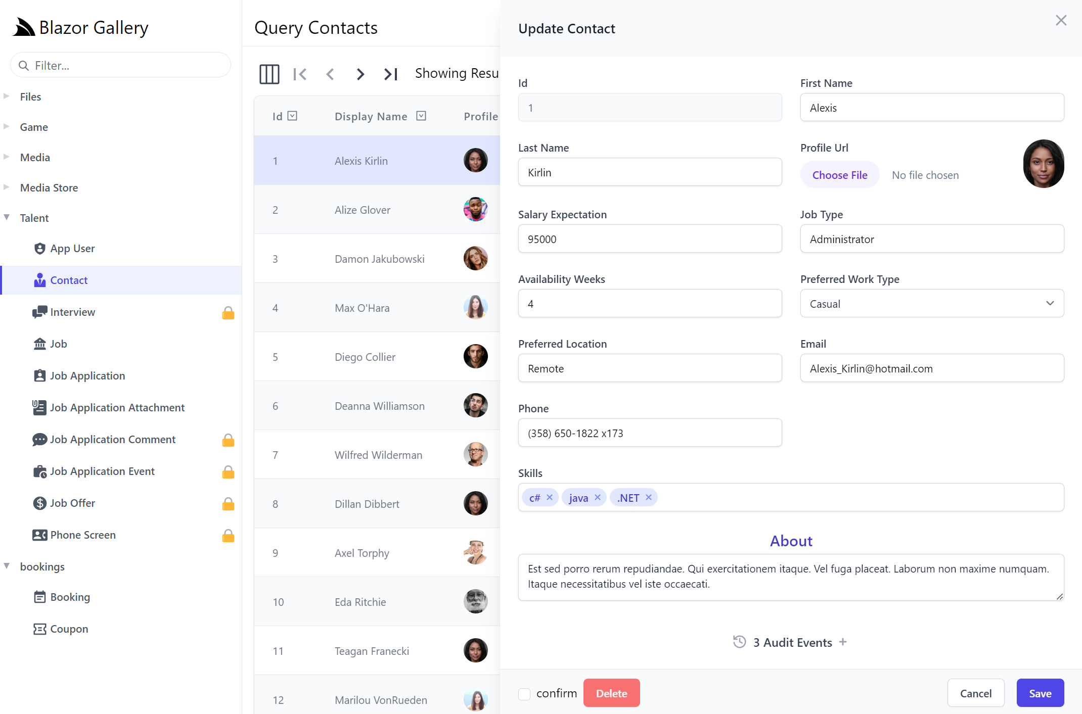
AutoQueryGrid Data References Labels
Data References Labels is a new feature added to both Blazor and Vue AutoQueryGrid components, where Foreign Key Ids are replaced with human-friendly references from a string column in the Foreign Key referenced table which AutoQuery is able to infer from the POCO References relationships of your Data Models.
Where AutoQueryGrid will be able to make use of DataModel's including [Reference] properties so that its related Data is returned in its AutoQuery APIs to render reference labels instead of just raw FK Ids as seen in Job Application's JobId and ContactId columns:
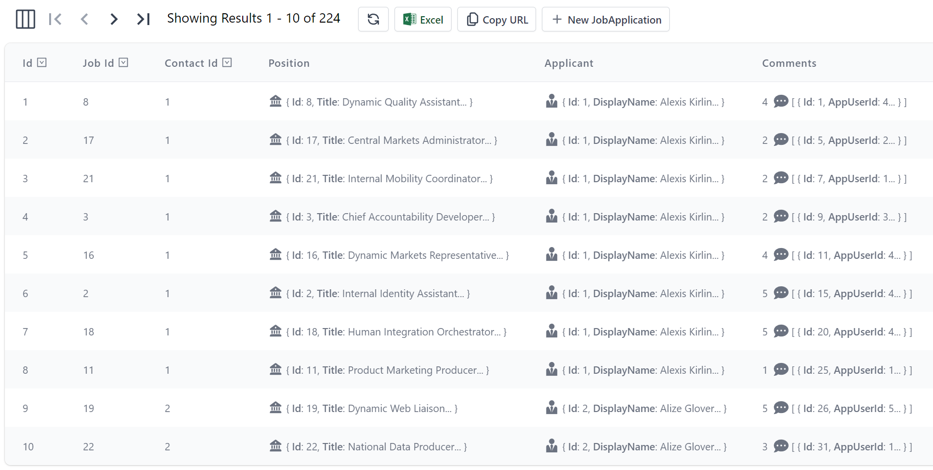
Will now render the Contact and Job Names and Icons instead of their plain Foreign Key Ids:
<AutoQueryGrid type="JobApplication" :prefs="{take:5}" />
With the original ids are discoverable by hovering over the Job & Contact labels.
This was datagrid is rendered based on the JobApplication DataModel DTO:
[Icon(Svg = Icons.Application)]
public class JobApplication : AuditBase
{
    [AutoIncrement]
    public int Id { get; set; }

    [References(typeof(Job))]
    public int JobId { get; set; }

    [References(typeof(Contact))]
    public int ContactId { get; set; }

    [Reference]
    [Format(FormatMethods.Hidden)]
    public Job Position { get; set; }

    [Reference]
    [Format(FormatMethods.Hidden)]
    public Contact Applicant { get; set; }

    [Reference]
    public List<JobApplicationComment> Comments { get; set; }

    public DateTime AppliedDate { get; set; }

    public JobApplicationStatus ApplicationStatus { get; set; }
    //...
}
By default AutoQuery will infer using the first string column of the related table for its label, this information can also be explicitly defined
with the [Ref] attribute, e.g:
public class JobApplication : AuditBase
{
    [AutoIncrement]
    public int Id { get; set; }

    [References(typeof(Job))]
    [Ref(Model=nameof(Job), RefId=nameof(Job.Id), RefLabel=nameof(Job.Title))]
    public int JobId { get; set; }

    [References(typeof(Contact))]
    [Ref(Model=nameof(Contact), RefId=nameof(Contact.Id), RefLabel=nameof(Contact.DisplayName))]
    public int ContactId { get; set; }
    //...
}
Alternatively you can use [Ref(None=true)] to disable any implicit inferences and render the FK property Ids as-is.
When displaying referential data you can tell AutoQueryGrid to hide rendering the complex data references as well columns using [Format(FormatMethods.Hidden)].
New Locode, API Explorer & Admin UIs now in Vue 3!
With access to all components needed, we've taken this opportunity to modernize all of ServiceStack's built-in UI's that were previously written with petite-vue and have rewritten them with Vue 3 and the Vue Components Library, which has become our preferred UI technology stack that all built-in UIs will be created with going forward.
Greater Customizability & Reuse
Ultimately the new Vue 3 UIs should now be a lot more appealing as you're better able to reuse, enhance and customize different components using the full Vue 3 framework and 3rd Party ecosystem for creating more compelling and interactive UIs:
Existing UIs
To ease upgrading, we've included the previous version which you can run side-by-side with the new version until all issues are resolved:
| Locode | API Explorer | |
|---|---|---|
| v2 | /locode | /ui |
| v1 | /locode-v1 | /ui-v1 |
We intend to remove the older versions next release so please let us know if there's any outstanding issues with the new version.
AutoQuery and Vue Components Productivity Demo
The best-of-class combination of our new Vue 3 project templates, Tailwind CSS, Auto Form and AutoQueryGrid components make for a powerfully productive technology stack where tasks that would've traditionally have taken days to build can be done in just minutes.
As a demonstration, we've created a new video to accomplish a common task of adding a new Job Application feature to a new vue-mjs project template from scratch, utilizing:
- Tailwind UI Components to create a beautiful UI
- OrmLite to create our
JobApplicationtable using its built-in code-first DB migrations - AutoQuery CRUD to create a complete CRUD API for managing JobApplication's from just API DTOs
- Vue 3 to create our Reactive UI components
- AutoForm Component to instantly create our API bound Job Application form
- Managed File Uploads to declaratively handle uploaded Job Application Resumes
- Locode to access an instant CRUD UI to manage submitted Job Applications
- Audit CRUD Events - for maintaining an executable Audit History of all changes to Job Applications
Locode v2
Rewriting Locode v2 in Vue 3 significantly reduces development and maintenance efforts as all efforts are now invested in improving the single Vue 3 Component Library instead of being split between maintaining a separate embedded, non-reusable Petite Vue code-base.
Other benefits of using Vue 3 includes:
- Using the more popular, capable and battle-tested Vue 3 flagship library that all our Vue Templates use
- Access to richer components in the Vue Component Library
- Access to an extendable and customizable AutoQueryGrid component
- Custom Locode Components are now just normal Vue 3 components
- Ability to reuse any custom Vue 3 components in bespoke Vue 3 Apps
Best of all if you ever decide to move beyond Locode to a bespoke solution you can take the custom AutoQueryGrid's with you or if preferred easily port it to a Blazor App using Blazor's AutoQueryGrid component which offers an equivalent featureset which should expand the potential use-cases that can benefit from starting with Locode.
To make upgrading easier we've visually kept (Vue 3) Locode v2 looking and behaving very similar to (petite-vue) Locode v1, the primary noticeable difference being that Forms now open in a Modal SlideOver dialog which is less visually jarring then moving the entire DataGrid up/down when opening/closing forms.
Otherwise Locode v2 implements most of Locode v1's features so any of your declarative UI customizations continue to be applied in v2:
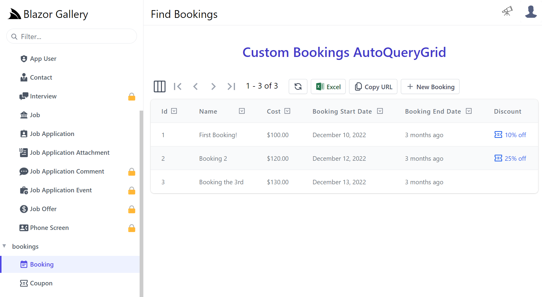
Custom AutoQueryGrid
One area of customization that wasn't possible before is being able to easily replace entire Locode Pages with your own, which thanks to the new AutoQueryGrid component takes very little effort to do. In fact since everything's now using the same libraries we can copy the custom Bookings AutoQueryGrid Vue 3 component in the new vue-mjs Project Template and use it to manage our Bookings in Locode by registering a Vue 3 component with the name:
{DataModel}Page
That we can auto register with Locode by adding it in our /wwwroot folder at /modules/locode/components/*.mjs.
Which we've added in our Blazor Gallery App, in /modules/locode/components/BookingPage.mjs containing our custom Bookings AutoQueryGrid component:
import { inject, ref } from "vue"
import { QueryCoupons } from "/types/mjs"

export const BookingPage = {
    template:`
    <div>
        <h1 class="py-8 text-center text-3xl text-indigo-700 font-semibold">Custom Bookings AutoQueryGrid</h1>
        <AutoQueryGrid type="Booking" selected-columns="id,name,cost,bookingStartDate,bookingEndDate,discount,notes">
        <template #discount="{ discount }">
            <TextLink v-if="discount" class="flex items-end" @click.stop="showCoupon(discount.id)" :title="discount.id">
                <Icon class="w-5 h-5 mr-1" type="Coupon" />
                <PreviewFormat :value="discount.description" />
            </TextLink>
        </template>
        </AutoQueryGrid>
        <AutoEditForm v-if="coupon" type="UpdateCoupon" v-model="coupon" @done="close" @save="close" />
    </div>
    `,
    props:['type'],
    setup() {
        const client = inject('client')
        const coupon = ref()
        async function showCoupon(id) {
            const api = await client.api(new QueryCoupons({ id }))
            if (api.succeeded) {
                coupon.value = api.response.results[0]
            }
        }
        const close = () => coupon.value = null
        return { coupon, showCoupon, close }
    }
}
Where our custom version will open the related Coupon entry for the booking allowing both Bookings and their Coupons to be managed from the same page.
Now when Booking is selected in Locode it will load our custom version:
Custom Forms
Most of the effort required will be converting any custom Petite Vue HTML Components into Vue 3 components which we'll walk through showing how we converted Locode v1 Components.
Custom Forms continue to use the existing naming convention, but now need to be created as Vue 3 components added
to your Host Project /wwwroot folder at /modules/locode/components/*.mjs using the naming conventions below:
| Component Name | Description |
|---|---|
New{Table} |
Custom Create Form UI |
Edit{Table} |
Custom Update Form UI |
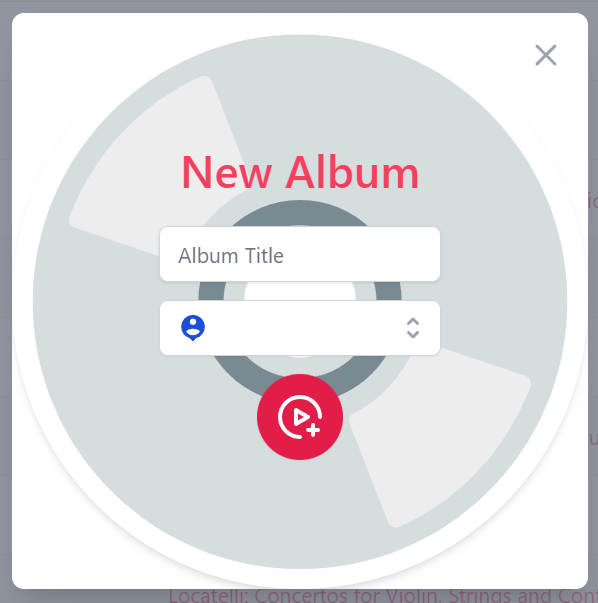
The chinook.locode.dev demo does this to create a custom Form UI for creating and
editing Albums by registering NewAlbums in NewAlbums.mjs
and EditAlbums component in EditAlbums.mjs
which are used to render Chinook's custom Create Album form
to update its Albums table.
JavaScript Libraries
Your custom components can utilize built in libraries embedded in ServiceStack.dll where they will have access to the latest Vue 3 reactive fx, @servicestack/client client library and Vue 3 Tailwind Component library which they can import by package name, e.g:
import { ref } from "vue"
import { useClient } from "@servicestack/vue"
import { humanify } from "@servicestack/client"
Static Analysis
As all package dependencies are written in TypeScript you can install them as dev dependencies to get static analysis from its TypeScript definitions at dev time:
npm install -D vue
npm install -D @servicestack/client
npm install -D @servicestack/vue
Your components can access your Apps Typed DTOs directly from the ES6 Module DTO endpoint at /types/mjs, e.g:
import { CreateAlbums } from "/types/mjs"
App functionality
Your components access to most App functionality via the injected dependencies for functionality defined in Locode's app.mjs:
const app = inject('app')                  // App for customizing Vue App, register components, providers, plugins, etc
const client = inject('client')            // JsonServiceClient for API Calls
const server = inject('server')            // AppMetadata (metadata for your Server App and APIs)
const store = inject('store')              // Locode's Reactive object model
const routes = inject('routes')            // usePageRoutes() Reactive store to manage its SPA routing
const breakpoints = inject('breakpoints')  // useBreakpoints() Reactive store to Tailwind responsive breakpoints
Most of which creates instance of common library features in core.mjs that are documented at api.locode.dev/modules/locode.html.
You're also not limited with what's in Locode, with full access to JavaScript Modules you can import external 3rd Party packages the same way you import built-in packages.
Code walkthrough
Your components will have full control to implement their desired functionality how they want, which can get a lot of integrated functionality for free by leveraging the Vue Component library, e.g. this custom component uses:
- ModalDialog - to load our custom Create Albums Form component in a Modal Dialog
- ErrorSummary - to display any non-contextual summary API errors
- TextInput - to create a validation bound form for the
CreateAlbumsTitle property - LookupInput - to create a Lookup input to select an Artist for the
CreateAlbumsArtistId property
Whilst <SubmitAlbumButton> is an example of using a shared component in
SubmitAlbumButton.mjs.
import { ref } from "vue"
import { useClient, useMetadata } from "@servicestack/vue"
import { CreateAlbums } from "/types/mjs"

export const NewAlbums = {
    template:/*html*/`
    <ModalDialog @done="done" sizeClass="">
      <div class="album-form relative flex flex-col">
        <ErrorSummary except="title,artistId"/>
        <form @submit.prevent="submit" class="m-4 shadow-md rounded-full w-96 h-96 flex justify-center items-center">
          <div class="flex flex-col justify-center items-center text-center">
            <h1 class="text-3xl font-medium text-rose-500 mb-4">New Album</h1>
            <fieldset>
              <TextInput id="title" v-model="request.title" label="" placeholder="Album Title" class="mb-3" />

              <LookupInput id="artistId" v-model="request" label="" placeholder="Select Artist"
                           :input="lookupProp.input" :metadataType="dataModelType" class="mb-3" />

              <SubmitAlbumButton />
            </fieldset>
          </div>
        </form>
      </div>
    </ModalDialog>
    `,
    props: ['type'],
    emits: ['done','save'],
    setup(props, { emit }) {
        const client = useClient()
        const { typeOf } = useMetadata()

        const dataModelType = typeOf("Albums")
        const lookupProp = dataModelType.properties.find(x => x.name === 'ArtistId')
        const request = ref(new CreateAlbums())

        /** @param {Event} e */
        async function submit(e) {
            const form = e.target
            const api = await client.apiForm(new CreateAlbums(), new FormData(form))
            if (api.succeeded) {
                emit('save', api.response)
            }
        }

        function done() {
            emit('done')
        }

        return { request, lookupProp, dataModelType, submit, done }
    }
}
The only integration needed to communicate back with Locode's
AutoQueryGrid component is to emit done when the form is dismissed without changes or emit save if changes are made to
refresh the AutoQueryGrid resultset to see the latest changes.
Invoking APIs with useClient() APIs will propagate any error information from any declarative validation attributes into validation-aware components which alleviates us from needing to perform any manual validation ourselves.
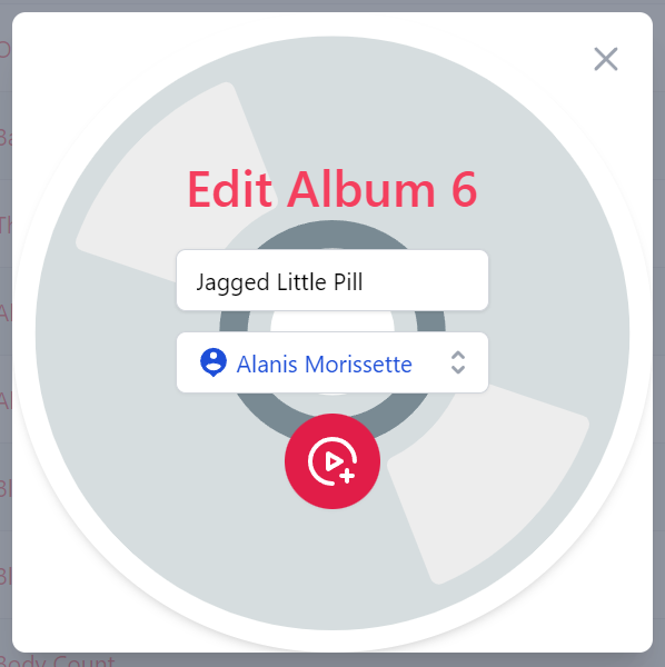
When registered this custom component replaces Locode's Auto Form UI with a custom Create Album Form:
That when submitting an empty form will trigger the contextual validation errors to appear:
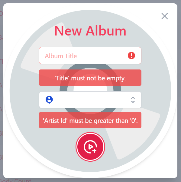
As enforced by the Declarative Validation rules on the CreateAlbums AutoQuery CRUD DTO its calling:
[Route("/albums", "POST"), Tag(Tags.Media)]
public class CreateAlbums
    : IReturn<IdResponse>, IPost, ICreateDb<Albums>
{
    [ValidateNotEmpty]
    public string Title { get; set; }

    [ValidateGreaterThan(0)]
    public long ArtistId { get; set; }
}
Custom Edit Form
The custom EditAlbums form has a very similar implementation the NewAlbums implementation above other than populating the Input components with
the existing Album's values, accessible via the model property.
import { useClient, useMetadata } from "@servicestack/vue"
import { ref } from "vue"
import { UpdateAlbums } from "/types/mjs"
export const EditAlbums = {
template:/*html*/`
<ModalDialog @done="done" sizeClass="">
<div class="album-form relative flex flex-col">
<ErrorSummary except="title,artistId" />
<form @submit.prevent="submit" class="m-4 shadow-md rounded-full w-96 h-96 max-w-96 flex justify-center items-center">
<div class="flex flex-col justify-center items-center text-center">
<h1 class="text-3xl font-medium text-rose-500 mb-4">Edit Album {{ request.albumId }}</h1>
<fieldset>
<input type="hidden" name="albumId" :value="request.albumId">
<TextInput id="title" v-model="request.title" label="" placeholder="Album Title" class="mb-3" />
<LookupInput id="artistId" v-model="request" label="" placeholder="Select Artist"
:input="lookupProp.input" :metadataType="dataModelType" class="mb-3" />
<SubmitAlbumButton />
</fieldset>
</div>
</form>
</div>
</ModalDialog>
`,
props: ['model','type','deleteType'],
emits: ['done','save'],
setup(props, { emit }) {
const client = useClient()
const { typeOf } = useMetadata()
const dataModelType = typeOf("Albums")
const lookupProp = dataModelType.properties.find(x => x.name === 'ArtistId')
const request = ref(new UpdateAlbums(props.model))
/** @param {Event} e */
async function submit(e) {
const form = e.target
const api = await client.apiForm(new UpdateAlbums(), new FormData(form))
if (api.succeeded) {
emit('save', api.response)
}
}
function done() {
emit('done')
}
return { request, lookupProp, dataModelType, submit, done }
}
}
If applicable deleteType will be populated with an API to Delete Albums that the current user has authorization to access, should you wish to implement delete functionality.
Then to perform the updates we just need to call an Update Albums API, which for Chinook is called PatchAlbums:
[Route("/albums/{AlbumId}", "PATCH"), Tag(Tags.Media)]
public class PatchAlbums
    : IReturn<IdResponse>, IPatch, IPatchDb<Albums>
{
    public long AlbumId { get; set; }
    public string Title { get; set; }
    public long ArtistId { get; set; }
}
Which is all that's need to implement our custom Edit Albums Form:
To minimize code duplication both custom forms makes use of a shared SubmitAlbumButton.mjs component, defined as:
export const SubmitAlbumButton = {
    template:`
    <button type="submit" class="inline-flex items-center p-3 border border-transparent rounded-full shadow-sm text-white bg-rose-600 hover:bg-rose-700 focus:outline-none focus:ring-2 focus:ring-offset-2 focus:ring-rose-500">
        <svg class="h-8 w-8" xmlns="http://www.w3.org/2000/svg" aria-hidden="true" preserveAspectRatio="xMidYMid meet" viewBox="0 0 48 48">
            <g fill="none" stroke="currentColor" stroke-linejoin="round" stroke-width="4">
                <path stroke-linecap="round" d="M24 44C12.954 44 4 35.046 4 24S12.954 4 24 4s20 8.954 20 20"/>
                <path d="M20 24v-6.928l6 3.464L32 24l-6 3.464l-6 3.464V24Z"/><path stroke-linecap="round" d="M37.05 32v10M42 36.95H32"/>
            </g>
        </svg>
    </button>`
}
Overriding built-in components
The Chinook Demo also shows an example of overriding its existing /modules/locode/components/Welcome.mjs component in order to render its custom Home page.
Which in addition to using built-in Locode functionality, also makes use of your Apps Typed DTOs directly from the ES6 Module DTO endpoint at /types/mjs, e.g:
import { QueryInvoices } from "/types/mjs"
This results in providing an end-to-end typed dev UX for creating custom components that call our App's APIs as done in:
import { inject, ref, onMounted, computed } from "vue"
import { QueryInvoices } from "/types/mjs"
export const Welcome = {
template:/*html*/`
<div class="pl-4">
<h1 class="text-3xl">
Welcome to Chinook Locode
</h1>
<div v-if="lastOrders.length" class="mt-8">
<h3 class="text-xl mb-4">Here are your last {{lastOrders.length}} orders:</h3>
<DataGrid class="max-w-screen-md" type="Invoices" :items="lastOrders" tableStyle="uppercaseHeadings" />
</div>
</div>`,
setup() {
const client = inject('client')
const api = ref()
const lastOrders = computed(() => api.value?.response?.results || [])
onMounted(async () => {
api.value = await client.api(new QueryInvoices({
orderBy:'-InvoiceId',
take:5,
fields:'InvoiceId,CustomerId,InvoiceDate,Total,BillingCountry,BillingCity'
}), { jsconfig: 'edv' })
})
return { lastOrders }
}
}
Which uses the DataGrid component to render its custom Home page:
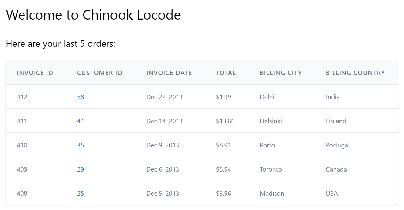
That makes use of the Declarative UI Attributes in its Invoices data model to render a formatted currency Total and a direct link to the Customer that the invoice was for.
API Explorer v2
The primary effort in upgrading to use API Explorer v2 will be converting any existing petite-vue API Docs into Vue 3 components which should be added to your Host projects local /modules/ui/docs folder which the Blazor WASM project template includes to showcase some customization examples:
-
/modules
- /ui/docs
Where you can enhance any of your APIs or DTOs with rich API docs by adding Vue Components to /modules/ui/docs/*.mjs which gets included together with API Explorers own components in its single file download.
For auto registration of components the *.mjs should match the API doc component which needs to be named:
`
Here's a simple CreateBookingDocs.mjs component example used to generate API Docs for the CreateBooking API:
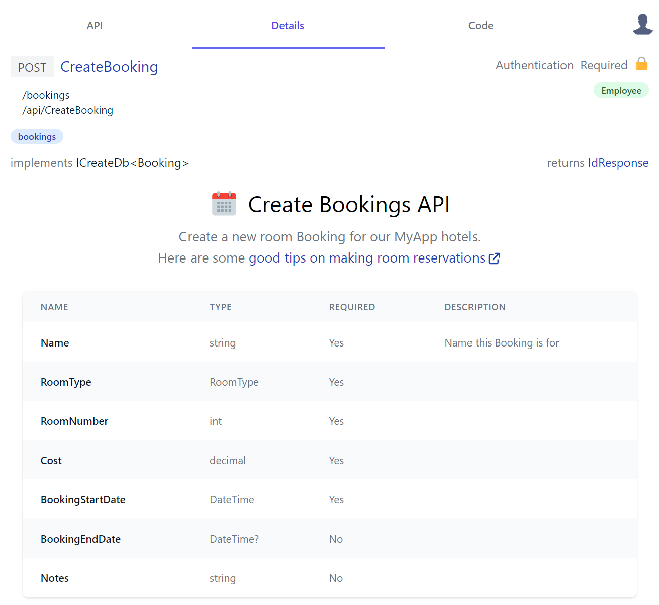
Which just references server AppMetadata to access server API info from the /metadata/app.json endpoint:
import { inject } from "vue"
export const CreateBookingDocs = {
template:`
<div class="text-center my-3">
<div class="flex justify-center">
<svg class="w-10 h-10" xmlns="http://www.w3.org/2000/svg" viewBox="0 0 48 48">
<path fill="#CFD8DC" d="M5 38V14h38v24c0 2.2-1.8 4-4 4H9c-2.2 0-4-1.8-4-4z"/><path fill="#F44336" d="M43 10v6H5v-6c0-2.2 1.8-4 4-4h30c2.2 0 4 1.8 4 4z"/>
<g fill="#B71C1C"><circle cx="33" cy="10" r="3"/><circle cx="15" cy="10" r="3"/></g>
<g fill="#B0BEC5"><path d="M33 3c-1.1 0-2 .9-2 2v5c0 1.1.9 2 2 2s2-.9 2-2V5c0-1.1-.9-2-2-2z"/><path d="M15 3c-1.1 0-2 .9-2 2v5c0 1.1.9 2 2 2s2-.9 2-2V5c0-1.1-.9-2-2-2z"/></g>
<g fill="#90A4AE"><path d="M13 20h4v4h-4z"/><path d="M19 20h4v4h-4z"/><path d="M25 20h4v4h-4z"/><path d="M31 20h4v4h-4z"/><path d="M13 26h4v4h-4z"/><path d="M19 26h4v4h-4z"/><path d="M25 26h4v4h-4z"/><path d="M31 26h4v4h-4z"/><path d="M13 32h4v4h-4z"/><path d="M19 32h4v4h-4z"/><path d="M25 32h4v4h-4z"/><path d="M31 32h4v4h-4z"/></g>
</svg>
<h2 class="text-3xl ml-3 mb-3">Create Bookings API</h2>
</div>
<div class="text-gray-500 text-lg">
<p>
Create a new room Booking for our {{serviceName}} hotels.
</p>
<p>
Here are some
<a class="svg-external text-blue-800" target="_blank"
href="https://edition.cnn.com/travel/article/scoring-best-hotel-rooms/index.html">
good tips on making room reservations
</a>
</p>
</div>
</div>
`,
setup() {
const server = inject('server')
return { serviceName: server.app.serviceName }
}
}
Dynamic Components
QueryTodos is a more advanced example that generates a dynamic UI shared by all TODO APIs
that generate its reactive Mini Navigation UI users can use to cycle through all TODO API docs with a v-href="{ op }" custom directive:
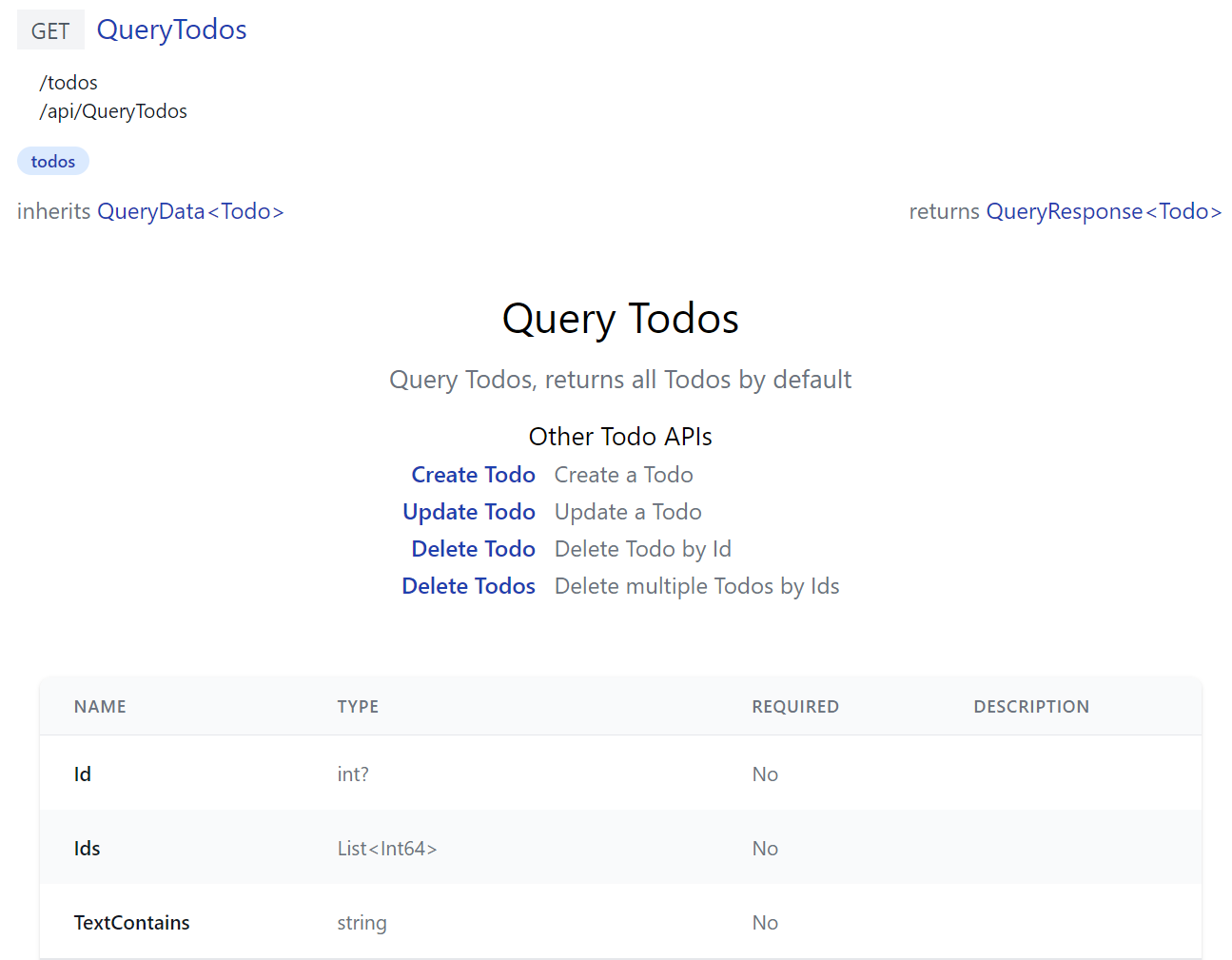
Where instead of registering a single component, it exports a install(app) function to register API Doc components for all TODO CRUD APIs, all registered
with the same TodosDocs component:
import { inject, computed } from "vue"
import { humanize } from "@servicestack/client"
export function install(app) {
const apis = {
QueryTodos: 'Query Todos, returns all Todos by default',
CreateTodo: 'Create a Todo',
UpdateTodo: 'Update a Todo',
DeleteTodo: 'Delete Todo by Id',
DeleteTodos: 'Delete multiple Todos by Ids',
}
const apiNames = Object.keys(apis)
const TodosDocs = {
template:`
<div class="mx-auto max-w-screen-md text-center py-8">
<h2 class="text-center text-3xl">{{humanize(op.request.name)}}</h2>
<p class="text-gray-500 text-lg my-3">{{apis[op.request.name]}}</p>
<div class="flex justify-center text-left">
<table>
<caption class="mt-3 text-lg font-normal">Other Todo APIs</caption>
<tr v-for="(info,name) in otherApis">
<th class="text-right font-medium pr-3">
<a v-href="{ op:name }" class="text-blue-800">{{humanize(name)}}</a>
</th>
<td class="text-gray-500">{{info}}</td>
</tr>
</table>
</div>
</div>`,
setup() {
const store = inject('store')
const op = computed(() => store.op)
const otherApis = computed(() => apiNames.filter(x => x !== store.op.request.name)
.reduce((acc,x) => { acc[x] = apis[x]; return acc }, {}))
return {
op,
apis,
otherApis,
humanize,
}
}
}
const components = apiNames.reduce((acc, x) => { acc[x + 'Docs'] = TodosDocs; return acc }, {})
app.components(components)
}
Built-in API Docs
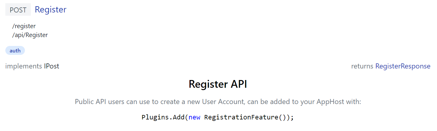
ServiceStack's own built-in APIs uses custom API Doc components itself to document its APIs, e.g. /ui/docs/RegisterDocs.mjs
export const RegisterDocs = {
    template:`
      <div class="max-w-screen-md mx-auto text-center">
          <h2 class="text-2xl font-medium mb-3">Register API</h2>
          <p class="text-gray-500">
            Public API users can use to create a new User Account, can be added to your AppHost with:
          </p>
          <pre class="my-3"><code v-highlightjs="'Plugins.Add(new RegistrationFeature());'"></code></pre>
      </div>`
}
Generates docs for the built-in Register API that includes C# Syntax highlighting using the pre-configured highlightjs directive:
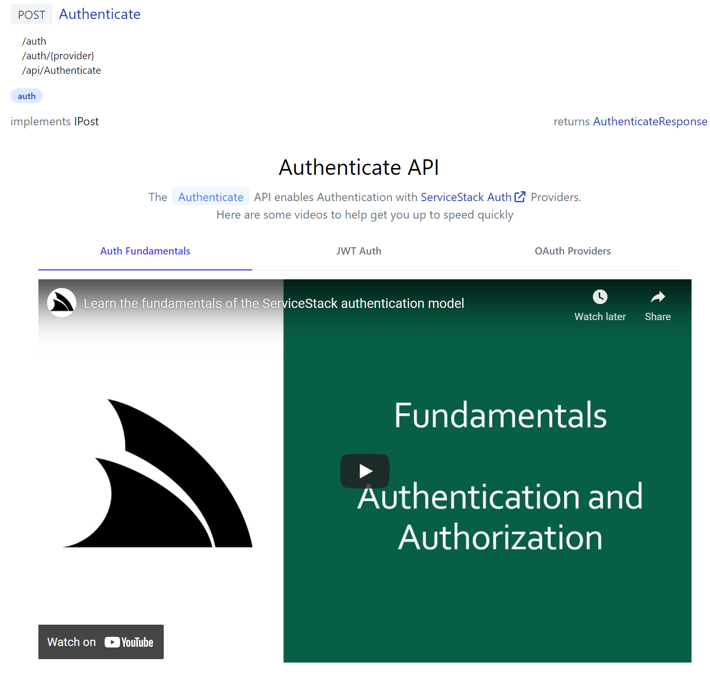
Whilst /ui/docs/AuthenticateDocs.mjs demonstrates a more advanced example in generating a responsive dynamic tab layout containing multiple relevant ServiceStack Auth YouTube videos:
Override built-in Components
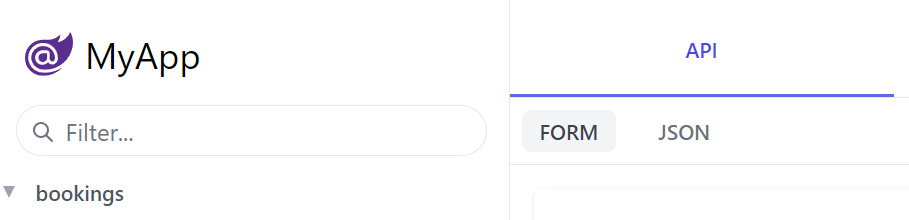
The built-in UIs also lets you override existing components by adding custom versions in /js/components e.g.
const Brand = {
    template:/*html*/`
    <div class="flex items-center flex-shrink-0 max-w-sidebar">
        <a title="My App" v-href="{ $page:'' }"
           class="text-2xl whitespace-nowrap overflow-x-hidden flex items-center">
           <svg xmlns="http://www.w3.org/2000/svg" class="w-8 h-8 ml-1 mr-2" viewBox="0 0 24 24">
               <path d="M23.834 8.101a13.912 13.912 0 0 1-13.643 11.72a10.105 10.105 0 0 1-1.994-.12a6.111 6.111 0 0 1-5.082-5.761a5.934 5.934 0 0 1 11.867-.084c.025.983-.401 1.846-1.277 1.871c-.936 0-1.374-.668-1.374-1.567v-2.5a1.531 1.531 0 0 0-1.52-1.533H8.715a3.648 3.648 0 1 0 2.695 6.08l.073-.11l.074.121a2.58 2.58 0 0 0 2.2 1.048a2.909 2.909 0 0 0 2.695-3.04a7.912 7.912 0 0 0-.217-1.933a7.404 7.404 0 0 0-14.64 1.603a7.497 7.497 0 0 0 7.308 7.405s.549.05 1.167.035a15.803 15.803 0 0 0 8.475-2.528c.036-.025.072.025.048.061a12.44 12.44 0 0 1-9.69 3.963a8.744 8.744 0 0 1-8.9-8.972a9.049 9.049 0 0 1 3.635-7.247a8.863 8.863 0 0 1 5.229-1.726h2.813a7.915 7.915 0 0 0 5.839-2.578a.11.11 0 0 1 .059-.034a.112.112 0 0 1 .12.053a.113.113 0 0 1 .015.067a7.934 7.934 0 0 1-1.227 3.549a.107.107 0 0 0-.014.06a.11.11 0 0 0 .073.095a.109.109 0 0 0 .062.004a8.505 8.505 0 0 0 5.913-4.876a.155.155 0 0 1 .055-.053a.15.15 0 0 1 .147 0a.153.153 0 0 1 .054.053A10.779 10.779 0 0 1 23.834 8.1zM8.895 11.628a2.188 2.188 0 1 0 2.188 2.188v-2.042a.158.158 0 0 0-.15-.15z" fill="#5C2D91"/>
            </svg>
           My App
        </a>
    </div>
    `
}
export default Brand
Which override's the built-in Brand component to replace the Logo on the top-right of API Explorer, Locode and the Admin UI with the custom version below:
Admin UI v2
As no customizations or extensibility features were available for the built-in Admin UIs, no effort should be required to upgrade.
If you do find any issues with the new version please let us know in the Customer Forums, where they'll be promptly resolved.
API Index
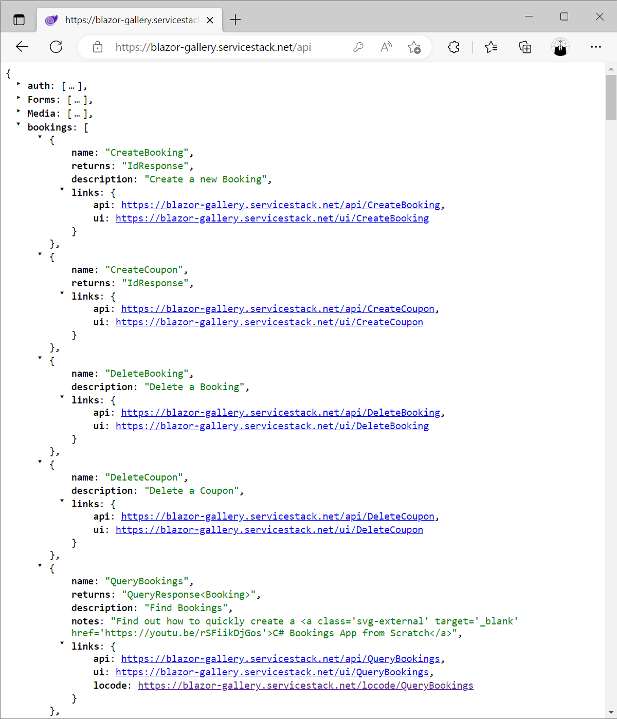
Previously calling the JSON /api pre-defined route without the name of the API to call resulted in an error, we're now using it as an opportunity to improve API Discovery by returning an App's public APIs grouped by user-defined tags with direct links to the API endpoint, viewing it in API Explorer and in Locode for AutoQuery APIs, e.g:
https://example.org/api
New Vue Components
In addition to the AutoQueryGrid
AutoForm
The AutoForm component is a generic form component (used extensively in API Explorer) that can be used to create and wire a traditional Form for any Request DTO definition where successful responses can be handled the @success event, e.g:
<AutoForm type="QueryBookings" @success="onSuccess" />
<div v-if="results">
    <h3 class="py-4 text-2xl">Results</h3>
    <HtmlFormat :value="results" />
</div>

<script setup>
const results = ref([])
const onSuccess = response => results.value = response.results
</script>
Results
See the AutoForm Component docs for different enhancement & customizability options.
Combobox
The Combobox component provides an Autocomplete Input optimized for searching a List of string values, Key Value Pairs or Object Dictionary, e.g:
<div class="grid grid-cols-12 gap-6">
  <Combobox id="Strings" class="col-span-4" v-model="strings" :values="['Alpha','Bravo','Charlie']" />
  <Combobox id="Object"  class="col-span-4" v-model="objects" :options="{ A:'Alpha', B:'Bravo', C:'Charlie' }" />
  <Combobox id="Pairs"   class="col-span-4" v-model="pairs"   label="Multiple from Pairs" multiple
    :entries="[{key:'A',value:'Alpha'}, {key:'B',value:'Bravo'}, {key:'C',value:'Charlie'}]" />
</div>
Which supports populating both a single string value or multiple strings in an Array with multiple property.
Auto Forms
Combobox components can also be used in Auto Form Components on string or string collection properties
with the [Input(Type="combobox")] declarative UI Attribute on C# Request DTOs, e.g:
public class ComboBoxExamples : IReturn<ComboBoxExamples>, IPost
{
    [Input(Type="combobox", Options = "{ allowableValues:['Alpha','Bravo','Charlie'] }")]
    public string? SingleClientValues { get; set; }

    [Input(Type="combobox", Options = "{ allowableValues:['Alpha','Bravo','Charlie'] }", Multiple = true)]
    public List<string>? MultipleClientValues { get; set; }

    [Input(Type="combobox", EvalAllowableValues = "['Alpha','Bravo','Charlie']")]
    public string? SingleServerValues { get; set; }

    [Input(Type="combobox", EvalAllowableValues = "AppData.AlphaValues", Multiple = true)]
    public List<string>? MultipleServerValues { get; set; }

    [Input(Type="combobox", EvalAllowableEntries = "{ A:'Alpha', B:'Bravo', C:'Charlie' }")]
    public string? SingleServerEntries { get; set; }

    [Input(Type="combobox", EvalAllowableEntries = "AppData.AlphaDictionary", Multiple = true)]
    public List<string>? MultipleServerEntries { get; set; }
}
Which can then be rendered with:
<AutoForm type="ComboBoxExamples" />
Combobox Options
Each property shows a different way of populating the Combobox's optional values, they can be populated from a JavaScript
Object literal using Options or on the server with a #Script Expression where they can be
populated from a static list or from a C# class as seen in the examples referencing AppData properties:
public class AppData
{
    public List<string> AlphaValues { get; set; }
    public Dictionary<string, string> AlphaDictionary { get; set; }
    public List<KeyValuePair<string, string>> AlphaKeyValuePairs { get; set; }
}
Which are populated on in the AppHost on Startup with:
ScriptContext.Args[nameof(AppData)] = new AppData
{
    AlphaValues = new() {
        "Alpha", "Bravo", "Charlie"
    },
    AlphaDictionary = new()
    {
        ["A"] = "Alpha",
        ["B"] = "Bravo",
        ["C"] = "Charlie",
    },
    AlphaKeyValuePairs = new()
    {
        new("A","Alpha"),
        new("B","Bravo"),
        new("C","Charlie"),
    },
};
Which can alternatively be populated from a dynamic source like an RDBMS table.
As C# Dictionaries have an undetermined sort order, you can use a List<KeyValuePair<string, string>> instead when you need to
display an ordered list of Key/Value pairs.
TagInput with allowable values
The TagInput has also gained the ability to select from a list of options, e.g:
<div class="shadow sm:rounded-md bg-white dark:bg-black">
    <div class="relative px-4 py-5 sm:p-6">
        <div class="grid grid-cols-12 gap-6">
            <div class="col-span-12">
                <TagInput v-model="request.skills" label="Technology Skills"
                    :allowableValues="['c#','servicestack','vue','.net','typescript']" />
            </div>
        </div>
    </div>
</div>
The list of allowable values can also be populated on C# Request DTO from a JavaScript expression:
public class MyRequest
{
    [Input(Type = "tag", Options="{ allowableValues: ['c#','servicestack','vue'] }")]
    public List<string>? Skills { get; set; }
}
Or from a #Script Expression in EvalEvalAllowableValues where it can be populated from a static list, e.g:
public class MyRequest
{
    [Input(Type = "tag", EvalEvalAllowableValues="['c#','servicestack','vue']")]
    public List<string>? Skills { get; set; }
}
Or sourced from a C# Expression, e.g:
public class MyRequest
{
    [Input(Type = "tag", EvalEvalAllowableValues="AppData.Tags")]
    public List<string>? Skills { get; set; }
}
Where it can be populated from a dynamic data source like from an RDBMS populated in your AppHost on Startup, e.g:
ScriptContext.Args[nameof(AppData)] = new AppData {
    Tags = db.Select<Tag>().Select(x => x.Name).ToList()
};
Tabs
The Tabs component lets you switch between different Vue components from a object component dictionary where the Key is used for the Tab's label and URL param and the Value component for the tab body.
<script setup>
import A from "./A.vue"
import B from "./B.vue"
import C from "./C.vue"
const tabs = { A, B, C }
</script>
The Tab's Label can alternatively be overridden with a custom label function, e.g:
<Tabs :tabs="tabs" :label="tab => `${tab} Tab Label`" />
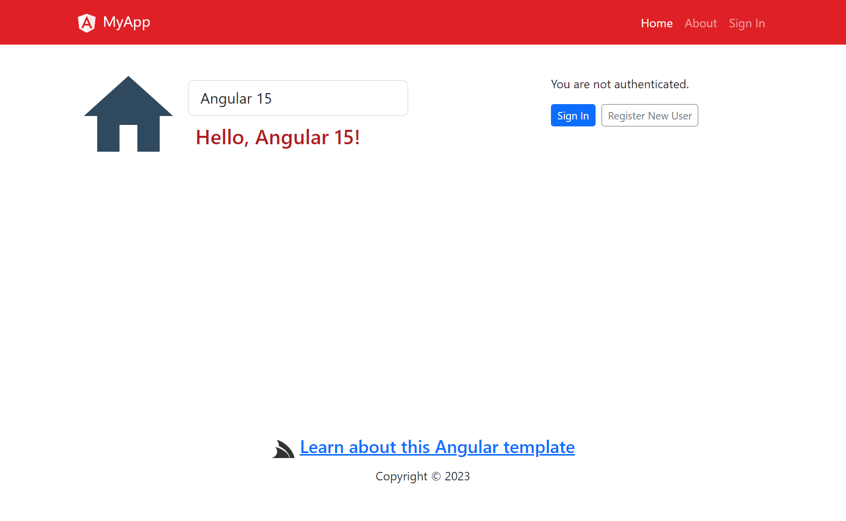
SignIn
The SignIn Component can be used to create an instant Sign Up form based on the registered Auth Providers that handles Signing In authenticated users into Vue Apps with the useAuth() APIs:
<SignIn v-if="!user" />
<div v-else>
<h3 class="text-2xl my-4">Hello, {{ user.displayName }}</h3>
<PrimaryButton @click="signOut()">Sign Out</PrimaryButton>
</div>
<script setup>
import { useAuth } from "@servicestack/vue"
const { user, signOut } = useAuth()
</script>
Hello, {{ user.displayName }}
Angular 15
The angular-spa project template has been upgraded to Angular 15:
It can be created from the servicestack.net/start page or on the command-line with the x tool:
x new angular-spa ProjectName
AutoQuery Collections not initialized by Default
As it's common for AutoQuery APIs to potentially have a large number of optional collection properties, having them initialized by default results in sending empty collections on the wire, which is unnecessary as they have the same behavior as if nothing was sent when the property was omitted entirely.
Since we added this feature C# introduced Target-Typed New Expressions which reduces the boilerplate to initialize collections, e.g:
var request = new QueryTable {
    Ids = new() { id1, id2, id3 },
};
As a result ServiceStack no longer initializes AutoQuery Collections by default, the previous behavior can be restored with:
ConfigurePlugin<NativeTypesFeature>(feature =>
  feature.ShouldInitializeCollection=NativeTypesFeature.AllCollectionProperties);