Dark Mode
This was another Blazor focused release packed with new components & features we're excited to share - first up Dark Mode everywhere!
Tailwind has revolutionized how we style our Web Apps with its mobile first design system that's dramatically simplified creating maintainable responsive Web Apps. It also excels at adding support for Dark Mode with its first-class dark: modifier allowing the use of standard tailwind classes to specify what elements should look like when viewed in Dark Mode, e.g:
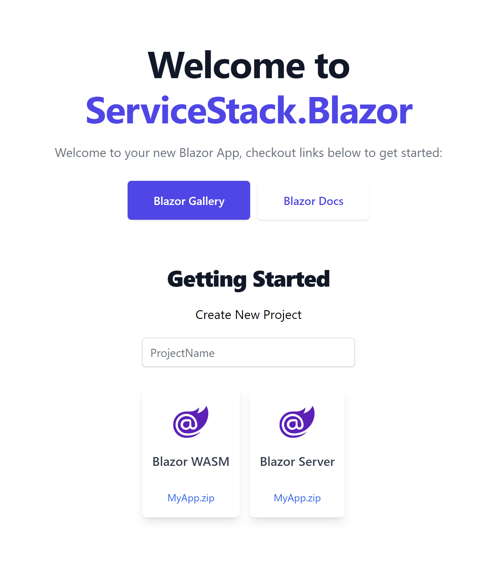
Light mode
Writes Upside-Down
The Zero Gravity Pen can be used to write in any orientation, including upside-down. It even works in outer space.
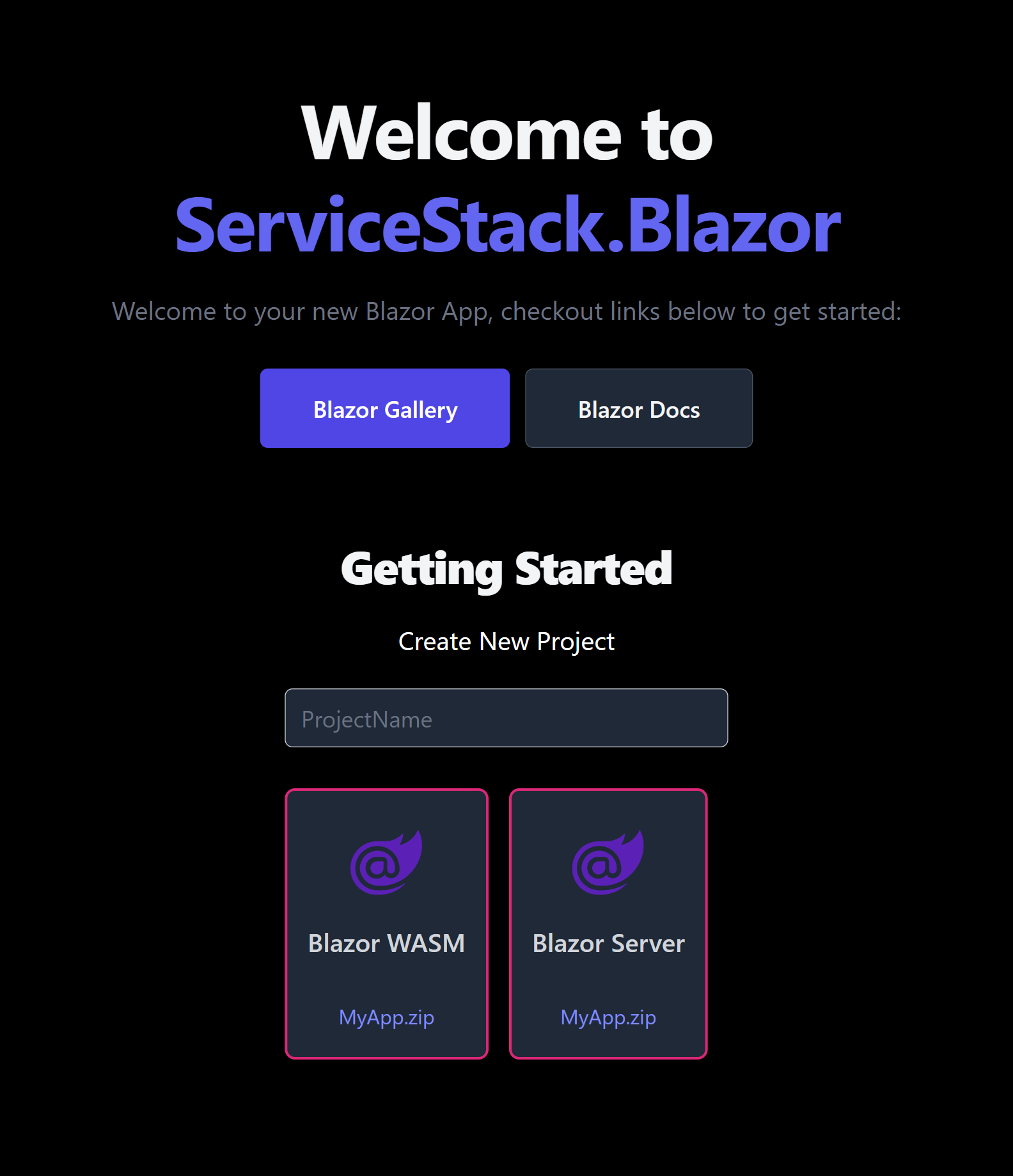
Dark mode
Writes Upside-Down
The Zero Gravity Pen can be used to write in any orientation, including upside-down. It even works in outer space.
<div class="bg-white dark:bg-slate-800 rounded-lg px-6 py-8 ring-1 ring-slate-900/5 shadow-xl">
  <div>
    <span class="inline-flex items-center justify-center p-2 bg-indigo-500 rounded-md shadow-lg">
      <svg class="h-6 w-6 text-white" xmlns="http://www.w3.org/2000/svg" fill="none" viewBox="0 0 24 24" stroke="currentColor" aria-hidden="true"><!-- ... --></svg>
    </span>
  </div>
  <h3 class="text-slate-900 dark:text-white mt-5 text-base font-medium tracking-tight">Writes Upside-Down</h3>
  <p class="text-slate-500 dark:text-slate-400 mt-2 text-sm">
    The Zero Gravity Pen can be used to write in any orientation, including upside-down. It even works in outer space.
  </p>
</div>
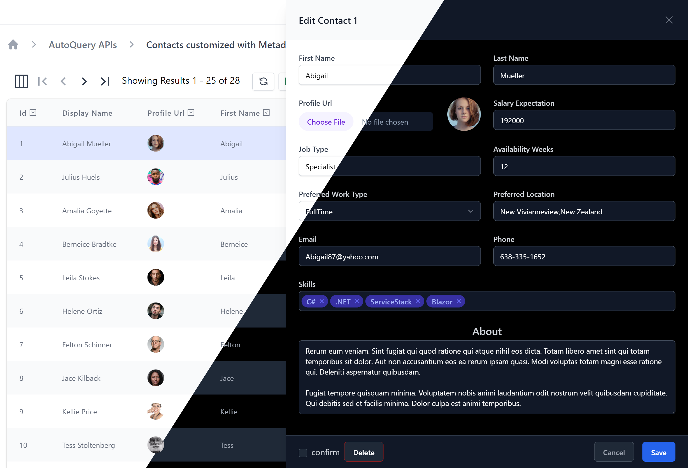
View ServiceStack.Blazor in Dark Mode
We're happy to announce that Dark Mode support has been added to all ServiceStack.Blazor components and all Blazor Tailwind project templates where you'll be able to toggle on/off Dark Mode with the new <DarkModeToggle> component. Checkout this video to see how beautiful Dark Mode looks like in the latest ServiceStack.Blazor Components and Tailwind project templates:
For a more interactive view, use the right Dark Mode toggle to turn on/off Dark Mode in the embedded Blazor Gallery Contacts Page:
Dark Mode is all implemented with CSS, controlled by toggling the dark class on the <html class="dark"> element, <DarkModeToggle> also saves this user preference in localStorage where it's preserved across browser restarts.
View in Dark Mode
The Blazor Tailwind templates also include the ability to override the users color scheme preference and open a page in dark or light mode with the
?dark and ?light query params:
Force Dark Mode
If your App is best viewed in Dark Mode you can force it to use Dark Mode with JS.init() when initializing ServiceStack.Blazor's JS library in Blazor Server's _Layout.cshtml or Blazor WASM's index.html, e.g:
<script src="_framework/blazor.server.js"></script>
<script src="/js/servicestack-blazor.js"></script>
<script>JS.init({ colorScheme:'dark' })</script>
Blazor Components
Blazor Components
The ServiceStack.Blazor component library continues to expand with exciting new Components and improvements.
Autocomplete
First up is the <Autocomplete> component that provides a user friendly Input for being able to search and quickly select items, that includes support for rich templated content, custom matching and infinite scrolling that avoids pre-loading the entire bound list of items.
Instead of being populated with a fixed List of strings or Key Value Pairs the Autocomplete component can bind directly to a list of POCOs to render its templated content where you'll be able to specify a custom Match filter to control which filtered items are displayed, that it can fuzzy match on single or multiple POCO properties.
Single Contact
Here's a simple Autocomplete example that binds to a simple Contact from a List<Contact> in allContacts:
<Autocomplete T="Contact" Options="allContacts" @bind-Value="simple" Label="Single Contact"
    Match="(x, value) => x!.DisplayName.Contains(value, StringComparison.OrdinalIgnoreCase)"
    placeholder="Select Contact">
    <Item>
        <span class="block truncate">@context!.DisplayName</span>
    </Item>
</Autocomplete>
Single Contact with Icon
The item content is templated allowing for rich content which can be used to display a Contact's profile picture and name:
<Autocomplete T="Contact" Options="allContacts" @bind-Value="contact" Label="Single Contact with Icon"
    Match="(x, value) => x!.DisplayName.Contains(value, StringComparison.OrdinalIgnoreCase)"
    placeholder="Select Contact">
    <Item>
        <div class="flex items-center">
            <Icon class="h-6 w-6 flex-shrink-0 rounded-full" Src=@context.ProfileUrl />
            <span class="ml-3 truncate">@context!.DisplayName</span>
        </div>
    </Item>
</Autocomplete>
Multiple Contacts with Icon
It also supports multiple selection by using @bind-Values to bind to the List<Contact> in contacts instead, e.g:
<Autocomplete Options="allContacts" @bind-Values="contacts" Label="Multiple Contacts with Icon"
    Match="(x, value) => x!.DisplayName.Contains(value, StringComparison.OrdinalIgnoreCase)"
    placeholder="Select Contacts">
    <Item>
        <div class="flex items-center">
            <Icon class="h-6 w-6 flex-shrink-0 rounded-full" Src=@context.ProfileUrl />
            <span class="ml-3 truncate">@context!.DisplayName</span>
        </div>
    </Item>
</Autocomplete>
and here's a working example of what they look like together in the same form (example source code):
TagInput
The TagInput component is useful for when you want to manage a list of strings like words or tags - an input that's notably lacking in HTML Forms.
Best of all <TagInput> functions like any other input where it can be included and customized in declarative forms.
For example this Update AutoQuery Request DTO:
// Customize Edit Forms with [Input] and [FieldCss] attributes
public class UpdateContact : IPatchDb<Contact>, IReturn<Contact>
{
public int Id { get; set; }
[ValidateNotEmpty]
public string? FirstName { get; set; }
[ValidateNotEmpty]
public string? LastName { get; set; }
[Input(Type = "file"), UploadTo("profiles")]
public string? ProfileUrl { get; set; }
public int? SalaryExpectation { get; set; }
[ValidateNotEmpty]
public string? JobType { get; set; }
public int? AvailabilityWeeks { get; set; }
public EmploymentType? PreferredWorkType { get; set; }
public string? PreferredLocation { get; set; }
[ValidateNotEmpty]
public string? Email { get; set; }
public string? Phone { get; set; }
[Input(Type = "tag"), FieldCss(Field = "col-span-12")]
public List<string>? Skills { get; set; }}
[Input(Type="textarea")]
[FieldCss(Field="col-span-12 text-center", Input="h-48", Label="text-xl text-indigo-700")]
public string? About { get; set; }
}
is all that's needed to render an instantly working API-enabled Form with validation binding using Auto Form components:
<AutoEditForm class=@Class Model="Contact" ApiType="typeof(UpdateContact)" Edit=@contact />
Which by default renders the form in a SlideOver dialog as seen when editing a row in the Contacts AutoQueryGrid component:
Alternatively it can be rendered in a traditional "card" form layout with the new FormStyle.Card option:
<AutoEditForm class=@Class FormStyle="FormStyle.Card" Model="Contact" ApiType="typeof(UpdateContact)" Edit=@contact />
Where it functions the same as other Input components where it can be bound directly to a List<string> Request DTO property:
<form @onsubmit="submit" @onsubmit:preventDefault class=@Class>
<CascadingValue Value=@apiQuery.Error>
    <div class="shadow sm:rounded-md bg-white dark:bg-black">
        <div class="relative px-4 py-5 sm:p-6">
            <fieldset>
                <ErrorSummary Except=@VisibleFields />

                <div class="grid grid-cols-12 gap-6">
                    <div class="col-span-6">
                        <TextInput @bind-Value="request.FirstName" />
                    </div>

                    <div class="col-span-6">
                        <TextInput @bind-Value="request.LastName" />
                    </div>

                    <div class="col-span-12">
                        <TagInput @bind-Value="request.Skills" />
                    </div>
                </div>
            </fieldset>
        </div>
    </div>
</CascadingValue>
</form>
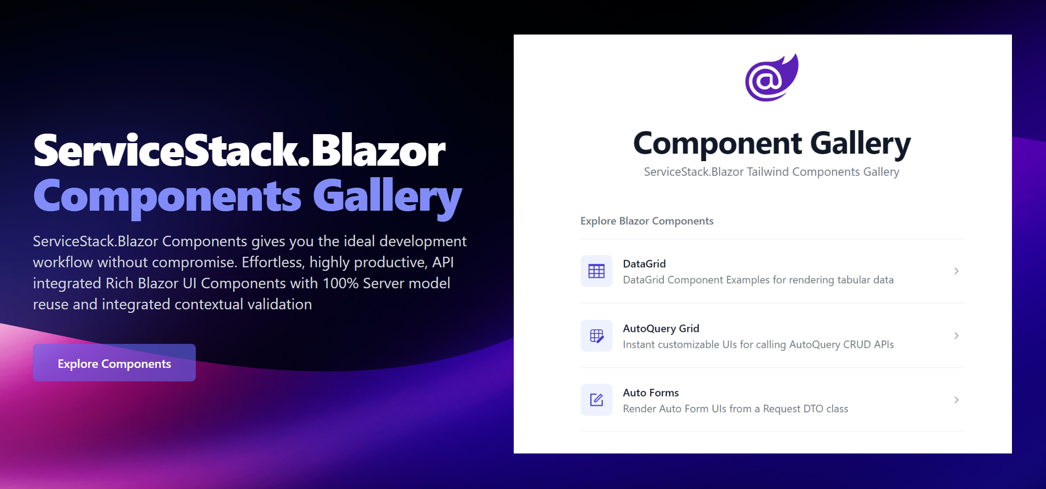
NavList
The NavList component encapsulates Tailwind's beautiful List component which is used extensively in Blazor Gallery's Navigation:
<div class="max-w-screen-sm">
    <NavList Title="Explore Blazor Components">
        <NavListItem Title="DataGrid" href="/gallery/datagrid" IconSvg=@Icons.DataGrid>
            DataGrid Component Examples for rendering tabular data
        </NavListItem>
        <NavListItem Title="AutoQuery Grid" href="/gallery/autoquerygrid" IconSvg=@Icons.AutoQueryGrid>
            Instant customizable UIs for calling AutoQuery CRUD APIs
        </NavListItem>
    </NavList>

    <h2 class="mt-8 text-base font-semibold text-gray-500 dark:text-gray-400 flex">
        <span title="Requires Auth"><Icon class="h-6 w-6 mr-2" Svg=@Icons.Padlock /></span>
        Booking APIs
    </h2>
    <NavList>
        <NavListItem Title="Bookings" href="/grid/bookings" Icon=@typeof(Booking).GetIcon()>
            Create and manage Bookings
        </NavListItem>
        <NavListItem Title="Coupons" href="/grid/coupons" Icon=@typeof(Coupon).GetIcon()>
            Create and manage discount Coupons
        </NavListItem>
    </NavList>
</div>
Where it will render a list of navigation links with descriptions and icons:
Colored Buttons
The new ButtonStyle on PrimaryButton component can be used to render buttons into Tailwind's different primary colors:
<div class="grid gap-4 grid-cols-3">
    <PrimaryButton>Default</PrimaryButton>
    <PrimaryButton Style="ButtonStyle.Blue">Blue</PrimaryButton>
    <PrimaryButton Style="ButtonStyle.Purple">Purple</PrimaryButton>
    <PrimaryButton Style="ButtonStyle.Red">Red</PrimaryButton>
    <PrimaryButton Style="ButtonStyle.Green">Green</PrimaryButton>
    <PrimaryButton Style="ButtonStyle.Sky">Sky</PrimaryButton>
    <PrimaryButton Style="ButtonStyle.Cyan">Cyan</PrimaryButton>
</div>
Select Input
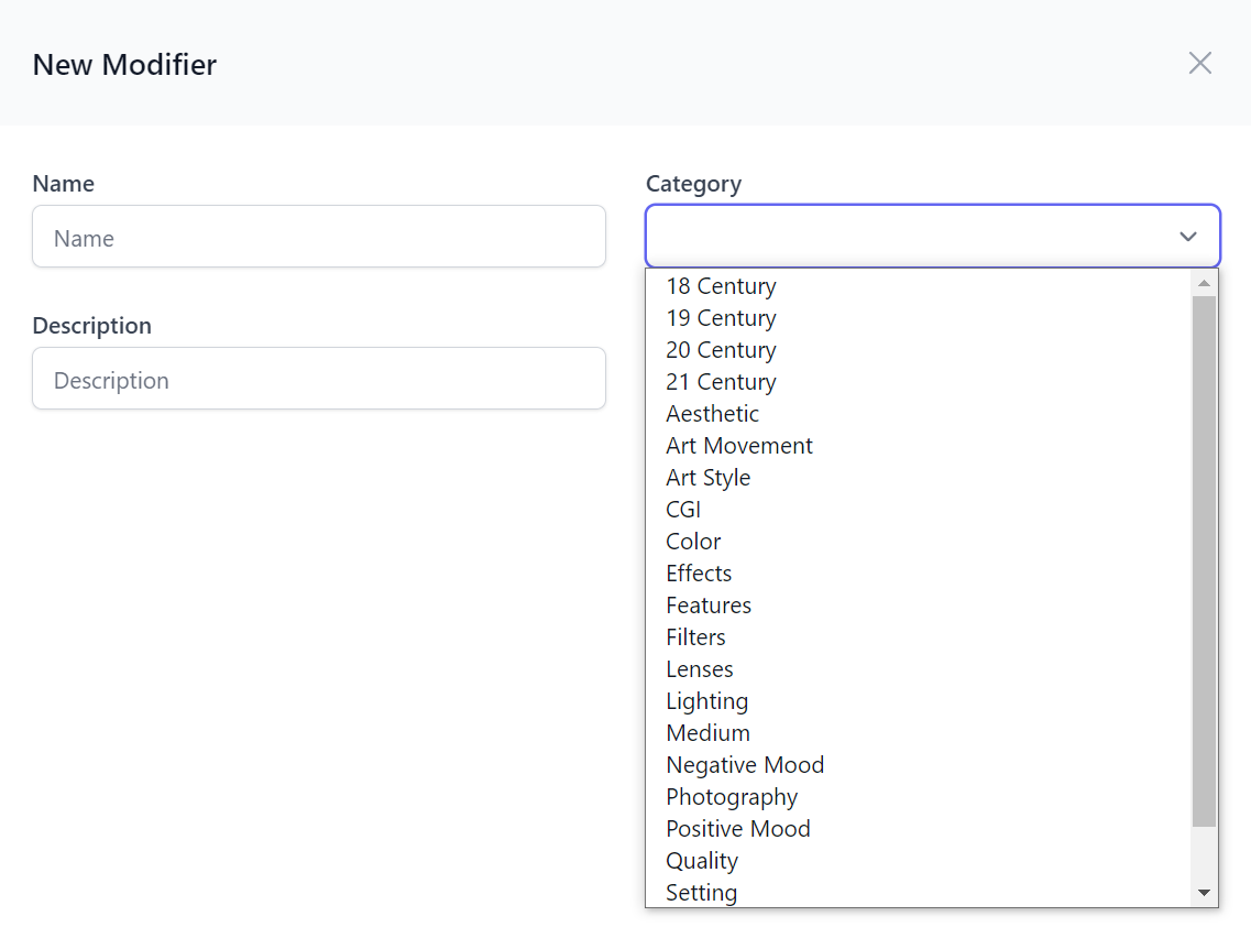
The existing <SelectInput> has new additional Values and Entries parameters for populating options from an array of string's or KeyValuePair's, it also gains new declarative features enabling more capable declarative forms which are typically restricted by the compile-time constant expression limitation of .NET attributes.
The new EvalAllowableValues and EvalAllowableEntries attribute properties overcomes this limitation by letting you define the Select options with a #Script Expression whose great .NET scriptability lets you reference your App's .NET instances from a string expression. This feature can then be used to populate declarative Select options from a .NET Instance, e.g:
public class CreateModifier : ICreateDb<Modifier>, IReturn<Modifier>
{
    [ValidateNotEmpty]
    public string Name { get; set; }

    [ValidateNotEmpty]
    [Input(Type="select", EvalAllowableValues = "AppData.Categories")]
    public string Category { get; set; }

    public string? Description { get; set; }
}
That we register as a global variable in our AppHost's ScriptContext which we can populate from a dynamic source like a DB Table, e.g:
using var db = container.Resolve<IDbConnectionFactory>().Open();
ScriptContext.Args[nameof(AppData)] = new AppData
{
    Categories = db.Column<string>(db.From<Category>().Select(x => x.Name))
};
Where it will populate the Select input in all CreateModifier Auto Form components:
AutoQueryGrid
Our flagship AutoQueryGrid Component continues to receive new improvements and features that make it more capable of supporting more use cases.
ToolbarButtons
The <ToolbarButtons> element can be used to customize the AutoQueryGrid to add your own custom Toolbar buttons, e.g:
<AutoQueryGrid>
  <ToolbarButtons>
    <div class="pl-2"><button>1</button></div>
    <div class="pl-2"><button>2</button></div>
  </ToolbarButtons>
</AutoQueryGrid>
Enabling complete control over the Toolbar as all existing toolbar buttons can be removed with AutoQueryGrid parameters.
Custom Edit and Create Forms
The <CreateForm> and <EditForm> elements can be used to replace the default Auto Forms used in creating and editing rows when more advanced or customized functionality is needed.
With this feature we can create a Custom AutoQueryGrid component that uses Custom Edit & Create Forms when selecting and adding new records and also customize the Grid results displayed with the new ConfigureQuery parameter to ensure results are filtered to the selected Tenant records:
<AutoQueryGrid @ref=@grid Model="Item" Apis="Apis.AutoQuery<QueryItems,NewItem,EditItem>()" ConfigureQuery="Configure">
    <CreateForm>
        <div class="relative z-10">
            <div class="pointer-events-none fixed inset-y-0 right-0 flex max-w-full pl-10 sm:pl-16">
                <CustomCreateItem OnClose="grid!.OnEditDone" />
            </div>
        </div>
    </CreateForm>
    <EditForm>
        <div class="relative z-10">
            <div class="pointer-events-none fixed inset-y-0 right-0 flex max-w-full pl-10 sm:pl-16">
                <CustomEditItem Item="context" OnClose="grid!.OnEditDone" />
            </div>
        </div>
    </EditForm>
</AutoQueryGrid>

@code {
    AutoQueryGrid<Creative>? grid;
    [Parameter, SupplyParameterFromQuery] public int? TenantId { get; set; }

    void Configure(QueryBase query)
    {
        query.AddQueryParam("TenantId", TenantId);
    }
}
Managing Filters & Preferences
By default the AutoQueryGrid displays the user's selected columns and query limit preferences which are persisted in localStorage. They can be overridden with the new Prefs attribute which has different ergonomic methods for configuration within an attribute:
To limit the Query Results Limit:
<AutoQueryGrid @ref=@grid Model="Contact" Apis="Apis.AutoQuery<QueryContacts,CreateContact,UpdateContact>()"
               Prefs="ApiPrefs.Create(take:10)" />
To limit which columns are displayed in the Query Results:
<AutoQueryGrid @ref=@grid Model="Contact" Apis="Apis.AutoQuery<QueryContacts,CreateContact,UpdateContact>()"
               Prefs="ApiPrefs.Columns(nameof(Contact.Id), nameof(Contact.LastName))" />
<AutoQueryGrid @ref=@grid Model="Contact" Apis="Apis.AutoQuery<QueryContacts,CreateContact,UpdateContact>()"
               Prefs="ApiPrefs.Columns<Contact>(x => new { x.Id, x.LastName, x.Email })" />
To configure both Query Limit and Selected Columns:
<AutoQueryGrid @ref=@grid Model="Contact" Apis="Apis.AutoQuery<QueryContacts,CreateContact,UpdateContact>()"
               Prefs="ApiPrefs.Create(take:10, columns:new(){ nameof(Contact.Id), nameof(Contact.LastName) })" />
<AutoQueryGrid @ref=@grid Model="Contact" Apis="Apis.AutoQuery<QueryContacts,CreateContact,UpdateContact>()"
               Prefs="ApiPrefs.Configure(x => { x.Take = 5; x.SelectedColumns=new() { nameof(Contact.LastName) }; })"/>
In addition the new methods below can be used to clear any user-defined query filters and column preferences:
| Method | Description |
|---|---|
| grid.ClearFiltersAsync() | Remove user-defined Filters |
| grid.ResetPreferencesAsync() | Remove user-defined Filters and Column Preferences |
Disable Column Filtering
By default Filtering and Sorting are disabled for complex type columns, they can also be explicitly disabled per column with AllowFiltering, e.g:
<AutoQueryGrid>
    <Column Field="(Contact x) => x.Phone" AllowFiltering="false" />
<AutoQueryGrid>
Blazor Diffusion
The goal of our increasing Blazor investments is to enable a highly productive and capable platform for rapidly developing a majority of internal Apps CRUD functionality as well as enabling a hybrid development model where the management of Back office supporting tables can be quickly implemented using custom AutoQueryGrid components freeing up developers to be able to focus a majority of their efforts where they add the most value - in the bespoke Blazor UI's optimized customer-facing UX.
To best demonstrate its potential we've embarked on development of a new project we're excited to announce that does exactly this!
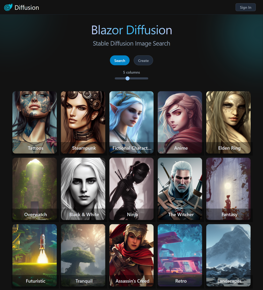
blazordiffusion.com is a new ServiceStack.Blazor App front-end for Stable Diffusion - a deep learning text-to-image model that can generate quality images from a text prompt whose ability to run on commodity GPU hardware makes it one of the most exciting Open Source AI projects ever released. If you haven't experienced Stable Diffusion yet, we welcome you to create an account and start building your Stable Diffusion portfolio for FREE!
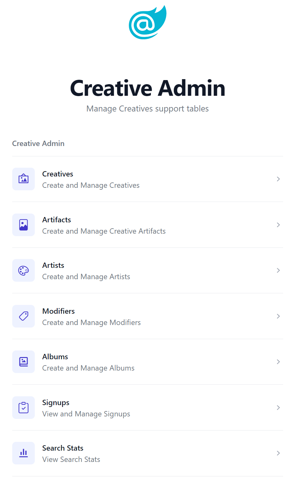
Effortless Admin Pages
It's a great example of Hybrid Development in action where the entire user-facing UI is a bespoke Blazor App that's optimized for creating, searching, cataloging and discovering Stable Diffusion generated images, whilst all its supporting admin tasks to manage the back office tables that power the UI were effortlessly implemented with custom AutoQueryGrid components.
To get a glimpse of this in action we've created a video showing how quick it was to build the first few Admin Pages:
Blazor Diffusion is an example of a real-world App leveraging a number of different ServiceStack features to achieve its functionality that we're using to "dog food" new ServiceStack features to help identify any friction points or missing functionality that we can feedback into the design and improvements of new and existing features, which it has done for most of the new features in this release.
Blazor Server or Blazor WASM
To ensure all new ServiceStack.Blazor features continue to work in both Blazor Server and Blazor WASM we're maintaining identical versions of Blazor Diffusion running in both of Blazor's hosting modes:
Where it's initially developed from a Blazor Server project template to take advantage of its fast iterative dev model then uses a script to export all Pages and Server functionality to a Blazor WASM project template that's optimal for Internet deployments.
Blazor Diffusion Features
To help discovery we'll link to where new features in this release are used.
Dark Mode
The decision to build blazordiffusion.com was in large part due to choosing an App that would look best in Dark Mode, as-is often preferred when viewing images and video. The public UI uses JS.init() to force Dark Mode whilst the Admin Pages uses a different AdminLayout.razor that allows dark mode to be toggled on/off as seen in the BlazorDiffusion Video.
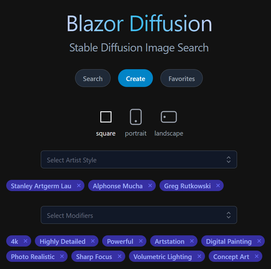
AutoComplete
The Create.razor uses the new <Autocomplete> to quickly select Artists
and Modifiers.
Admin Pages
The /admin pages we're all built using AutoQueryGrid for its data management and uses NavList and Breadcrumbs for its navigation.
EditForm
The following components make use of <EditForm> AutoQueryGrid extensibility to display unique forms for their custom workflow requirements:
<AutoQueryGrid @ref=@grid Model="Creative" Apis="Apis.AutoQuery<QueryCreatives,UpdateCreative,HardDeleteCreative>()"
               ConfigureQuery="ConfigureQuery">
    <EditForm>
        <div class="relative z-10" aria-labelledby="slide-over-title" role="dialog" aria-modal="true">
            <div class="pointer-events-none fixed inset-y-0 right-0 flex max-w-full pl-10 sm:pl-16">
                <CreativeEdit Creative="context" OnClose="grid!.OnEditDone" />
            </div>
        </div>
    </EditForm>
</AutoQueryGrid>
SelectInput
The Modifiers.razor admin page uses SelectInput EvalAllowableValues feature to populate its options from a C# AppData property:
public class CreateModifier : ICreateDb<Modifier>, IReturn<Modifier>
{
    [ValidateNotEmpty, Required]
    public string Name { get; set; }
    [ValidateNotEmpty, Required]
    [Input(Type="select", EvalAllowableValues = "AppData.Categories")]
    public string Category { get; set; }
    public string? Description { get; set; }
}
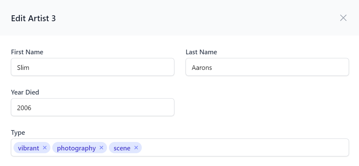
TagInput
The Artists.razor admin page uses declarative TagInput to render its AutoQueryGrid Create and Edit Forms:
public class UpdateArtist : IPatchDb<Artist>, IReturn<Artist>
{
    public int Id { get; set; }
    public string? FirstName { get; set; }
    public string? LastName { get; set; }
    public int? YearDied { get; set; }
    [Input(Type = "tag"), FieldCss(Field = "col-span-12")]
    public List<string>? Type { get; set; }
}
We're excited to be able to leverage our support for Litestream and showcase an example of architecting a production App at minimal cost which avoids paying for expensive managed hosted RDBMS's by effortlessly replicating its SQLite databases to object storage.
Reduce Complexity & Save Costs
Avoid expensive managed RDBMS servers, reduce deployment complexity, eliminate infrastructure dependencies & save order of magnitude costs vs production hosting

To make it easy for Blazor Tailwind projects to take advantage of our first-class Litestream support, we've created a new video combining these ultimate developer experience & value combo solutions that walks through how to deploy a new Blazor Tailwind SQLite + Litestream App to any Linux server with SSH access, Docker and Docker Compose:
Useful Blazor Litestream Video Links
Custom SQLite functions
Using SQLite also gives us access to features not available in other RDBMS's, e.g. for the "Explore Similar Artifacts" feature we're using a custom registered C# function that we can use in SQL to find other Artifacts with the nearest background colors in SearchService.cs:
public static class DbFunctions
{
    public static void RegisterBgCompare(this IDbConnection db)
    {
        var sqliteConn = (SqliteConnection)db.ToDbConnection();
        sqliteConn.CreateFunction("bgcompare", (string a, string b) => ImageUtils.BackgroundCompare(a, b));
    }
}
After registering the function with the db connection we can reference it in our typed SQL Expression with OrmLite's Sql.Custom() API:
db.RegisterBgCompare();
q.SelectDistinct<Artifact, Creative>((a, c) => new {
    a,
    c.UserPrompt,
    c.ArtistNames,
    c.ModifierNames,
    c.PrimaryArtifactId,
    Similarity = Sql.Custom($"bgcompare('{similarToArtifact.Background}',Background)"),
});
This same technique is also used for finding similar images by PerceptualHash, AverageHash & DifferenceHash functions provided by the ImageHash library.
The SearchService.cs itself is a great example of a complex custom AutoQuery implementation which is solely responsible for providing the entire search functionality on the home page.
Hetzner US Cloud
Our analysis of US Cloud Hosting Providers led us to moving to Hetzner Cloud for hosting where it costs vastly less than equivalent specs at a major cloud provider. But this also meant we also had to look elsewhere to also avoid AWS's expensive egress costs for S3 for image storage which can easily get out of control for a highly traffic image host.
R2 Virtual Files Provider
Fortunately we were in time to take advantage of Cloudflare's inexpensive R2 Object Storage solution with $0 egress fees, together with their generous free tier and ability to serve R2 assets behind their free CDN, we ended up with great value and performance managed cloud storage solution with the only cost expected in the near future to be R2's $0.015 / GB storage cost.
R2 is mostly S3 compatible however it needed a custom S3VirtualFiles provider to workaround missing features which is being maintained in the new R2VirtualFiles VFS provider.
Files Upload Transformer
The Managed Files Upload Feature is configured in Configure.AppHost.cs and used for all website File Uploads:
var appFs = VirtualFiles = new R2VirtualFiles(s3Client, appConfig.ArtifactBucket);
Plugins.Add(new FilesUploadFeature(
    new UploadLocation("artifacts", appFs,
        readAccessRole: RoleNames.AllowAnon,
        maxFileBytes: AppData.MaxArtifactSize),
    new UploadLocation("avatars", appFs, allowExtensions: FileExt.WebImages,
        // Use unique URL to invalidate CDN caches
        resolvePath: ctx => X.Map((CustomUserSession)ctx.Session, x => $"/avatars/{x.RefIdStr[..2]}/{x.RefIdStr}/{ctx.FileName}")!,
        maxFileBytes: AppData.MaxAvatarSize,
        transformFile:ImageUtils.TransformAvatarAsync)
    ));
Our usage highlighted it was missing the ability to transform an uploaded file and save a reference to the transformed file instead, a feature now possible with the new transformFile: option. This is used to only save a reference to the 128x128 resized avatar used by the App, whilst still persisting the original uploaded image in a Background MQ task in case a higher resolution of their avatar is needed later.
public class ImageDetails
{
    public static async Task<IHttpFile?> TransformAvatarAsync(FilesUploadContext ctx)
    {
        var originalMs = await ctx.File.InputStream.CopyToNewMemoryStreamAsync();

        // Offload persistance of original image to background task
        using var mqClient = HostContext.AppHost.GetMessageProducer(ctx.Request);
        mqClient.Publish(new DiskTasks {
            SaveFile = new() {
                FilePath = ctx.Location.ResolvePath(ctx),
                Stream = originalMs,
            }
        });

        var resizedMs = await CropAndResizeAsync(originalMs, 128, 128, PngFormat.Instance);

        return new HttpFile(ctx.File)
        {
            FileName = $"{ctx.FileName.LastLeftPart('.')}_128.{ctx.File.FileName.LastRightPart('.')}",
            ContentLength = resizedMs.Length,
            InputStream = resizedMs,
        };
    }

    public static async Task<MemoryStream> CropAndResizeAsync(Stream inStream, int width, int height, IImageFormat format)
    {
        var outStream = new MemoryStream();
        var image = await Image.LoadAsync(inStream);
        using (image)
        {
            var clone = image.Clone(context => context
                .Resize(new ResizeOptions {
                    Mode = ResizeMode.Crop,
                    Size = new Size(width, height),
                }));
            await clone.SaveAsync(outStream, format);
        }
        outStream.Position = 0;
        return outStream;
    }
}
Background MQ
Background MQ is utilized to improve API response times by offloading a number of non-essential background tasks in BackgroundMqServices.cs to perform functions like:
- Saving JSON metadata snapshot of Stable Diffusion generated images alongside the images themselves
- Write Files to R2
- Recalculating temporal scores and ranking of Artifacts and Albums
- Recording Analytics
Universal Blazor Components
Blazor Server has become our preferred platform for Interactive Intranet Apps which excels in low-latency environments to enable a best-in-class responsive end-user UX that also offers a superior development experience in Visual Studio's live reload where it enables a fast iterative development workflow and good debugging experience.
A fantastic property of Blazor is its support for multiple hosting modes which allows the same components from being able to run in the Browser with Blazor WASM or rendered on the Server with Blazor Server. But whilst Blazor is capable of it, this trait is typically conceded in most Apps with database access where it recommends using EF Core directly in Blazor components - effectively prohibiting reuse in Blazor WASM should you ever want to utilize Blazor's preferred hosting model for hosting your Blazor App's on the Internet.
Blazing Fast Networkless APIs
Whilst better performing, having Blazor components access DB's directly encourages a more tightly-coupled and less reusable & testable architecture than the traditional well-defined API dev model used in client/server Mobile & Desktop Apps or Web SPA Apps like WASM.
To achieve the best of both worlds, we've enabled support for utilizing the In Process Service Gateway in Blazor Server Apps which lets you retain the traditional client/server dev model for invoking your Server APIs In Process - avoiding any serialization, HTTP networking or even Kestrel middleware overhead to invoke your APIs directly!
This enables using the exact same source code to call APIs in Blazor Server and WASM which allows us to develop reusable Blazor Components to invoke the same Server APIs that serve Web, Mobile and Desktop Apps in Blazor Server Apps. Where instead of using HttpClient to invoke your APIs, they're invoked directly from a C# method which will preserve its StackTrace where you'll be able to track the API call down to the Blazor UI component calling it.
ServiceStack's Message-based API Design makes it possible for all API calls in ServiceStack.Blazor components and project templates to be routed through these 2 methods:
public interface IServiceGatewayAsync
{
    Task<TResponse> SendAsync<TResponse>(object dto, CancellationToken ct=default);
    //...
}

public interface IServiceGatewayFormAsync
{
    Task<TResponse> SendFormAsync<TResponse>(object dto, MultipartFormDataContent form, CancellationToken ct=default);
}
INFO
The SendFormAsync API is a new method added to support multi-part API requests with File Uploads
Which allows the HTTP JsonApiClient and networkless InProcessGateway clients to be used interchangeably. By default Blazor Server Apps now use the InProcess Gateway but can be switched over to invoke APIs using the HTTP JsonApiClient with:
BlazorConfig.Set(new() {
    UseInProcessClient = false
});
Which changes all Api* methods in Blazor components and Pages inheriting ServiceStack.Blazor's BlazorComponentBase to use the registered JsonApiClient client.
Other components can access both the InProcess Gateway or JsonApiClient by injecting the IClientFactory dependency into their components, e.g:
public class MyComponent : ComponentBase
{
    [Inject] public IClientFactory? ClientFactory { get; set; }

    public IServiceGateway Gateway => ClientFactory!.GetGateway();
    public JsonApiClient Client => ClientFactory!.GetClient();
}
This capability is what has made it possible for high-level "API-enabled" components like AutoQuery Grids and AutoForm to support both Blazor Server and Blazor WASM utilizing the most efficient API client available to its platform.
The Blazor Gallery websites themselves are also good demonstrations of being able to run entire Web Apps in both Blazor Server and WASM, with all development being done with Blazor Server to take advantage of its superior iterative dev model then a script is used to "export" all pages to an identical Blazor WASM project.
Blazor Gallery
Blazor Gallery
Discover ServiceStack.Blazor's Rich UI Components
Checkout sites below to see ServiceStack.Blazor components running on both Blazor Server and WASM:
For a closer look at ServiceStack.Blazor Components in action, they can be downloaded & run locally from:
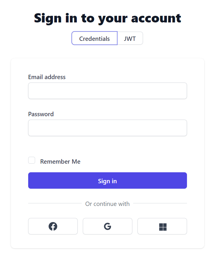
Unified Authentication
Authentication was a particularly challenging feature to get working in Blazor Server Apps and maintained in-sync across:
- Users's Authentication State in the Blazor Server App (Server Rendering SignalR Circuit)
- Authenticated HttpClient used to Sign In and make Authenticated API Requests
- Authenticated Browser Session
Where the default behaviour after authenticating in a Blazor App with an App's AuthenticationStateProvider was maintaining a "disconnected" Authentication state separate from the external browser session as "authenticating" in Blazor Server would not authenticate the Browser and a full page refresh would lose the Users Authenticated State, another issue was after a while the "Authenticated HttpClient" used to Authenticate the user and make authenticated API requests would be lost, resulting in the Authenticated user losing the ability to make Authenticated HttpClient Requests.
This was especially surprising given the recommendation is to use HttpClientFactory to resolve HttpClients, unfortunately the scopes used to resolve HttpClients and its Message Handlers is different to the App's scope used to maintain User's Authentication State where we were witnessing the Authenticated HttpClient Instances (configured with JWT Cookies) would get lost over time, a behavior identified in Andrew Lock's excellent post explaining HttpClient Message Handlers DI Scopes.
Fortunately the post does include a workaround for being able to access the App's same Request Scope by using HttpContextAccessor. Unfortunately whilst this approach did work, further research into using HttpClient in Blazor Server Apps revealed this approach should not be used in Blazor Server Apps:
WARNING
Additionally, again for security reasons, you must not use IHttpContextAccessor within Blazor apps. Blazor apps run outside of the context of the ASP.NET Core pipeline. The HttpContext isn't guaranteed to be available within the IHttpContextAccessor, nor is it guaranteed to be holding the context that started the Blazor app
This was particularly concerning since using IHttpContextAccessor was the only solution that ever worked in successfully maintaining Authentication state across Blazor Server App, HttpClient and external Browser session, and as such is frequently promoted as the solution for implementing Blazor Server Cookie Authentication or Calling protected APIs with Auth0.
Luckily we were able to get the desired authentication functionality by adopting Microsoft's "recommended way to pass request state to the Blazor app" through parameters to the root component which required breaking changes to _Host.cshtml to pass the Browser's Request Session to the App:
<component type="typeof(App)" param-InitialState="Request.GetInitialHostState()" render-mode="ServerPrerendered" />
Where this initial State is loaded into the App's scoped HostState context in App.razor:
@code {
    [Parameter] public InitialHostState? InitialState { get; set; }

    protected override Task OnInitializedAsync()
    {
        HostState.Load(InitialState);
        return base.OnInitializedAsync();
    }
}
Together with a custom AuthenticationStateProvider using JavaScript to serialize Blazor Server authentication tokens to Browser Cookies and a custom IClientFactory that utilizes the HostState to recreate an Authenticated HttpClient we were finally able to achieve the desired objective of keeping Blazor Server App Authentication in sync with the external Browser Session and HttpClient.
Now new Blazor Server Apps are able to Sign In externally, e.g. through standard OAuth workflow or the Integrated Sign In in API Explorer, Admin UI or Locode and this Authenticated state will be able to be passed into the Blazor Server App to Authenticate the user, likewise Authenticating in Blazor Server will update the Browser Cookies to authenticate the external browser session resulting in the desired and expected Unified Authentication behavior!
Upgrading existing Blazor Projects
To make use of new Blazor Features in this release, existing Blazor Server and WASM templates will need to include the latest tailwind classes ServiceStack.Blazor uses by updating:
It's not required, but we recommend calling JS.init() to initialize ServiceStack.Blazor's JS helper after importing it in _Layout.cshtml in Blazor Server or index.html in WASM:
<script src="/js/servicestack-blazor.js"></script>
<script>JS.init()</script>
To avoid future breaking changes to the base constructor when needing access to new dependencies, the Blazor WASM /Auth/ServiceStackStateProvider.cs was changed to inject a context encapsulating all its required dependencies:
public class ServiceStackStateProvider : BlazorWasmAuthenticationStateProvider
{
    public ServiceStackStateProvider(BlazorWasmAuthContext ctx, ILogger<BlazorWasmAuthenticationStateProvider> log)
        : base(ctx, log) { }
}
Whilst Blazor Server's /Auth/ServiceStackStateProvider.cs was changed to:
public class ServiceStackStateProvider : BlazorServerAuthenticationStateProvider
{
    public ServiceStackStateProvider(BlazorServerAuthContext ctx, ILogger<BlazorServerAuthenticationStateProvider> log)
        : base(ctx, log) {}
}
As described above the /Pages/_Host.cshtml and App.razor will also need updating to utilize Blazor Server's Unified Authentication.
Add ServiceStack Reference
The native types code generation in Add ServiceStack Reference was improved to better support C# nullable annotations where this mixed type containing both value and reference nullable types:
public class Data
{
    public int Value { get; set; }
    public int? OptionalValue { get; set; }
    public string Text { get; set; }
    public string? OptionalText { get; set; }

    [Required]
    public int RequiredValue { get; set; }
    [Required]
    public string RequiredText { get; set; }

    // Override default behavior
    [ApiMember(IsRequired=true)]
    public string? OverrideRequiredText { get; set; }

    [ApiMember(IsOptional=true)]
    public string OverrideOptionalText { get; set; }
}
Now generate the expected TypeScript DTO:
export class Data
{
    public value: number;
    public optionalValue?: number;
    public text: string;
    public optionalText?: string;
    // @Required()
    public requiredValue: number;

    // @Required()
    public requiredText: string;

    // @ApiMember(IsRequired=true)
    public overrideRequiredText: string;

    // @ApiMember(IsOptional=true)
    public overrideOptionalText?: string;
    //...
}
The C# Types Generator now also supports generating nullable reference types that your C# clients can opt-in to with the new AddNullableAnnotations option, e.g:
/* Options:
Date: 2022-12-06 11:03:22
Version: 6.41
Tip: To override a DTO option, remove "//" prefix before updating
BaseUrl: https://localhost:5001

//GlobalNamespace:
AddNullableAnnotations: True
IncludeTypes: Data
//...
*/

public partial class Data
{
    public virtual int Value { get; set; }
    public virtual int? OptionalValue { get; set; }
    public virtual string Text { get; set; }
    public virtual string? OptionalText { get; set; }

    [Required]
    public virtual int RequiredValue { get; set; }

    [Required]
    public virtual string RequiredText { get; set; }

    [ApiMember(IsRequired=true)]
    public virtual string OverrideRequiredText { get; set; }

    [ApiMember(IsOptional=true)]
    public virtual string? OverrideOptionalText { get; set; }
}
If most of your C# clients prefer their C# DTOs to have nullable type references, this default behavior can be changed with:
ConfigurePlugin<NativeTypesFeature>(feature => feature.MetadataTypesConfig.AddNullableAnnotations = true);
ServiceStack.Logging
To avoid breaking changes ILogTrace was added as an optional interface that ServiceStack.Logging providers can choose to implement if they support trace level logging, which the new ILog.Trace() and ILog.TraceFormat() extension methods will use if it exists, otherwise falls back to Debug Logging.