Our focus in this release was higher up the value chain with improvements across our existing templates, component libraries, new examples of utilizing ServiceStack features to quickly handle real-world tasks, existing templates for rapidly develop Admin UIs, developing responsive high-performance Apps with Razor SSG, easily enhance existing static websites with dynamic features powered by our new self-hosting CreatorKit App and an update on our exciting progress on a new ServiceStack GPT plugin for creating ChatGPT agents knowledge to invoke System APIs to accomplish specified tasks.
First up, we're excited to announce the availability of:

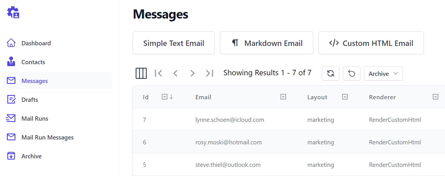
CreatorKit is a simple, customizable, self-hostable alternative solution to using Mailchimp for managing an organization's mailing lists, accepting newsletter subscriptions, defining customizable email layouts and templates and sending rich HTML emails to your Customers and subscribers using your preferred SMTP provider.
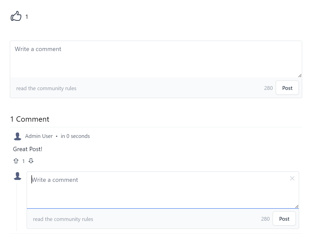
It also provides a private alternative to using Disqus to enhance websites with a threading and commenting system on your preferred blog posts and website pages that you want to be able to connect with your community on.
Everything you need
Grow your on-site community
CreatorKit offers all the tools you need to reach and retain users, from managing subscriber mailing lists to moderating a feature-rich comments system
- Mailing List Subscriptions.
- Collect and manage subscribers for your Newsletters and other Contact Mailing Lists.
- Email Templates.
- Create email templates utilizing a powerful #Script .NET templating system with layouts, partials & live previews.
- Rich Emails.
- Send plain-text or rich HTML emails with built-in Markdown editor, save email drafts and preview generated emails.
- Simple Integrations.
- Effortlessly integrate beautiful Tailwind Components into your existing site with simple, customizable progressive markup
- Content Moderation.
- Moderation tools for deleting or flagging unwanted comments, action reported comments by temporarily or permanent banning repeat offenders
- Newsletter generation.
- Save time with automatic Newsletter generation from including new content added to your static Razor SSG websites.
Start capturing your audience's engagement.
Download, customize CreatorKit to your brand and start building an engaged community around your website content today!
Enhance static websites
We're developing CreatorKit as an ideal companion for JAMStack or statically generated branded websites like Razor SSG enabling you to seamlessly integrate features such as newsletter subscriptions, email management, comments, voting, and moderation into your existing websites without the complexity of a custom solution.
It's ideally suited for Websites who want to keep all Mailing Lists Contacts and Authenticated User Comments in a different, private self-hosted site, isolated from your existing Customer Accounts and internal Systems.
With CreatorKit, you can enjoy the convenience of managing your blog's comments, votes, and subscriptions directly from your own hosted CreatorKit Portal without needing to rely on complex content management systems to manage your blog's interactions with your readers.
Additionally, CreatorKit makes it easy to send emails and templates to different mailing lists, making it the perfect tool for managing your email campaigns. Whether you're a blogger, marketer, or entrepreneur, CreatorKit is a great solution for maximizing your blog's functionality and engagement.
CreatorKit Features
The CreatorKit Portal offers a complete management UI to manage mailing lists, email newsletter and marketing campaigns, thread management and moderation workflow.
Email Management
Optimized Email UI's with Live Previews
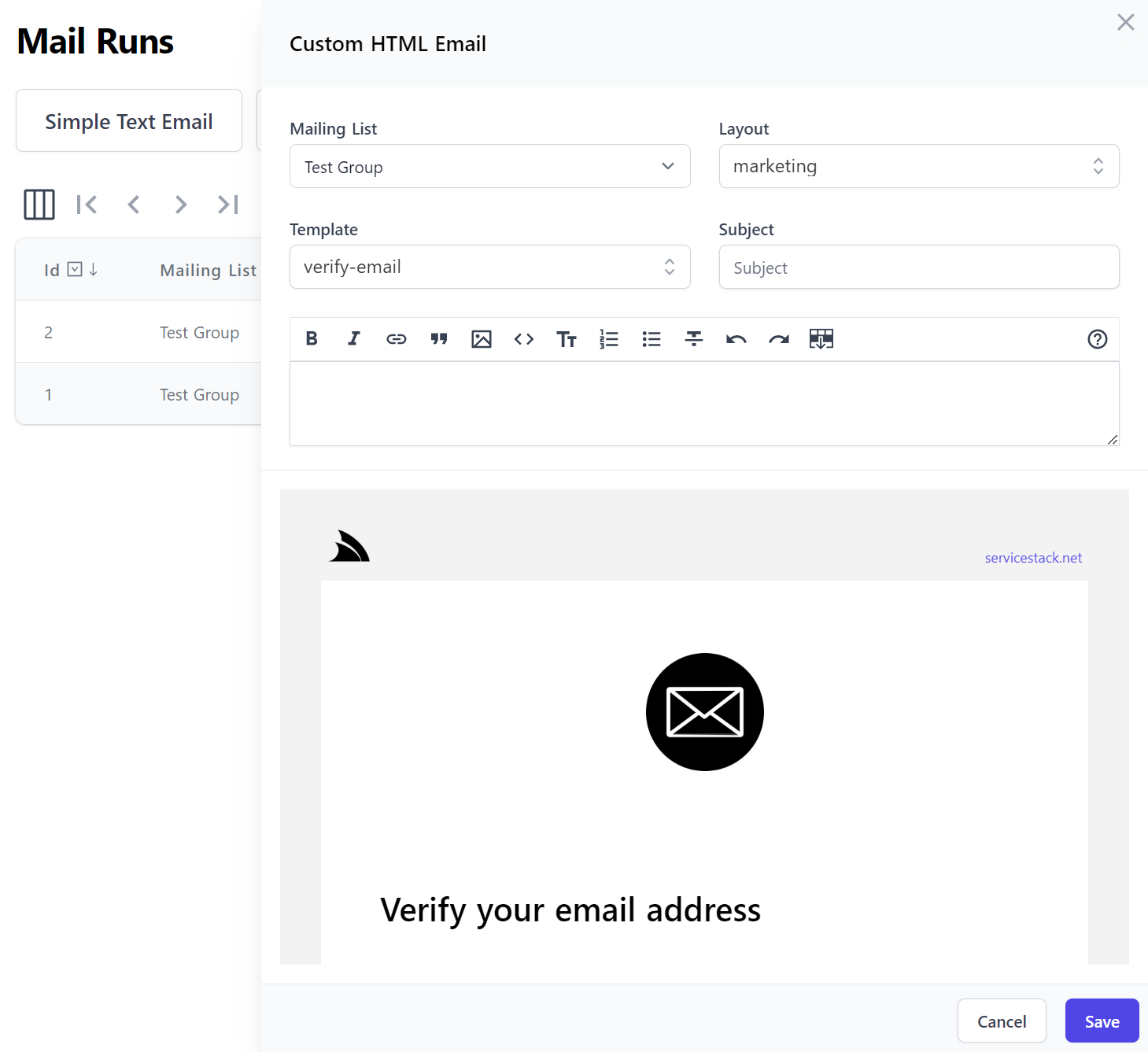
Custom HTML Templates
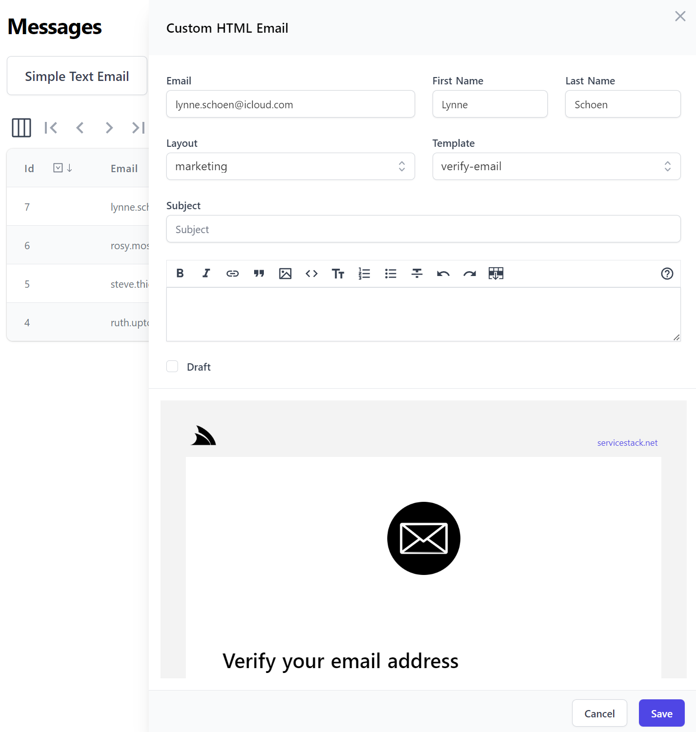
HTML Email Templates
Mailing List Email Runs
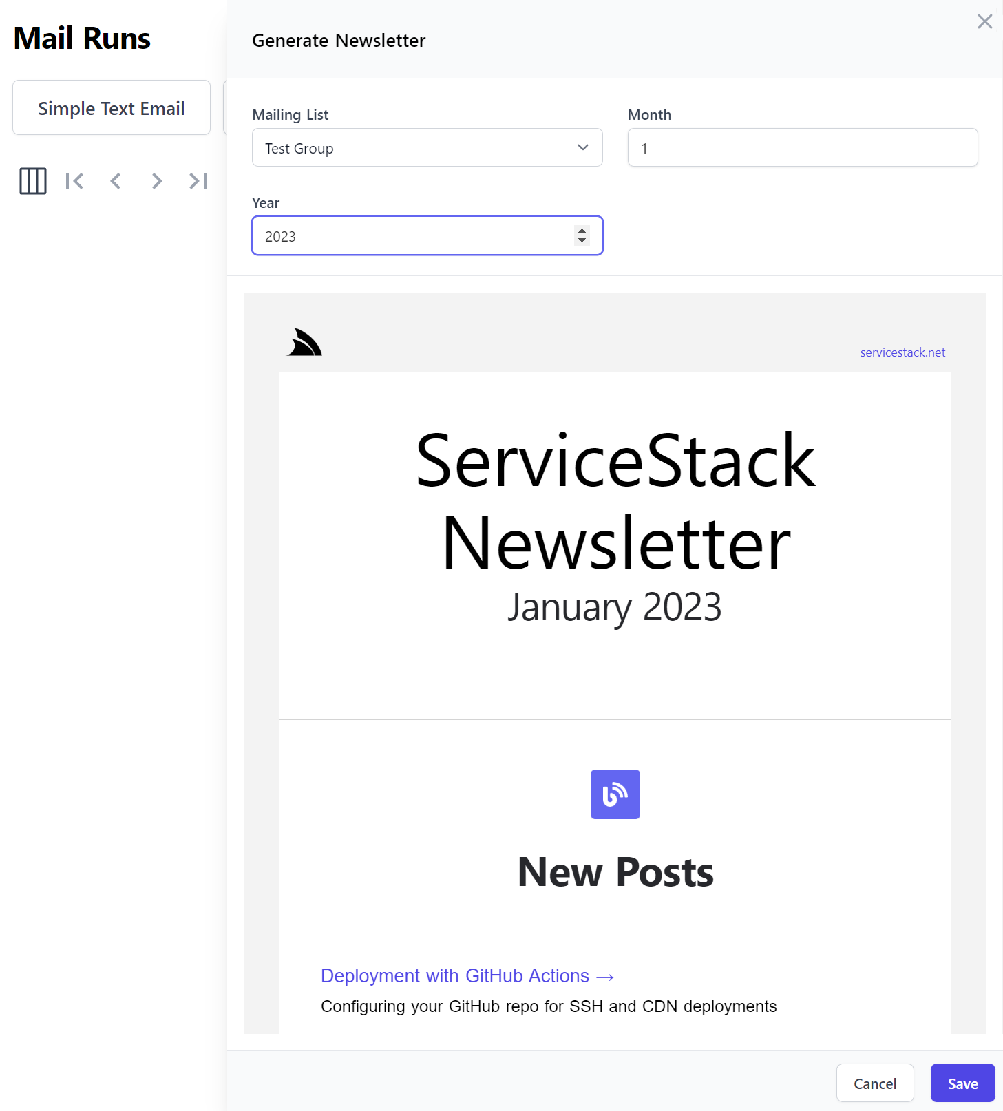
Newsletter Generation
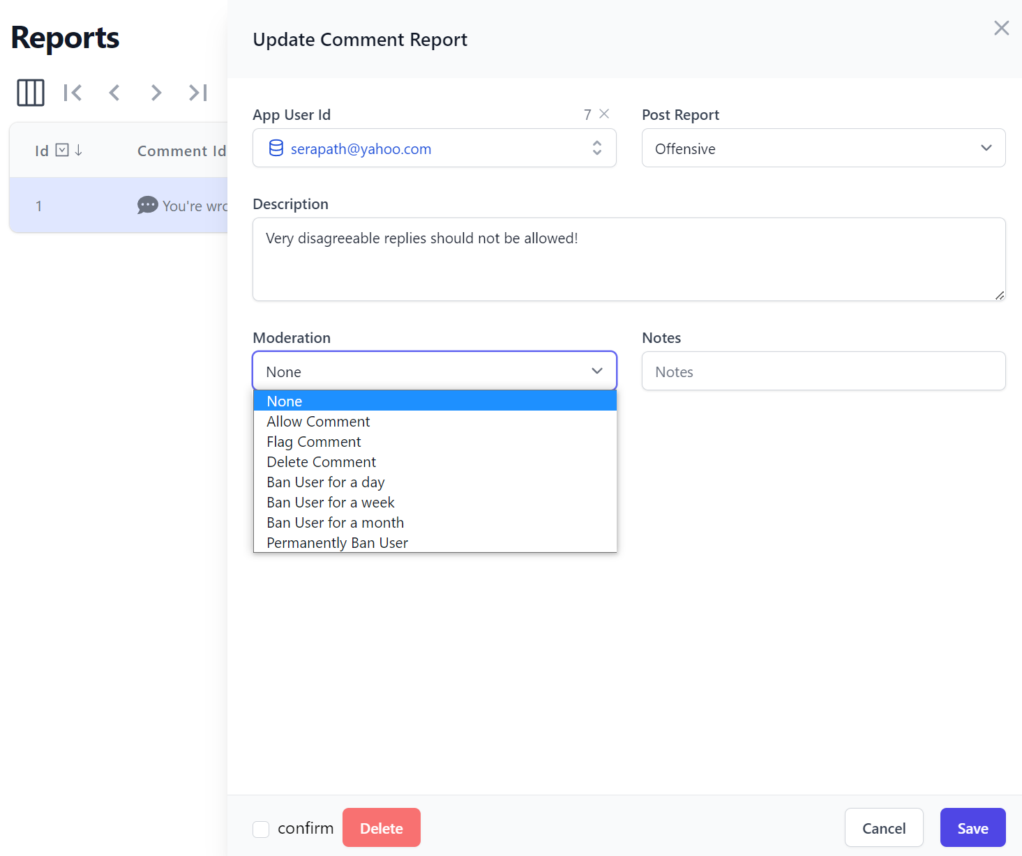
Comment Moderation
CreatorKit Docs
Checkout CreatorKit docs for more information about CreatorKit features and whether its features make sense for your existing websites:
To get started follow the installation instructions to download and configure it with your organization's website settings.
Future
As we're using CreatorKit ourselves to power all dynamic Mailing List and Comment System features on https://servicestack.net, we'll be continuing to develop it with useful features to empower static websites with more generic email templates and potential to expand it with commerce features, inc. Stripe integration, products & subscriptions, ordering system, invoicing, quotes, PDF generation, etc.
As a design goal CreatorKit's components will be easily embeddable into any external website, where it will be integrated into the Razor SSG project template to serve as a working demonstration and reference implementation. As such it's a great option if you're looking to create a Fast, FREE, CDN hostable, simple, modern statically generated website created with Razor & Markdown like ServiceStack/servicestack.net.
Feedback welcome
If you'd like to prioritize features you'd like to see first or propose new, generically useful features for static websites, please let us know in servicestack.net/ideas.
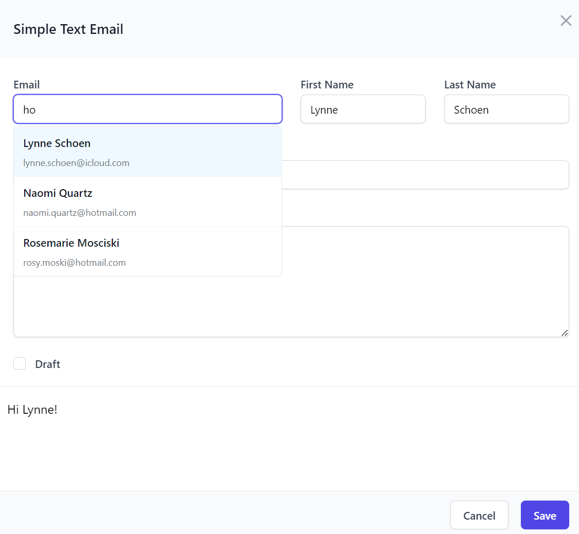
Markdown Editor Input
The CreatorKit Portal also makes use of several new Vue Components we're excited to share, starting with the new <MarkdownInput> component for
providing a rich Markdown Textarea Input to capture rich formatted text in Markdown with icons for markdown's popular formatting options
and convenience keyboard bindings for a pleasant intuitive authoring experience.
It behaves like all other Input components which you can embed in custom UIs as a standard Vue Component:
<MarkdownInput id="body" v-model="request.body" />
MarkdownInput Properties
Which offers a number of properties to customize its appearance and behavior:
defineProps<{
    status?: ResponseStatus|null
    id: string
    inputClass?: string
    label?: string
    labelClass?: string
    help?: string
    placeholder?: string
    modelValue?: string

    counter?: boolean
    rows?: number
    errorMessages?: string[]
    lang?: string
    autoFocus?: boolean
    disabled?: boolean
    helpUrl?: string
    hide?: string|MarkdownInputOptions|MarkdownInputOptions[]
}>()

type MarkdownInputOptions = "bold" | "italics" | "link" | "image" | "blockquote" | "code"
  | "heading" | "orderedList" | "unorderedList" | "strikethrough" | "undo" | "redo" | "help"
Just like other Input components it can also be annotated on Request DTO string properties to change which Input component it should use in AutoForm components, where it can be further customized with tailwind classes on its containing Field and Textarea Input elements, e.g:
public class MarkdownEmail
{
    [Input(Type="MarkdownInput", Label=""), FieldCss(Field="col-span-12", Input="h-56")]
    public string? Body { get; set; }
}
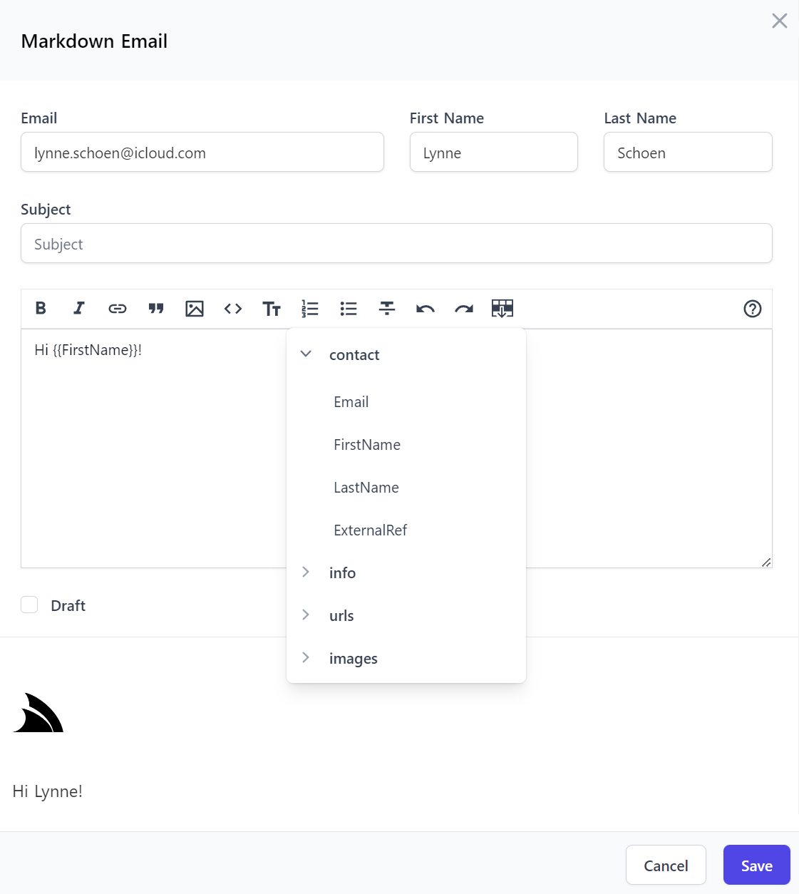
Which is how all CreatorKit's Markdown Email Forms used to generate their UIs, e.g:
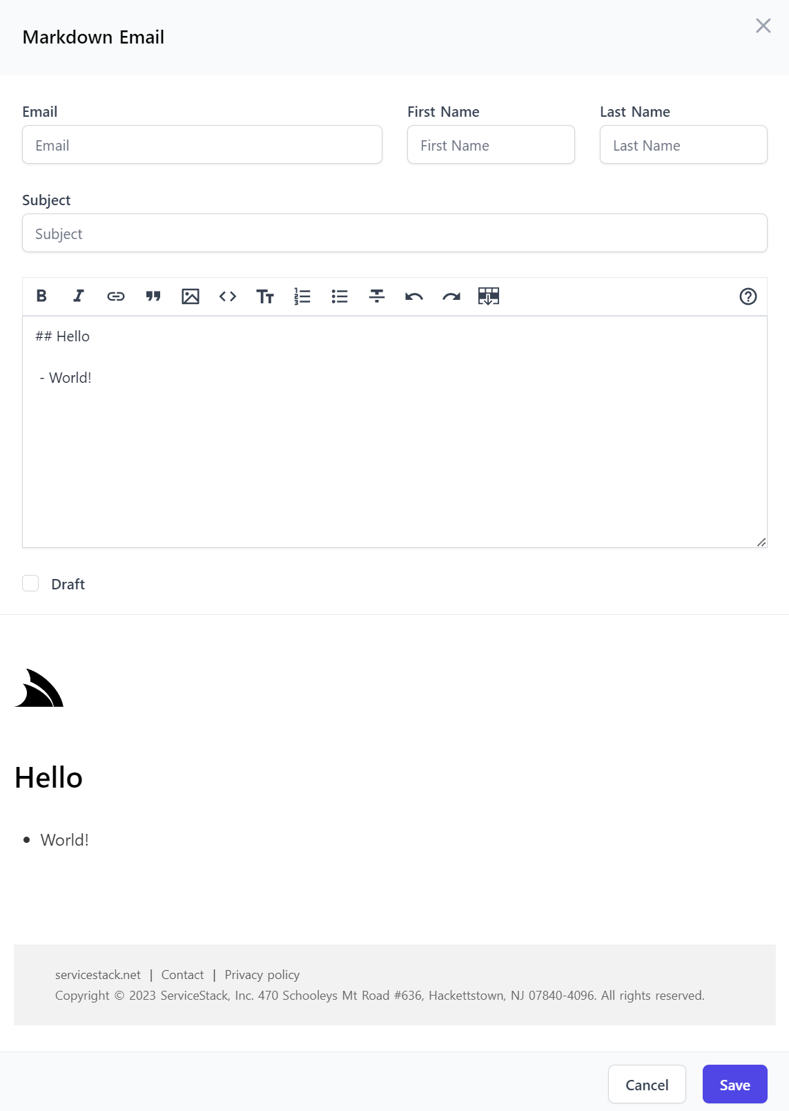
Which was generated using a customized <AutoCreateForm> component that's been enhanced to include an <EmailPreview> component to provide
live HTML Email previews as-you-type:
<AutoCreateForm v-if="selectedOp" :type="selectedOp?.name" @save="save" @done="done">
    <template #footer="{ model }">
        <EmailPreview :type="selectedOp?.name" :modelValue="model" />
    </template>
</AutoCreateForm>
Which was generated from its declarative Request DTO definition:
[Description("Markdown Email")]
public class MarkdownEmail : CreateEmailBase, IPost, IReturn<MailMessage>
{
    [ValidateNotEmpty]
    [FieldCss(Field = "col-span-12")]
    public string Subject { get; set; }

    [ValidateNotEmpty]
    [Input(Type="MarkdownEmailInput", Label=""), FieldCss(Field="col-span-12", Input="h-56")]
    public string? Body { get; set; }

    public bool? Draft { get; set; }
}

public abstract class CreateEmailBase
{
    [ValidateNotEmpty]
    [Input(Type="EmailInput")]
    public string Email { get; set; }

    [ValidateNotEmpty]
    [FieldCss(Field = "col-span-6 lg:col-span-3")]
    public string FirstName { get; set; }

    [ValidateNotEmpty]
    [FieldCss(Field = "col-span-6 lg:col-span-3")]
    public string LastName { get; set; }
}
The keen eyes among you may have noticed that the Body property references a MarkdownEmailInput component that's different from MarkdownInput and a
never seen before EmailInput component, which brings us to our next feature...
Custom Declarative Input Components
Where AutoForm components bound to your declarative Request DTOs are no longer limited to the Input Components in the Vue Component Library as they can now reference your own Input components instead!
The AutoForm components and rapid development workflow enabled by Locode's Auto UIs can put us in a tough spot at times where you want to deliver the most optimal UX but you don't want to leave the high productivity of Auto UI and Auto Form components to go back to creating manual forms.
Which we found ourselves in when developing CreatorKit where we want users to be able to quickly develop custom Email Templates and UIs, but not have to put in the effort to get the great UX we're used to when creating emails. For example we could've used the default LookupInput that's inferred and rendered for Reference Fields, but that would require opening a modal form to search through existing contacts every time we wanted to send an email.
But gmail have already showed us it's much more user-friendly and quicker to provide a non-modal autocomplete dropdown that automatically searches
our contact list as we type, which is what we ended up doing, without giving up the productivity of our validation-bound API Forms, by registering our custom EmailInput component with the Vue Component Library in app.mjs:
import ServiceStackVue, { useAuth } from "@servicestack/vue"
//...

ServiceStackVue.component('EmailInput', EmailInput)
ServiceStackVue.component('MarkdownEmailInput', MarkdownEmailInput)
EmailInput
That registers the custom EmailInput and MarkdownEmailInput components defined in Inputs.mjs
Where we can see that <EmailInput> is a customized <TextInput> with an added SelectEmail component that's used to display the Autocomplete
email dropdown:
export const EmailInput = {
    components: { SelectEmail },
    template: `<TextInput v-bind="$attrs" @update:modelValue="$emit('update:modelValue',$event)">
      <template #footer="{ id, inputElement, modelValue }">
        <SelectEmail v-if="inputElement" :inputElement="inputElement" :modelValue="modelValue" />
      </template>
    </TextInput>`,
    emits:['update:modelValue'],
}
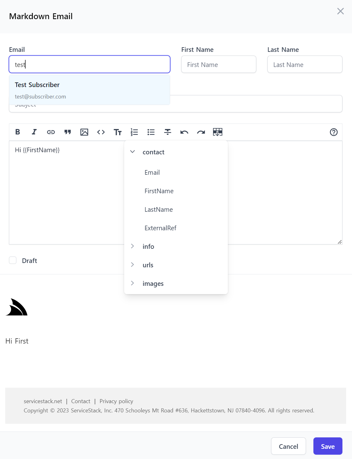
MarkdownEmailInput
Whilst <MarkdownEmailInput> is a customized <MarkdownInput> that's been extended with an additional
Insert Template Variables button that enables quick access for users to discover and insert user-defined Template Variables:
export const MarkdownEmailInput = {
    components: { InsertVariableButton },
    template: `<MarkdownInput v-bind="$attrs" @update:modelValue="$emit('update:modelValue',$event)">
      <template #toolbarbuttons="{ instance, textarea }">
        <InsertVariableButton :instance="instance" :textarea="textarea" />
      </template>
    </MarkdownInput>`,
    emits:['update:modelValue'],
}
Where they're effortlessly used together to deliver a great, optimal UX in all Markdown Email Forms:
AutoForm Components Everywhere
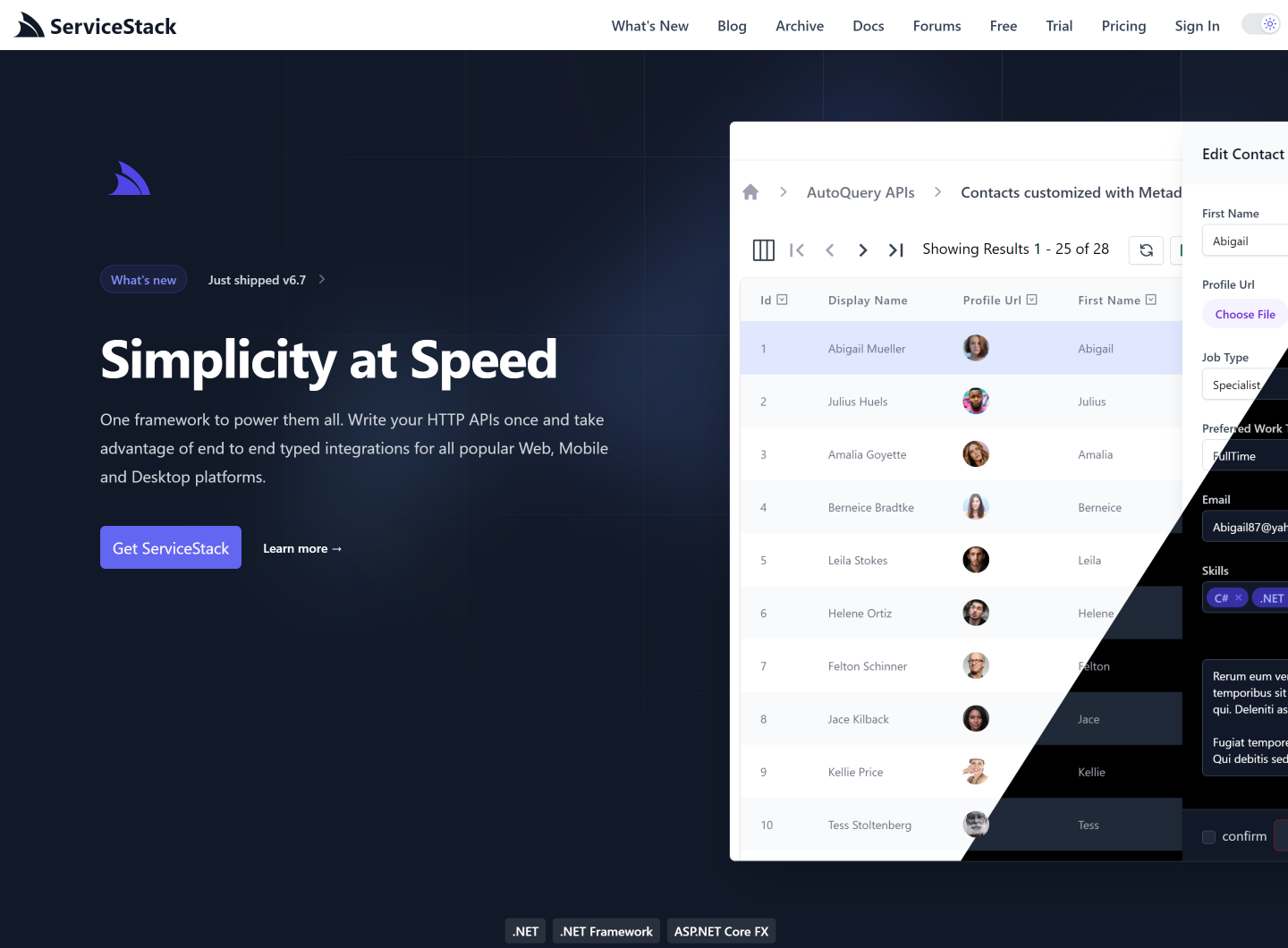
This feature has given AutoForm components all the flexibility needed to be able to deliver a great, optimal experience without sacrificing the high-productivity of ServiceStack's validation-bound Auto UIs and API Form components, as a result CreatorKit was able to continue to use AutoForm components for all 17 of its API Forms.
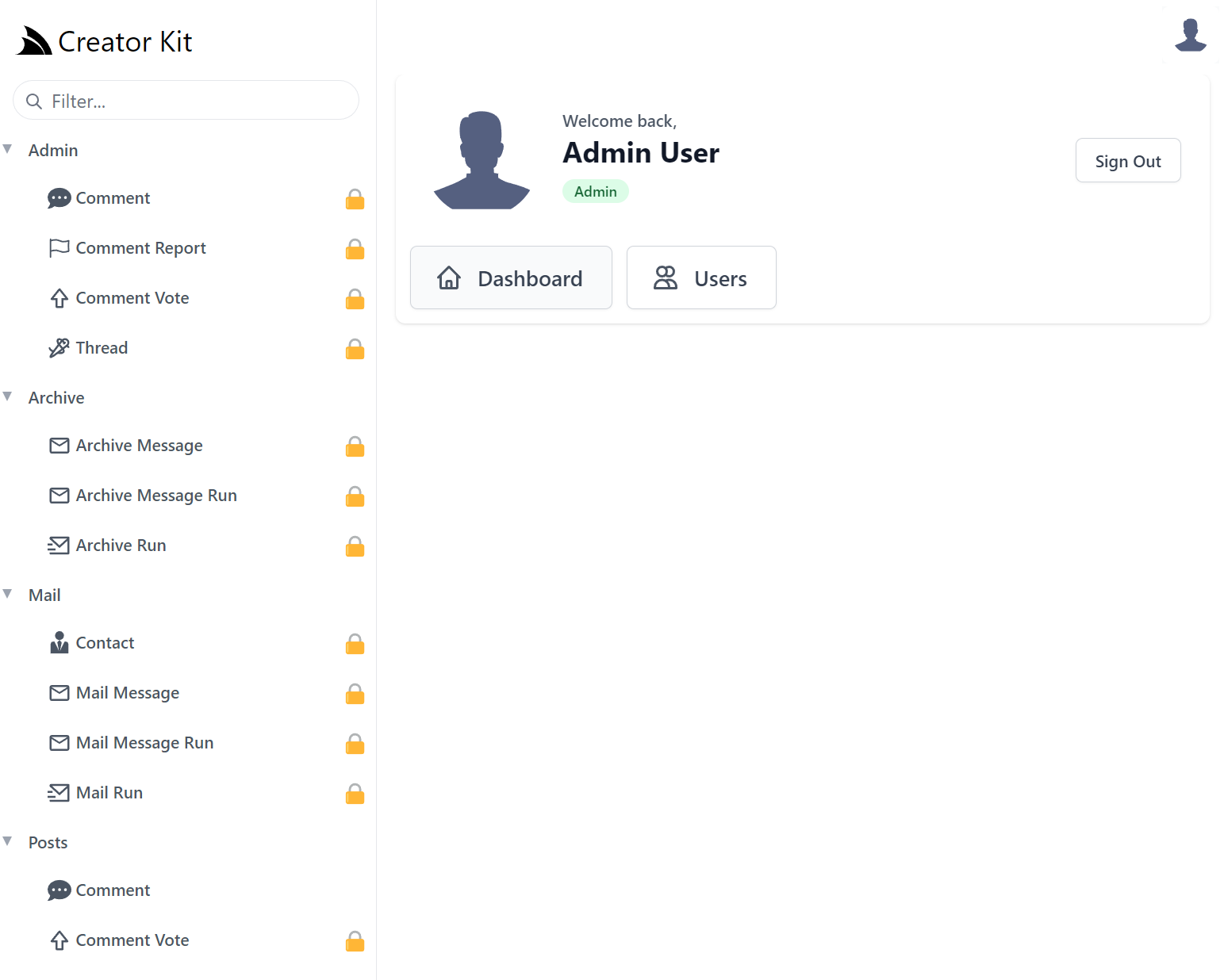
Build Admin UIs, Fast

Another high-productivity Vue Component available in this release is <SidebarLayout> which has been invaluable in being able to rapidly
create custom Admin UIs.
As we use AutoQuery to develop most new APIs we often lean on Locode's instant Auto Admin UI at the start of every project to manage backend RDBMS tables freeing, us to focus most of our efforts on the user-facing features adding the most value.
This was also the case for CreatorKit where its Locode Admin UI:
Which was sufficient enough to develop CreatorKit's embeddable Tailwind Components, however as the Admin Portal itself makes up a significant part of the user-facing value proposition in CreatorKit, we ultimately decided to develop a Custom UI for its Admin Portal in order to gain complete control of its UX and freedom to create the optimized UI we want to in future.
Adopting a Simple, Modern JavaScript approach free of build tools complexity with the instant live reload of a simple static index.html yielded the most productive workflow, combined with all built-in UIs having been rebuilt in reusable Vue 3 components meant we were able to replicate most of Locode's functionality into a customizable Vue App in no time.
SidebarLayout Vue Component
So much so that we believe this is a great progressive option for others needing to move beyond Locode or
looking to create their own customizable Admin UI. To minimize the effort we've encapsulated Tailwind's Responsive
Sidebar Navigation into a reusable
<SidebarLayout> Vue 3 component and upgraded the vue-mjs project template
to include both a Razor Pages server rendered Admin UI:
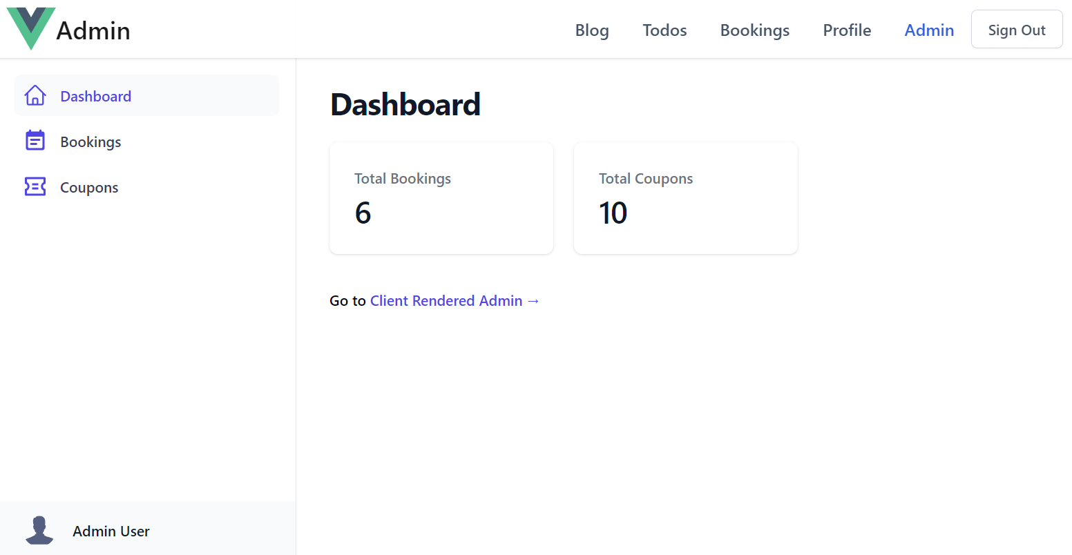
As well as a client rendered Admin UI created from a single static index.html
We'll quickly go through how we can easily extend each layout to with new pages and AutoQueryGrid components to manage new tables.
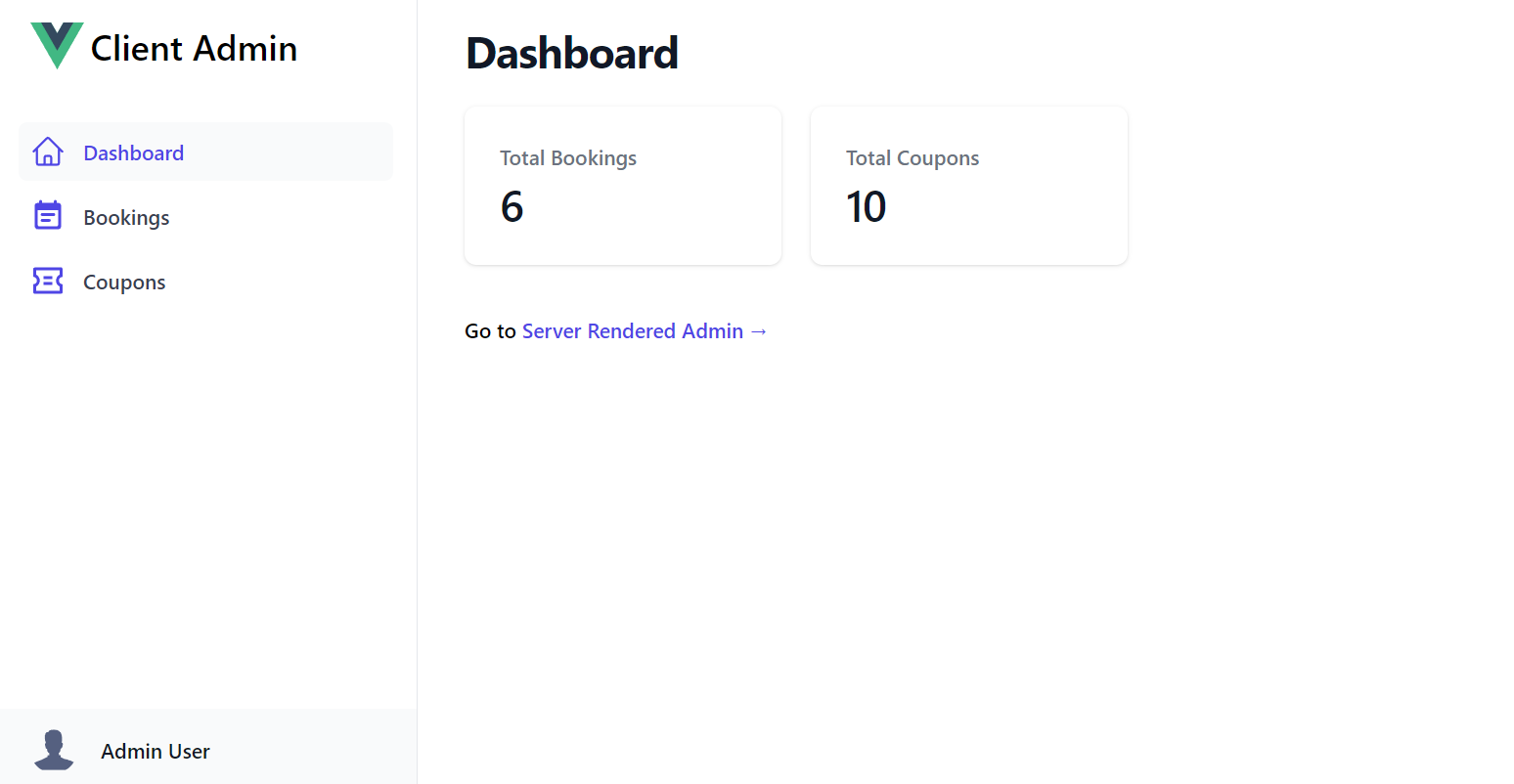
Client Admin UI
The customizable UI is maintained within a single JS Object literal that defines all the sections in the Admin UI. Each section defines the Menu Item on the Sidebar, the Title of the Page and the Vue 3 component body to display when selected:
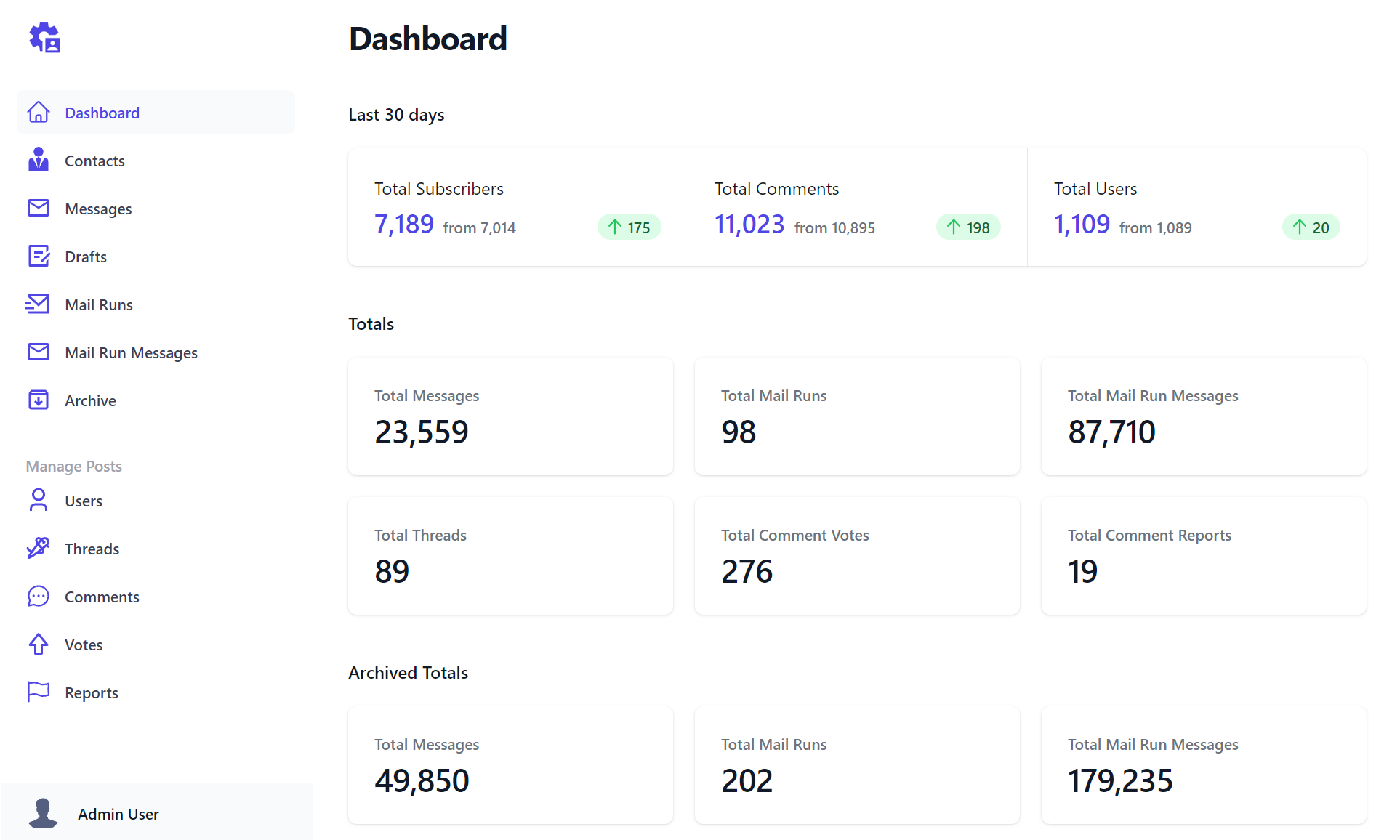
const sections = {
Dashboard: {
icon: `<svg fill="none">...</svg>`,
component: {
template:`
<div>
<dl class="mt-5 grid grid-cols-1 gap-5 sm:grid-cols-3">
<div v-for="stat in stats" @click="$emit('nav',stat.label)" class="...">
<dt class="...">Total {{humanize(stat.label)}}</dt>
<dd class="...">{{formatNumber(stat.total)}}</dd>
</div>
</dl>
</div>`,
setup() {
const client = useClient()
const stats = ref([])
client.swr(new AdminData(), r => stats.value = r.response?.pageStats || [])
const formatNumber = value => new Intl.NumberFormat().format(value)
return { stats, humanize, formatNumber }
}
},
},
Bookings: {
type: 'Booking',
component: {
template:`<AutoQueryGrid :type="type"
selected-columns="id,name,roomType,roomNumber,bookingStartDate,cost,couponId,discount"
:header-titles="{ roomNumber:'Room No', bookingStartDate:'Start Date', couponId:'Coupon' }"
:visible-from="{ roomNumber:'lg', cost:'md', couponId:'xl', discount:'never' }" />`,
},
},
Coupons: {
type: 'Coupon',
component: {
template:`<AutoQueryGrid :type="type" />`,
},
},
}
Each section can use optional properties to customize their appearance with the properties below:
icon- SVG Icon to use in the Sidebar Menu Itemtype- Metadata Type to use to populate icon or reference in componentlabel- The label of the menu item on the Sidebartitle- The Title of the pagegroup- The Sidebar group where the menu item should be displayed incomponent- The page's Vue 3 component body
All properties except for component are optional, defaulting to the section name and default icon when not provided.
The above example creates an Admin UI with 3 different types of pages:
- A custom component to display the Dashboard
- A customized responsive AutoQueryGrid to manage Bookings
- A default AutoQueryGrid to manage Coupons
Most of the time you'll just need to use the default AutoQueryGrid to enable a CRUD UI to manage your RDBMS tables.
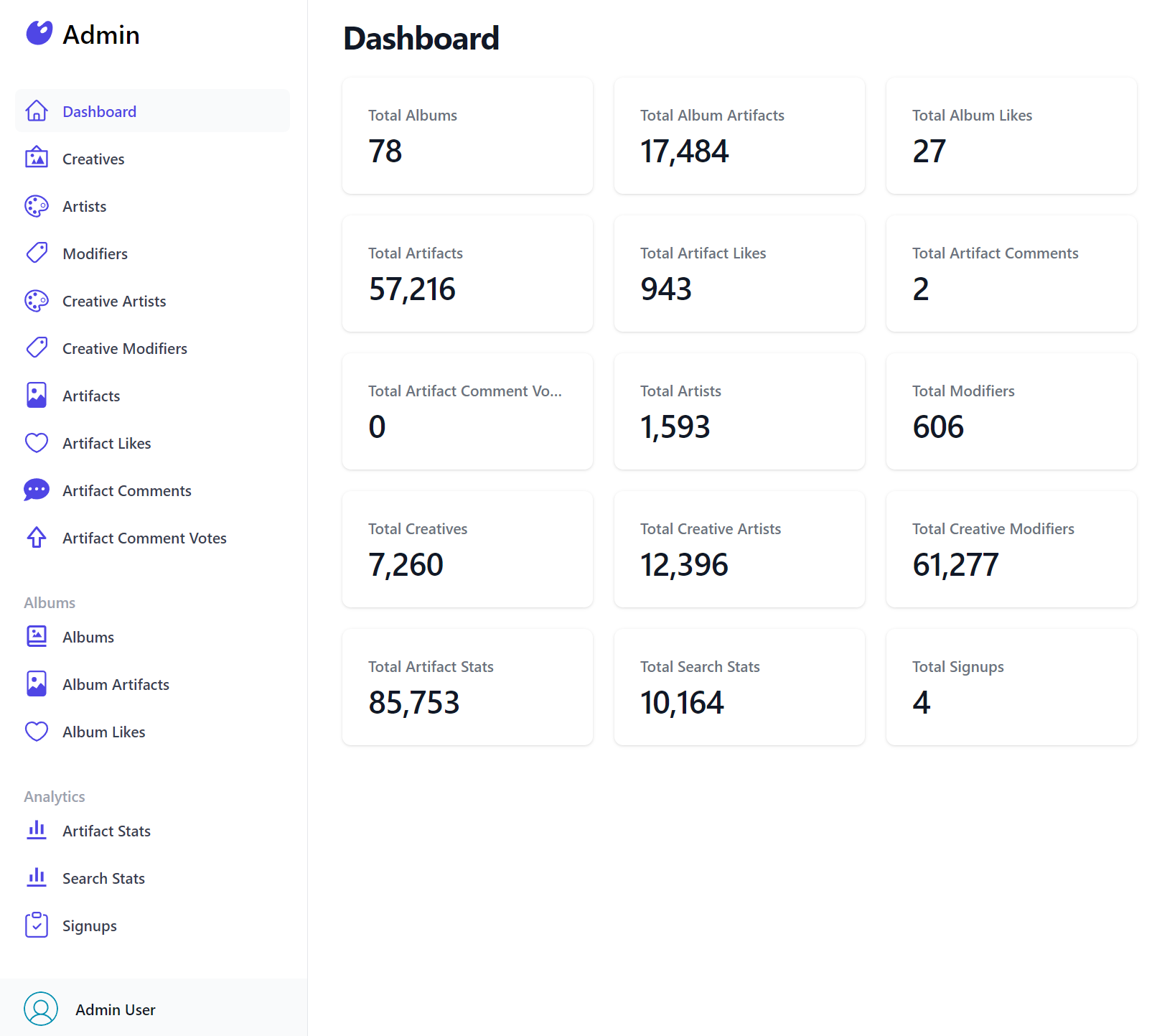
Which was all that was needed to render Vue Diffusion's Admin UI:
const sections = {
Dashboard: {
icon: `<svg>...</svg>`,
component: {
template:`
<div>
<dl class="...">
<div v-for="stat in stats" @click="$emit('nav',stat.label)" class="...">
<dt class="...">Total {{humanize(stat.label)}}</dt>
<dd class="...">{{formatNumber(stat.total)}}</dd>
</div>
</dl>
</div>`,
setup() {
const client = useClient()
const stats = ref([])
client.swr(new AdminData(), r => stats.value = r.response?.pageStats || [])
const formatNumber = value => new Intl.NumberFormat().format(value)
return { stats, humanize, formatNumber }
}
},
},
Creatives: {
type: 'Creative',
component: { template:`<AutoQueryGrid :type="type" />` },
},
Artists: {
type: 'Artist',
component: { template:`<AutoQueryGrid :type="type" />` },
},
Modifiers: {
type: 'Modifier',
component: { template:`<AutoQueryGrid :type="type" />` },
},
CreativeArtists: {
type: 'CreativeArtist',
component: { template:`<AutoQueryGrid :type="type" />` },
},
CreativeModifiers: {
type: 'CreativeModifier',
component: { template:`<AutoQueryGrid :type="type" />` },
},
Artifacts: {
type: 'Artifact',
component: { template:`<AutoQueryGrid :type="type" />` },
},
ArtifactLikes: {
type: 'ArtifactLike',
component: { template:`<AutoQueryGrid :type="type" />` },
},
ArtifactComments: {
type: 'ArtifactComment',
component: { template:`<AutoQueryGrid :type="type" />` },
},
ArtifactCommentVotes: {
type: 'ArtifactCommentVote',
component: { template:`<AutoQueryGrid :type="type" />` },
},
Albums: {
group: 'Albums',
type: 'Album',
component: { template:`<AutoQueryGrid :type="type" />` },
},
AlbumArtifacts: {
group: 'Albums',
type: 'AlbumArtifact',
component: { template:`<AutoQueryGrid :type="type" />` },
},
AlbumLikes: {
group: 'Albums',
type: 'AlbumLike',
component: { template:`<AutoQueryGrid :type="type" />` },
},
ArtifactStats: {
group: 'Analytics',
type: 'ArtifactStat',
component: { template:`<AutoQueryGrid :type="type" />` },
},
SearchStats: {
group: 'Analytics',
type: 'SearchStat',
component: { template:`<AutoQueryGrid :type="type" />` },
},
Signups: {
group: 'Analytics',
type: 'Signup',
component: { template:`<AutoQueryGrid :type="type" />` },
},
}
Server Admin UI
For developers preferring to develop Server rendered Web Apps the vue-mjs project template also includes a Multi Page App (MPA) Razor Pages & Vue App which defines the Admin Sections in the custom C# Admin/_Layout.cshtml
 (string label, string href, string icon)[] sections =
 {
     ("Dashboard", "/admin/",         Icons.Dashboard),
     ("Bookings",  "/admin/bookings", Icons.Booking),
     ("Coupons",   "/admin/coupons",  Icons.Coupon),
 };
Where each section links to the different Admin UI Razor Pages:
Admin/Index.cshtml
Generates the Admin UI Dashboard which retrieves the data for the page from the AdminData API invoked
with the internal Service Gateway:
@page
@{
    ViewData["Title"] = "Dashboard";
    var adminData = await Html.Gateway().SendAsync(new AdminData());
}

<div>
    <dl class="mt-5 grid grid-cols-1 gap-5 sm:grid-cols-3">
        @foreach (var item in adminData.PageStats)
        {
            <a href="/admin/@item.Label.ToLower()" class="...">
                <dt class="...">Total @item.Label</dt>
                <dd class="...">@item.Total</dd>
            </a>
        }
    </dl>
</div>
Admin/Bookings.cshtml
Defines the same responsive AutoQueryGrid to manage the Bookings RDBMS Table:
@page
@{
    ViewData["Title"] = "Bookings";
}

<auto-query-grid type="Booking"
    selected-columns="id,name,roomType,roomNumber,bookingEndDate,cost,couponId,discount"
    :header-titles="{ roomNumber:'Room No', bookingStartDate:'Start Date', couponId:'Coupon' }"
    :visible-from="{ roomNumber:'lg', cost:'md', couponId:'xl', discount:'never' }" ></auto-query-grid>
Admin/Coupons.cshtml
Utilizes the default AutoQueryGrid component to manage the Coupons RDBMS Table:
@page
@{
    ViewData["Title"] = "Coupons";
}

<auto-query-grid type="Coupon"></auto-query-grid>
Creating Custom Admin UIs
Easiest way to start creating Custom Admin UIs is to start with a new vue-mjs Razor Pages template containing both client and server rendered Admin UIs:
Alternatively you can download their pages to incorporate them into your existing Tailwind Projects:
Client Admin UI
Server Admin UI
Creating ChatGPT Agents to call System APIs
We've been working on different patterns of development to enable ChatGPT to leverage an App's ServiceStack APIs to solve given tasks. This is done through various prompting techniques which allows the Agent to reason about the context of the conversation and make decisions to reach for different 'tools' (your APIs) when trying to achieve a specific goal.
For anyone wishing to incorporate AI into their systems we've created a introductory video into the techniques of how to leverage Large Language Models (LLMs) like GPT so they can make informed decisions on which of your internal APIs they should call to accomplish a given task described in natural language:
We've created a working example of this in action to help facilitate automated solutions using the reasoning capabilities of ChatGPT with their ServiceStack APIs in the new GPTMeetingAgent GitHub project, that's being hosted at:
Use Natural Language to instruct GPT Meeting Agents to Book Meetings using internal System APIs
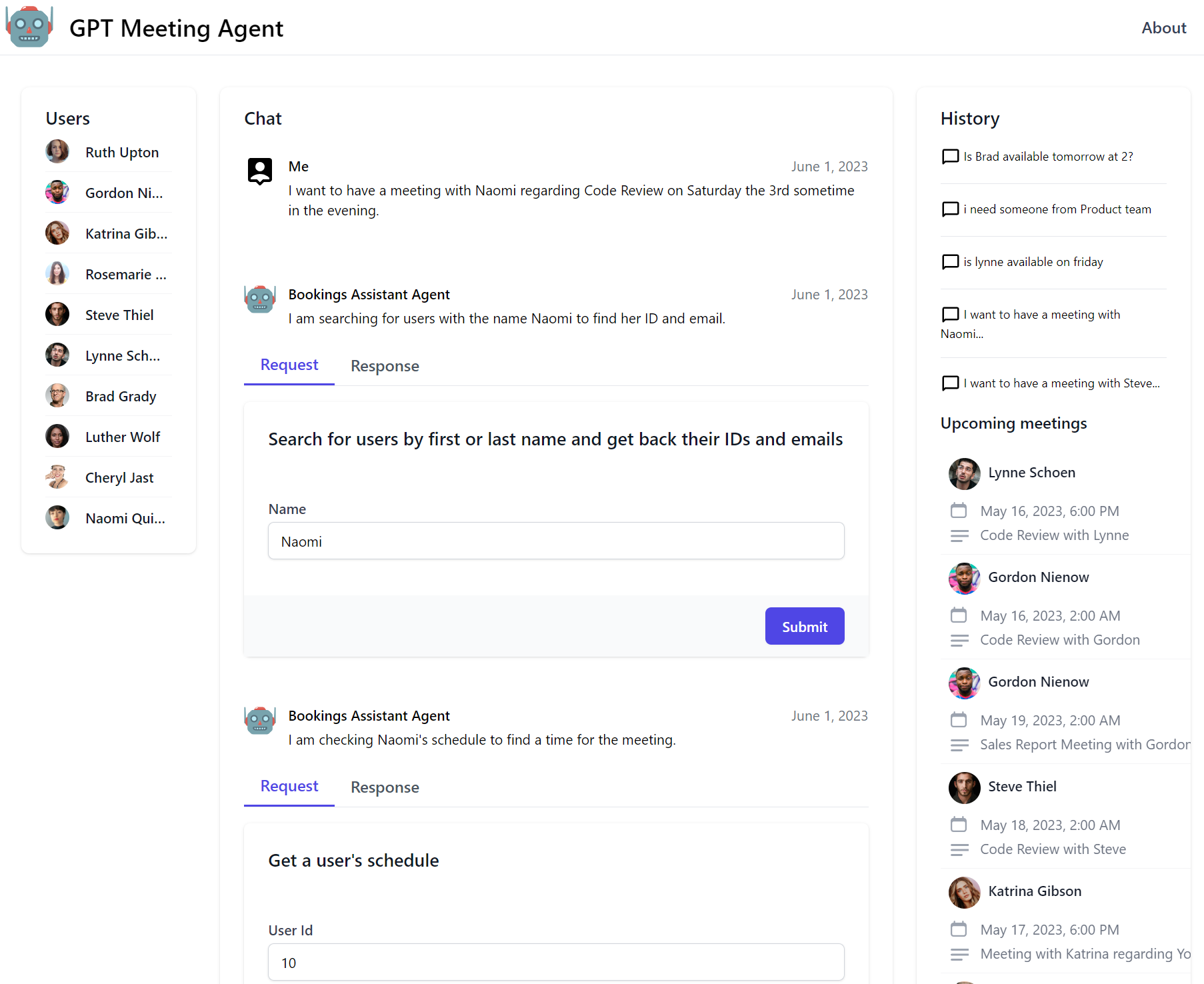
Which uses a new GptAgentFeature plugin to make it easy to create multiple Chat GPT Agents, define their roles and which of your ServiceStack APIs you want them to have access to, e.g:
var gptAgentFeature = new GptAgentFeature();

gptAgentFeature.RegisterAgent(new GptAgentData {
        Name = "BookingAgent",
        PromptBase = File.ReadAllText(
            $"{Path.Combine("Prompts", "BasePromptExample.txt")}"
        ),
        Role = "An AI that makes meeting bookings between staff."
    },
    agentFactory: data => new OpenAiChatGptAgent(chatGptApiKey,data),
    includeApis: new List<string>
    {
        Tags.Teams,
        Tags.Calendar,
    });
The above configuration registers a new Agent with the name BookingAgent and a description of what it does as the Role.
It also is configured to include the APIs with the Tags.Teams and Tags.Calendar tags, which are the APIs that the Agent will use to achieve its goals.
Only these APIs will be exposed to the Agent, and the Agent will only be able to use them in the context of the prompt that is provided to it.
The Agent will also use the Description of the API to assist the Agent in understanding how and when to use the API.
[Tag("Teams"), Description("Search for users by name")]
public class SearchUsers : IReturn<SearchUsersResponse>
{
    public string Name { get; set; }
}
Autonomy of GPT Agents
In fact the GPT Agents will automatically reach out to use all the APIs made available to them to fulfil the request it was tasked with.

The video walks through an example of this by adding "Ensure the meeting room has a projector" to the meeting request, a statement which it largely
ignores initially since it has no way of knowing which meeting rooms have projectors, but when we add a new ListMeetingRooms AutoQuery API that lists
meeting rooms along with their related resources like Projector, SmartBoard and Whiteboard:
public enum MeetingRoomResource
{
    SmartBoard,
    Projector,
    Whiteboard,
    VideoConference,
    SpeakerPhone
}
Then make it available to the GPT Meeting Agent by tagging it with Tags.Teams it's configured with:
[Tag(Tags.Teams), Description("Get a list of meeting rooms and their resources.")]
public class ListMeetingRooms : QueryDb<MeetingRoom> { }

public class MeetingRoom
{
    [AutoIncrement]
    public int Id { get; set; }
    public string Name { get; set; }
    public string Location { get; set; }
    public List<string> Resources { get; set; }
}
Then extend the CreateCalendarEvent API that books the meeting to include a reference to the meeting room by Id:
[Tag(Tags.Calendar), Description("Create a meeting")]
[ConfirmationRequired("Are you sure you want to create a meeting?")]
public class CreateCalendarEvent : IReturn<CreateCalendarEventResponse>
{
    public string Subject { get; set; }
    public string Body { get; set; }
    [Input(Type = "datetime-local")]
    public DateTime Start { get; set; }
    [Input(Type = "datetime-local")]
    public DateTime End { get; set; }
    public string AttendeeEmail { get; set; }
    // Newly Added
    public int? MeetingRoomId { get; set; }
}
Now after we restart the application, our injected Service Commands now reflect both the new ListMeetingRooms API and the updated CreateCalendarEvent
API in the Agent's prompt.
Now when we ask the Agent to "Ensure the meeting room has a projector", the added context results in the agent calling our new ListMeetingRooms API
to discover which Meeting Rooms have a projector, which it then uses to populate the correct MeetingRoomId when booking a meeting.
This is particularly exciting as no other changes were needed for the Agent to adopt this new intuitive behavior, which is reflected in both the Agent and the UI which it renders using AutoForm components from the APIs definition.
Human Verification Steps
We believe there's a great opportunity to be had in leveraging Chat GPT in this way to automate system tasks, populate forms and invoke APIs, but also that you'd want to intervene at important steps to verify the information is correct before authorizing the Action.
We've added support for this feature by using the [ConfirmationRequired] attribute which instructs the UI which specific API forms can only be
submitted manually, e.g:
[ConfirmationRequired("Are you sure you want to create a meeting?")]
public class CreateCalendarEvent : IReturn<CreateCalendarEventResponse> { }
Which is used in GPT Meetings to add a verification step allowing users to inspect the populated API Form that the GPT Meeting Agent created before deciding whether to create, modify or discard the Booking.
How it works
If you're interested to learn more about how this works behind the scenes checkout our Creating ChatGPT Agents Blog Post which goes into the background of how LLM's work in more detail and how we can use chain-of-thought and prompt engineering techniques to get the most out of them.
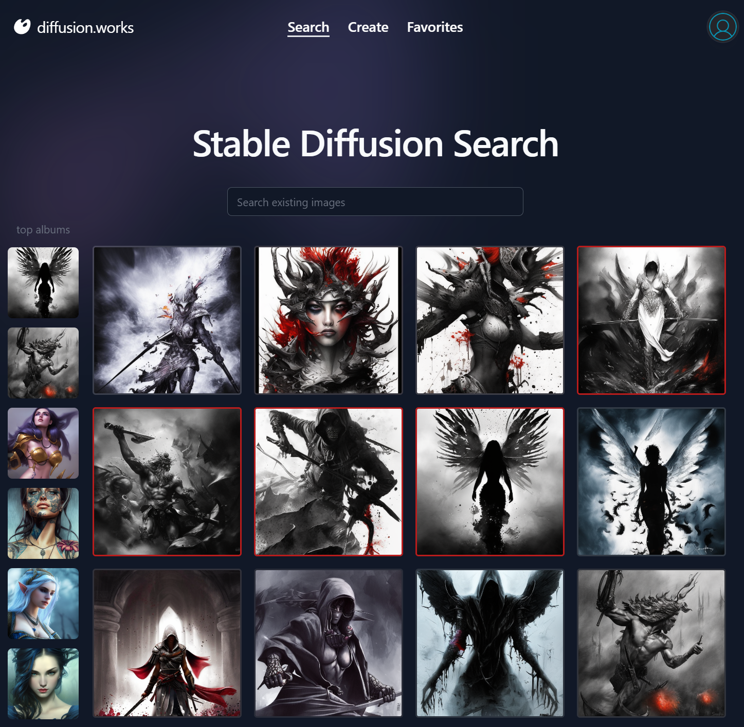
Vue Stable Diffusion

Just as blazordiffusion.com was created to showcase ServiceStack's Blazor Server and Blazor WASM project templates and components, we've also recreated a new Stable Diffusion UI in Vue to showcase the Razor SSG Project Template and Tailwind Vue Component Library that's now available at:
https://diffusion.works
Vue Stable Diffusion
Weighing close to 100 APIs, Blazor Diffusion is good representation of a medium-sized real-world App that can be used to compare the end user UX of different popular UI technologies used to develop Web Apps.
These Diffusion Apps are especially comparable as both Blazor WASM and Vue are both SSG Jamstack Apps deployed to a CDN which both access the same backend .NET APIs and both make use of the Tailwind Blazor Component Library and Vue Component Library rewritten in Vue, so any differences in UX are predominantly differences in what the UI technologies can deliver.
We'll look at covering the development workflow, productivity, startup and runtime performance of Blazor Server, Blazor WASM and Vue in a future post, for now you can compare their GitHub code-bases and Live Demos of each or download and run them locally to evaluate their code-base size, development workflow and performance to evaluate the different UI technologies:
| Name | Repo | Live Demo |
|---|---|---|
| Vue | NetCoreApps/VueDiffusion | https://diffusion.works |
| Blazor WASM | NetCoreApps/BlazorDiffusionWasm | blazordiffusion.com |
| Blazor Server | NetCoreApps/BlazorDiffusion | server.blazordiffusion.com |
It's best to evaluate Blazor Server by running it locally as it in particular has poor responsiveness when served over high internet latencies, but loads and runs exceptional well in low latency environments like Intranets which is the only environment where we'd recommend hosting it.
Razor SSG
Vue Diffusion is built differently from other Razor SSG Apps as instead of being pre-rendered from static content like Markdown documents, it's prerendered from https://blazordiffusion.com APIs to render its dynamic Albums, Top and Latest pages at deployment which it does by configuring the App's Service Gateway to reference external Blazor Diffusion APIs:
services.AddSingleton<IServiceGateway>(implementationFactory:
    provider => new JsonApiClient(AppConfig.Instance.ApiBaseUrl!));
Resulting in all APIs invoked within Razor Pages being delegated to external Blazor Diffusion APIs as the data source to generate its prerendered Razor Pages.
Features
For a preview of the development model of Razor SSG enhanced with Vue Components, checkout some of the different pages and their implementations:
Stable Diffusion Search Index.cshtml
Generate Images Create.cshtml | Create.mjs
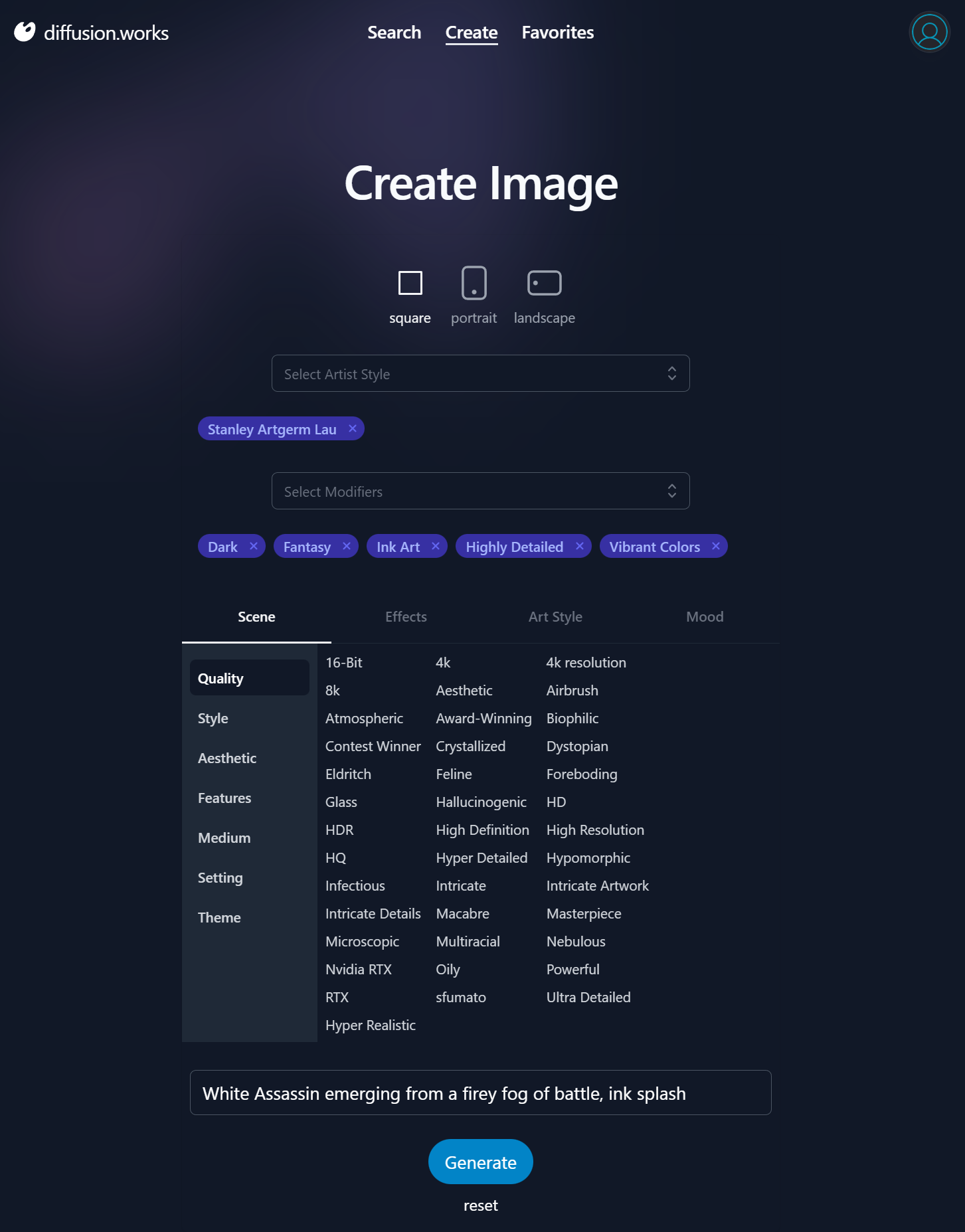
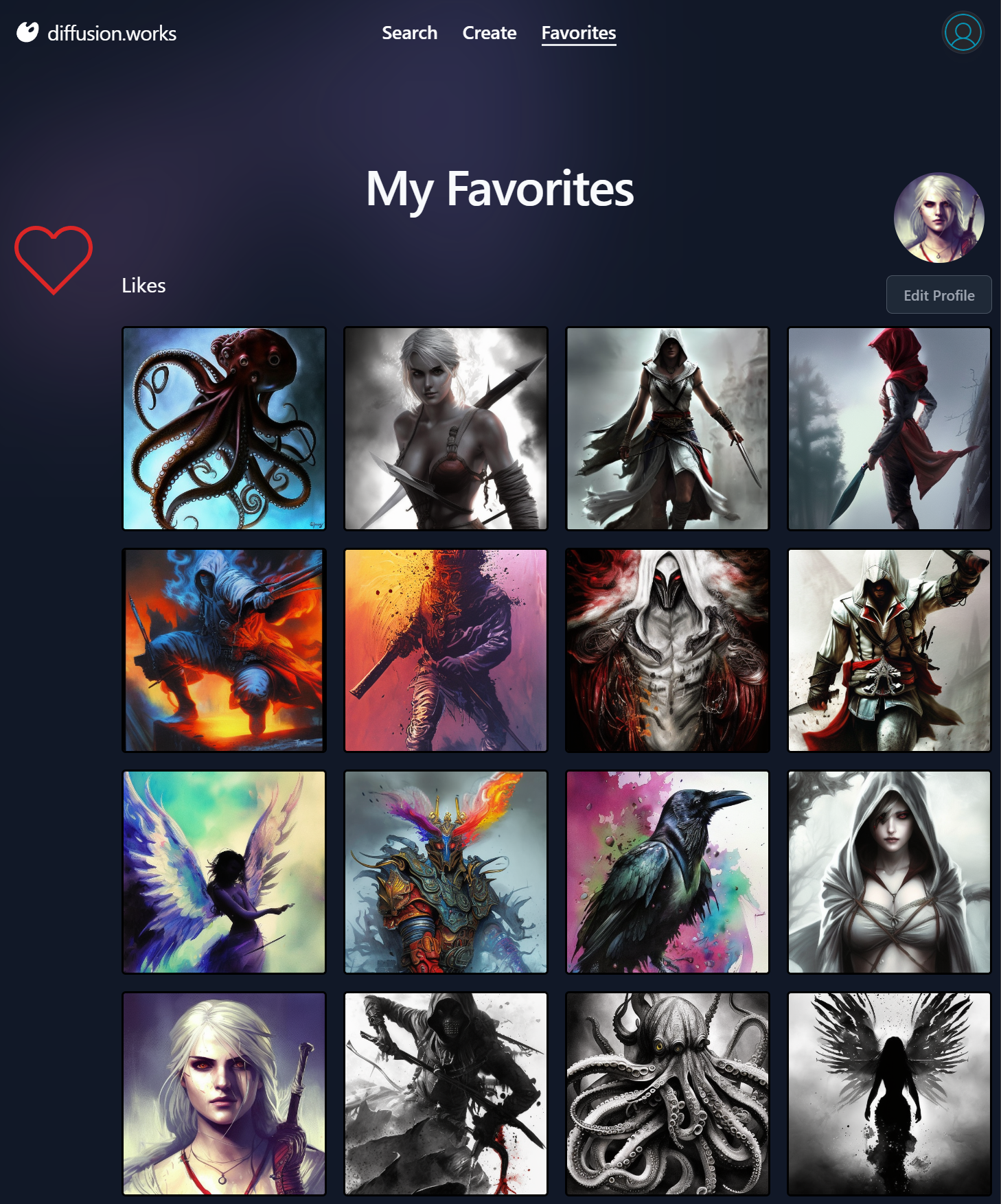
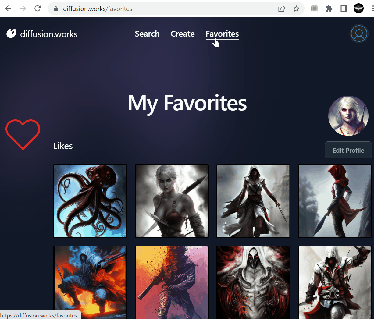
Favorites Favorites.cshtml
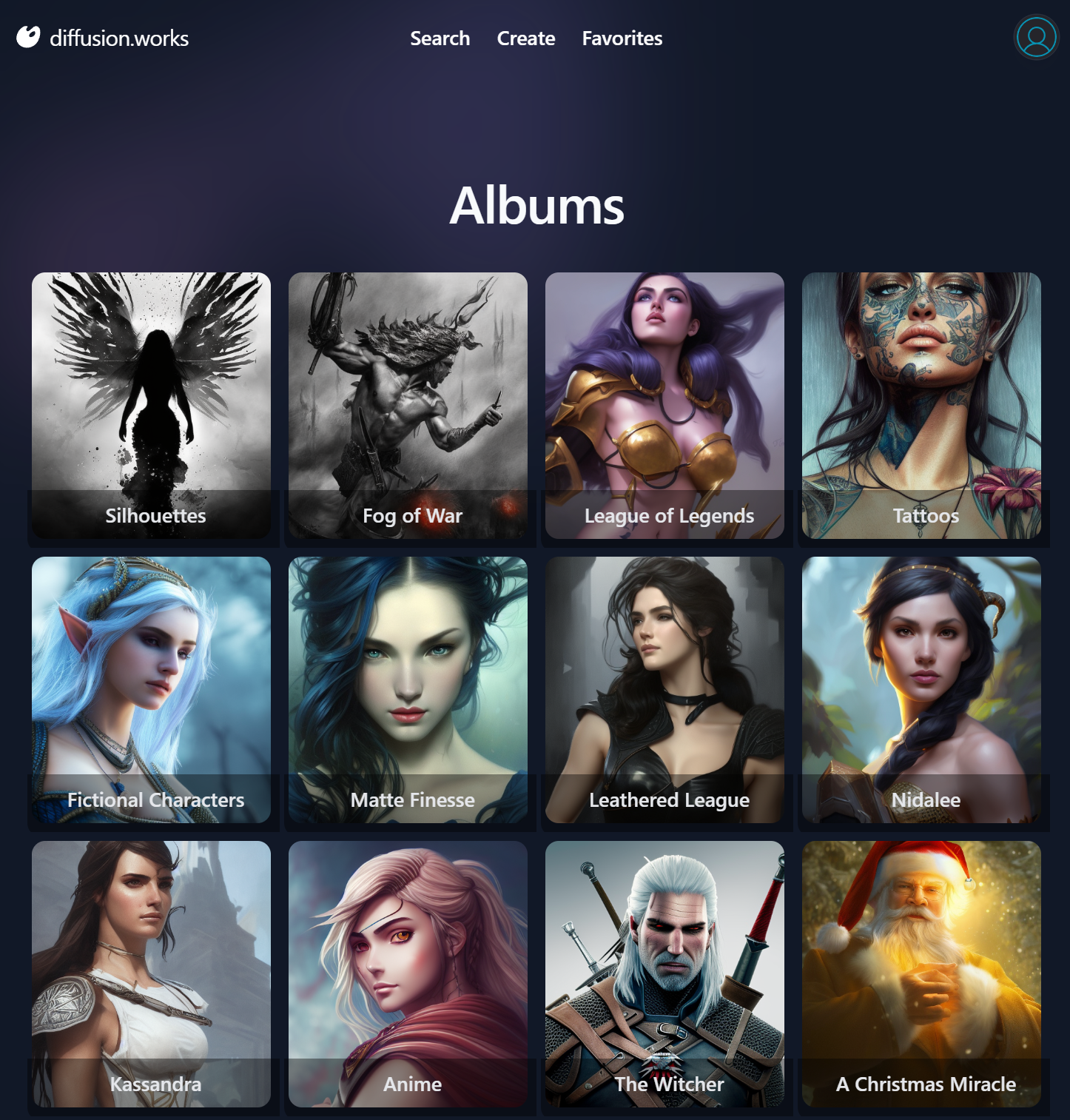
Albums Albums.cshtml
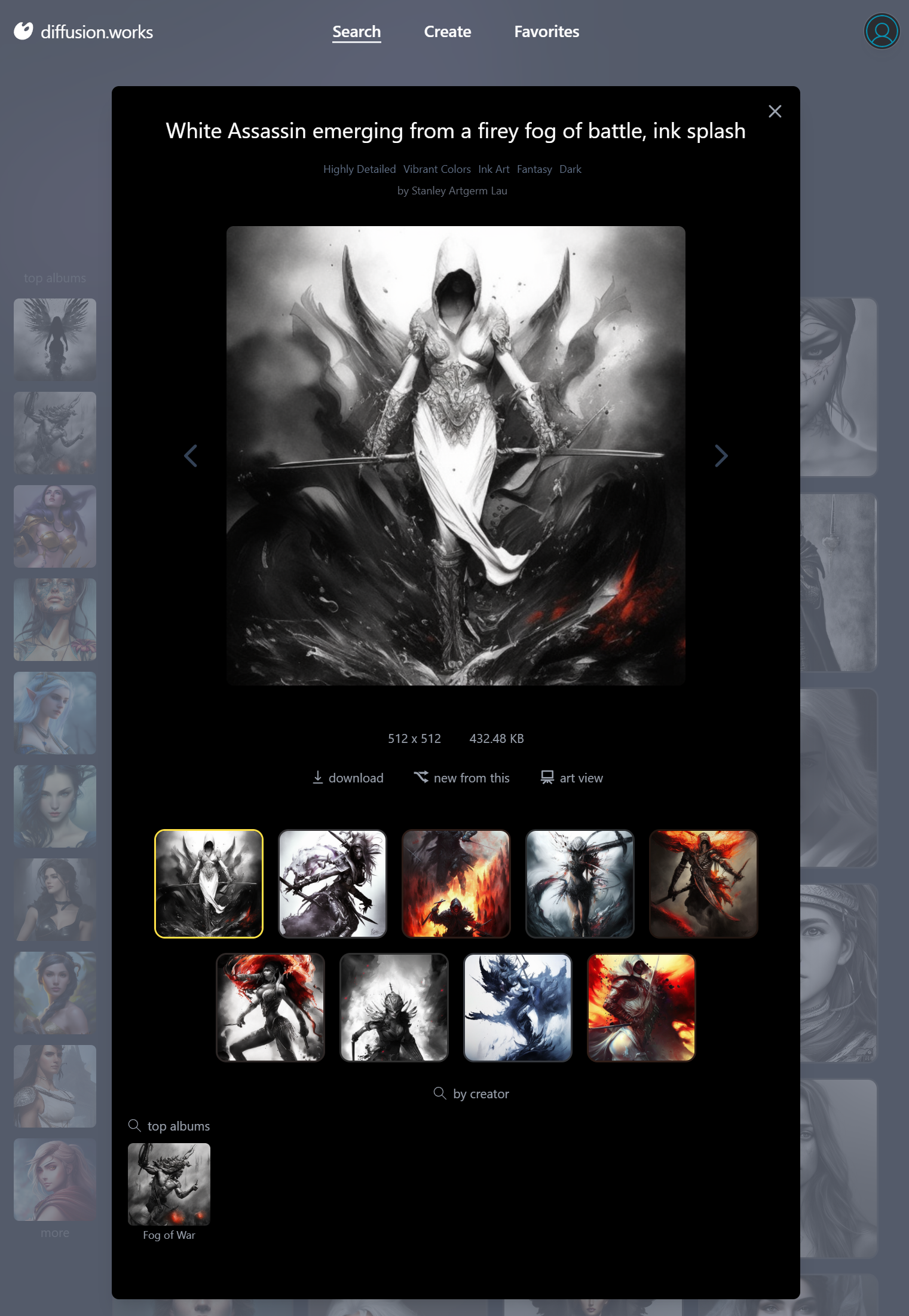
Selected Image Artifacts.mjs
Top Images Top.cshtml

Latest Images Latest.cshtml | Latest.cshtml.cs

Most of these pages also utilize the reusable Vue 3 components defined in:
Stale-While-Revalidate APIs
We'll have a lot more to write up about our experiences with Vue Diffusion vs Blazor Diffusion in future
Blog Posts, but we wanted to highlight the performance enhancing technique it uses
to improve perceived performance between pages by utilizing @servicestack/vue new State-While-Revalidate (SWR) APIs.
Latency is the biggest performance killer when hosting Web Applications on the Internet, so much so that we'd historically look to start with a Single Page App template in order to provide the best UX up until the advent of native ES Modules support in modern browsers meant we could rid ourselves of SPA complexity and adopt a Simple, Modern JavaScript Multi Page App (MPA) approach combined with htmx's Boost feature to improve performance by avoiding full page reloads.
However we found that to be a fragile approach when navigating back/forward between pages as you'd need to be
mindful of what scripts to place between <head> and <body> tags and which scripts need to be re-executed
between navigations, reintroducing some of the stateful SPA complexity we want to avoid with a traditional MPA Web App.
We instead discovered we could get just as good UX with stateless full page reloads of pre-rendered HTML pages if we use SWR to fetch all the API data needed to render the page on first load:
This is easily achieved in reactive Vue.js UIs by invoking API requests with the new swr() client API where if
the same API request had been run before it will execute the callback immediately with its "stale" cached results
in localStorage first, before invoking the callback again after receiving the API response with the latest data:
import { useClient } from "@servicestack/vue"
const client = useClient()

const results = ref([])
const topAlbums = ref([])
//...

onMounted(async () => {
    await Promise.all([
        client.swr(request.value, api => {
            results.value = api.response?.results || []
            //...
        }),
        client.swr(new AnonData(), async api => {
            topAlbums.value = api.response?.topAlbums || []
            //...
        }),
    ])
})
This results in UIs being immediately rendered on load and if the API response has changed, the updated reactive collections will re-render the UI with the updated data.
swrEffect
After running into an issue upgrading useSWRV after upgrading the Vue Jamstack templates npm dependencies, we decided to replace their existing swrv dependency with a built-in feature.
Previously we used useSWRV with some boilerplate around the generic JsonServiceClient:
class SwrClient {
    client:JsonServiceClient
    constructor(client:JsonServiceClient) { this.client = client }
    get<T>(fn: () => IReturn<T> | string) : IResponse<T, any> {
        return useSWRV(() => {
            let request = fn()
            return appendQueryString(`SwrClient:${nameOf(request)}`, request)
        }, key => this.client.get(fn()))
    }
}

const swrClient = new SwrClient(client)
To enabled a pleasant API for executing SWR requests that re-executed when it detected changes in any of its referenced properties:
const { data, error } = swrClient.get(() => new Hello({ name: props.name }))
We've since replaced the swrv dependency with a built-in swrEffect() API that uses Vue's watchEffect to detect property changes to trigger invoking the API request and returning API responses in a more idiomatic ApiResult<T> with a similarly pleasant declarative API without the unnecessary boilerplate:
const client = useClient()
//...

const api = client.swrEffect(() => new Hello({ name: props.name }))
It also includes a built-in debounce feature where you can collapse multiple event triggers within a specified duration (like input events when a user is typing), e.g. we can initiate an API request when a user has paused briefly after 50ms with:
const api = client.swrEffect(() => new Hello({ name: props.name }), { delayMs:50 })
Bringing xkcd static dataset to life with AutoQuery

One of the big advantages of using AutoQuery is the ability to turn data into an API with very little effort where once your data is exposed behind an AutoQuery API, it's accessible in any way you want, Auto UIs, a web app, a mobile app, a desktop app, or even from CLI's.
Unsiloing Data with AutoQuery
Outside of IT systems many organizations still heavily deal with static files, often maintained sporadically across multiple excel files and documents. Poor data accessibility is still something that slows down teams, while it can be easier for a single analyst/modeler/data scientist to work directly with static files, not having shared access to the data can limit reuse, discovery and insights from the dataset.
Web APIs can help un-silo the data, create more efficient access points and reduce the time it takes to get data from single use into a widely accessible production application. This is where AutoQuery shines, making it easy to expose data behind a fully queryable API that can easily be turned into a Web Application by utilizing the various AutoQueryGrid and DataGrid components.
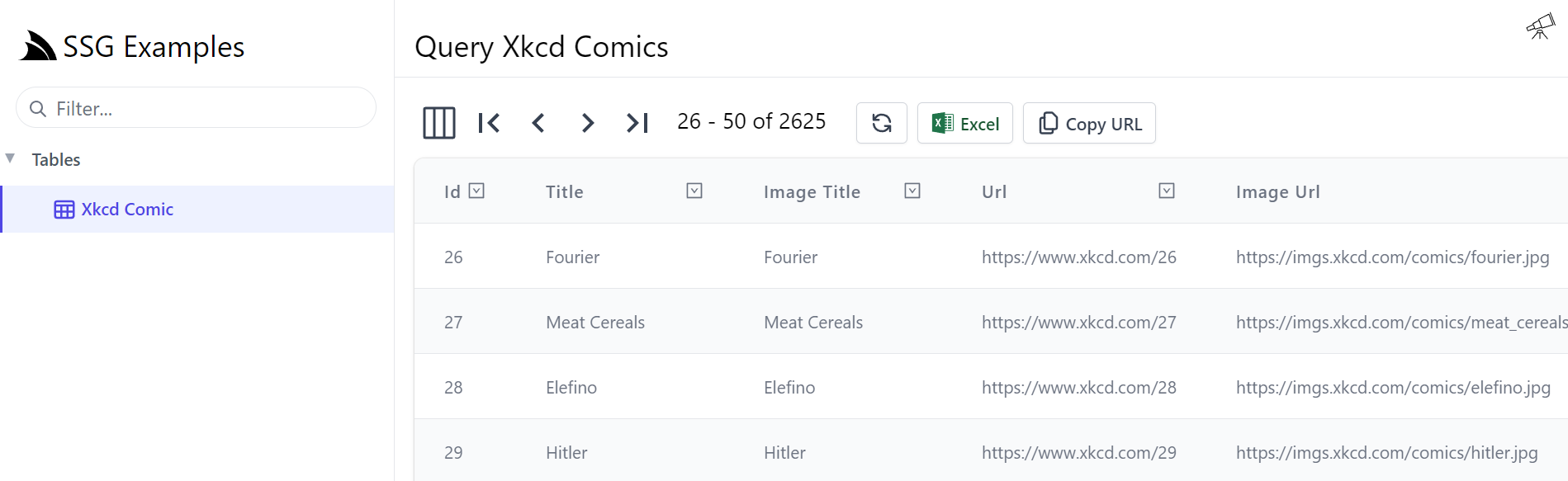
In this video, we'll look at example of this, by using AutoQuery to create a Web App providing multiple views around a static xkcd JSON Lines dataset that's available on Hugging Face:
The xkcd AutoQuery API
After importing its .jsonl into an RDBMS table only a single AutoQuery API was needed to expose this dataset behind an AutoQuery API:
[Route("/xkcd")]
public class QueryXkcdComics : QueryDb<XkcdComic>
{
    public int[] Ids { get; set; }
}

public class XkcdComic
{
    public int Id { get; set; }
    public string Title { get; set; }
    public string ImageTitle { get; set; }
    public string Url { get; set; }
    public string ImageUrl { get; set; }
    public string ExplainedUrl { get; set; }
    public string Transcript { get; set; }
    public string Explanation { get; set; }

    public int Width { get; set; }
    public int Height { get; set; }
}
Which is the entire API definition, as AutoQuery will generate its fully queryable implementation when one isn't provided. As an AutoQuery API an immediate queryable Auto UI is provided by Locode is accessible from /locode/QueryXkcdComics
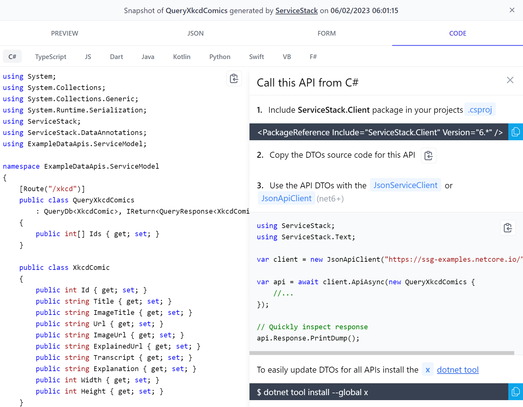
Also queryable from API Explorer at /ui/QueryXkcdComics and Auto HTML API Page at /api/QueryXkcdComics.html where step-by-step instructions are available to call this typed API in 10 languages:
Of which the TypeScript DTOs was enough to build entire Web Application around, published on GitHub Pages CDN at:
https://xkcd.netcore.io
Built from a new Razor SSG project template that's maintained at: https://github.com/NetCoreApps/Xkcd
It includes 3 different views of the data:
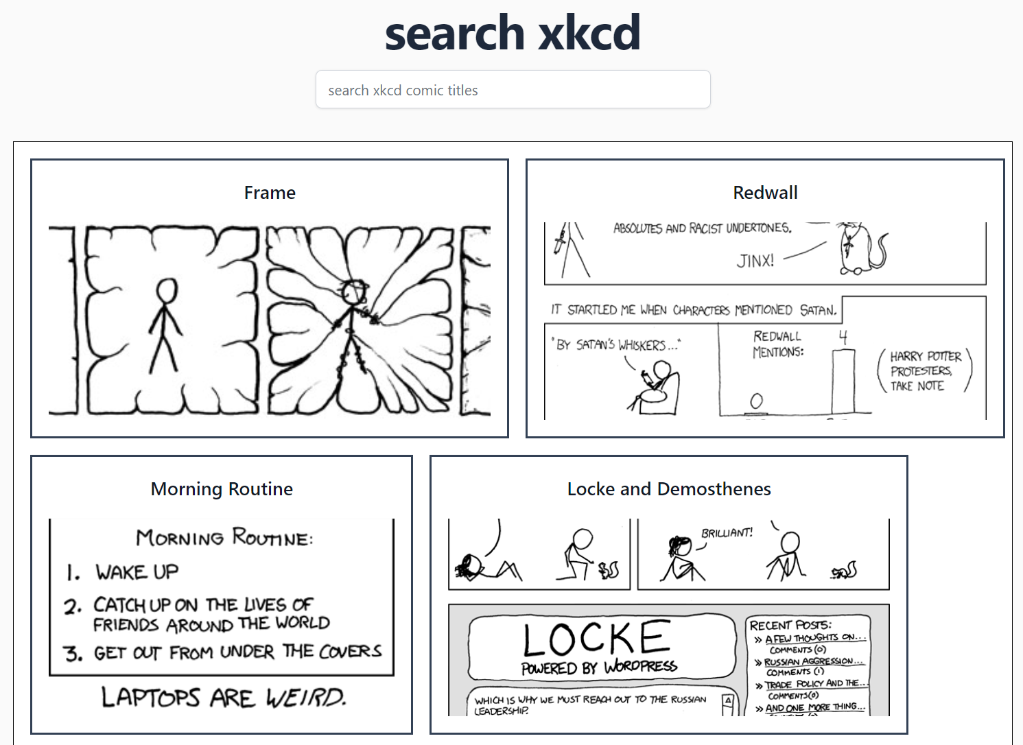
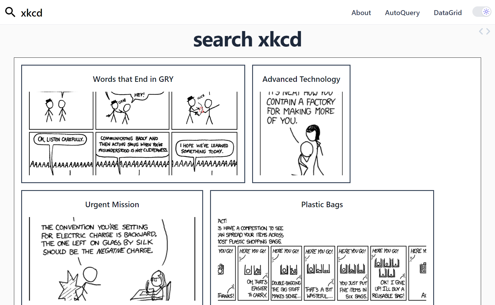
Search xkcd
The home page optimized for visually searching through and learning about the background and pretext behind different comics:
 view source
AutoQueryGrid xkcd
A custom responsive AutoQueryGrid providing an alternative queryable UI for searching xkcd comics:
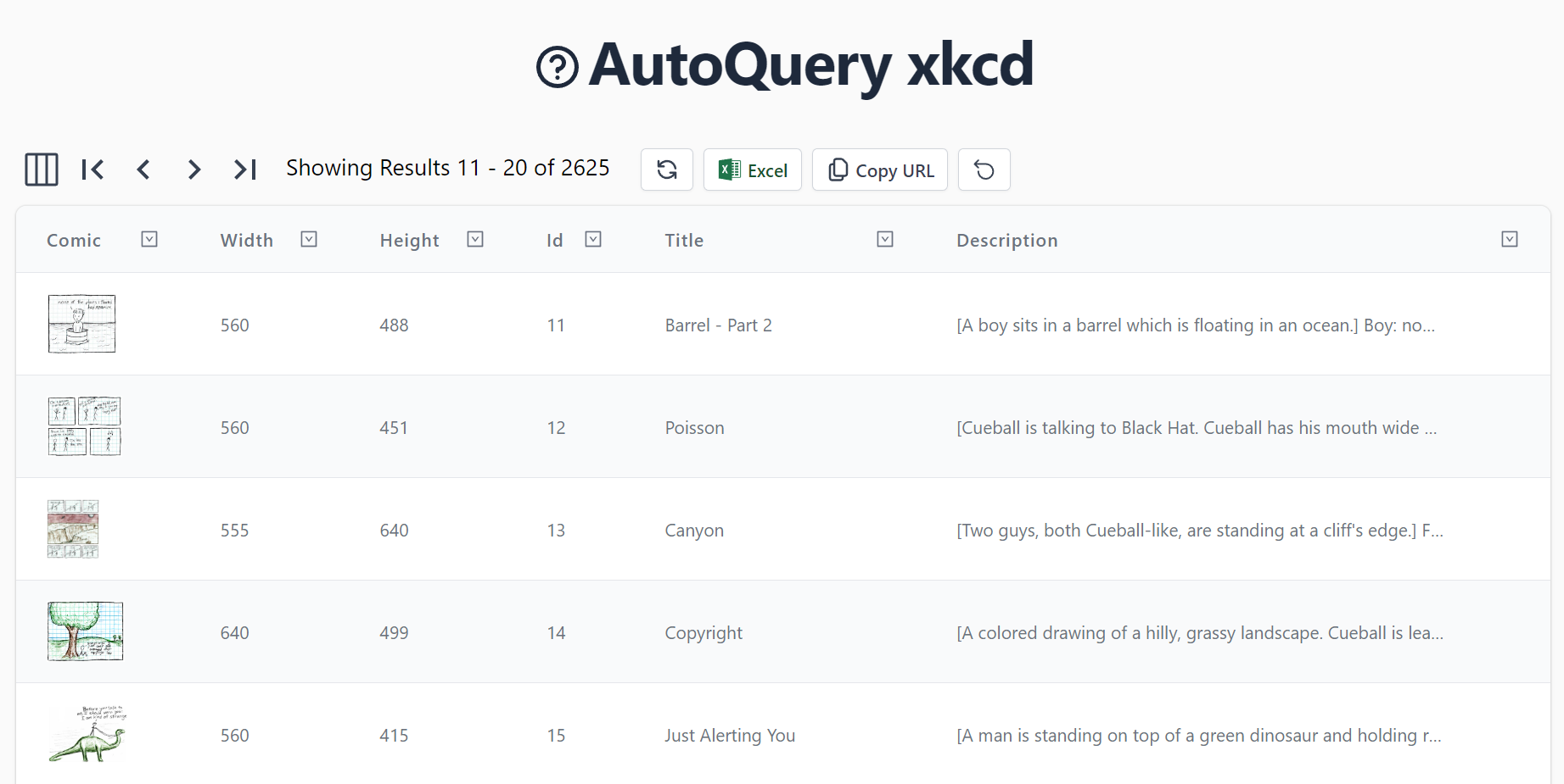 view source
Generated using a custom AutoQueryGrid Vue Component:
<auto-query-grid type="XkcdComic"
selected-columns="imageUrl,width,height,id,title,transcript,explanation,url"
:visible-from="{ title:'sm', transcript:'xl', explanation:'2xl', url:'never' }"
:header-titles="{ imageUrl:'Comic', transcript:'Description' }"
v-on:row-selected="rowSelected"
class="mx-auto">
<template #imageUrl="{ id, imageUrl }">
<img :src="imageUrl" class="h-12 object-cover" loading="lazy">
</template>
<template #transcript="{ transcript }">
<p class="block max-w-sm text-ellipsis overflow-hidden">{{ transcript }}</p>
</template>
<template #explanation="{ explanation }">
<p class="block max-w-sm text-ellipsis overflow-hidden">{{ explanation }}</p>
</template>
</auto-query-grid>
DataGrid xkcd
An alternative Grid display to search for comics:
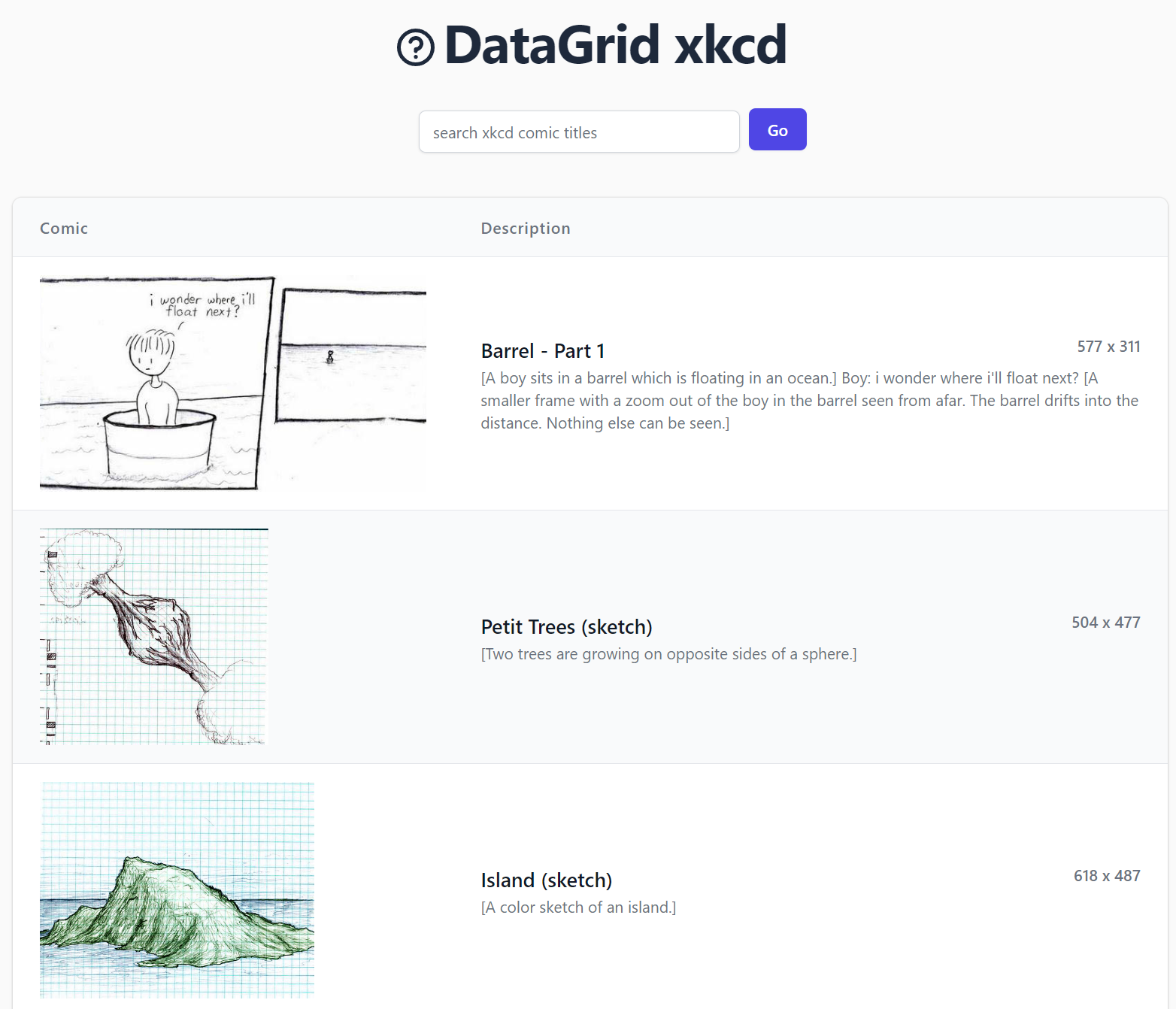 view source
Generated from a custom DataGrid Vue Component:
<data-grid :items="comics"
selected-columns="imageUrl,transcript"
v-on:row-selected="rowSelected" :is-row-selected="row => row == selected"
:header-titles="{ imageUrl:'Comic',transcript: 'Description' }"
class="max-w-screen-lg mx-auto">
<template #imageUrl="{ imageUrl }">
<img :src="imageUrl" class="h-48 object-cover" loading="lazy">
</template>
<template #transcript="{ title, transcript, width, height }">
<div class="flex flex-col max-w-3xl">
<div class="flex justify-between">
<h2 class="text-lg font-semibold text-gray-900">{{ title }}</h2>
<div class="text-right text-sm font-semibold block">{{width}} x {{height}}</div>
</div>
<p class="whitespace-normal break-words overflow-hidden max-h-40">{{ transcript }}</p>
</div>
</template>
</data-grid>
Checkout the companion Blog Post to learn more about how this application was built:
Razor SSG Improvements

The underlying template that underpins most of the features in this release is that they were built with our newest Razor SSG project template, which uniquely differs from typical .NET Apps in that there's no .NET App to deploy since (like its Next.js and Jekyll inspirations) its build output is a static website that can be hosted on any CDN or static file server.
It quickly became our favorite Jamstack SSG template since unlike our Next.js and Vue SSG project templates it doesn't require any npm dependencies as it's generated entirely using .NET and Razor Pages where you'll be able to make use of your existing .NET Libraries, IDEs and Razor Pages development experience to build delightfully responsive websites thanks to its optimal performance & SEO architecture of generating static HTML pages that can be served from CDN edge caches.
We're also confident in the longevity of the technologies it's built on, which wont be outdated by the next npm build tool as its Simple, Modern JavaScript approach lets us take advantage of the native ES Modules support in all modern browsers to forgo using any build tools or transpilers.
Razor SSG Websites
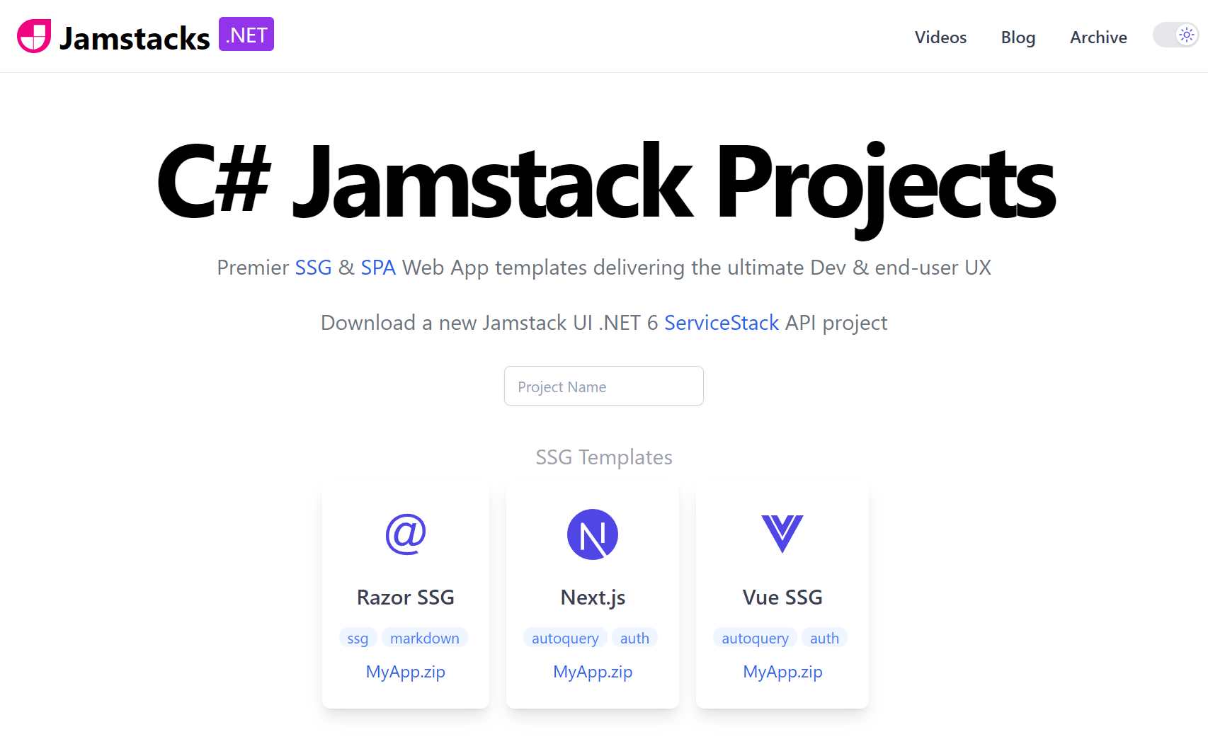
In addition to rewriting our old Jekyll website in the last release, we've created 3 new Razor SSG websites during this release including rewriting jamstacks.net website from its old Vue SSG Codebase.
Markdown Video Feature
Razor SSG includes a new videos feature populated by Markdown.Videos.cs from markdown files in its _videos folder:
Rendered by the VideoGroup.cshtml partial to render video content in the Videos.cshtml page:

Markdown Docs
Razor SSG improves support for maintaining documentation in Markdown where nested documentation can be added in _pages that's
later accessible in Razor Pages using the MarkdownPages collection.
As a demonstration a copy of the CreatorKit Docs were added to _pages/creatorkit:
Which are generated by the Razor Pages in:
To generate both the razor-ssg.web-templates.io/creatorkit/ home page and documentation pages.
Metadata APIs
A disadvantage of not having .NET App to deploy is the lack of having APIs we can call to query website data in a easily readable data format like JSON. This is required to support use-cases like CreatorKit's Generating Newsletters feature which generates a Monthly Newsletter Email with all new content added in the month.
We can easily support this in Razor SSG by also pre-rendering static *.json data structures along with the pre-rendered website at deployment.
This capability is provided by the new Markdown.Meta.cs feature which generates multiple projections of the Markdown metadata for each type of content added in every year, e.g:
With this you can fetch the metadata of all the new Blog Posts added in 2023 from:
/2023/posts.json
Or all the website content added in 2023 from:
/2023/all.json
Or ALL the website metadata content from:
/all.json
CreatorKit Integration
The lack of a .NET backend server is no longer a barrier to enable popular dynamic website features now that we're able to embed CreatorKit's Tailwind Components into our static websites which sees Razor SSG support accepting newsletter sign ups throughout the website:

As well as enabling support for voting and post comments:
Integration Pages
Razor SSG is the easiest template to get use CreatorKit with which includes all the necessary Pages for integrating with CreatorKit features:
| Page | Source Code | Description |
|---|---|---|
| /signup-confirmed | signup-confirmed.md | Landing page after email verified Newsletter Signup |
| /mail-preferences | mail-preferences.md | Allow subscribers to manage their subscriptions |
| /privacy | privacy.md | Privacy policy linked from email footers |
| /community-rules | community-rules.md | Community Rules for posting public comments |
Pre-rendering removed from vue-mjs
As Razor SSG has become the preferred template for performance enthusiasts wanting to use pre-rendering to deliver the best UX for their content heavy websites, we've decided to remove the pre-rendering features from the vue-mjs template to reduce the complexity and required knowledge to use the template.
AutoQuery Enum Flags
Enum flags are an efficient data structure that can provide an alternative to maintaining joined tables when needing to capture multiple values of fixed options in a single integer value and column. Their issue was that they didn't have a great UX when exposed on an API boundary or data bound form which have both been improved in this release.
Firstly support was added to AutoQuery with two new Implicit Conventions that can be used to query Enum Flag fields when they match ALL enum field values or include ANY of them:
new AutoQueryFeature()
{
    ImplicitConventions = new() {
        //...
        {"%HasAll", "{Value} & {Field} = {Value}"},
        {"%HasAny", "{Value} & {Field} > 0"},
    }
}
As they're efficient and simplify maintenance efforts, CreatorKit uses them to maintain which Mailing Lists Contacts are subscribed to:
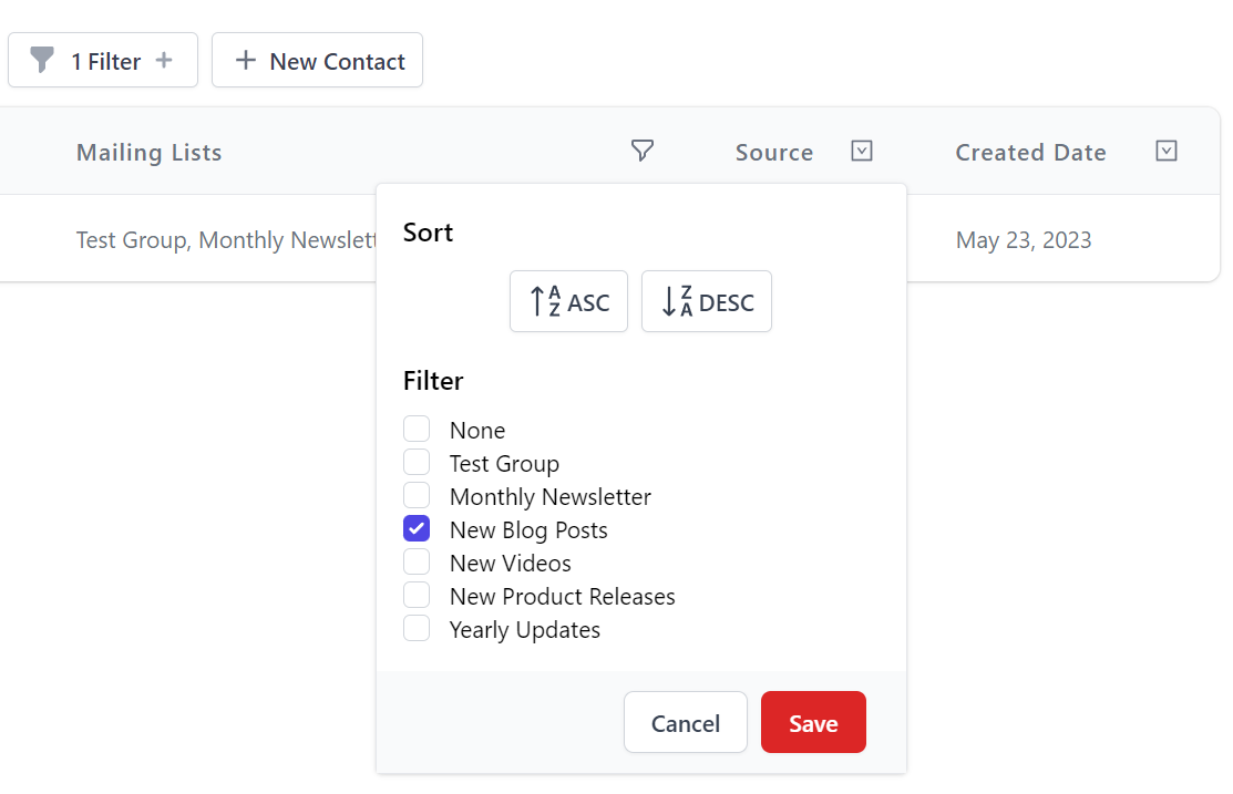
[Flags]
public enum MailingList
{
    [Description("None")]
    None = 0,                            //0
    [Description("Test Group")]
    TestGroup = 1 << 0,                  //1
    [Description("Monthly Newsletter")]
    MonthlyNewsletter = 1 << 1,          //2
    [Description("New Blog Posts")]
    BlogPostReleases = 1 << 2,           //4
    [Description("New Videos")]
    VideoReleases = 1 << 3,              //8
    [Description("New Product Releases")]
    ProductReleases = 1 << 4,            //16
    [Description("Yearly Updates")]
    YearlyUpdates = 1 << 5,              //32
}
Which AutoQuery now lets us query by single enum name or combinatorial integer enum values, e.g:
| Description | URL |
|---|---|
Subscribed to MonthlyNewsletter |
/api/QueryContacts?MailingListsHasAll=MonthlyNewsletter |
Subscribed to both TestGroup and VideoReleases |
/api/QueryContacts?MailingListsHasAll=9 |
Subscribed to either TestGroup or VideoReleases |
/api/QueryContacts?MailingListsHasAny=9 |
With this feature we can now query enum flags, but we also need to enable support for editing them in Auto Form components.
Enum Flags in AutoForms
We're able to create a good UX for maintaining enum flags like Contact MailingLists by combining a few different features together, by first changing
the UpdateContact to accept a more UX friendly List of Enum String Descriptions instead of their combined integer value. This allows us to use the
standard TagInput component pre-populated with an Autocomplete list of Mailing List descriptions
by using a JavaScript enumFlagsConverter that uses the MailingList metadata to expand the contact's MailingLists integer value into an expanded list of enum
descriptions resulting in providing a nice UX for adding and removing mailing lists using their preferred description:
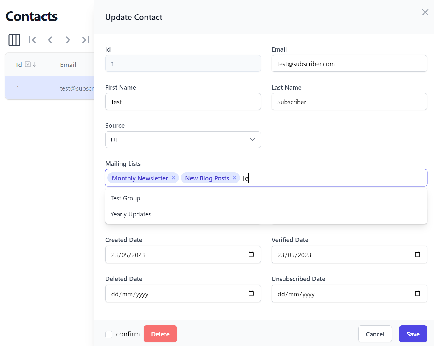
The last feature we need is the #Script fromEnumFlagsList method to perform the reverse operation on the server and convert the list of Enum descriptions
into a combined enum integer value, all features of which are declaratively added on the UpdateContact Request DTO:
[AutoPopulate(nameof(Contact.MailingLists), Eval = "dto.MailingLists.fromEnumFlagsList(typeof('MailingList'))")]
public class UpdateContact : IPatchDb<Contact>, IReturn<Contact>
{
    public int Id { get; set; }
    public string? Email { get; set; }
    public string? FirstName { get; set; }
    public string? LastName { get; set; }
    [Input(Type = "tag", EvalAllowableValues = "AppData.MailingListValues",
           Options = "{ converter:enumFlagsConverter('MailingList') }"]
    public List<string>? MailingLists { get; set; }
    //...
}
Whilst the new [FormatEnumFlags] Attribute:
public class Contact
{
    [AutoIncrement]
    public int Id { get; set; }
    public string Email { get; set; }
    public string FirstName { get; set; }
    public string LastName { get; set; }

    [FormatEnumFlags(nameof(MailingList))]
    public MailingList MailingLists { get; set; }
    //...
}
Customizes the AutoQueryGrid component to show an expanded list of enums instead of its integer value:
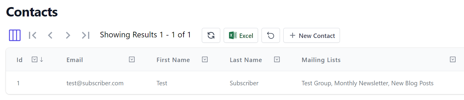
AutoQueryGrid also adds support for Enum Flags in filters which uses the new %HasAny AutoQuery Convention to filter them:
OrmLite Connection Commands
We've added a Connection Commands feature which that let you define RDBMS commands you want to always run after opening an RDBMS connection. We can use this to enable SQLite pragma's to change SQLite's behavior like enabling Foreign Key Support with:
SqliteDialect.Instance.ConnectionCommands.Add("PRAGMA foreign_keys=ON;");
As this a common feature to use with SQLite we've also added a typed API for it:
SqliteDialect.Instance.EnableForeignKeys = true;
CorsFeature AppSettings
Support was added for being able to configure CorsFeature from appsettings.json, e.g:
{
  "CorsFeature": {
    "allowedHeaders": "Content-Type,Authorization",
    "allowCredentials": true,
    "allowOriginWhitelist": [
      "http://localhost:5000",
      "http://localhost:8080"
    ]
  }
}
By using its AppSettings constructor, which can be further extended in code, e.g:
Plugins.Add(new CorsFeature(AppSettings)
    .AppendOriginWhitelist(new[] {
        "https://example.org",
    }));