To override Locode's built-in Form UI you can add custom PetiteVue HTML components
to your Host Project /wwwroot folder at /modules/locode/custom.html using the naming conventions below:
| Component Name | Description |
|---|---|
New{Table} |
Custom Create Form UI |
Edit{Table} |
Custom Update Form UI |
The chinook.locode.dev demo does this to create a custom Form UI for creating and
editing Albums by registering NewAlbums and EditAlbums components in
/modules/locode/custom.html used to render Chinook's custom Create Album form
to update its Albums table.
It's able to benefit from static analysis and intelli-sense by installing @servicestack/ui and importing
static types using standard ES6 import syntax which it can reference using standard JSDoc annotations
or TypeScript's JSDoc support as an alternative
to maintaining a separate custom.ts file. By using JSDoc comments directly in custom.js we can avoid the
additional build-step and get instant feedback on each save when we run our App with $ dotnet watch
Code walkthrough
CreateComponentArgs contains a type method signature for the params passed into New* components to enable
intelli-sense when using them.
As custom.js is loaded without any source code transforms, we don't have access to TypeScript's newer high-level
JS features like Optional Chaining ?. so we instead use a custom map() function which only executes the
property access lambda if the target isn't null.
apiState contains the call context for the API call to the Create CRUD API, which is invoked using its apiForm API
with a populated FormData created from serializing the FORM Input's. If successful save() is called to notify the
parent results should update to include the latest changes, before calling done() to close the form.
If the response failed the error response information is retained in the apiState call context which is used to render
contextual validation errors next to each failed input.
<script>
import { CreateComponentArgs, map, inputClass } from "@servicestack/ui"
import { App, Forms } from "@servicestack/ui/locode"

App.components({
    /** @param {CreateComponentArgs} args */
    NewAlbums({ store, routes, settings, state, save, done }) {
        return {
            $template: '#new-album-template',
            store, routes, settings,
            /** @type {State} */
            get state() { return state && state() },
            get apiState() { return map(this.state, x => x.apiCreate) },
            get model() { return map(this.apiState, x => x.model) || {} },
            inputClass(prop,cls) { return inputClass(this.apiState.fieldError(prop),cls) },

            done,
            submit() {
                this.apiState.apiForm(Forms.formData(this.$refs.form, this.apiState.op))
                    .then(r => {
                        if (r.api.succeeded) {
                            save()
                            done()
                        }
                    })
            }
        }
    }
})
</script>
The NewAlbums UI shows an example of using our own custom HTML <input/> including how to render adjacent contextual
validation errors.
Whilst v-scope=Input() shows how we can customize and use the built-in PetiteVue Input() component for the ArtistId
property which in this case defaults to using a Lookup Input control so users are presented with a rich modal dialog
to select the Artist they want instead of having to enter Ids manually.
<template id="new-album-template">
<div v-if="apiState" class="album-form flex justify-center">
    <div class="relative flex flex-col">
        <div v-scope="CloseButton({ onclick:done })" title="Close"></div>
        <div v-if="apiState.errorSummary" v-scope="ErrorSummary({ errorSummary: () => apiState.errorSummary })"></div>
        <form ref="form" @submit.prevent="submit" class="shadow-md rounded-full w-96 h-96 flex justify-center items-center">
        <div class="flex flex-col justify-center items-center text-center">
            <h1 class="text-3xl font-medium text-rose-500 mb-4">New Album</h1>
            <fieldset>
                <!---: Using custom input -->
                <div class="mb-4">
                    <input type="text" name="Title" :class="inputClass('Title')" placeholder="Album Title">
                    <p id="title-error" v-if="apiState.fieldError('Title')" v-html="apiState.fieldError('Title')"></p>
                </div>

                <!---: Using Input Lookup component -->
                <div v-scope="Input({ field:apiState.field('ArtistId', f => {f.input.label='';f.input.placeholder='Select Artist'}), model, api:() => apiState.api })" class="mb-4"></div>

                <div v-scope="SubmitAlbumButton()"></div>
            </fieldset>
        </div>
        </form>
    </div>
</div>
</template>
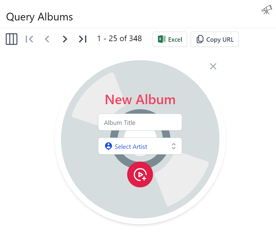
When registered this custom component replaces Locode's Auto Form UI with a custom Create Album Form:
That when submitting an empty form will trigger the contextual validation errors to appear:
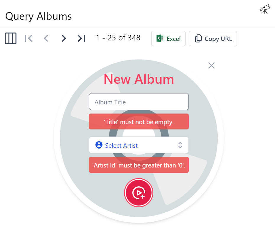
As enforced by the Declarative Validation rules on the
CreateAlbums AutoQuery CRUD DTO its calling:
[Route("/albums", "POST"), Tag(Tags.Media)]
public class CreateAlbums
    : IReturn<IdResponse>, IPost, ICreateDb<Albums>
{
    [ValidateNotEmpty]
    public string Title { get; set; }
    [ValidateGreaterThan(0)]
    public long ArtistId { get; set; }
}
Custom Edit Form
The custom EditAlbums Form has a little larger implementation due to needing to load the data of the Album it wants
to update which it does by calling the AutoQuery API for Albums, predictably called QueryAlbums. It updates
the form on load or when the edit route changes, enabled by registering the routes.onEditChange() callback when the
component is mounted and unmounted.
Otherwise, its implementation closely follows the NewAlbums implementation above:
import { EditComponentArgs, map } from "@servicestack/ui"
import { App, Forms } from "@servicestack/ui/locode"

App.components({
    /** @param {EditComponentArgs} args */
    EditAlbums({ store, routes, settings, state, save, done }) {
        return {
            $template: '#edit-album-template',
            store, routes, settings,
            get state() { return state && state() },
            get apiState() { return map(this.state, x => x.apiPatch) },
            api: null,
            errorSummary: null,
            model: {},
            origModel: {},
            done,
            submit() {
                this.apiState.apiForm(Forms.formData(this.$refs.form, this.apiState.op))
                    .then(r => {
                        if (r.api.succeeded) {
                            save()
                            done()
                        }
                    })
            },

            updated() {
                let state = this.state
                if (!state || !state.opQuery || !routes.edit) return

                this.model = this.apiState.model
                this.errorSummary = ''
                let apiQuery = state.apiQuery
                apiQuery.apiSend({ albumId:routes.edit })
                    .then(r => {
                        let results = map(r.api.response, x => x.results)
                        if (apiQuery.errorSummary) this.errorSummary = apiQuery.errorSummary
                        this.api = r.api
                        this.origModel = this.apiState.createModel(results[0])
                        this.model = Object.assign({}, this.origModel)
                    })
            },

            mounted() { routes.onEditChange(() => this.updated()) },
            unmounted() { routes.onEditChange(null) },
        }
    }
})
Except it uses the defined apiPatch call context to update the album, which for Chinook is called PatchAlbums:
[Route("/albums/{AlbumId}", "PATCH"), Tag(Tags.Media)]
public class PatchAlbums
    : IReturn<IdResponse>, IPatch, IPatchDb<Albums>
{
    public long AlbumId { get; set; }
    public string Title { get; set; }
    public long ArtistId { get; set; }
}
The Edit Form UI is a fairly straight-forward Tailwind Form that just uses the built-in Input() components with its
label hidden to fit in with the custom Forms aesthetics:
<template id="edit-album-template">
<div v-if="apiState" class="album-form flex justify-center" @vue:mounted="mounted" @vue:unmounted="unmounted">
<div class="relative flex flex-col">
<div v-scope="CloseButton({ onclick:done })" title="Close"></div>
<div v-if="apiState.errorSummary" v-scope="ErrorSummary({ errorSummary: () => apiState.errorSummary })"></div>
<form ref="form" @submit.prevent="submit" class="shadow-md rounded-full w-96 h-96 max-w-96 flex justify-center items-center">
<div class="flex flex-col justify-center items-center text-center">
<h1 class="text-3xl font-medium text-rose-500 mb-4">Edit Album {{model.albumId}}</h1>
<fieldset>
<input type="hidden" name="albumId" :value="model.albumId">
<!---: Using built-in Input components without labels -->
<div v-scope="Input({ field:apiState.field('Title', f => f.input.label=''), model:() => model, api:() => apiState.api })" class="mb-4"></div>
<div v-scope="Input({ field:apiState.field('ArtistId', f => {f.input.label='';f.input.placeholder='Select Artist'}), model:() => model, api:() => apiState.api })" class="mb-4"></div>
<div v-scope="SubmitAlbumButton()"></div>
</fieldset>
</div>
</form>
</div>
</div>
</template>
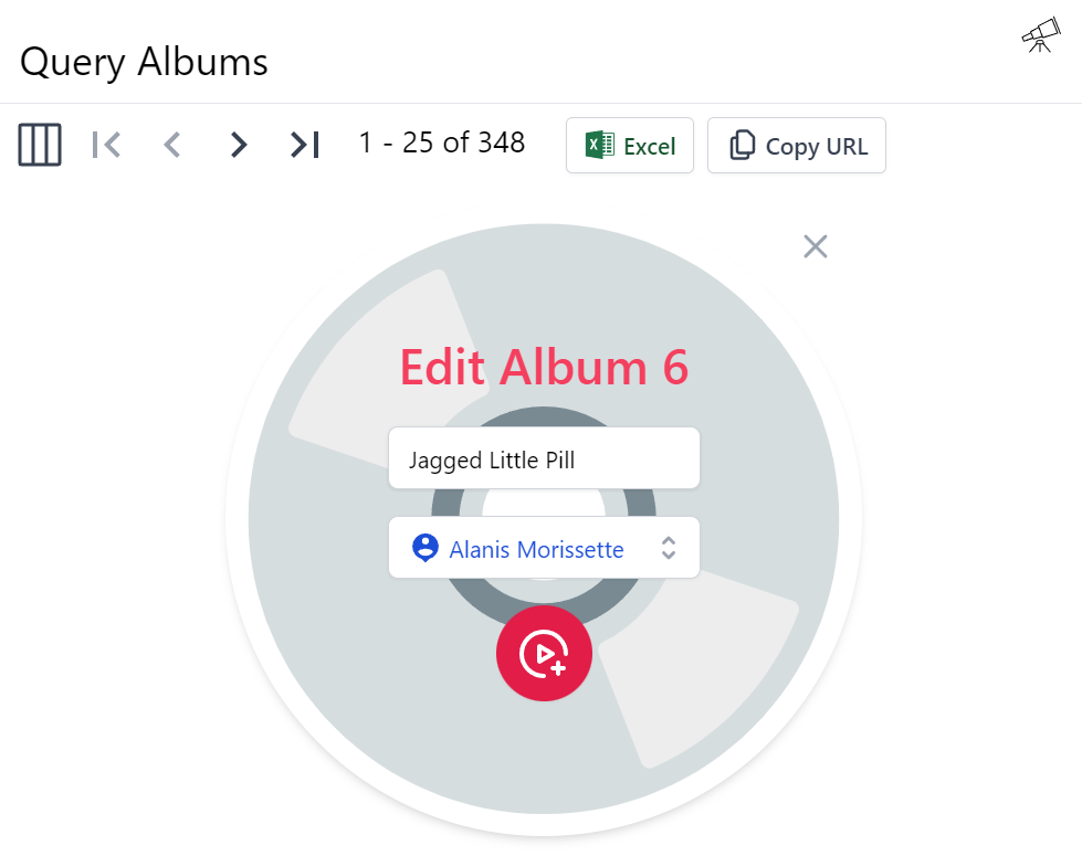
In order to render our custom Edit Albums Form:
To minimize code duplication both custom forms makes use of a SubmitAlbumButton Reusable Component, defined as:
<!---: Reuse functionality with custom components -->
<script>App.components({ SubmitAlbumButton: '#submit-album-template' })</script>
<template id="submit-album-template">
<button type="submit" class="inline-flex items-center p-3 border border-transparent rounded-full shadow-sm text-white bg-rose-600 hover:bg-rose-700 focus:outline-none focus:ring-2 focus:ring-offset-2 focus:ring-rose-500">
    <svg class="h-8 w-8" xmlns="http://www.w3.org/2000/svg" aria-hidden="true" preserveAspectRatio="xMidYMid meet" viewBox="0 0 48 48">
        <g fill="none" stroke="currentColor" stroke-linejoin="round" stroke-width="4">
            <path stroke-linecap="round" d="M24 44C12.954 44 4 35.046 4 24S12.954 4 24 4s20 8.954 20 20"/>
            <path d="M20 24v-6.928l6 3.464L32 24l-6 3.464l-6 3.464V24Z"/><path stroke-linecap="round" d="M37.05 32v10M42 36.95H32"/>
        </g>
    </svg>
</button>
</template>
Custom Locode Home Page
Next we'll look at how we can create a custom Home page by overriding Locode's
existing Welcome.html component.