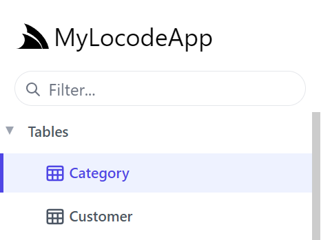
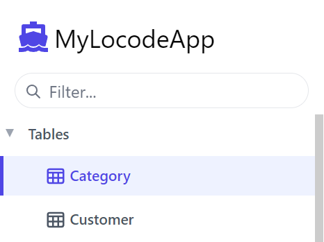
The logo at the top left can be changed by configuring the UiFeature plugin from your AppHost using ConfigurePlugin<UiFeature>.
ConfigurePlugin<UiFeature>(feature =>
    feature.Info.BrandIcon = new ImageInfo { Uri = "/logo.svg", Cls = "w-8 h-8 mr-1" });
Uri is the path of your own logo from the wwwroot folder and the Cls value is the CSS classes applied to the image.
-
Default
-
Custom branding
Custom Brand Component
For even greater flexibility you can also replace the entire Brand.mjs component by
creating a local Brand component in
/wwwroot/js/components/Brand.mjs which the Blazor WASM template does with:
const Brand = {
    template:/*html*/`
    <div class="flex items-center flex-shrink-0 max-w-sidebar">
        <a title="My App" v-href="{ $page:'' }"
           class="text-2xl whitespace-nowrap overflow-x-hidden flex items-center">
           <svg xmlns="http://www.w3.org/2000/svg" class="w-8 h-8 ml-1 mr-2" viewBox="0 0 24 24">
               <path d="M23.834 8.101a13.912 13.912 0 0 1-13.643 11.72a10.105 10.105 0 0 1-1.994-.12a6.111 6.111 0 0 1-5.082-5.761a5.934 5.934 0 0 1
               11.867-.084c.025.983-.401 1.846-1.277 1.871c-.936 0-1.374-.668-1.374-1.567v-2.5a1.531 1.531 0 0 0-1.52-1.533H8.715a3.648 3.648 0 1 0
               2.695 6.08l.073-.11l.074.121a2.58 2.58 0 0 0 2.2 1.048a2.909 2.909 0 0 0 2.695-3.04a7.912 7.912 0 0 0-.217-1.933a7.404 7.404 0 0 0-14.64
               1.603a7.497 7.497 0 0 0 7.308 7.405s.549.05 1.167.035a15.803 15.803 0 0 0 8.475-2.528c.036-.025.072.025.048.061a12.44 12.44 0 0 1-9.69
               3.963a8.744 8.744 0 0 1-8.9-8.972a9.049 9.049 0 0 1 3.635-7.247a8.863 8.863 0 0 1 5.229-1.726h2.813a7.915 7.915 0 0 0 5.839-2.578a.11.11
               0 0 1 .059-.034a.112.112 0 0 1 .12.053a.113.113 0 0 1 .015.067a7.934 7.934 0 0 1-1.227 3.549a.107.107 0 0 0-.014.06a.11.11 0 0 0
               .073.095a.109.109 0 0 0 .062.004a8.505 8.505 0 0 0 5.913-4.876a.155.155 0 0 1 .055-.053a.15.15 0 0 1 .147 0a.153.153 0 0 1 .054.053A10.779
               10.779 0 0 1 23.834 8.1zM8.895 11.628a2.188 2.188 0 1 0 2.188 2.188v-2.042a.158.158 0 0 0-.15-.15z" fill="#5C2D91"/>
            </svg>
           My App
        </a>
    </div>
    `
}
export default Brand
To render its custom App Brand component:
Custom Table Icons
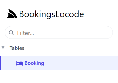
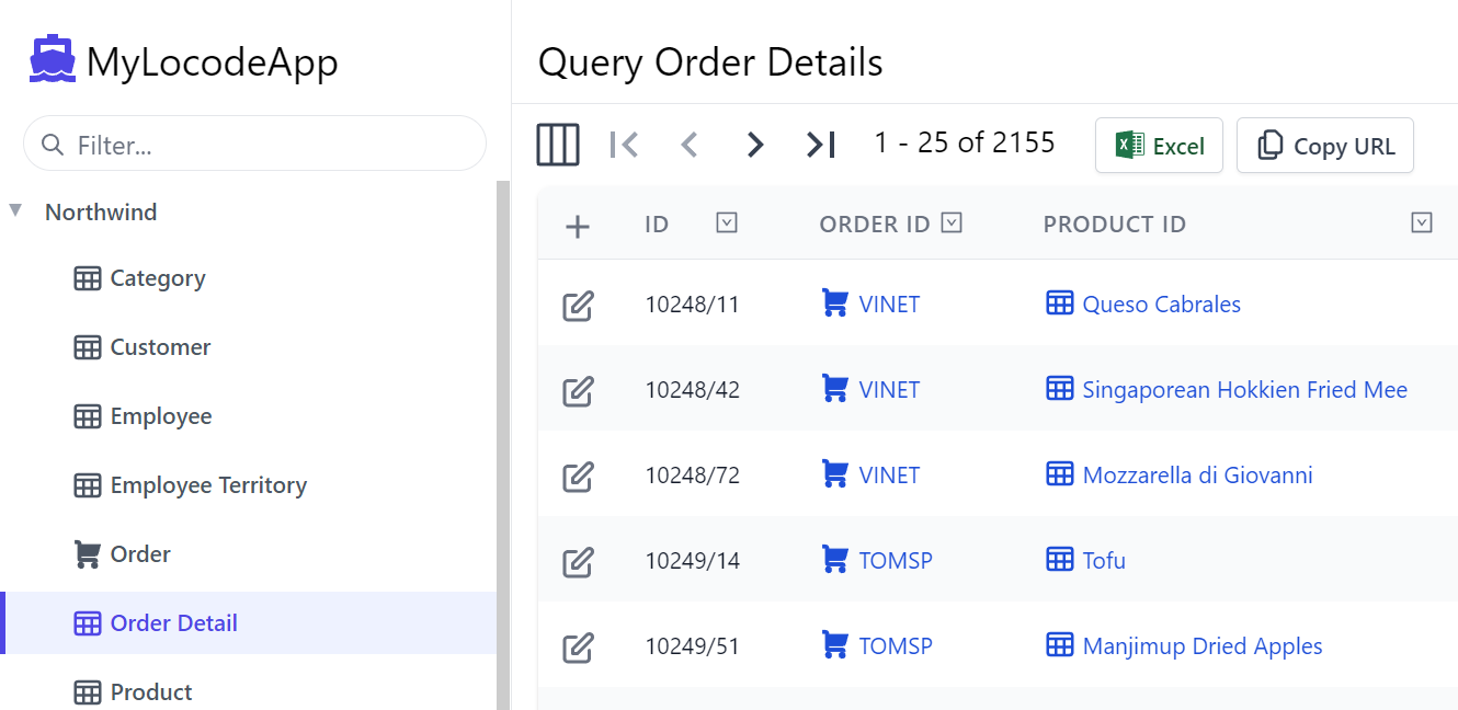
Attributes added to your database model can change the visuals in your Locode application. For example, by adding [Icon]
top of Booking specifying either an Svg or Uri path we can change the icon for the table in left menu and table relationships.
[Icon(Svg = "<svg xmlns=\"http://www.w3.org/2000/svg\" ...")]
public class Booking
{
    ...
}
Which will use this Icon whenever referring to Booking items:
Custom Icons for Database-first tables
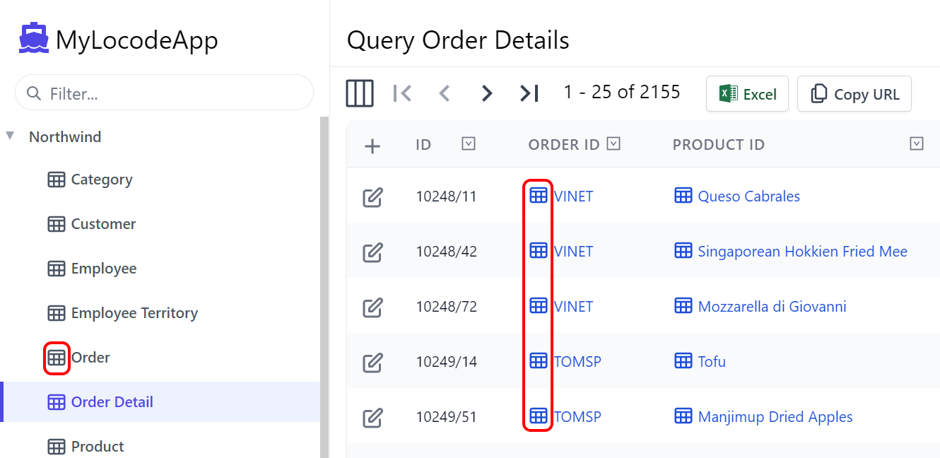
On database model classes, the Icon attribute can be used with a Uri or Svg to style the table in the left menu and when
lookup data is displayed. For example, if we use the TypeFilter to access the data model types, we can apply the Icon attribute dynamically
to Order it will impact the tables that reference Order.
TypeFilter = (type, req) =>
{
    if (Icons.TryGetValue(type.Name, out var icon))
        type.AddAttribute(new IconAttribute { Svg = Svg.Create(icon) });
    ...
}

public static Dictionary<string, string> Icons { get; } = new()
{
    ["Order"] = "<path fill='currentColor' ...",
};
-
Default Icon
-
Custom Icon
Grouping services with Tag
To group the Northwind services under the same Tag name for the left menu in Locode, we can use the Tag attribute.
[Tag("Northwind")]
public class Category { ... }

[Tag("Northwind")]
public class Customer { ... }
Instead of Tables we can now see our Northwind tag in the Locode app UI.
-
Default "Tables"

-
Custom Tag
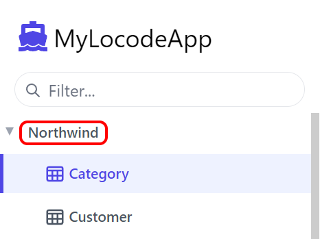
As more unique Tag names are added, additional drop down menus will be created to group your services together.
Adding Tags to Database-first tables
We can add the [Tag] attribute to all our Database-First Request DTOs using AutoQuery AutoGen's ServiceFilter:
GenerateCrudServices = new GenerateCrudServices {
    DbFactory = dbFactory,
    AutoRegister = true,
    ServiceFilter = (op, req) => {
        // Annotate all Auto generated Request DTOs with [Tag("Northwind")] attribute
        op.Request.AddAttributeIfNotExists(new TagAttribute("Northwind"));
    },
}
