Custom Declarative Input Components
In addition to all the Input Components in the Vue Component Library, AutoForm components bound to your declarative Request DTOs can also reference your own Vue Input components.
This allows us to continue to benefiting rapid development workflow enabled by the AutoForm components whilst also being able to deliver the most optimal UX when we need to.
CreatorKit's Email Templates are a good example of this, which instead of utilizing the standard
LookupInput (inferred from Reference Fields)
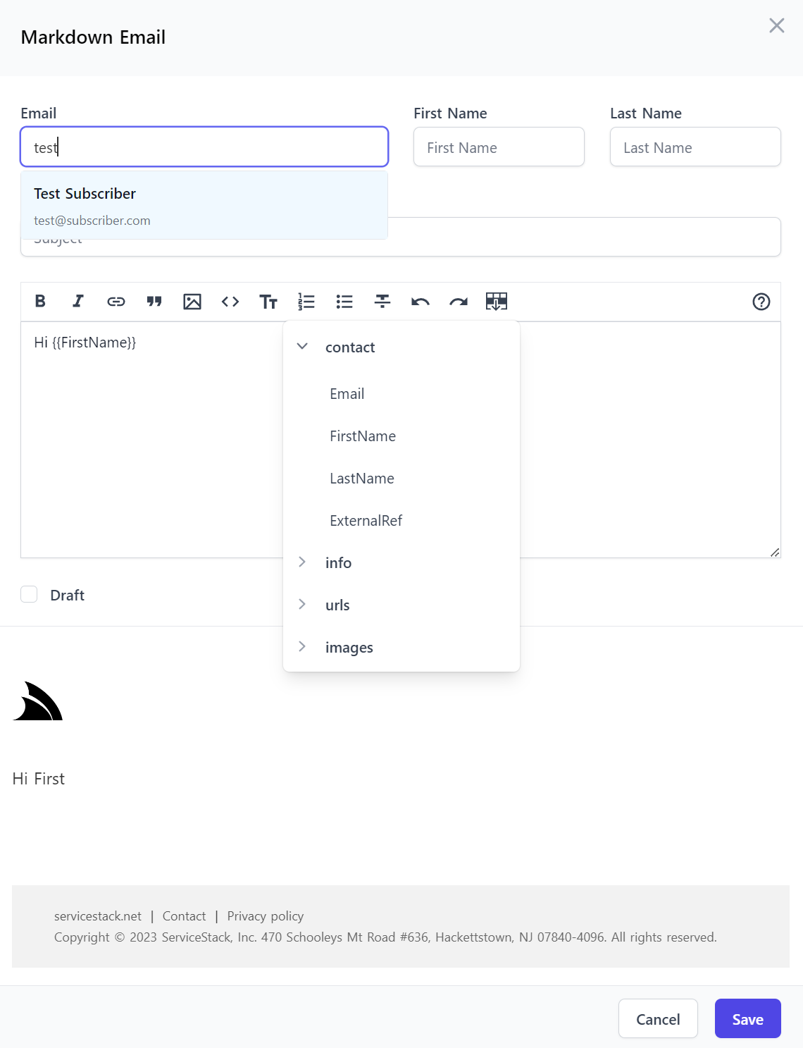
to open a modal to select a contact from a Contacts DataGrid it uses a custom EmailInput Component to provide an optimal, user-friendly UX that
we've come to expect from popular Email clients like gmail to provide a non-modal autocomplete dropdown that automatically searches our contact list
as we type.
Registering Custom Components
To make use of a custom Input component we need to register it with the Vue Component Library in app.mjs, e.g:
import ServiceStackVue, { useAuth } from "@servicestack/vue"
//...

ServiceStackVue.component('EmailInput', EmailInput)
ServiceStackVue.component('MarkdownEmailInput', MarkdownEmailInput)
EmailInput
This registers the custom EmailInput and MarkdownEmailInput components defined in Inputs.mjs
Where we can see that <EmailInput> is a customized <TextInput> with an added SelectEmail component that's used to display the Autocomplete
email dropdown:
export const EmailInput = {
    components: { SelectEmail },
    template: `<TextInput v-bind="$attrs" @update:modelValue="$emit('update:modelValue',$event)">
      <template #footer="{ id, inputElement, modelValue }">
        <SelectEmail v-if="inputElement" :inputElement="inputElement" :modelValue="modelValue" />
      </template>
    </TextInput>`,
    emits:['update:modelValue'],
}
MarkdownEmailInput
Whilst <MarkdownEmailInput> is a customized <MarkdownInput> that's been extended with an additional
Insert Template Variables button that enables quick access for users to discover and insert user-defined Template Variables:
export const MarkdownEmailInput = {
    components: { InsertVariableButton },
    template: `<MarkdownInput v-bind="$attrs" @update:modelValue="$emit('update:modelValue',$event)">
      <template #toolbarbuttons="{ instance, textarea }">
        <InsertVariableButton :instance="instance" :textarea="textarea" />
      </template>
    </MarkdownInput>`,
    emits:['update:modelValue'],
}
Once registered they can be declaratively used like any other Input Component using the [Input(Type)] attribute:
[Description("Markdown Email")]
public class MarkdownEmail : CreateEmailBase, IPost, IReturn<MailMessage>
{
    [ValidateNotEmpty]
    [FieldCss(Field = "col-span-12")]
    public string Subject { get; set; }

    [ValidateNotEmpty]
    [Input(Type="MarkdownEmailInput", Label=""), FieldCss(Field="col-span-12", Input="h-56")]
    public string? Body { get; set; }

    public bool? Draft { get; set; }
}

public abstract class CreateEmailBase
{
    [ValidateNotEmpty]
    [Input(Type="EmailInput")]
    public string Email { get; set; }

    [ValidateNotEmpty]
    [FieldCss(Field = "col-span-6 lg:col-span-3")]
    public string FirstName { get; set; }

    [ValidateNotEmpty]
    [FieldCss(Field = "col-span-6 lg:col-span-3")]
    public string LastName { get; set; }
}
Where they're effortlessly used together to deliver a great, optimal UX in all of CreatorKit's Markdown Email Forms:
Extending Auto Forms
The Email Forms also includes a Live Preview component so you can view a HTML Preview of what the Email looks like as-you-type which was
created using a customized <AutoCreateForm> component that's enhanced to include an <EmailPreview> component by using a custom
<template #footer>:
<AutoCreateForm v-if="selectedOp" :type="selectedOp?.name" @save="save" @done="done">
    <template #footer="{ model }">
        <EmailPreview :type="selectedOp?.name" :modelValue="model" />
    </template>
</AutoCreateForm>
AutoForm Components Everywhere
These features have given AutoForm components all the flexibility needed to be able to deliver a great, optimal experience without sacrificing the high-productivity of ServiceStack's validation-bound Auto UIs and API Form components, as a result CreatorKit was able to continue to use AutoForm components for all 17 of its API Forms.