Default CRUD
By default you can create an AutoQueryGrid that allows authorized users the ability to Create, Read, Update & Delete records with just the DataModel, e.g:
<AutoQueryGrid type="Booking" />
This will utilize your App's existing AutoQuery APIs for the specified DataModel to enable its CRUD functionality.
Read Only
You can use apis to limit which AutoQuery APIs AutoQueryGrid should use, so if only the AutoQuery DTO is provided, the AutoQueryGrid will only be browsable in read-only mode:
<AutoQueryGrid type="Booking" apis="QueryBookings" />
Table Styles
The same DataGrid Table Styles can also be used to style AutoQueryGrid, e.g:
<AutoQueryGrid type="Booking" tableStyle="verticalLines,uppercaseHeadings" />
Custom Styles
The AutoQueryGrid's appearance is further customizable with the property classes & functions below:
defineProps<{
  toolbarButtonClass: string
  tableStyle: "simple" | "fullWidth" | "stripedRows" | "whiteBackground" | "uppercaseHeadings" | "verticalLines"
  gridClass: string
  grid2Class: string
  grid3Class: string
  grid4Class: string
  tableClass: string
  theadClass: string
  tbodyClass: string
  theadRowClass: string
  theadCellClass: string

  rowClass:(model:any,i:number) => string
  rowStyle:(model:any,i:number) => StyleValue
}>()
Custom AutoQueryGrid
Different AutoQueryGrid features can be hidden with hide and functionality disabled with deny, e.g:
<AutoQueryGrid type="Booking" hide="pagingNav,copyApiUrl,downloadCsv" deny="filtering" />
Features that can be hidden and disabled include:
defineProps<{
    deny: "filtering" | "queryString" | "queryFilters"
    hide: "toolbar"   | "preferences" | "pagingNav" | "pagingInfo" | "downloadCsv" | "refresh"
       | "copyApiUrl" | "filtersView" | "newItem"   | "resetPreferences"
}>()
Global AutoQueryGrid Configuration
These features can also be disabled at a global level, applying to all <AutoQueryGrid> components with setConfig, e.g:
const { setAutoQueryGridDefaults } = useConfig()

setAutoQueryGridDefaults({
  hide: ['pagingNav','copyApiUrl','downloadCsv']
})
Limit Columns
By default AutoQueryGrid displays all public properties returned in its AutoQuery API which can be further limited with selected-columns:
<AutoQueryGrid type="Booking" selectedColumns="id,name,roomType,roomNumber,cost" />
Simple Responsive Columns
Using visible-from is a simple way to enable a responsive DataGrid by specifying at which Tailwind breakpoints
columns should be visible from and header-titles to use friendlier aliases for different columns, e.g:
<AutoQueryGrid type="Booking"
  selectedColumns="id,name,roomType,roomNumber,cost,bookingStartDate,bookingEndDate"
  :headerTitles="{ roomNumber:'Room', bookingStartDate:'Start', bookingEndDate:'End' }"
  :visibleFrom="{ bookingStartDate:'lg', bookingEndDate:'xl' }" />
Custom Responsive Columns
Which columns are displayed and how they're formatted are further customizable with <template #column> slots:
<AutoQueryGrid type="Booking" :visibleFrom="{ name:'xl', bookingStartDate:'sm', bookingEndDate:'xl', createdBy:'2xl' }">
<template #id="{ id }">
<span class="text-gray-900" v-html="id"></span>
</template>
<template #name="{ name }">{{name}}</template>
<template #roomNumber-header>
<span class="hidden lg:inline">Room </span>No
</template>
<template #cost="{ cost }">
<span v-html="currency(cost)"></span>
</template>
<template #bookingStartDate-header>
Start<span class="hidden lg:inline"> Date</span>
</template>
<template #bookingEndDate-header>
End<span class="hidden lg:inline"> Date</span>
</template>
<template #createdBy-header>
Employee
</template>
<template #createdBy="{ createdBy }" v-html="createdBy"></template>
</AutoQueryGrid>
Custom Functionality
The column template slots can be leveraged to implement custom functionality, e.g. instead of navigating to separate pages to manage related data we can use a custom column to manage Booking Coupons from within the same grid, e.g:
<AutoQueryGrid type="Booking" selectedColumns="id,name,cost,bookingStartDate,bookingEndDate,discount">
    <template #discount="{ discount }">
        <TextLink v-if="discount" class="flex items-end" @click.stop="showCoupon(discount.id)" :title="discount.id">
            <Icon class="w-5 h-5 mr-1" type="Coupon" />
            <PreviewFormat :value="discount.description" />
        </TextLink>
    </template>
</AutoQueryGrid>
<AutoEditForm v-if="coupon" type="UpdateCoupon" v-model="coupon" @done="close" @save="close" />

<script setup lang="ts">
import { ref } from "vue"
import { useClient } from "@servicestack/vue"
import { QueryCoupons } from "dtos"

const client = useClient()
const coupon = ref()

async function showCoupon(id:string) {
    const api = await client.api(new QueryCoupons({ id }))
    if (api.succeeded) {
        coupon.value = api.response!.results[0]
    }
}

const close = () => coupon.value = null
</script>
Data Reference Labels
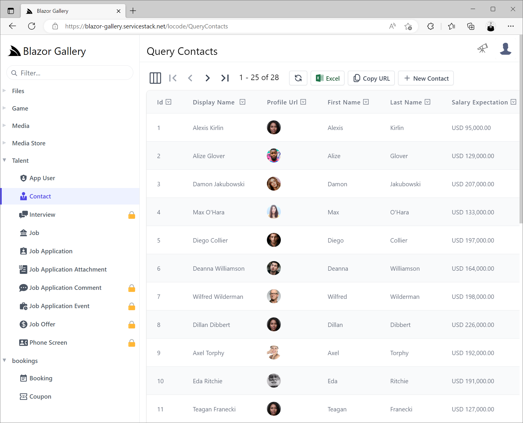
AutoQuery is able to infer relationships from the POCO References of your Data Models where if your DataModel includes [Reference] attributes so that its related Data is returned in your AutoQuery APIs, AutoQueryGrid will be able to make use of it to render the Contacts & Job Names and Icons instead of just the plain Foreign Key Ids.
An example of this in the JobApplications DataModel DTO:
[Icon(Svg = Icons.Application)]
public class JobApplication : AuditBase
{
    [AutoIncrement]
    public int Id { get; set; }

    [References(typeof(Job))]
    public int JobId { get; set; }

    [References(typeof(Contact))]
    public int ContactId { get; set; }

    [Reference]
    [Format(FormatMethods.Hidden)]
    public Job Position { get; set; }

    [Reference]
    [Format(FormatMethods.Hidden)]
    public Contact Applicant { get; set; }

    [Reference]
    public List<JobApplicationComment> Comments { get; set; }

    public DateTime AppliedDate { get; set; }

    public JobApplicationStatus ApplicationStatus { get; set; }
    //...
}
Which AutoQueryGrid uses to automatically display the Job and Contact name instead of their ids:
<AutoQueryGrid type="JobApplication" :prefs="{take:5}" />
With the original ids are discoverable by hovering over the Job & Contact labels.
Reference Fields
By default AutoQuery will infer using the first string column of the related table for its label, this information can also be explicitly defined
with the [Ref] attribute, e.g:
public class JobApplication : AuditBase
{
    [AutoIncrement]
    public int Id { get; set; }

    [References(typeof(Job))]
    [Ref(Model=nameof(Job), RefId=nameof(Job.Id), RefLabel=nameof(Job.Title))]
    public int JobId { get; set; }

    [References(typeof(Contact))]
    [Ref(Model=nameof(Contact), RefId=nameof(Contact.Id), RefLabel=nameof(Contact.DisplayName))]
    public int ContactId { get; set; }
    //...
}
Alternatively you can use [Ref(None=true)] to disable any implicit inferences and render the FK property Ids as-is.
When displaying referential data you can tell AutoQueryGrid to hide rendering the complex data references as well columns
using [Format(FormatMethods.Hidden)].
AutoQueryGrid Template Slots
AutoQueryGrid supports a number of Vue slots to customize its built-in UIs,
including formheader and formfooter slots to insert custom content before and after the Auto Create & Edit components forms:
<template #formheader="{ form, type, apis, model, id }">
<template #formfooter="{ form, type, apis, model, id }">
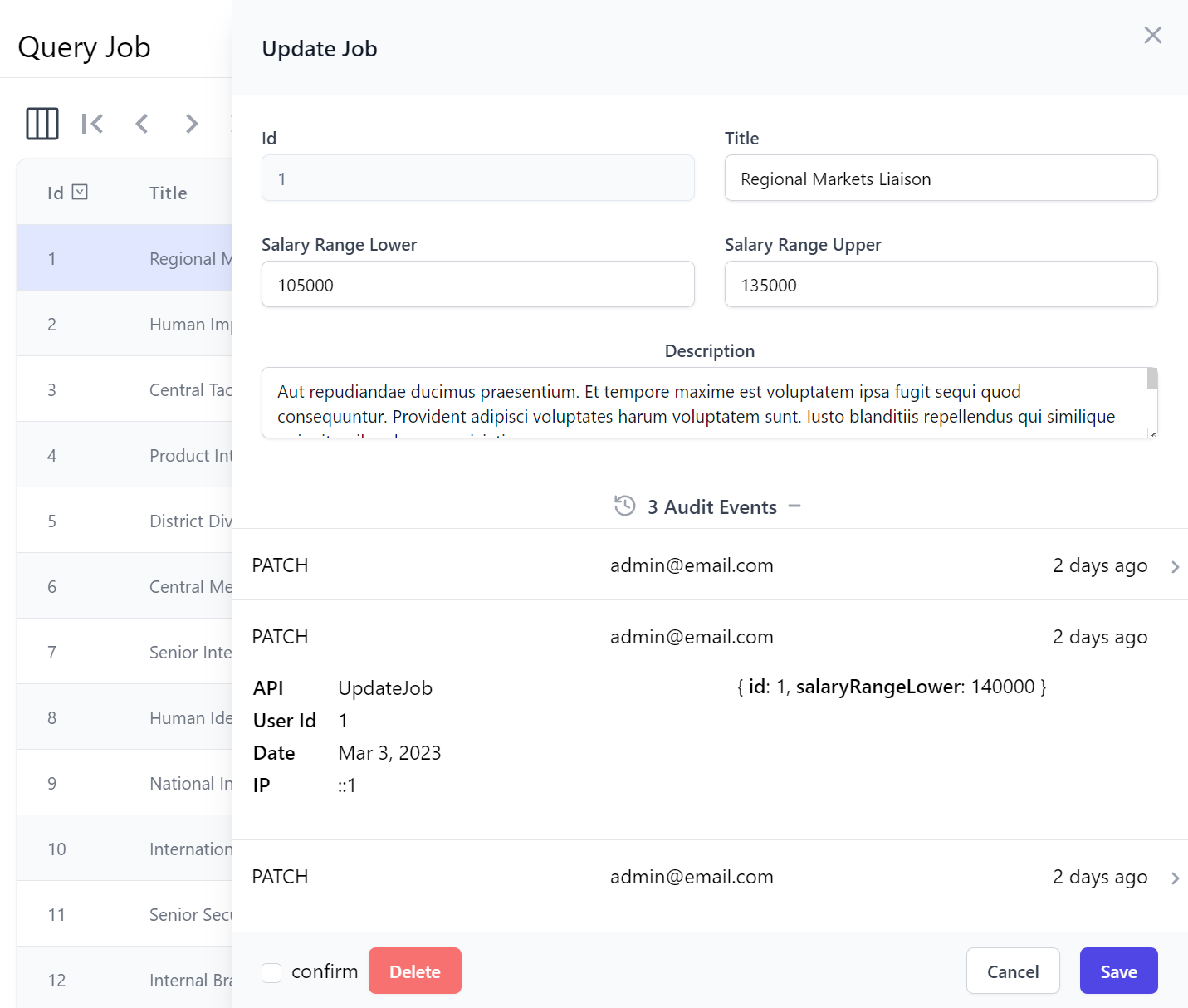
This feature is used to implement Locode's Audit History UI for displaying the Audit History of each record in the bottom of the Edit Form for Authorized Users, implemented with:
<AutoQueryGrid :key="store.opDataModel" ref="grid" :type="store.opDataModel">
    <template #formfooter="{ form, type, apis, model, id }">
        <AuditEvents v-if="form === 'edit' && canAccessCrudEvents" class="mt-4" :key="id" :type="type" :id="id" />
    </template>
</AutoQueryGrid>
Which loads the AuditEvents.mjs component at the bottom of Edit forms, allowing Admin Users to inspect the Audit History of each record:
Alternatively you can replace the entire Create and Edit Forms used with the createform and editforms slots:
<template #createform="{ form, apis, type }">
<template #editform="{ form, apis, type }">
Additional toolbar buttons can be added with the toolbarbuttons slot, e.g:
<template #toolbarbuttons="{ toolbarButtonClass }">
  <div class="pl-2 mt-1">
      <button type="button" @click="customAction" :class="toolbarButtonClass">
        <span class="whitespace-nowrap">My Action</span>
      </button>
  </div>
</template>
Alternatively you can replace the entire toolbar with your own with:
<template #toolbar>
All other template slots are passed down to the embedded DataGrid component where they can be used to customize column headers and cells.
AutoQueryGrid Properties
Additional customizations available using AutoQueryGrid properties include:
defineProps<{
    filterDefinitions?: AutoQueryConvention[]
    id?: string
    apis?: string|string[]
    type?: string|InstanceType<any>|Function
    prefs?: ApiPrefs

    deny?: string|GridAllowOptions|GridAllowOptions[]
    hide?: string|GridShowOptions|GridShowOptions[]

    selectedColumns?:string[]|string
    toolbarButtonClass?: string
    tableStyle?: TableStyleOptions
    gridClass?: string
    grid2Class?: string
    grid3Class?: string
    grid4Class?: string
    tableClass?: string
    theadClass?: string
    tbodyClass?: string
    theadRowClass?: string
    theadCellClass?: string

    headerTitle?:(name:string) => string
    headerTitles?: {[name:string]:string}
    visibleFrom?: {[name:string]:Breakpoint}
    rowClass?:(model:any,i:number) => string
    rowStyle?:(model:any,i:number) => StyleValue | undefined

    apiPrefs?: ApiPrefs
    canFilter?:(column:string) => boolean
    disableKeyBindings?:(column:string) => boolean
    configureField?: (field:InputProp) => void
    skip?: number
    create?: boolean
    edit?: string|number
}>()

type ApiPrefs = {
    take?: number
    selectedColumns?: string[]
}

type FormStyle  = "slideOver" | "card"
type TableStyle = "simple" | "fullWidth" | "stripedRows" | "whiteBackground" | "uppercaseHeadings"
  | "verticalLines"

type Breakpoint = "xs" | "sm" | "md" | "lg" | "xl" | "2xl"

type GridAllowOptions =
  "filtering"   | "queryString" | "queryFilters"

type GridShowOptions =
  "toolbar"     | "preferences" | "pagingNav"        | "pagingInfo"  | "downloadCsv" |
  "refresh"     | "copyApiUrl"  | "resetPreferences" | "filtersView" | "newItem"
AutoQueryGrid Events
Whilst the headerSelected and rowSelected events can be used to invoke custom functionality when column headers and rows are selected:
defineEmits<{
    (e: "headerSelected", name:string, ev:Event): void
    (e: "rowSelected", item:any, ev:Event): void
}>()
Powers Locode
AutoQueryGrid is already used extensively and is the key component that enables Locode's Instant Auto UI to manage your App's AutoQuery CRUD APIs.