
With ServiceStack now fully integrated with .NET 8, our focus has shifted from providing platform-agnostic solutions that supports all ServiceStack's .NET Framework and .NET hosts to building on the new capabilities of .NET 8 by enhancing ASP .NET Core's built-in features and templates with ServiceStack's high-productivity features.
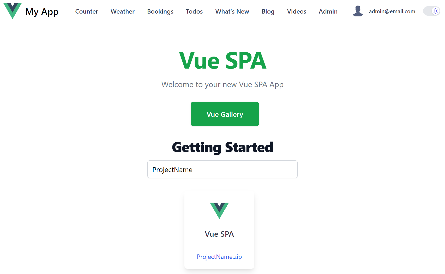
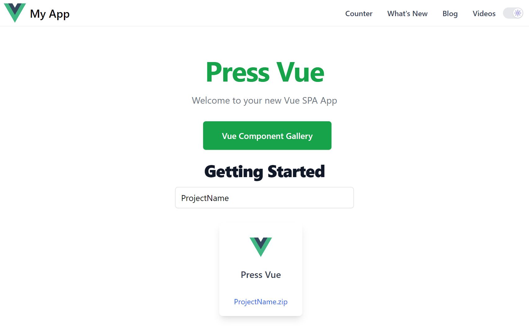
New Vue SPA Template
The latest Vue SPA template is a good example of this, building on and enhancing the built-in ASP.NET Core Vue SPA template with many high-productivity features.
Vite Vue SPA Template
Explore the high productivity features in the new ServiceStack Vue SPA template
Live Demo
ASP.NET Core Vue SPA Template
The Vue and ASP.NET Core template provides a seamless starting solution which runs both the .NET API backend and Vite Vue frontend during development.
It's a modern template capturing the best Vue has to offer, configured with Vite's fast HMR (Hot Module Reload) and TypeScript support - it allows App's to be developed with Vue's typed Single File Components enabling both a productive development experience and an optimal high-performance production build at runtime.
Minimal API integration
Whilst a great starting point, it's still only a basic template configured with a bare-bones Vue Vite App that's modified to show an example of calling a Minimal API.
Built-in API Integration
Although the approach used isn't very scalable, with a proxy rule needed for every user-defined API route:
export default defineConfig({
    //...
    server: {
        proxy: {
            '^/weatherforecast': {
                target,
                secure: false
            }
        },
    }
})
And the need for hand maintained Types to describe the shape of the API responses with Stringly Typed fetch API calls referencing string routes:
import { defineComponent } from 'vue';

type Forecasts = {
    date: string,
    temperatureC: string,
    temperatureF: string,
    summary: string
}[];

interface Data {
    loading: boolean,
    post: null | Forecasts
}

export default defineComponent({
    data(): Data {
        return {
            loading: false,
            post: null
        };
    },
    created() {
        // fetch the data when the view is created and the data is
        // already being observed
        this.fetchData();
    },
    watch: {
        // call again the method if the route changes
        '$route': 'fetchData'
    },
    methods: {
        fetchData(): void {
            this.post = null;
            this.loading = true;

            fetch('weatherforecast')
                .then(r => r.json())
                .then(json => {
                    this.post = json as Forecasts;
                    this.loading = false;
                    return;
                });
        }
    },
});
Which is used to render the API response in a hand rolled table:
<div v-if="post" class="content">
<table>
<thead>
<tr>
<th>Date</th>
<th>Temp. (C)</th>
<th>Temp. (F)</th>
<th>Summary</th>
</tr>
</thead>
<tbody>
<tr v-for="forecast in post" :key="forecast.date">
<td>{{ forecast.date }}</td>
<td>{{ forecast.temperatureC }}</td>
<td>{{ forecast.temperatureF }}</td>
<td>{{ forecast.summary }}</td>
</tr>
</tbody>
</table>
</div>
ServiceStack API Integration
Fortunately ServiceStack can significantly improve this development experience with the /api pre-defined route where only a single proxy rule is needed to proxy all APIs:
export default defineConfig({
    //...
    server: {
        proxy: {
            '^/api': {
                target,
                secure: false
            }
        },
    }
})
End-to-end Typed APIs
Instead of hand-rolled types and Stringly Typed API calls, it utilizes server generated TypeScript DTOs with a generic JsonServiceClient to enable end-to-end Typed APIs:
import { ref, onMounted } from 'vue'
import { ApiResult } from "@servicestack/client"
import { useClient } from "@servicestack/vue"
import { GetWeatherForecast } from "@/dtos"

const client = useClient()
const api = ref(new ApiResult())

onMounted(async () => {
    api.value = await client.api(new GetWeatherForecast())
})
This benefits in less code to maintain, immediate static typing analysis to ensure correct usage of APIs and valuable feedback when APIs are changed, that's easily updated with a single command:
npm run dtos
High Productivity Vue Components
With access to the ServiceStack Vue Components library there's also less code to maintain in the UI, where you can render a beautiful tailwind styled DataGrid with just:
<DataGrid :items="api.response" />
ServiceStack Vue SPA Features
Other high-productivity features available in the ServiceStack Vue SPA template include:
Integrated Identity Auth
Pre-configured with ASP.NET Core Identity Auth, including Sign In and Custom Registration APIs and UI Pages which can be customized as needed, examples of Role-based security as well as a turn key solution for Integrating Identity Auth Registration workflow with your SMTP Provider with all emails sent from a managed non-blocking Background MQ for optimal responsiveness and execution.
tailwindcss
Tailwind has quickly become the best modern CSS framework for creating scalable, mobile-first responsive websites built upon a beautiful expert-crafted constraint-based Design System that enables effortless reuse of a growing suite of Free Community and professionally-designed Tailwind UI Component Libraries, invaluable for quickly creating beautiful websites.

Dark Mode
In addition to revolutionizing how we style mobile-first responsive Apps, Tailwind's Dark Mode does the same for enabling Dark Mode a feature supported throughout all of ServiceStack's Vue Component Library.
Built for Productivity
So that you're immediately productive out-of-the-box, the template includes a rich set of high-productivity features, including:
| tailwind/typography | Beautiful css typography for markdown articles & blog posts |
| tailwind/forms | Beautiful css form & input styles that's easily overridable |
| Markdown | Native Markdown integration |
| plugin/press | Static markdown for creating blogs, videos and other content |
| plugin/vue-router | Conventional file system based routing for Vue 3 on Vite |
| plugin/layouts | Support for multiple page layouts |
| plugin/components | Auto importing & registering of components on-demand |
| plugin/svg | Load SVG files as Vue components |
| Iconify | Unified registry to access 100k+ high quality SVG icons |
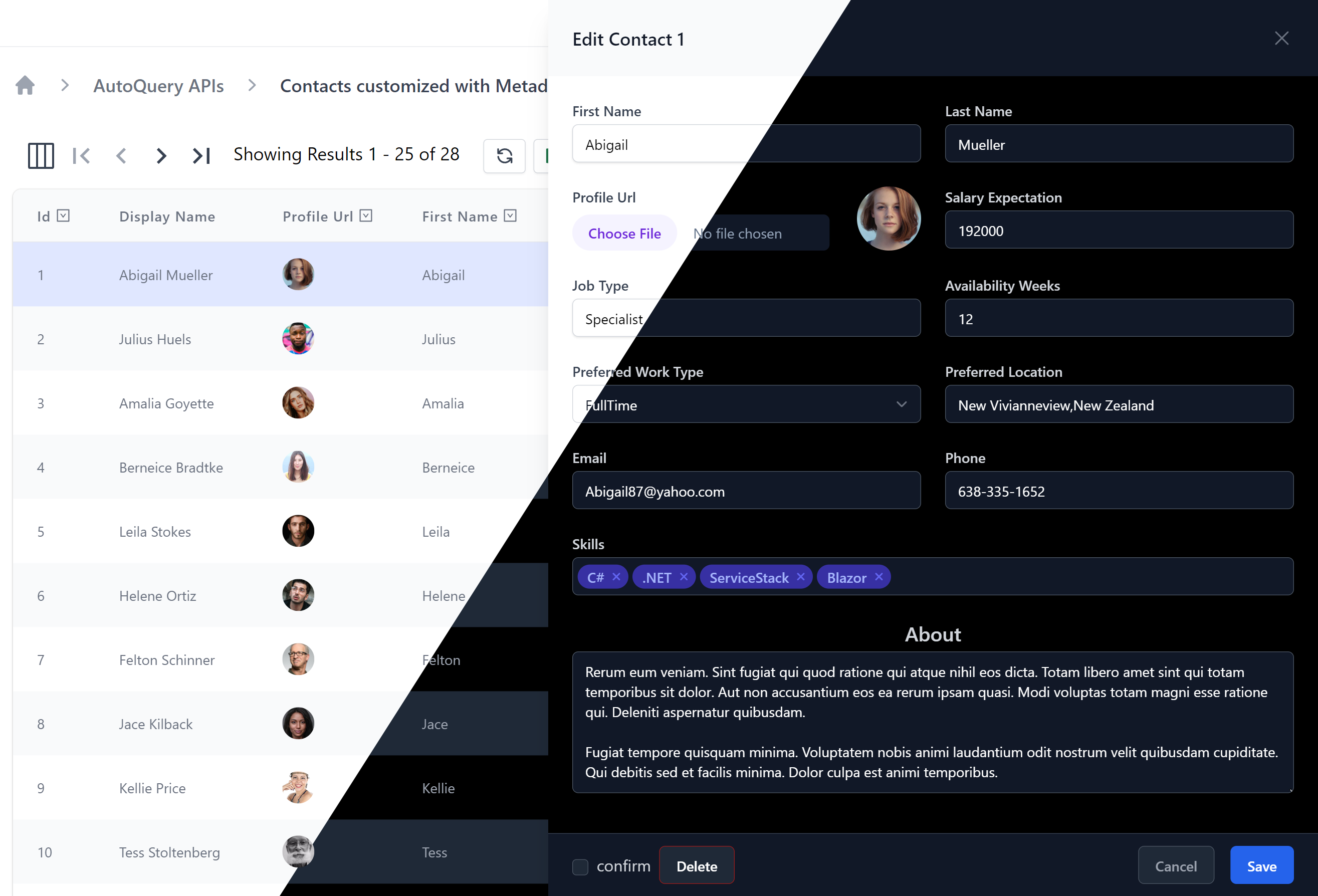
Bookings CRUD Pages
Bookings CRUD example shows how you can rapidly develop beautiful responsive, customized CRUD UIs with minimal effort using AutoQuery APIs, AutoForms & AutoQueryGrid Vue Components.
Admin Pages
Whilst Bookings CRUD is a good example of creating custom UI for end users, you may also want to quickly develop a set of back-office CRUD Admin UIs to manage your App's Database tables, which is easily achievable AutoQueryGrid's default behavior:
The development UX of Admin Pages is further improved in Vue Vite which is able to use SFC Pages and conventional file system routing to quickly add Admin Pages to manage an App's back-end tables, e.g:
/admin/coupons.vue
<AutoQueryGrid type="Coupon" />
/admin/bookings.vue
<AutoQueryGrid type="Booking"
selected-columns="id,name,roomType,roomNumber,bookingStartDate,cost,couponId,discount"
  :header-titles="{ roomNumber:'Room No', bookingStartDate:'Start Date' }"
   :visible-from="{ roomNumber:'lg', cost:'md', couponId:'xl', discount:'never' }" />
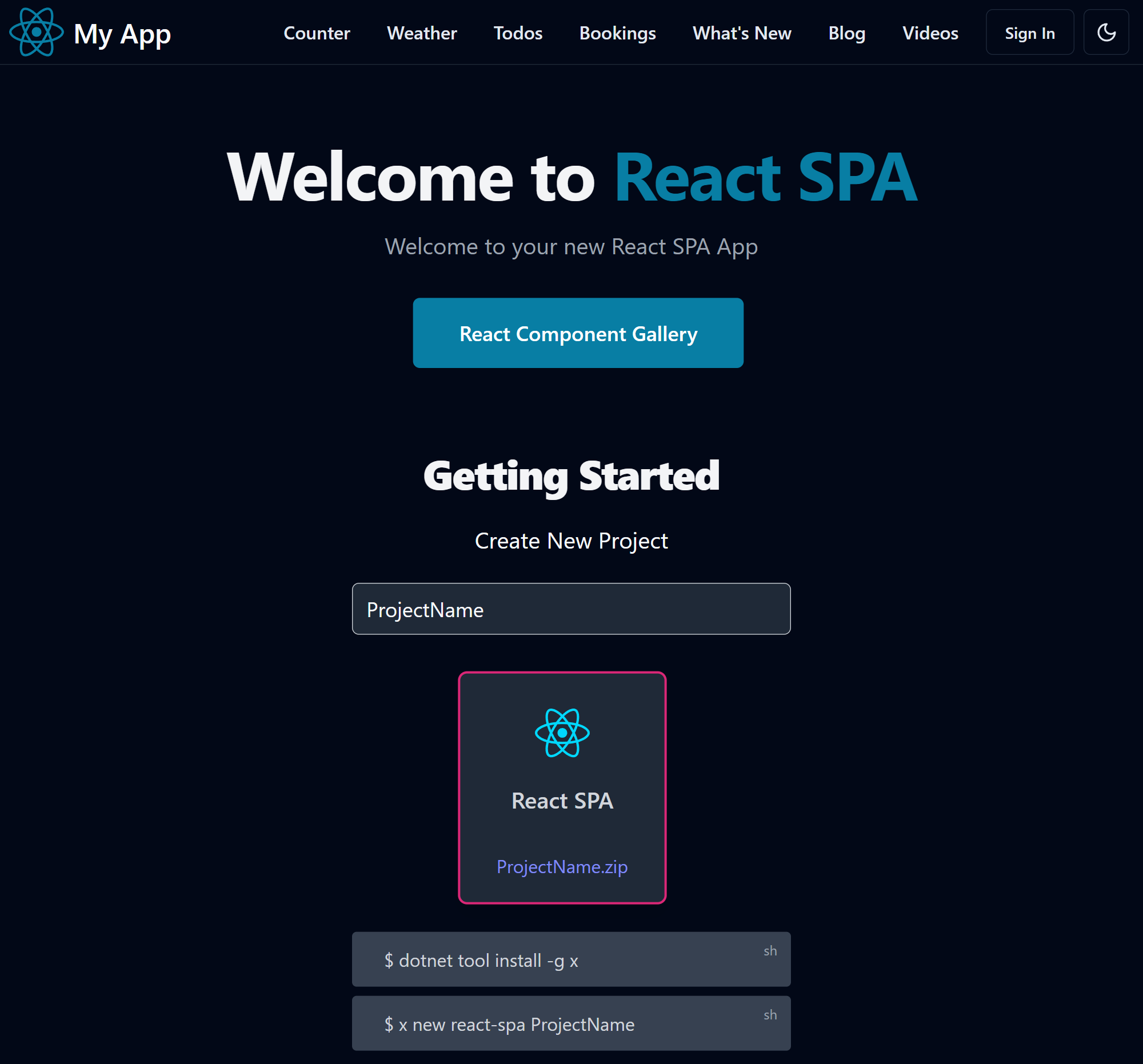
ServiceStack React SPA Template
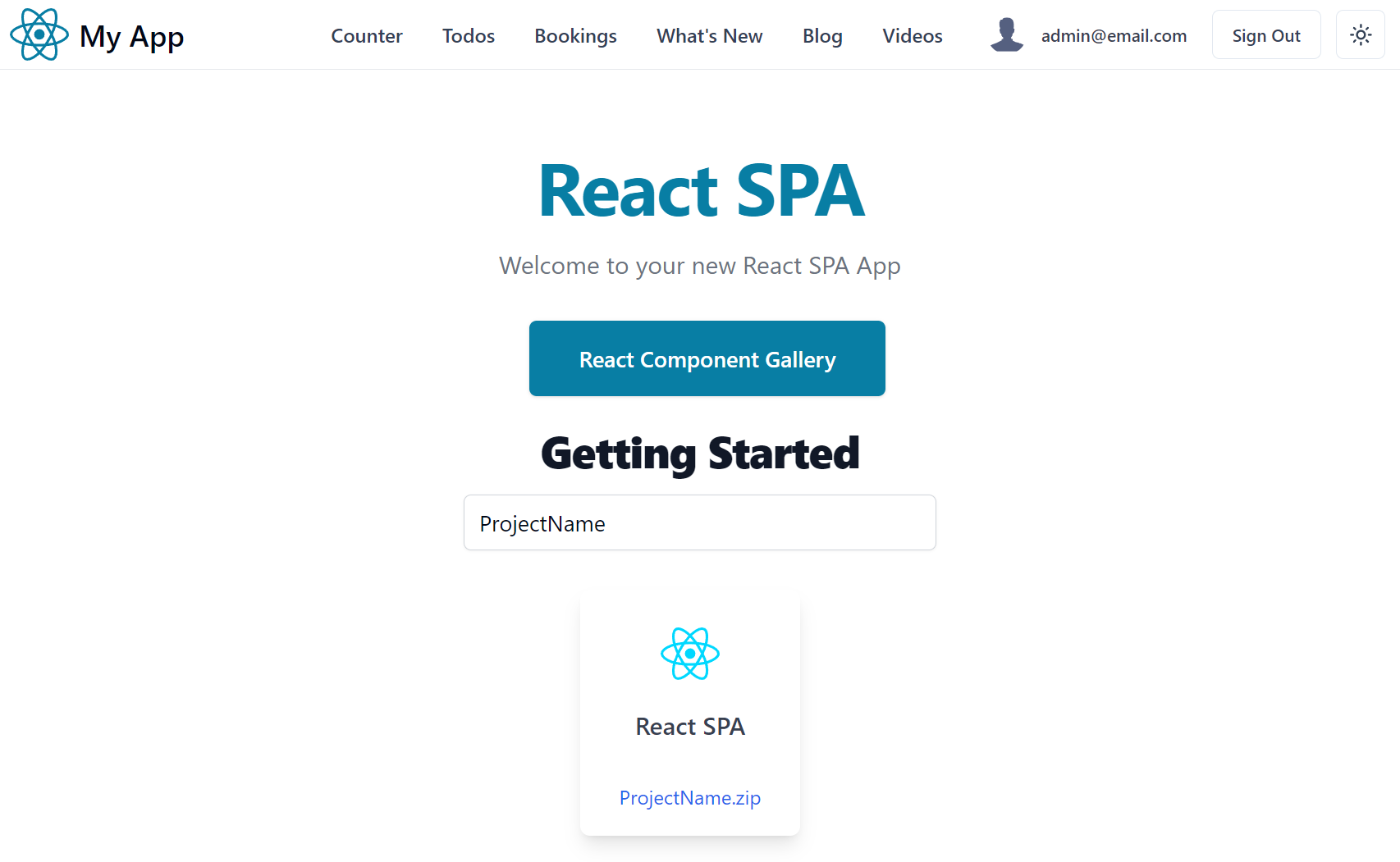
Just as we've enhanced the built-in ASP.NET Core React SPA template we've also enhanced the built-in ASP.NET Core React SPA template with the new TypeScript Vite React SPA template with many new high-productivity features.
Vite React SPA Template
Explore the high productivity features in the new ServiceStack React SPA template
Live Demo
ASP.NET Core React SPA Template
The React and ASP.NET Core like the Vue template is a good minimal starting point with great Vite integration and the same shortcomings using Stringly Typed HTTP API calls and hand maintained Types:
interface Forecast {
    date: string;
    temperatureC: number;
    temperatureF: number;
    summary: string;
}

function App() {
    const [forecasts, setForecasts] = useState<Forecast[]>();

    useEffect(() => {
        populateWeatherData();
    }, []);
    //...
}

async function populateWeatherData() {
    const response = await fetch('weatherforecast');
    const data = await response.json();
    setForecasts(data);
}
and uses a hand rolled table to render the API response in:
function App() {
    //...
    const contents = forecasts === undefined
        ? <p><em>Loading... Please refresh once the ASP.NET backend has started. See
            <a href="https://aka.ms/jspsintegrationreact">jsps</a> for more details.
            </em></p>
        : <table className="table table-striped" aria-labelledby="tabelLabel">
            <thead>
            <tr>
                <th>Date</th>
                <th>Temp. (C)</th>
                <th>Temp. (F)</th>
                <th>Summary</th>
            </tr>
            </thead>
            <tbody>
                {forecasts.map(forecast =>
                    <tr key={forecast.date}>
                        <td>{forecast.date}</td>
                        <td>{forecast.temperatureC}</td>
                        <td>{forecast.temperatureF}</td>
                        <td>{forecast.summary}</td>
                    </tr>
                )}
            </tbody>
        </table>;
}
ServiceStack API Integration
Instead of hand-rolled types and Stringly Typed API calls, the new React SPA template utilizes server generated TypeScript DTOs with a generic JsonServiceClient to enable end-to-end Typed APIs:
import { useState, useEffect } from "react"
import { useClient } from "@/gateway"
import { GetWeatherForecast } from "@/dtos"

const client = useClient()
const [forecasts, setForecasts] = useState<Forecast[]>([])

useEffect(() => {
    (async () => {
        const api = await client.api(new GetWeatherForecast())
        if (api.succeeded) {
            setForecasts(api.response!)
        }
    })()
}, [])
React Component Ecosystem
Given it's popularity, React has arguably the richest ecosystem of freely available libraries and components, a good example are the popular shadcn/ui Tailwind components. Unlike most libraries they're source copied piecemeal into your project where they're locally modifiable, i.e. instead of an immutable package reference.
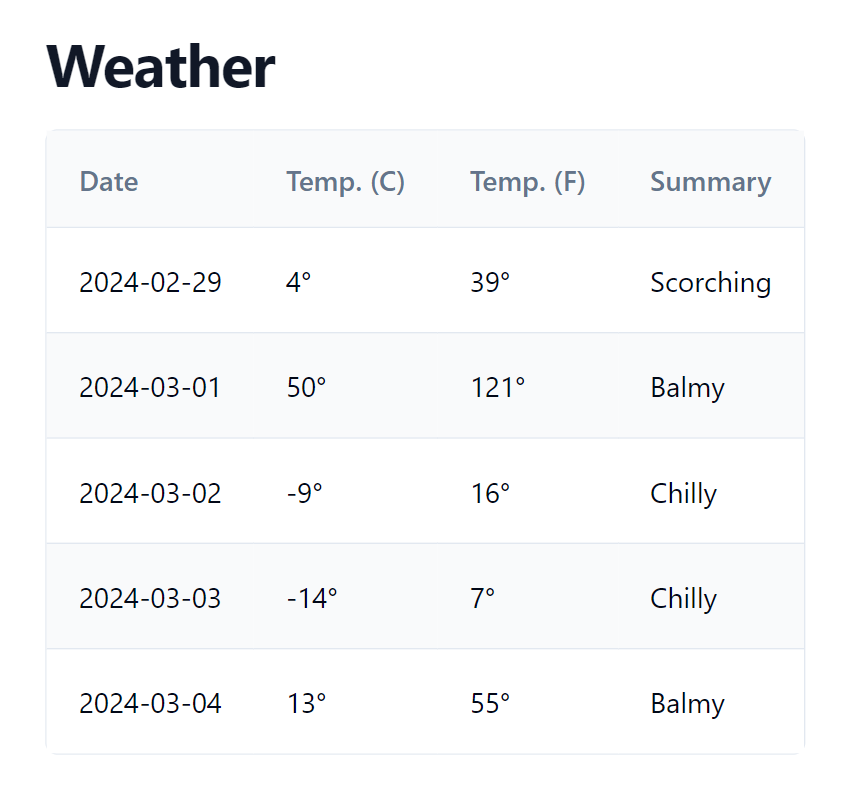
As they're just blueprints, they're not dependent on a single library and will utilize the best library to implement each component if needed. E.g. the Data Table component documents how to implement your own Data Table utilizing the headless TanStack Table - a version of which we've built into DataTable.tsx which is used in the template to implement both complex CRUD UIs and weather.tsx simple table results:
import { columnDefs, DataTable, getCoreRowModel } from "@/components/DataTable.tsx"
const columns = columnDefs(['date', 'temperatureC', 'temperatureF', 'summary'],
({ temperatureC, temperatureF}) => {
temperatureC.header = "Temp. (C)"
temperatureF.header = "Temp. (F)"
temperatureC.cell = temperatureF.cell = ({ getValue }) => <>{getValue()}°</>
})
return (<LayoutPage title="Weather">
<DataTable columns={columns} data={forecasts} getCoreRowModel={getCoreRowModel()} />
</LayoutPage>)
To render the /weather customized Data Table:
The template also includes customizable Form.tsx Input components which can be used to create beautiful validation-bound forms which effortlessly integrates with ServiceStack's Error Handling and Declarative Validation attributes.
ServiceStack React SPA Features
Other high-productivity features available in the ServiceStack React SPA template include:
Integrated Identity Auth
Pre-configured with ASP.NET Core Identity Auth, including Sign In and Custom Registration APIs and UI Pages which can be customized as needed, examples of Role-based security as well as a turn key solution for Integrating Identity Auth Registration workflow with your SMTP Provider with all emails sent from a managed non-blocking Background MQ for optimal responsiveness and execution.
tailwindcss with Dark Mode
In addition to revolutionizing how we style mobile-first responsive Apps, Tailwind's Dark Mode does the same for enabling Dark Mode a feature supported throughout the template and its Tailwind UI Components.
Built for Productivity
So that you're immediately productive out-of-the-box, the template includes a rich set of high-productivity features, including:
| tailwind/typography | Beautiful css typography for markdown articles & blog posts |
| tailwind/forms | Beautiful css form & input styles that's easily overridable |
| Markdown | Native mdx Markdown integration |
| React Router | Full featured routing library for React |
| plugin/press | Static markdown for creating blogs, videos and other content |
| plugin/pages | Conventional file system based routing for Vite |
| plugin/svg | Load SVG files as React components |
| Iconify | Unified registry to access 100k+ high quality SVG icons |
Bookings CRUD Pages
The Bookings CRUD example shows how you can utilize a customized Data Table and templates Form components to create a beautifully styled CRUD UI with minimal effort.
Vite Press Plugin

The Vite Press Plugin is an alternative to VitePress for adding Markdown features to existing Vite Vue or React projects. It's a non-intrusive plugin for Vue and React Vite apps that want to add markdown powered content features without needing to adopt an opinionated framework for their entire App.
Universal Markdown Features
A goal for vite-press-plugin is to implement a suite of universal markdown-powered features that can be reused across Vue, React and .NET Razor and Blazor projects, allowing you to incorporate same set of markdown feature folders to power markdown content features across a range of websites built with different technologies.
Vite Apps with vite-press-plugin
The vite-press-plugin currently powers the markdown features in the static Vite Vue and React templates which are ideal for creating static websites, blogs, documentation and marketing websites that can be hosted FREE on GitHub Pages CDN:
Static Vite Templates with vite-press-plugin
- press-vue - Vite Vue App
- press-react - Vite React App
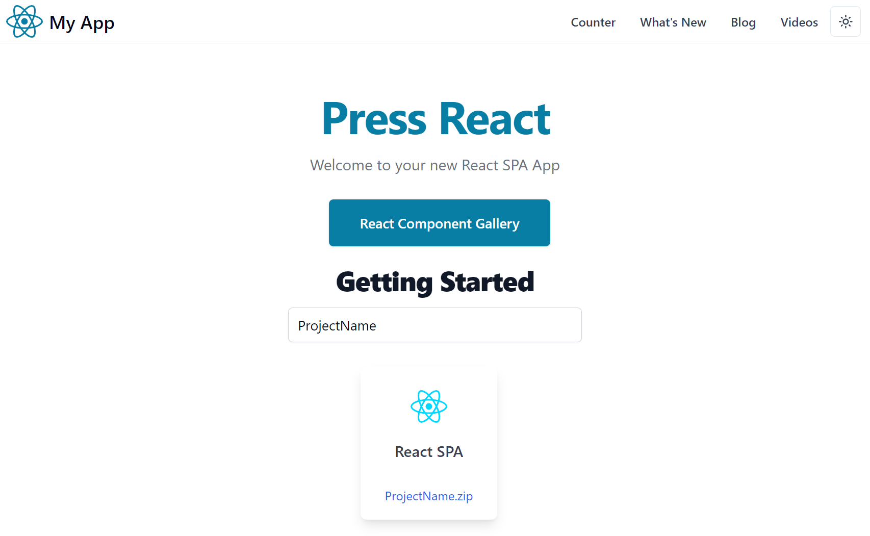
Vite Vue Static SPA Template
Vite React Static SPA Template
The vite-press-plugin makes the Markdown features available to the Vite App, whilst the markdown rendering itself is optimally implemented in:
- Vue Templates - with markdown-it in Vue SFC Components
- React Templates - with remark and MDX in React Components
.NET 8 API backend with Vite Vue & React SPA frontend
When more capabilities are required and you want a .NET API backend to your Vite Vue or React SPA frontend, you can use one of our integrated .NET 8 SPA templates:
.NET Templates with C# and Markdig
Whilst the same Markdown feature folders are implemented in C# and rendered with Markdig and either Razor Pages or Blazor Components:
.NET 8 Razor SSG and Blazor SSR Templates
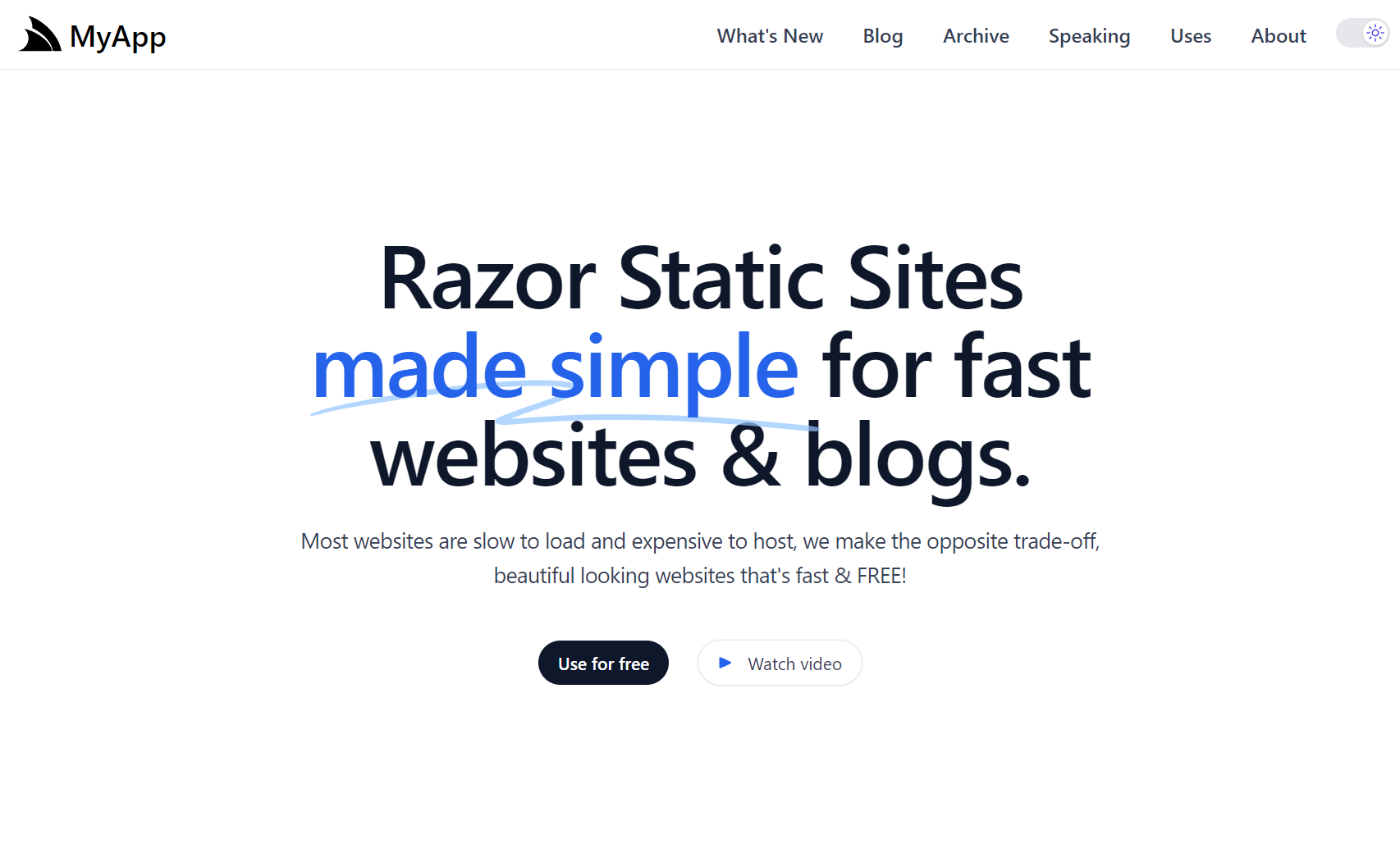
- razor-ssg - .NET Razor SSG Blog and Marketing Website with Markdig
- razor-press - .NET Razor SSG Documentation Website with Markdig
- blazor-vue - .NET 8 Blazor Server Rendered Website with Markdig
Markdown Feature Folders
The content for each Markdown feature is maintained within its own feature folder with a _ prefix:
Markdown Document Structure
Additional metadata for each markdown page is maintained in the frontmatter of each markdown page, e.g. the front matter for this blog post contains:
---
title:   Vite Press Plugin
summary: Introducing the Vite Press Plugin
author:  Lucy Bates
tags:    [docs,markdown]
image:   https://source.unsplash.com/random/2000x1000/?stationary
---
The frontmatter is used in combination with file attributes to populate the document metadata. The schema used to support the current markdown features include:
type Doc = {
    title: string     // title of Markdown page (frontmatter)
    slug: string      // slug to page (populated)
    path: string      // path to page (populated)
    fileName: string  // filename of markdown file (populated)
    content: string   // markdown content (populated)
    date: string      // date of page (frontmatter)
    tags: string[]    // related tags (frontmatter)
    order?: number    // explicit page ordering (frontmatter)
    group?: string    // which group page belongs to (populated)
    draft?: boolean   // make visible in production (frontmatter)
    wordCount: number      // (populated)
    lineCount: number      // (populated)
    minutesToRead: number  // (populated)
}

type Post = Doc & {
    summary: string // short summary of blog post (frontmatter)
    author: string  // author of blog post (frontmatter)
    image: string   // hero image of blog post (frontmatter)
}

type Video = Doc & {
    url: string // URL of YouTube Video
}

type WhatsNew = Doc & {
    url: string    // URL of YouTube Video
    image: string  // Image to display for feature
}
Markdown files can contain additional frontmatter which is also merged with the document metadata.
Accessing Markdown Metadata
In Vue App's the Metadata is available as an injected dependency that's navigable with the typed VirtualPress schema, e.g:
import type { VirtualPress } from "vite-plugin-press"

const press:VirtualPress = inject('press')!
In React App's it's available via an injected context:
import { PressContext } from "@/contexts"

const press = useContext(PressContext)
Which is defined as:
import { createContext } from 'react'
import type { VirtualPress } from 'vite-plugin-press'

export const PressContext = createContext<VirtualPress>({} as VirtualPress)
This VirtualPress metadata is used to power all markdown features.
Blog
The blog maintains its markdown posts in a flat /_posts folder which each Markdown post containing its publish date and URL slug it should be published under, e.g:
Supporting all Blog features requires several different pages to render each of its view:
| Description | Example | Vue | React |
|---|---|---|---|
| Main Blog layout | /blog | blog.vue | blog.tsx |
| Navigable Archive of Posts | /posts | index.vue | index.tsx |
| Individual Blog Post (like this!) | /posts/vite-press-plugin | [slug].vue | [slug].tsx |
| Display Posts by Author | /posts/author/lucy-bates | [name].vue | [name].tsx |
| Display Posts by Tag | /posts/tagged/markdown | [tag].vue | [tag].tsx |
| Display Posts by Year | /posts/year/2024 | [year].vue | [year].tsx |
Configuration
Additional information about the Website Blog is maintained in _posts/config.json
{
  "localBaseUrl": "http://localhost:5173",
  "publicBaseUrl": "https://press-vue.servicestack.net",
  "siteTwitter": "@Vue",
  "blogTitle": "From the blog",
  "blogDescription": "Writing on software design and aerospace industry.",
  "blogEmail": "email@example.org (Vue)",
  "blogImageUrl": "https://servicestack.net/img/logo.png"
}
Authors
Whilst information about Post Authors are maintained in _posts/authors.json
[
  {
    "name": "Lucy Bates",
    "email": "lucy@email.org",
    "bio": "Writing on software design and aerospace industry.",
    "profileUrl": "/img/profiles/user1.svg",
    "twitterUrl": "https://twitter.com/lucy",
    "threadsUrl": "https://threads.net/@lucy",
    "gitHubUrl": "https://github.com/lucy"
  },
]
To associate an Author the name property is used to match a posts frontmatter author.
General Features
Most unique markdown features are captured in their Markdown's frontmatter metadata, but in general these features are broadly available for all features:
- Live Reload - Latest Markdown content is displayed during Development
- Drafts - Prevent posts being worked on from being published with
draft: true - Future Dates - Posts with a future date wont be published until that date
What's New Feature
The /whatsnew page is an example of creating a custom Markdown feature to implement a portfolio or a product releases page where a new folder is created per release, containing both release date and release or project name, with all features in that release maintained markdown content sorted in alphabetical order:
What's New follows the same structure as Pages feature which is rendered in:
Videos Feature
The videos feature maintained in the _videos folder allows grouping of related videos into different folder groups, e.g:
These can then be rendered as UI fragments using the <VideoGroup> component, e.g:
<VideoGroup
  title="Vue Components"
  summary="Learn about productive features in Vue Component Library"
  group="vue"
  learnMore="https://docs.servicestack.net/vue/" />
Includes Feature
The includes feature allows maintaining reusable markdown fragments in the _includes folder, e.g:
Which can be included in other Markdown files with:
:::include privacy.md:::

:::include features/include.md:::
Alternatively they can be included in other Vue, React or Markdown pages with the <Include> component, e.g:
<Include src="privacy.md" />

<Include src="features/include.md" />
Metadata APIs Feature
To support external clients from querying static markdown metadata you can export it to pre-rendered static *.json
data structures by configuring metadataPath to the location you the *.json files published to, e.g:
export default defineConfig({
    plugins: [
        Press({
            metadataPath: 'public/api',
        }),
    ]
})
This will publish all the content of each content type in the year they were published in, along with an all.json containing
all content published in that year as well aso for all time, e.g:
With this you can fetch the metadata of all the new Blog Posts added in 2023 from:
Or all the website content added in 2024 from:
Or ALL the website metadata content from:
This feature makes it possible to support use-cases like CreatorKit's Generating Newsletters feature which generates a Monthly Newsletter Email with all new content added within a specified period.
Markdown Containers
Most of VitePress Containers are also implemented, enabling rich markup to enhance markdown content and documentation universally across all Markdown App implementations:
Input
:::info
This is an info box.
:::

:::tip
This is a tip.
:::

:::warning
This is a warning.
:::

:::danger
This is a dangerous warning.
:::
Output
INFO
This is an info box.
TIP
This is a tip.
WARNING
This is a warning.
DANGER
This is a dangerous warning.
Custom Title
You can specify a custom title by appending the text right after the container type:
Input
:::danger STOP
Danger zone, do not proceed
:::
Output
STOP
Danger zone, do not proceed
copy
The copy container is ideal for displaying text snippets in a component that allows for easy copying:
Input
:::copy
Copy Me!
:::
Output
Copy Me!
HTML or XML fragments can also be copied by escaping them first:
Input
:::copy
`<PackageReference Include="ServiceStack" Version="8.*" />`
:::
Output
<PackageReference Include="ServiceStack" Version="8.*" />
sh
Similarly the sh container is ideal for displaying and copying shell commands:
Input
:::sh
npm run dev
:::
Output
npm run dev
YouTube
For embedding YouTube Videos, optimally rendered using the <LiteYouTube> component, e.g:
Input
:::youtube YIa0w6whe2U
Vue Components Library
:::
Output
Markdown Fenced Code Blocks
For more flexibility you can utilize custom fenced components like the files fenced code block which can
be used to capture ascii representation of a structured documentation like a folder & file structure, e.g:
```files
/_videos
  /vue
    admin.md
    autoquerygrid.md
    components.md
  /react
    locode.md
    bookings.md
    nextjs.md
```
That we can render into a more UX-friendly representation by calling the Files component with the body
of the code-block to convert the structured ascii layout into a more familiar GUI layout:
The benefit of this approach of marking up documentation is that the markdown content still remains in an optimal human-readable form even when the markdown renderer lacks the custom fenced components to render the richer UI.
Components In Markdown
Up till now all above features will let you render the same markdown content in all available Vue, React, Razor or Blazor templates. At the cost of reduced portability, you're also able to embed rich Interactive Vue or React components directly in markdown.
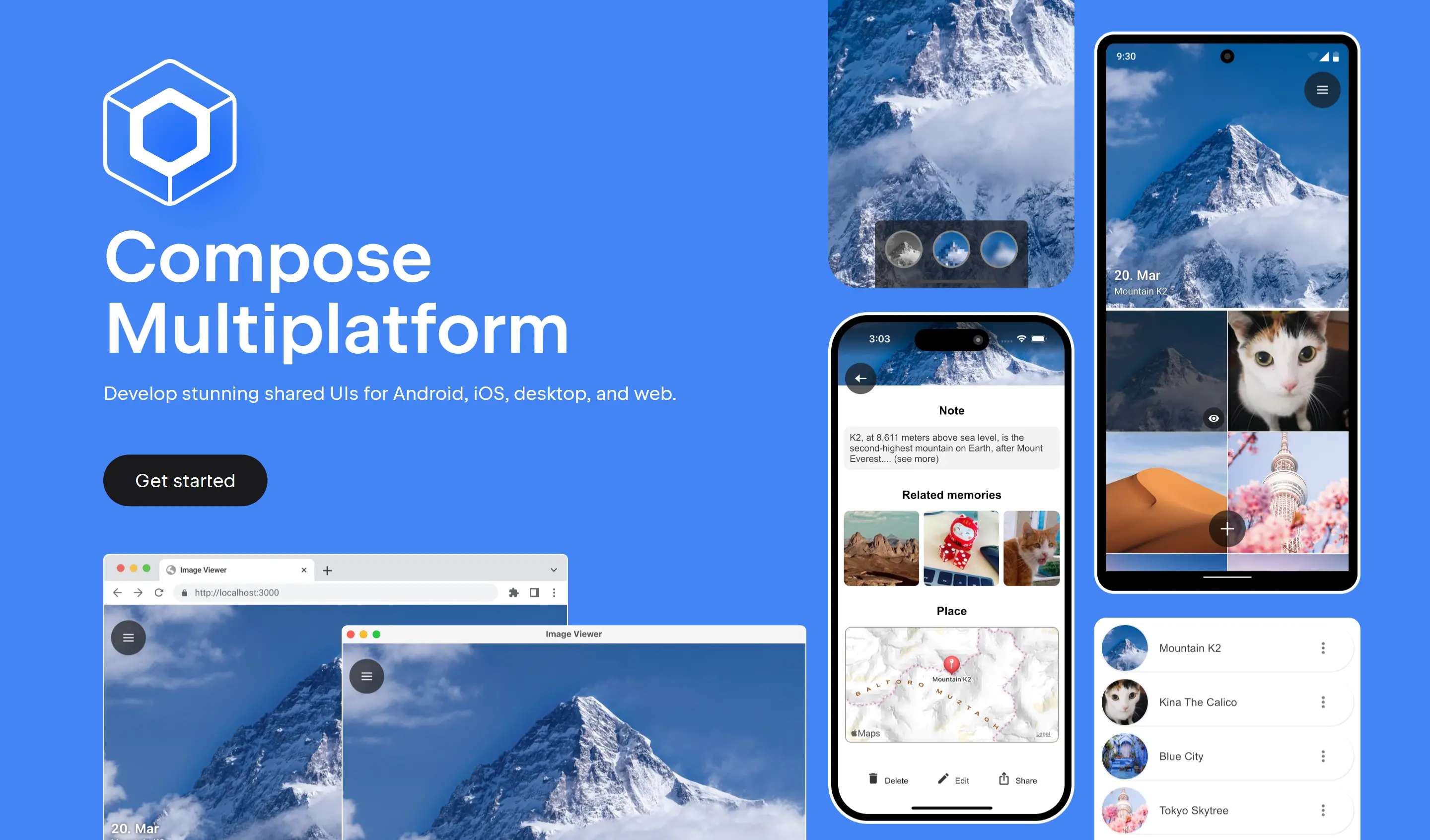
Kotlin Compose Multiplatform
The last few years of neglect of Xamarin has slid it into irrelevance, removing itself from consideration in the already shortlist of viable development options for creating native multi-platform iOS, Android and Desktop Apps, which leaves us just Flutter and React Native as the only viable options.
Thanks to the vast language ecosystem covered by Add ServiceStack Reference, which ever technology you end up choosing to develop native Mobile and Desktop Apps with, you'll always be able to develop with the productivity and type safety benefits of end-to-end typed APIs in your preferred language, whether it's TypeScript or JavaScript for React Native, Dart for Flutter, Java or Kotlin for Android, or Swift for iOS.
Fortunately JetBrains has stepped in to fill the void with Compose Multiplatform offering a modern alternative for creating native Mobile, Desktop & Web Apps which can also leverage Kotlin ServiceStack Reference for end-to-end typed APIs.
Compose Multiplatform builds on Jetpack Compose - Google's modern toolkit for building native Android UIs bringing it to more platforms, including Windows, macOS and Linux Desktops, Web UIs with Kotlin Wasm and on iOS with Kotlin/Native.
We'll look at the latest Compose Multiplatform v1.6 Release
and use it to build a cross-platform Desktop App integrated with a .NET API backend utilizing
Kotlin ServiceStack Reference to generate Kotlin DTOs
that can be used with the generic ServiceStack Java JsonServiceClient to enable its end-to-end typed API
integration.
JVM Platform Required
Whilst Compose Multiplatform supports both JVM and non-JVM platforms, targeting a non JVM platform is very limited
as you won't be able to reference and use any Java packages like ServiceStack's Java Client library in net.servicestack:client
which is required for this example utilizing Kotlin ServiceStack Reference
typed Kotlin DTOs.
Compose Multiplatform iOS & Android Apps
The quickest way to a working Compose Multiplatform App integrated with a .NET API backend is to create a new project from the Compose Desktop template:
Create a new Compose Desktop App
Create a new Kotlin Multiplatform App with your preferred project name:
Or install from the command-line with the x dotnet tool:
x new kmp-desktop MyApp
Install JetBrains IDE
As a JetBrains technology, you're spoilt for choice for which IDE to use.
Android Studio
If you're primarily developing for Android, Android Studio is likely the the best option, which you can setup by following their Getting Started with Android Studio guide.
JetBrains Fleet
Otherwise if you're primarily developing a Desktop App it's recommended to use Fleet - JetBrains alternative to VS Code as a lightweight IDE for Kotlin Multiplatform Development. It's the preferred IDE when developing against a .NET API as you can develop both Kotlin front-end UI and backend .NET APIs from a single IDE.
To get setup with Fleet, follow the Getting Started with JetBrains Fleet.
Open Project with Fleet
Once you've installed Fleet, you can open your Desktop App project by opening the Folder in the Fleet IDE, or like VS Code you can launch it to open your Project's folder from the command-line with:
fleet MyApp
Setup Fleet
When first opening fleet you'll start with an empty canvas. I'd recommend adding the Files tool window on the left panel to manage the Kotlin UI and the Solution tool window on the bottom left panel to manage the .NET API backend.
Run .NET API and Kotlin Desktop App
Once setup, you can run both the Desktop App and the .NET API backend with from the Run Dialog with the Ctrl+R keyboard shortcut,
or by clicking on the play button icon in the top menu bar:
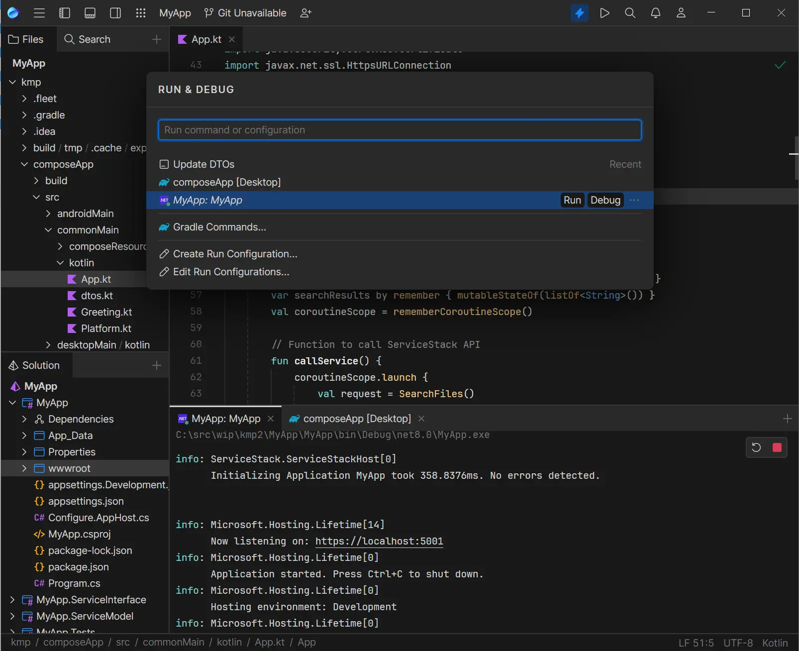
You'll want to run the .NET API backend first by selecting your Project Name which should launch your browser at https://localhost:5001,
then launch the Desktop App by selecting the composeApp [Desktop] configuration which should launch a working Desktop App
that calls your .NET API on each keystroke to search for matching files in your project:
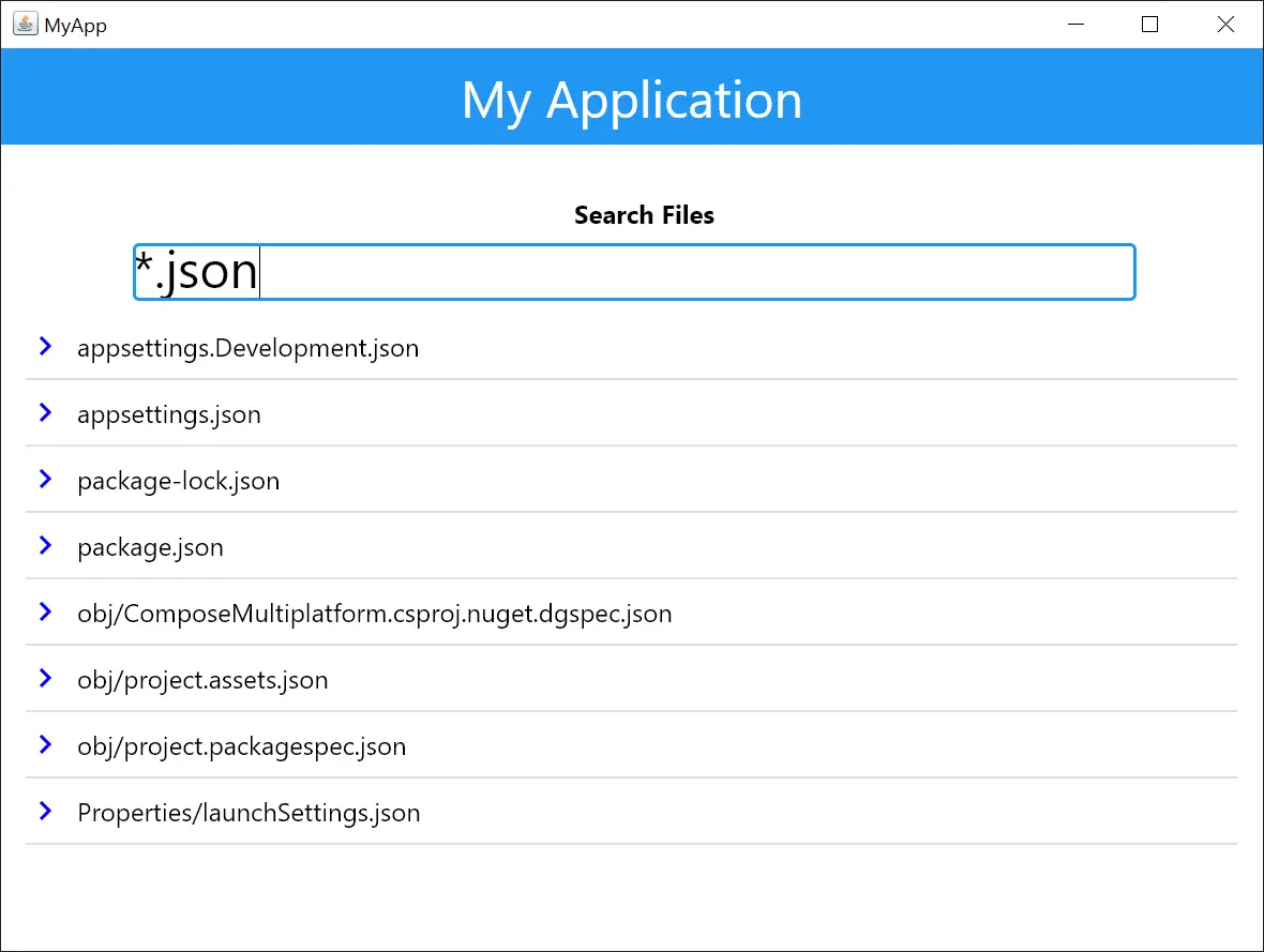
Majority of the UI is maintained in /commonMain/kotlin/App.kt created using Jetpack Compose's declarative Kotlin UI.
Update Kotlin DTOs
The typed Kotlin DTOs for your .NET APIs is generated in dtos.kt. Which can be regenerated by running Update DTOs in the Run Dialog.
Alternatively they can also be regenerated by running the dtos npm script from the command-line in your .NET Host project:
npm run dtos
Android Studio
If you're using Android Studio, you can also install the ServiceStack Plugin from the JetBrains Marketplace:
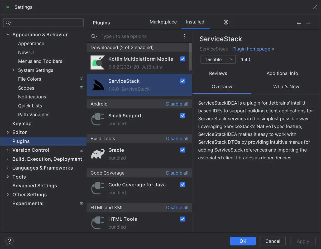
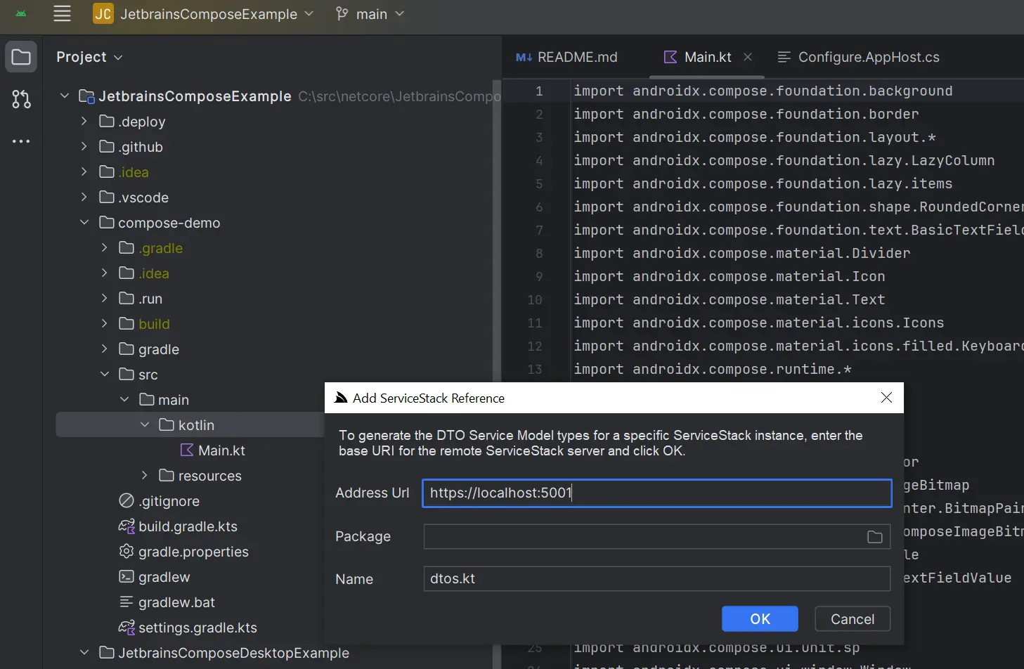
Which provides a Add ServiceStack Reference UI on the Context Menu, by right-clicking the folder where you want the DTOs generated:
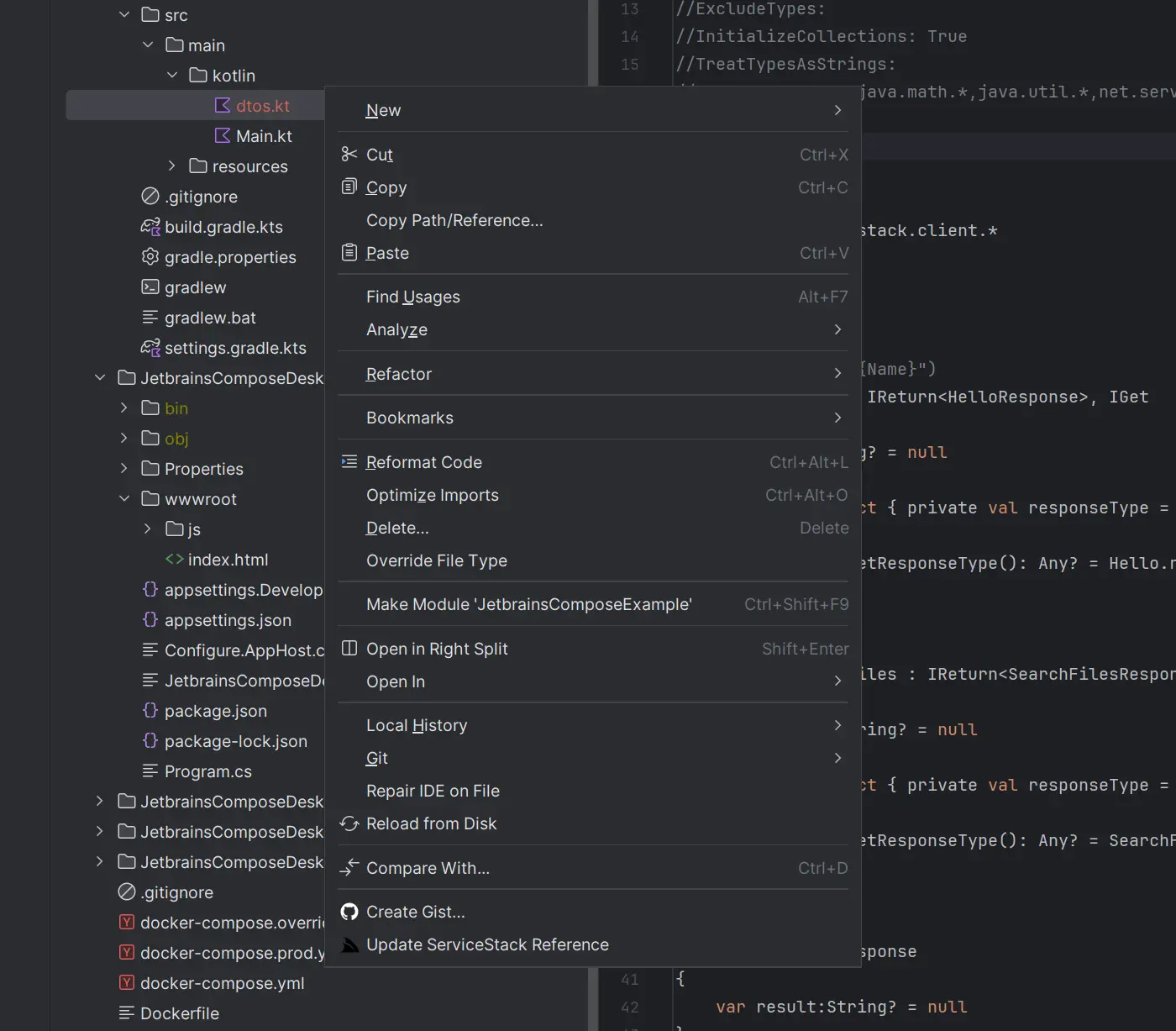
Then to update just right-click the dtos.kt and click Update ServiceStack Reference on the context menu:
Command Line
For any other Text Editors or IDEs a Kotlin ServiceStack Reference can also be added from the command-line using the x dotnet tool by specifying the BaseUrl where the ServiceStack APIs are hosted, e.g:
x kotlin https://localhost:5001
To update and regenerate all Kotlin DTOs within a folder, run:
x kotlin
Create a new Kotlin Multiplatform App from Scratch
For a customized Compose Multiplatform App, you can create a new App with Kotlin Multiplatform Wizard with just the options you need:
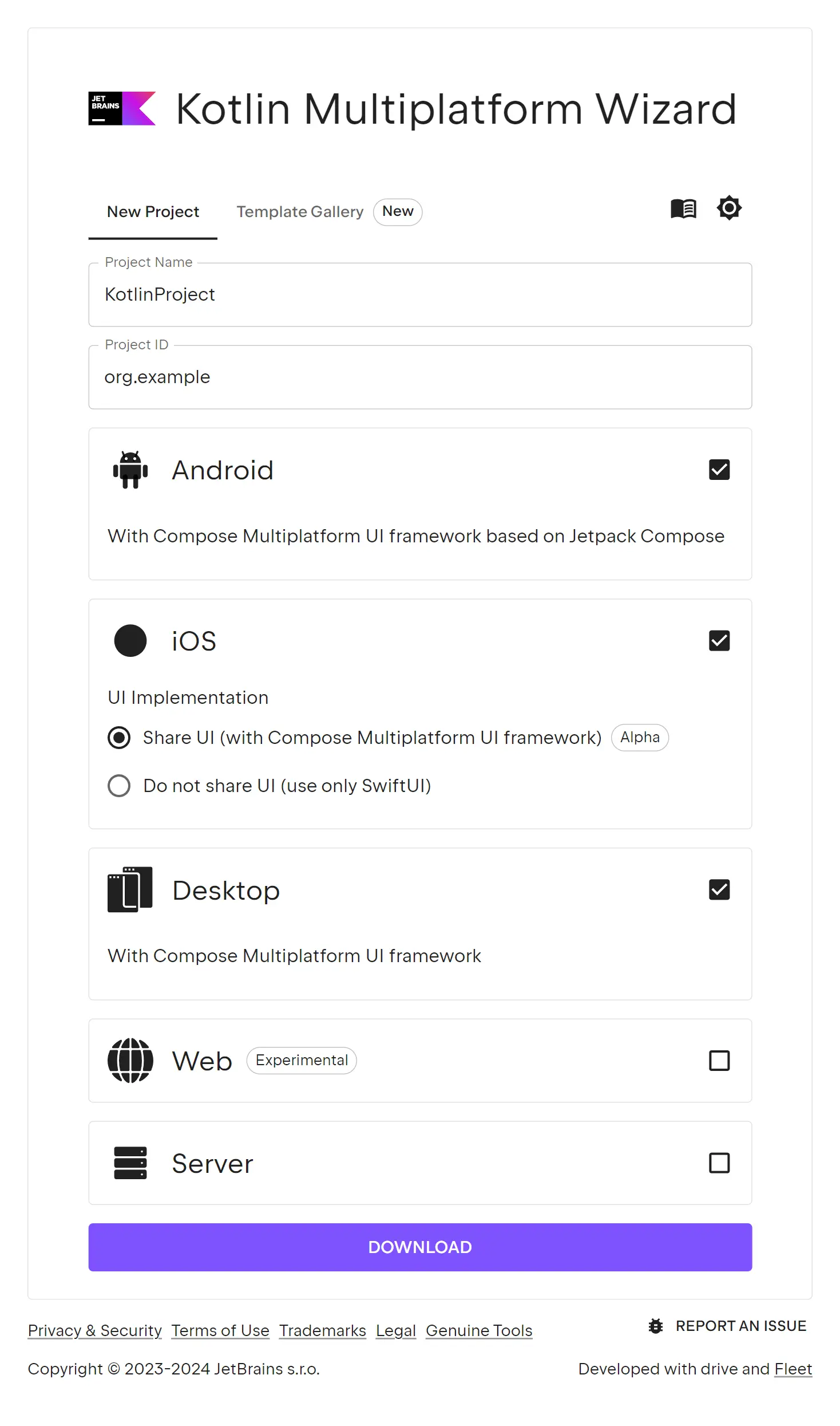
Which you can download in an empty Web Project:
x new web MyApp
Then open the folder with both the Kotlin Multiplatform and .NET Web App in fleet:
fleet MyApp