RAD Blazor
Due to the popularity of our Blazor Jamstack templates we've continued investing in Blazor and improving upon their already optimal Development Workflow in which we're excited to announce exciting new Blazor Components enabling a compelling a Rapid Application Development platform for Blazor Apps delivering many of the productivity benefits previously limited to locode.dev UI's.
Seamless Upgrade from Locode
Our new native Blazor Components allows for a beautiful progression story where you can start with a Database-First Locode solution to instantly generate Data Models and CRUD APIs around your existing databases that's able to utilize Locode's built-in UI for an instant modern UI for managing your App's databases whose declarative dev model can be used to define API Authorization & Validation rules or to customize the Behaviour & Appearance of Locode's Auto UI.
But to provide a compelling UX you'll want to adopt a Hybrid solution where after the necessary RAD dev cycles to gather and solidify business requirements you can start implementing their important unique workflows with a bespoke Blazor App that can reuse existing typed AutoQuery APIs and Data Models to speed up development whilst other supporting back-office functionality can continue to be managed by Locode.
Rapid Application with Blazor
Thanks to the new AutoQueryGrid Blazor component, being able to implement CRUD UIs is now trivial where you'll be able to quickly replace Locode and develop your entire App in Blazor! In addition the new Blazor components also support customization using existing UI & Metadata Attributes - preserving any efforts spent customizing UI's Behavior and Appearance.
Introducing Blazor Server
We're also happy to report our Blazor Tailwind Components are no longer limited to just Blazor WASM and arguably work even better in Blazor Server Apps which benefits from fast startup and exceptional responsiveness in low latency environments thanks to its architecture of running your App in a server session that only needs to propagate thin UI Virtual DOM updates to clients.
Blazor Server Tailwind Template
Blazor Server Tailwind Template
Ultimate dev model & UX ideal for low-latency Intranet environments
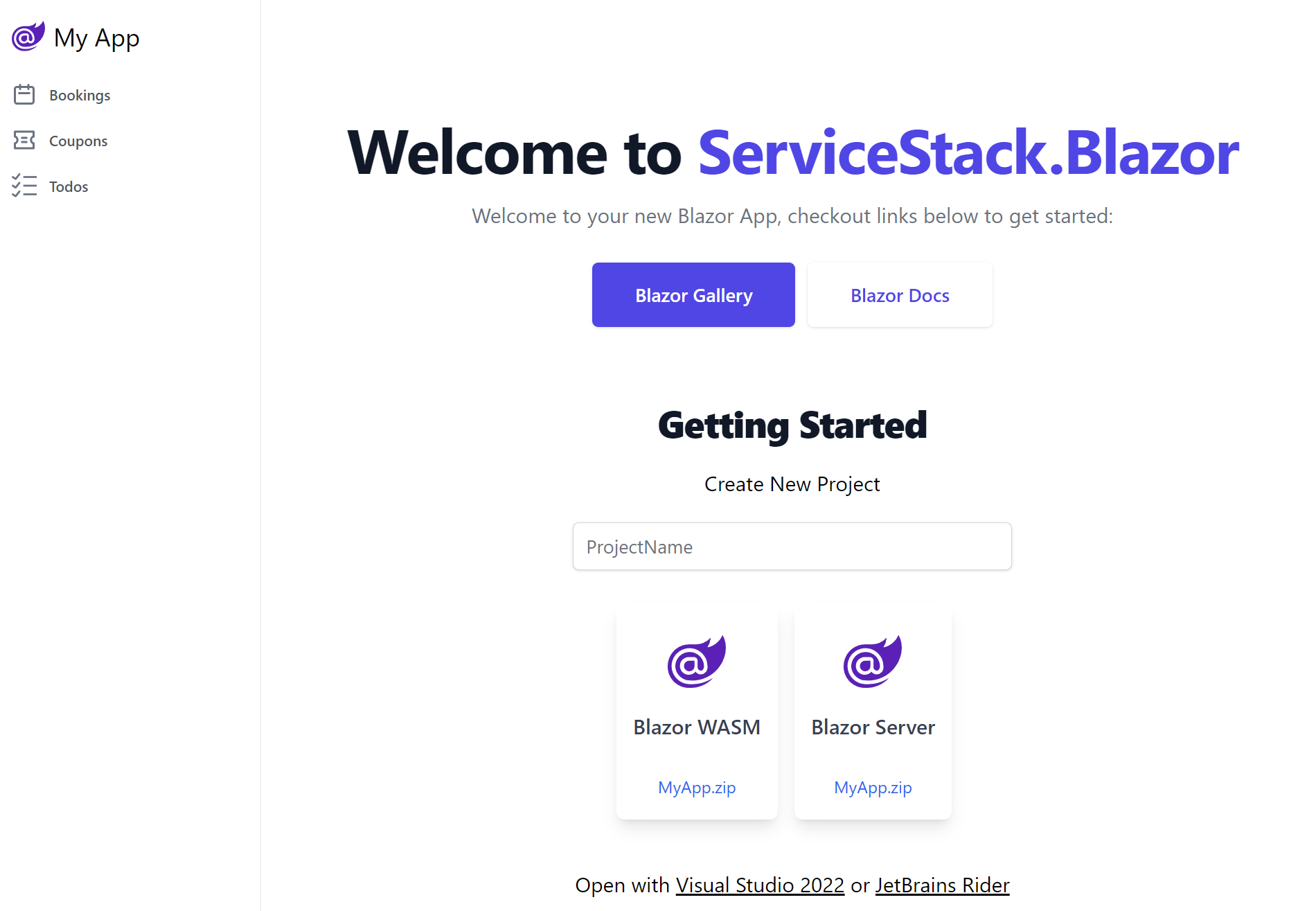
We're happy to announce our new Blazor Server App template offering a number compelling advantages over Blazor WASM, including:
- A superior dev model and debugging experience
- Improved live-reload and faster iterative dev cycles
- Full access to .NET Server functionality
- Better start times & UI responsiveness
- Less complexity from unnecessary client project or pre-rendering solutions
Although the limitations of its highly-coupled stateful server rendering session architecture does make it a poor fit for most high latency Internet sites which we continue to recommend our Blazor WASM project template for.
Lightweight Blazor Tailwind Templates
To improve the utility of our Blazor WASM templates we've reduced their included functionality down to Simple CRUD and TODO MVC Examples pre-configured to use DB Migrations, integrated Auth inc. Sign In and Sign Up pages, support for Markdown docs and Top & Sidebar navigation which should reduce the effort to remove and replace functionality to make way for your new App.
To better showcase our growing Blazor functionality we've moved all other functionality to the new Blazor Gallery websites showcasing usage of available rich Blazor Components for rapidly develop beautiful Tailwind Web Apps:
Blazor Gallery
Blazor Gallery
Discover ServiceStack.Blazor Rich UI Components and Integrated Features
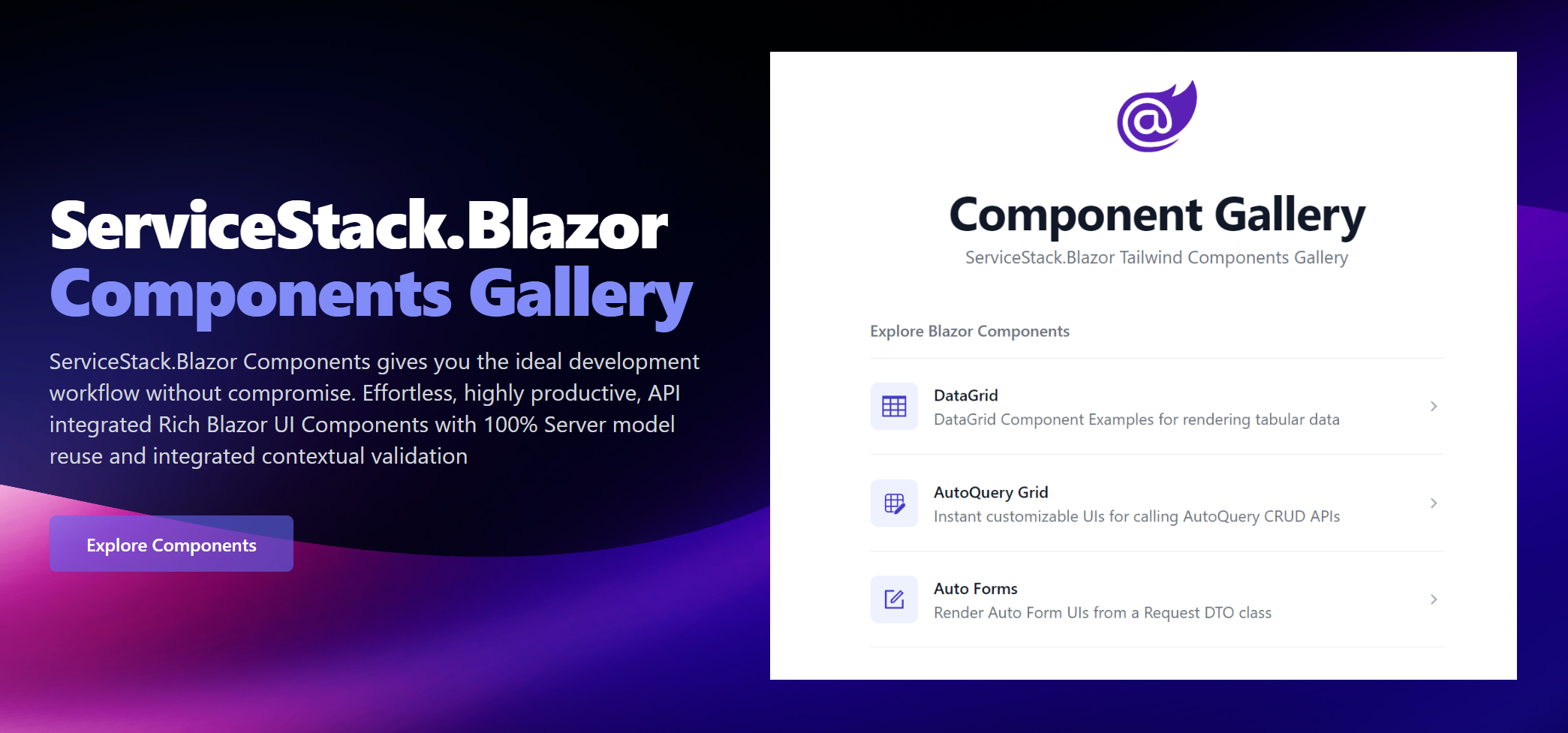
As our components support both hosting models we're maintaining identical Gallery sites running on both Blazor Server and WASM:
For a closer look at ServiceStack.Blazor Components in action, download & run them to see how good they'll run in your Environment:
Blazor Tailwind Components
Blazor Tailwind Components
We encourage you to explore to the Blazor Gallery websites for the full preview, but we'll look at some of the Components here to give you some idea of the functionality available.
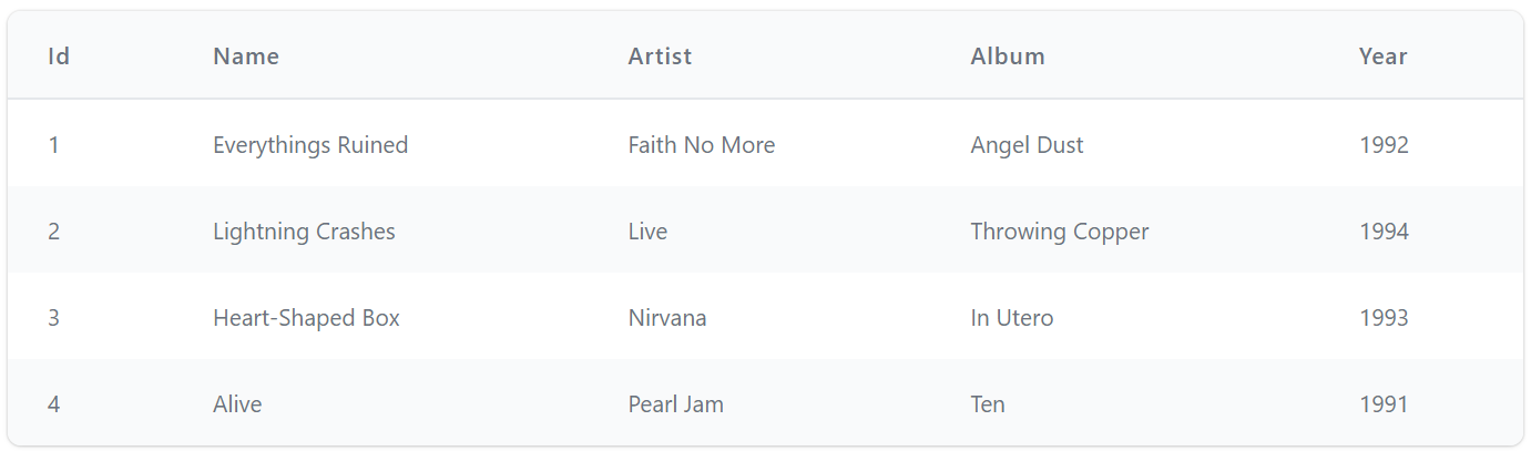
DataGrid
DataGrid is a versatile Component we expect to be heavily used for rendering any typed collection:
<DataGrid Model="Track" Items=@Track.Results />
Which by default renders results in a striped Tailwind Table:
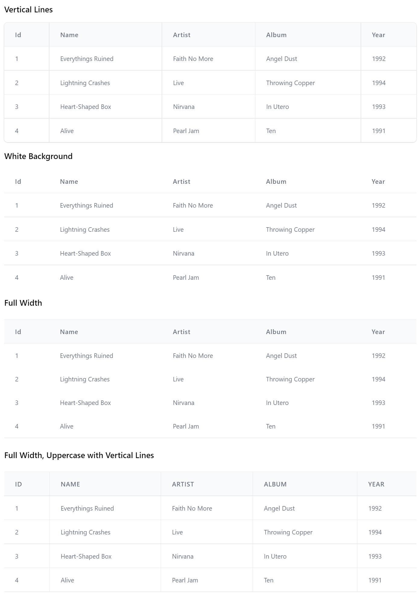
Whose appearance can be styled to support many of the Tailwind Table Styles with the TableStyles Flag enum, e.g:
<DataGrid Model="Track" Items=@Track.Results TableStyle="TableStyle.VerticalLines" />

<DataGrid Model="Track" Items=@Track.Results TableStyle="TableStyle.WhiteBackground" />

<DataGrid Model="Track" Items=@Track.Results TableStyle="TableStyle.FullWidth" />

<DataGrid Model="Track" Items=@Track.Results
          TableStyle="TableStyle.UppercaseHeadings | TableStyle.FullWidth | TableStyle.VerticalLines" />
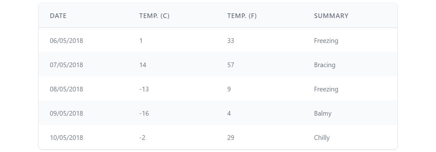
It's a highly versatile component where you'll be able to control which columns are displayed and how they're formatted using <Column> definitions, e.g. here's how we can customize the table to look like Blazor's FetchData.cshtml tabular results:
<DataGrid Items=@forecasts class="max-w-screen-md" TableStyle="TableStyle.StripedRows | TableStyle.UppercaseHeadings">
    <Column Field="(WeatherForecast x) => x.Date" Format="dd/MM/yyyy" />
    <Column Title="Temp. (C)" Field="(WeatherForecast x) => x.TemperatureC" />
    <Column Title="Temp. (F)" Field="(WeatherForecast x) => x.TemperatureF" />
    <Column Field="(WeatherForecast x) => x.Summary" />
</DataGrid>

@code {
    List<WeatherForecast> forecasts = new();

    protected override async Task OnInitializedAsync()
    {
        forecasts = await Http.GetFromJsonAsync<List<WeatherForecast>>("data/weather.json") ?? new();
    }
}
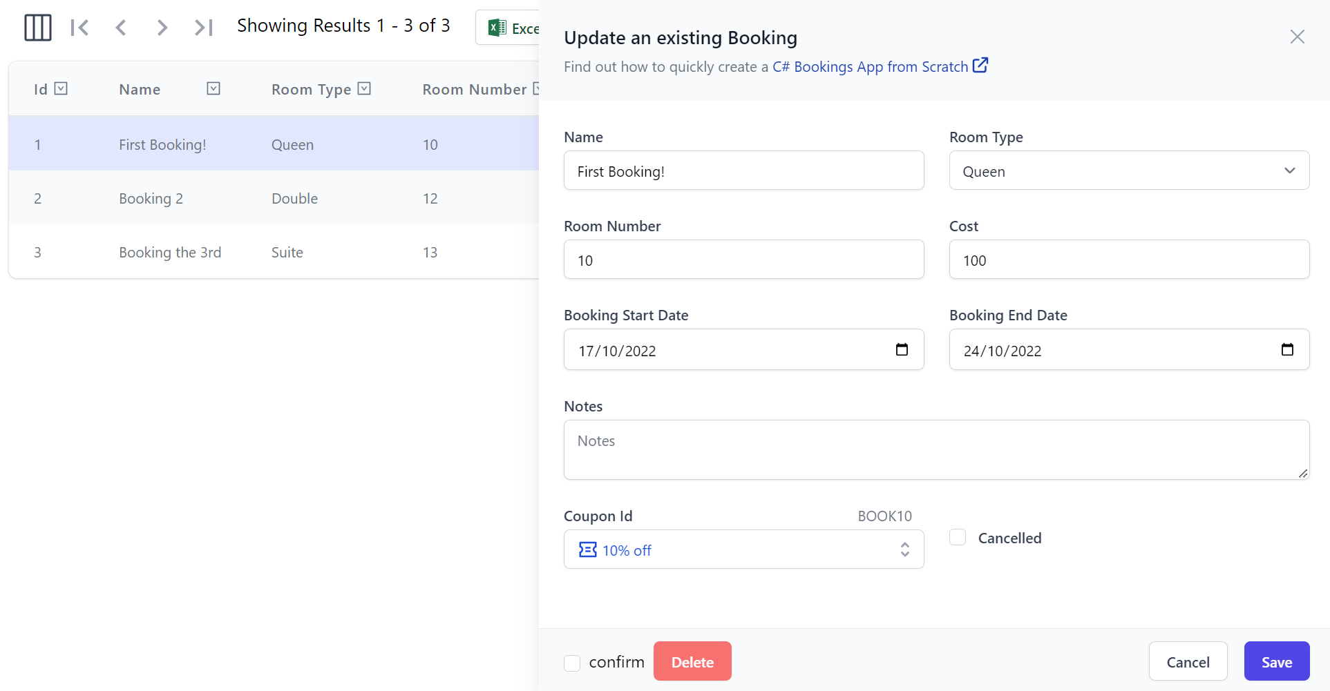
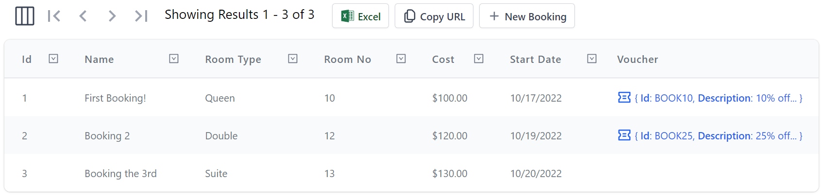
Here's a more advanced example showing how to implement a responsive DataGrid by utilizing custom Header and Table Cell templates to define what columns and Headers are visible at different responsive breakpoints and how to enable different features like Row Selection and Filtering and examples of handling the Row and Header selected events App's can use for executing custom logic:
<DataGrid Model="Booking" Items=@Items AllowSelection="true" AllowFiltering="true"
          HeaderSelected="HandleSelectedHeader" RowSelected="HandleSelectedRow">
    <Column Field="(Booking x) => x.Id" class="text-gray-900" />
    <Column Field="(Booking x) => x.Name" VisibleFrom="Breakpoint.ExtraLarge" />
    <Column Field="(Booking x) => x.RoomType">
        <Header>
            <span class="hidden lg:inline">Room </span>Type
        </Header>
    </Column>
    <Column Field="(Booking x) => x.RoomNumber">
        <Header>
            <span class="hidden lg:inline">Room </span>No
        </Header>
    </Column>
    <Column Field="(Booking x) => x.Cost" Format="C" />
    <Column Field="(Booking x) => x.BookingStartDate" Formatter="FormatDate" VisibleFrom="Breakpoint.Small">
        <Header>
            Start<span class="hidden lg:inline"> Date</span>
        </Header>
    </Column>
    <Column Field="(Booking x) => x.BookingEndDate" Formatter="FormatDate" VisibleFrom="Breakpoint.ExtraLarge">
        <Header>
            End<span class="hidden lg:inline"> Date</span>
        </Header>
        <Template>@{ var booking = context as Booking; }@booking.BookingEndDate?.ToString("D")
        </Template>
    </Column>
    <Column Title="Employee" Field="(Booking x) => x.CreatedBy" VisibleFrom="Breakpoint.Medium" />
</DataGrid>

@code {
    public List<Booking> Items { get; set; } = new() {
        Create.Booking("First Booking!",  RoomType.Queen,  10, 100, "employee@email.com", "BOOK10"),
        Create.Booking("Booking 2",       RoomType.Double, 12, 120, "manager@email.com",  "BOOK25"),
        Create.Booking("Booking the 3rd", RoomType.Suite,  13, 130, "employee@email.com", "BOOK50"),
    };

    string FormatDate(object o) => o is DateTime d ? d.ToShortDateString() : "";

    public async Task HandleSelectedHeader(Column<Booking> item)
    {
        await JS.Log(item.Name);
    }

    public async Task HandleSelectedRow(Booking x)
    {
        await JS.Log(x);
    }
}
TIP
Resize webpage to preview its responsive appearance and different resolution breakpoints
AutoQueryGrid
The functionality and extensibility in DataGrid lays the foundation for higher-level components like AutoQueryGrid which makes use of it to enable its Auto UI around AutoQuery CRUD Services.
AutoQueryGrid Read Only
At a minimum AutoQueryGrid requires the AutoQuery APIs it should call to implement its functionality, so you can implement a read-only grid by only specifying the AutoQuery API to query a data model, e.g:
<AutoQueryGrid Model="Booking" Apis="Apis.AutoQuery<QueryBookings>()" />
This one AutoQuery API is enough to power a functional read-only UI enabling multi flexible querying capabilities, paging, custom column selection and the ability to export the desired filtered resultset to .csv which can be open in Excel or copy the API URL Apps can use to consume the JSON API results:
AutoQueryGrid CRUD
Full CRUD functionality can be enabled by specifying the AutoQuery CRUD APIs for a specified data model, e.g:
<AutoQueryGrid Model="Booking" Apis="Apis.AutoQuery<QueryBookings,CreateBooking,UpdateBooking,DeleteBooking>()" />
Customizable Columns
As AutoQueryGrid builds on DataGrid it also inherits its customizable option allowing for customizable responsive columns, e.g:
<AutoQueryGrid Model="Booking" Apis="Apis.AutoQuery<QueryBookings,CreateBooking,UpdateBooking,DeleteBooking>()"
               AllowSelection="true" AllowFiltering="true"
               HeaderSelected="OnSelectedHeader" RowSelected="OnSelectedRow">
    <Columns>
        <!-- Custom class -->
        <Column Field="(Booking x) => x.Id" class="text-gray-900" />
        <!-- Only show from Tailwind's xl responsive Breakpoint -->
        <Column Field="(Booking x) => x.Name" VisibleFrom="Breakpoint.ExtraLarge" />
        <!-- Custom Header collapsing 'Room' below 'lg' responsive breakpoint -->
        <Column Field="(Booking x) => x.RoomType">
            <Header>
                <span class="hidden lg:inline">Room </span>Type
            </Header>
        </Column>
        <!-- Custom Header collapsing 'Room' below 'lg' responsive breakpoint -->
        <Column Field="(Booking x) => x.RoomNumber">
            <Header>
                <span class="hidden lg:inline">Room </span>No
            </Header>
        </Column>
        <!-- Custom string Format -->
        <Column Field="(Booking x) => x.Cost" Format="C" />
        <!-- Custom C# Formatter -->
        <Column Field="(Booking x) => x.BookingStartDate" Formatter="FormatDate" VisibleFrom="Breakpoint.Small">
            <Header>
                Start<span class="hidden lg:inline"> Date</span>
            </Header>
        </Column>
        <!-- Custom Header and Cell Value -->
        <Column Field="(Booking x) => x.BookingEndDate" VisibleFrom="Breakpoint.ExtraLarge2x">
            <Header>
                End<span class="hidden lg:inline"> Date</span>
            </Header>
            <Template>
                @context.BookingEndDate?.ToString("D")
            </Template>
        </Column>
        <!-- Custom Title and Complex Type Cell with Reference Link -->
        <Column Title="Voucher" Field="(Booking x) => x.Discount" VisibleFrom="Breakpoint.ExtraLarge">
            <Template>
@if (context.Discount != null)
{
    <TextLink class="flex items-end" href=@($"/gallery/autoquerygrid/coupons?Id={context.Discount.Id}")>
        <PreviewFormat Value=@context.Discount />
    </TextLink>
}          </Template>
        </Column>
    </Columns>
</AutoQueryGrid>
Customizing how and when columns are rendered at different breakpoints using different formatting options and custom table header and cell templates:
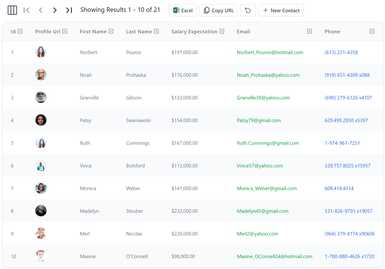
Declarative Customizations
The columns can also be customized declaratively using the [Format] Metadata Attribute on the Model type:
public class Contact : AuditBase
{
    [AutoIncrement]
    public int Id { get; set; }

    [Format(FormatMethods.IconRounded)]
    public string ProfileUrl { get; set; }

    public string FirstName { get; set; }
    public string LastName { get; set; }

    [Format(FormatMethods.Currency)]
    public int? SalaryExpectation { get; set; }

    [Format(FormatMethods.LinkEmail, Options =
        @"{target:'_self',subject:'New Job Opportunity',
           body:'We have an exciting new opportunity...', cls:'text-green-600'}")]
    public string Email { get; set; }

    [Format(FormatMethods.LinkPhone)]
    public string Phone { get; set; }
}
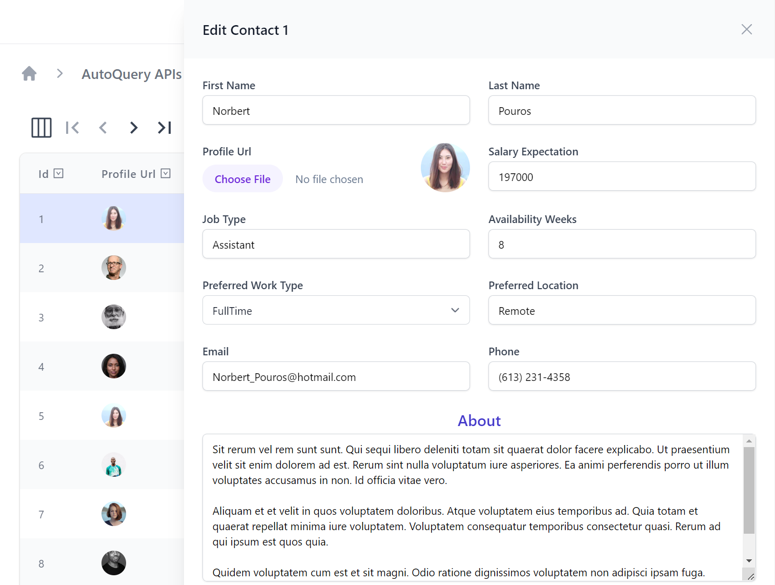
Which can change how results are formatted in the data grid results:
Whilst the [Input] and [FieldCss] attributes on the AutoQuery CRUD DTOs:
public class UpdateContact : IPatchDb<Contact>, IReturn<Contact>
{
    public int Id { get; set; }

    [ValidateNotEmpty]
    public string? FirstName { get; set; }

    [ValidateNotEmpty]
    public string? LastName { get; set; }

    [Input(Type = "file"), UploadTo("profiles")]
    public string? ProfileUrl { get; set; }

    public int? SalaryExpectation { get; set; }

    [ValidateNotEmpty]
    public string? JobType { get; set; }

    public int? AvailabilityWeeks { get; set; }
    public EmploymentType? PreferredWorkType { get; set; }
    public string? PreferredLocation { get; set; }

    [ValidateNotEmpty]
    public string? Email { get; set; }
    public string? Phone { get; set; }

    [Input(Type="textarea")]
    [FieldCss(Field="col-span-12 text-center", Input="h-48", Label="text-xl text-indigo-700")]
    public string? About { get; set; }
}
Can customize how forms are rendered, e.g:
Changing AutoQueryGrid Defaults
A lot of AutoQueryGrid's UI is customizable allowing you to easily toggle on/off UI features as needed, if you have a consistent style you wish to enforce you can change the defaults of every AutoQueryGrid component with BlazorConfig, e.g. you can remove Copy URL button and change the default Table style to use Uppercase Headings with:
BlazorConfig.Set(new() {
    //...
    AutoQueryGridDefaults = new() {
        TableStyle = TableStyle.StripedRows | TableStyle.UppercaseHeadings,
        ShowCopyApiUrl = false,
    }
});
Which will change the appearance of every AutoQueryGrid Component used in the App unless overridden.
AutoQueryGrid Gallery
As AutoQueryGrid is a core component for the rapid development of Apps we're maintaining a dedicated section showcasing their different features at blazor-gallery.servicestack.net/grid:
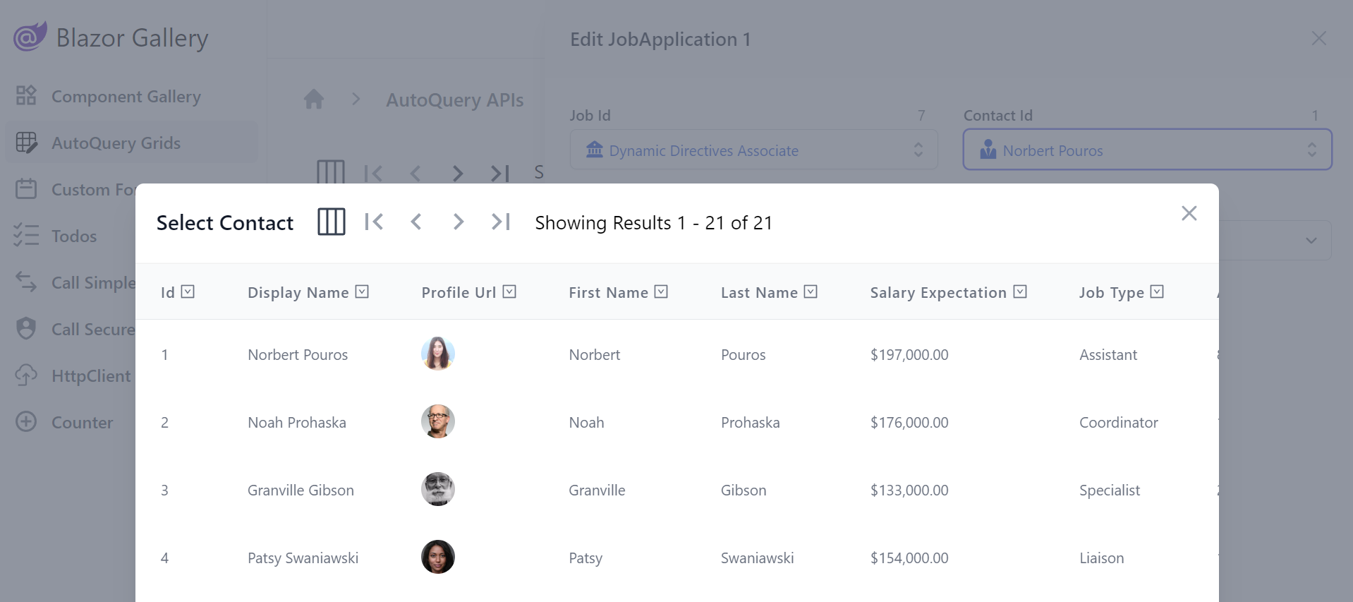
Modal Lookups
To provide an optimal UX for relational fields AutoQueryGrid utilizes Modal Lookups for searching and selecting referential data that's automatically inferred from your OrmLite data model relationships, e.g:
public class JobApplication : AuditBase
{
    [AutoIncrement]
    public int Id { get; set; }

    [References(typeof(Job))]
    public int JobId { get; set; }

    [References(typeof(Contact))]
    public int ContactId { get; set; }
    //...
}
Where it will display an enhanced LookupInput instead of a plain Text Input for the relational JobId and ContactId fields:
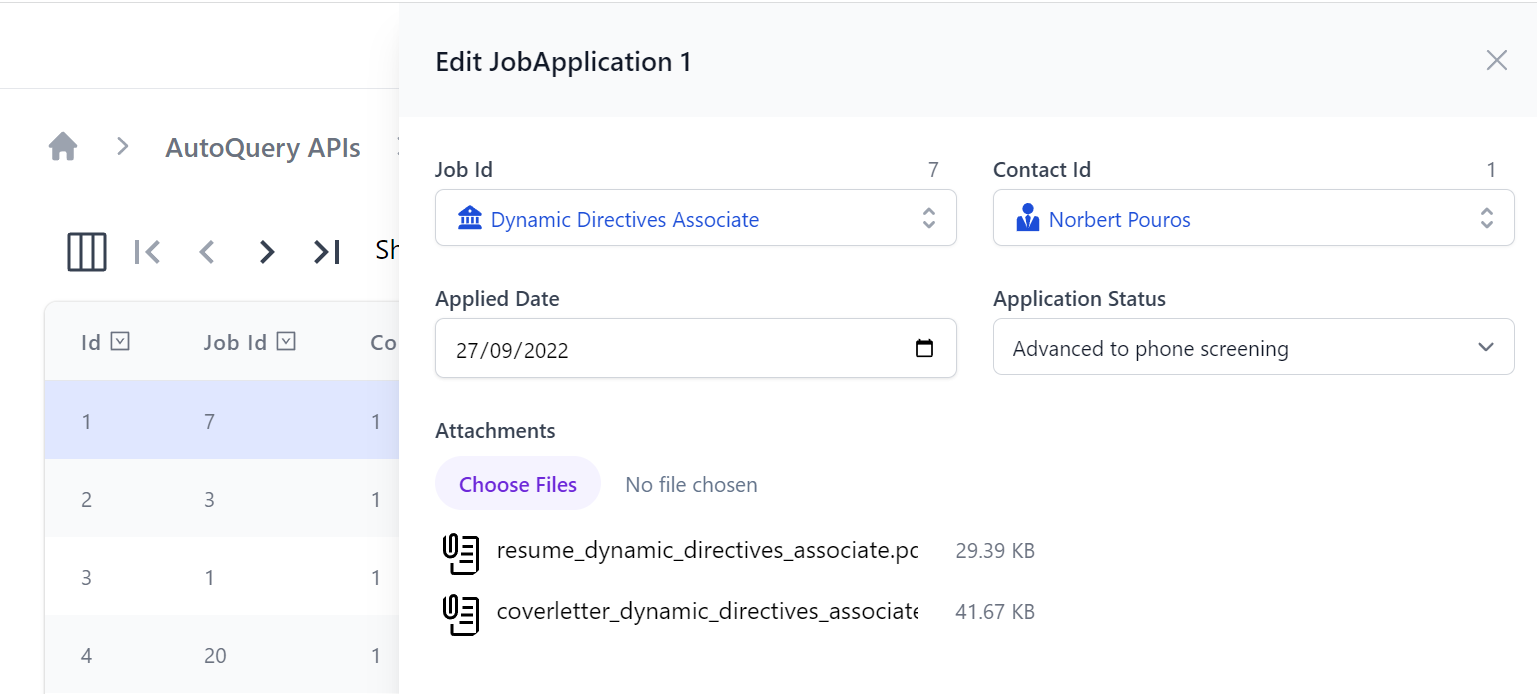
Which users can use to quickly search for the related record instead of manually inserting Foreign Key Ids:
File Uploads
Another feature showcased in the above screenshots is support for Managed File Uploads which can be declaratively added with the [Input(Type="file")] to render the FileInput Component and [UploadTo] attribute to specify which File Upload location it should use:
public class UpdateJobApplication : IPatchDb<JobApplication>, IReturn<JobApplication>
{
    public int Id { get; set; }
    public int? JobId { get; set; }
    public int? ContactId { get; set; }
    public DateTime? AppliedDate { get; set; }
    public JobApplicationStatus? ApplicationStatus { get; set; }

    [Input(Type = "file"), UploadTo("applications")]
    public List<JobApplicationAttachment>? Attachments { get; set; }
}
For a quick primer on using Managed File Uploads to Upload files from Blazor checkout:
Auto Forms
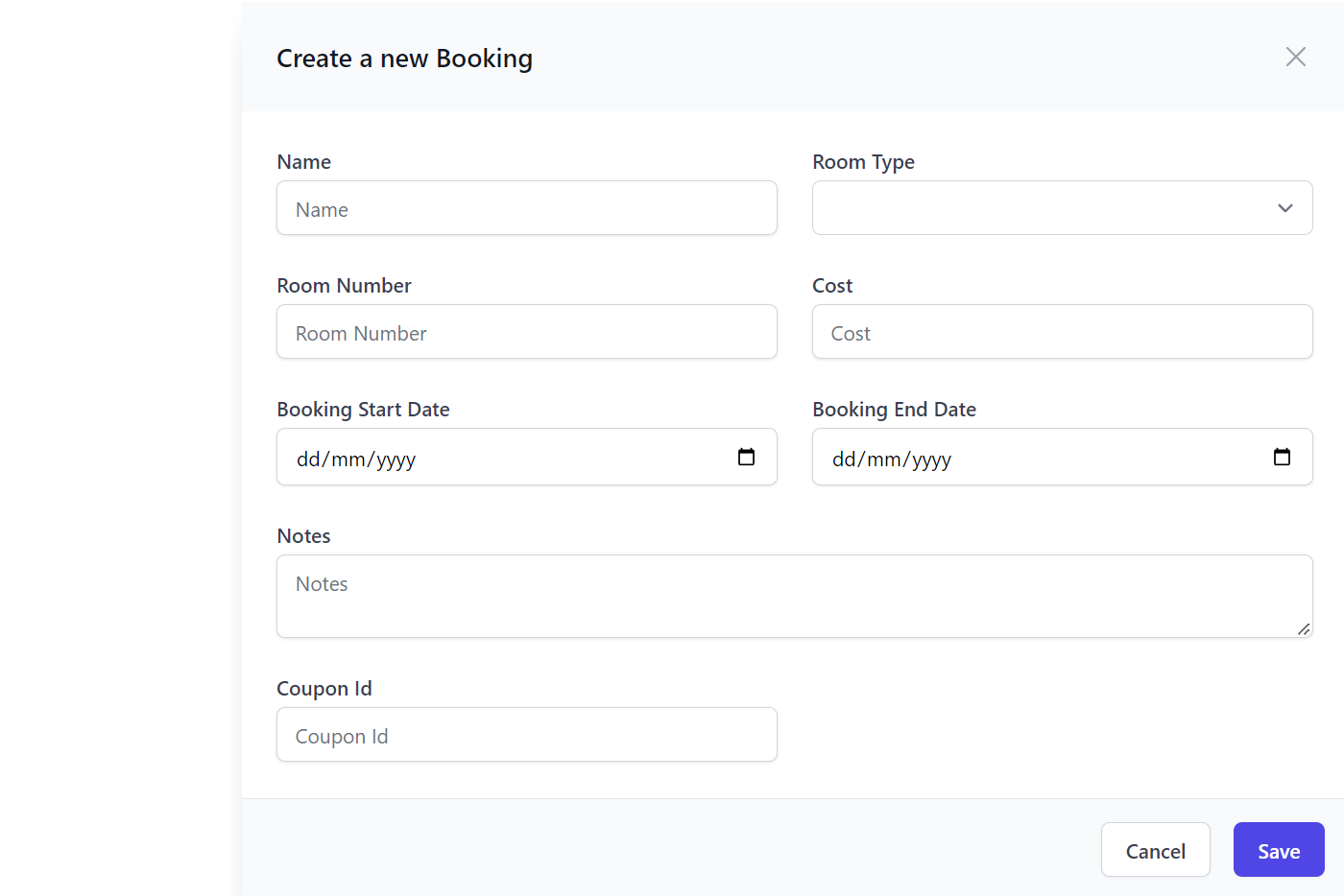
The Auto Form components are other high productivity components which can be used to create an automated form based from a Request DTO definition:
<AutoCreateForm Model="Booking" ApiType="typeof(CreateBooking)" />
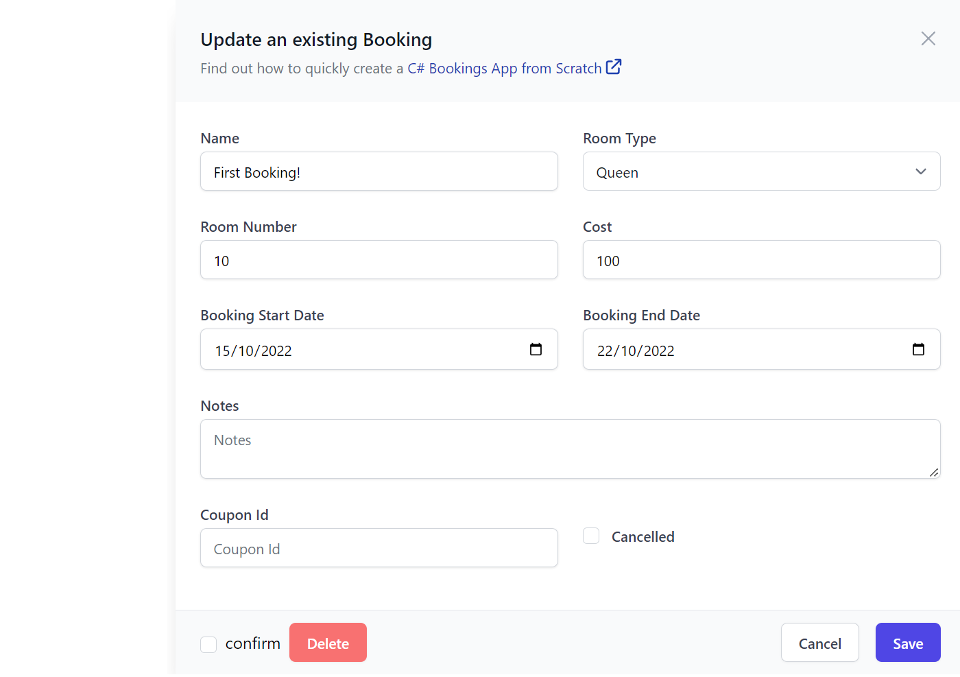
AutoEditForm
Whilst AutoEditForm can be used to render an automated form based to update and delete an AutoQuery CRUD API:
<AutoEditForm Model="Booking" Edit="Model" ApiType="typeof(UpdateBooking)" DeleteApiType="typeof(DeleteBooking)" />

@code {
    Booking Model = Create.Booking("First Booking!", RoomType.Queen, 10, 100, "employee@email.com");
}
The forms behavior and appearance is further customizable with the API annotation, declarative validation and the custom Field and Input attributes, e.g:
[Description("Update an existing Booking")]
[Notes("Find out how to quickly create a <a class='svg-external' target='_blank' href='https://youtu.be/rSFiikDjGos'>C# Bookings App from Scratch</a>")]
[Route("/booking/{Id}", "PATCH")]
[ValidateHasRole("Employee")]
[AutoApply(Behavior.AuditModify)]
public class UpdateBooking : IPatchDb<Booking>, IReturn<IdResponse>
{
    public int Id { get; set; }
    public string? Name { get; set; }
    public RoomType? RoomType { get; set; }
    [ValidateGreaterThan(0)]
    public int? RoomNumber { get; set; }
    [ValidateGreaterThan(0)]
    public decimal? Cost { get; set; }
    public DateTime? BookingStartDate { get; set; }
    public DateTime? BookingEndDate { get; set; }
    [Input(Type = "textarea")]
    public string? Notes { get; set; }
    public bool? Cancelled { get; set; }
}
Both AutoForm components will render the Forms UI in a Slide Over dialog and includes built-in support for calling the API to update or edit the record with integrated contextual validation, reporting any field validation errors alongside their Input controls.
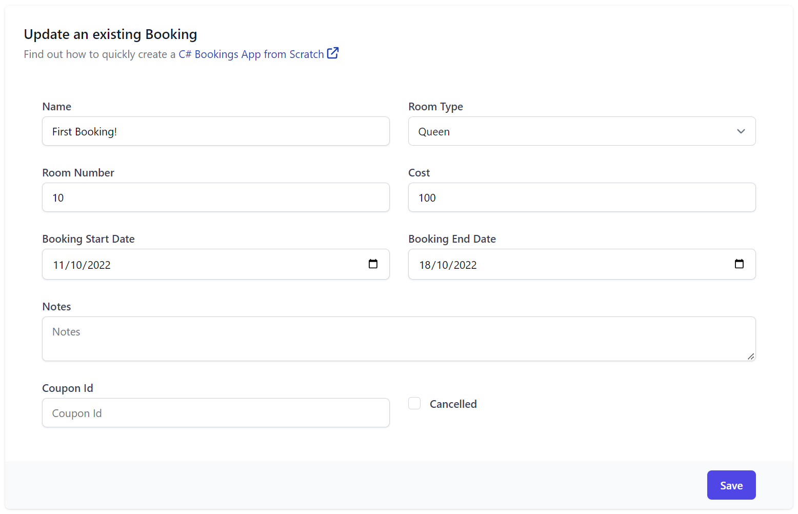
AutoFormFields
If more advanced customization of a Forms appearance and behavior is required, you can use AutoFormFields to just render the Form's fields (including Validation binding) that can be used to populate a Request DTO that your App can handle sending, e.g:
<form @onsubmit="submit" @onsubmit:preventDefault>
    <div class="shadow sm:overflow-hidden sm:rounded-md max-w-screen-lg">
        <div class="space-y-6 bg-white py-6 px-4 sm:p-6">
            <div>
                <h3 class="text-lg font-medium leading-6 text-gray-900">@(ApiType.GetDescription())</h3>
                <p class="notes mt-1 text-sm text-gray-500">
                    @((MarkupString)ApiType.GetNotes())
                </p>
            </div>

            <AutoFormFields Type="typeof(Booking)" Api="Api" FormLayout="FormLayout" ModelDictionary="ModelDictionary"/>

        </div>
        <div class="bg-gray-50 px-4 py-3 text-right sm:px-12">
            <PrimaryButton type="submit" onclick="submit">Save</PrimaryButton>
        </div>
    </div>
</form>

@code {
    [Inject] public JsonApiClient? Client { get; set; }
    IHasErrorStatus? Api { get; set; }
    Type ApiType = typeof(UpdateBooking);
    List<InputInfo>? FormLayout { get; set; }
    Dictionary<string, object> ModelDictionary { get; set; } = new();
    MetadataType MetadataType => ApiType.ToMetadataType();

    Booking Edit = Create.Booking("First Booking!", RoomType.Queen, 10, 100, "employee@email.com");

    protected override async Task OnParametersSetAsync()
    {
        await base.OnParametersSetAsync();
        Api = null;

        ModelDictionary = Edit.ToModelDictionary();
        FormLayout ??= MetadataType.CreateFormLayout<Booking>();
    }

    async Task submit()
    {
        var request = ModelDictionary.FromModelDictionary<UpdateBooking>();
        Api = await Client!.ApiAsync(request);
    }
}
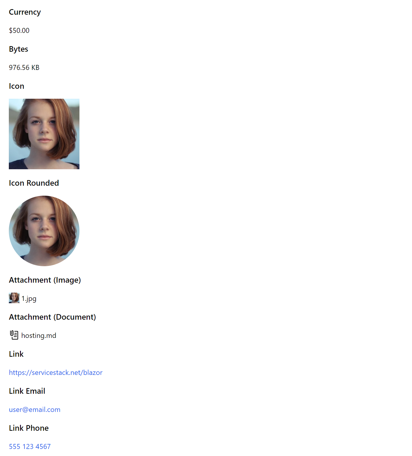
PreviewFormat
The <PreviewFormat> component is useful for rendering Table Cell data into different customizable formats, e.g:
<PreviewFormat Value="50" Format=Formats.Currency />

<PreviewFormat Value="1000000" Format=Formats.Bytes />

<PreviewFormat Value=@Url Format=Formats.Icon IconClass="w-40 h-40" />

<PreviewFormat Value=@Url Format=Formats.Icon IconClass="w-40 h-40 rounded-full" />

<PreviewFormat Value=@Url Format=Formats.Attachment />

<PreviewFormat Value=@Path Format=Formats.Attachment />

<PreviewFormat Value=@Url Format=Formats.Link />

<PreviewFormat Value=@Email Format=Formats.LinkEmail />

<PreviewFormat Value=@Phone Format=Formats.LinkPhone />
HtmlFormat
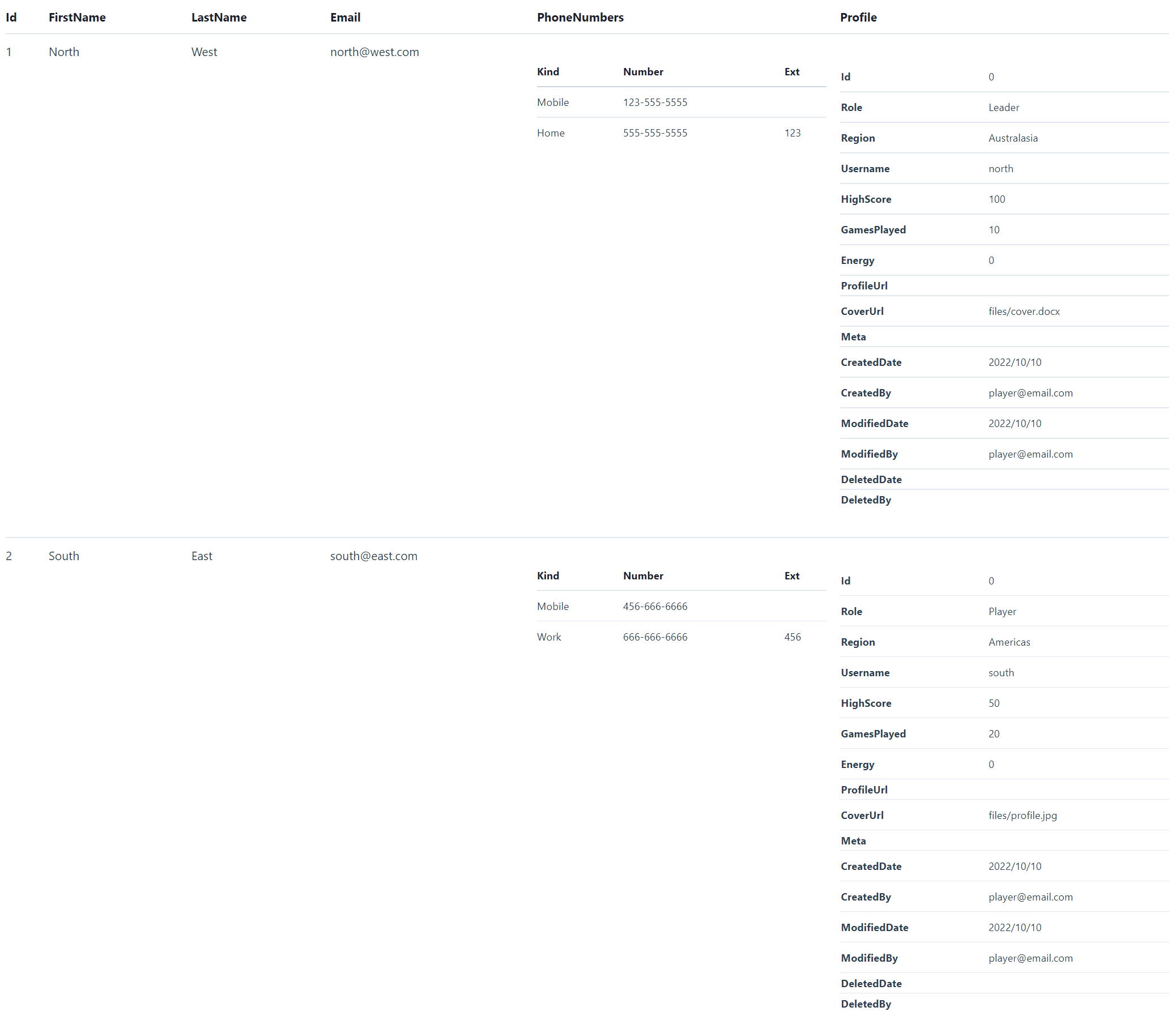
Whilst the versatile <HtmlFormat> component can be used to render any Serializable object into a human-friendly HTML Format, e.g:
Single Model
<div class="max-w-screen-sm">
    <HtmlFormat Value=@Track.Results[0] />
</div>

Item Collections
<div class="max-w-screen-sm">
    <HtmlFormat Value=@Track.Results />
</div>

Nested Complex Types
<HtmlFormat Value=@Create.Players />
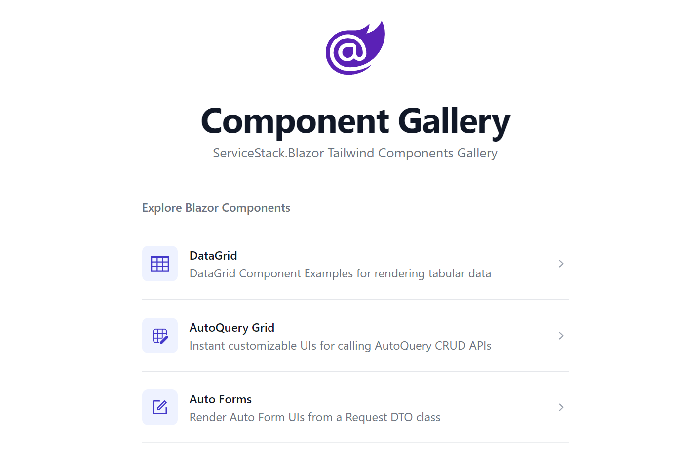
For more info about the Blazor Components available checkout the Component Gallery:
Blazor Config
A lot of the default conventions used by the Blazor Components are overridable with BlazorConfig initialized in Program.cs, where Blazor WASM projects configured with something like:
BlazorConfig.Set(new BlazorConfig
{
    IsWasm = true,
    Services = app.Services,
    FallbackAssetsBasePath = apiBaseUrl,
    EnableLogging = true,
    EnableVerboseLogging = builder.HostEnvironment.IsDevelopment(),
});
Asset and Fallback Paths
Where FallbackAssetsBasePath allows you to specify a fallback path for Images which is useful when there's a delay for syncing uploaded assets to the CDN that the Blazor WASM client is deployed to, as it can fallback to referencing the asset from the .NET App Server that handled the file upload.
Alternatively AssetsBasePath can be used for specifying a different primary CDN location that's different from the Blazor WASM App CDN or AssetsPathResolver and FallbackPathResolver can be used when more a advanced custom strategy is required.
Blazor WASM Tailwind Upgrade
The advanced functionality in the new high-level components required making some breaking changes to move Auth and Components previously defined in the templates to be included in the ServiceStack.Blazor library. To simplify upgrading we've wrapped most of these required changes in the mix scripts below which should be run from your blazor-tailwind WASM Client project:
x mix -delete blazor-upgrade-clean
x mix blazor-upgrade
Blazor Feedback
We'll be continuing to further develop and expand our Blazor Tailwind Component library in the coming releases that if you have any suggestions for new Components or new features on existing Components, please drop us a Feature Request at:
servicestack.net/ideas
DB Migrations
We've continued improving our story around Code-First DB Migrations and have created a new video demonstrating how it can be used to maintain DB Schema migrations under a typical development workflow:
Jamstack Templates Upgraded
As they encourage a structured workflow for incremental development of new App features we've upgraded all modern jamstacks.net templates to adopt DB Migrations for creating and populating their App DB.
Run or Debug Migrations from your IDE
A benefit of DB Migrations being implemented in a library instead of wrapped up behind an external tool, is that it's better integrated and more versatile in supporting more executable options like being able to run from code, a feature all Jamstack templates now benefit from with the new MigrationTasks Explicit TestFixture enabling DB Migrations to be run or debugged directly from within your IDE, implemented as:
[TestFixture, Explicit, Category(nameof(MigrationTasks))]
public class MigrationTasks
{
   IDbConnectionFactory ResolveDbFactory() => new ConfigureDb().ConfigureAndResolve<IDbConnectionFactory>();
   Migrator CreateMigrator() => new(ResolveDbFactory(), typeof(Migration1000).Assembly);

   [Test]
   public void Migrate()
   {
       var migrator = CreateMigrator();
       var result = migrator.Run();
       Assert.That(result.Succeeded);
   }

   [Test]
   public void Revert_All()
   {
       var migrator = CreateMigrator();
       var result = migrator.Revert(Migrator.All);
       Assert.That(result.Succeeded);
   }

   [Test]
   public void Revert_Last()
   {
       var migrator = CreateMigrator();
       var result = migrator.Revert(Migrator.Last);
       Assert.That(result.Succeeded);
   }

   [Test]
   public void Rerun_Last_Migration()
   {
       Revert_Last();
       Migrate();
   }
}
Which uses your App's ConfigureDb Modular Startup configuration to resolve your App's configured OrmLiteConnectionFactory that the migrations are run against, that if needed can be run from Unit tests to debug through any schema migration issues.
Revert and Rerun Last Migration
The Rerun_Last_Migration task is especially useful during development of new features to easily revert and rerun the last migration before checking in a completed feature, allowing you to re-iterate and check in a completed and tested DB migration along with the new feature requiring it instead of multiple "micro migrations" for each DB change run at different times.
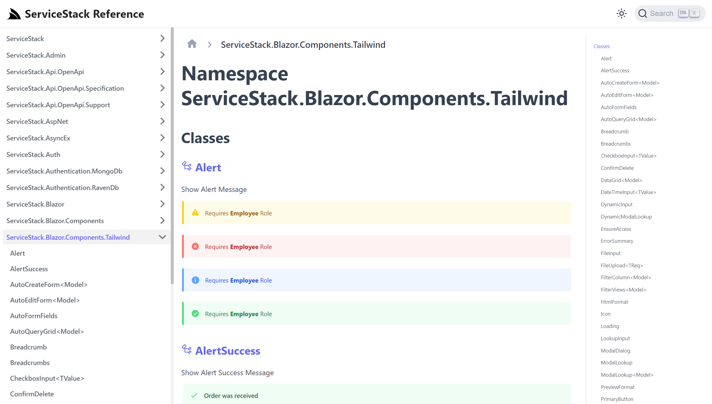
ServiceStack Reference
The pursuit of improving the discovery of Blazor Component features prompted us to generate library reference documentation for all core ServiceStack libraries which is being hosted at reference.servicestack.net that's configured with Real-time search using TypeSense that should let you quickly jump to the type or methods you're after with a few key strokes.
Along with the new Blazor Gallery websites it's a great resource to discover Blazor Component parameters and features which we'll continue improving over time at:
It covers most of ServiceStack's 69 Packages which given its size takes a couple hours to generate but has given us some insightful stats on the size and scale of ServiceStack libraries which have been in active development for over 10 years:
Lines of Code
| Package | Lines of Code |
|---|---|
| ServiceStack | 358802 |
| ServiceStack.Aws | 22169 |
| ServiceStack.Azure | 4135 |
| ServiceStack.Blazor | 9098 |
| ServiceStack.Logging | 2214 |
| ServiceStack.OrmLite | 95075 |
| ServiceStack.Redis | 44765 |
| ServiceStack.Text | 61850 |
Total Namespaces / Classes / Interfaces
| Symbol | Count |
|---|---|
| Namespaces | 116 |
| Classes | 2538 |
| Interfaces | 498 |
API QueryParams
ServiceStack's message-based design is centered around sending a single message which is all that's required to invoke any Typed API, however there may be times when you need to send additional params where you can't change the API's Request DTO definition or in AutoQuery's case its Implicit Conventions would require too many permutations to be able to type the entire surface area on each Request DTO.
Previously this would inhibit being able to invoke these Services from a typed Service Client API that would instead need to either use the untyped Get<T>(relativeUrl) ServiceClient APIs or HTTP Utils to construct the API Request path manually.
Now Request DTOs can implement IHasQueryParams where any entries will be sent as additional query params along with the typed DTO:
public interface IHasQueryParams
{
    Dictionary<string, string> QueryParams { get; set; }
}
Which is now available in all AutoQuery DTOs where it's added as a non-serializable property so it's only included in the QueryString:
[DataContract]
public abstract class QueryBase : IQuery, IHasQueryParams
{
    //...
    [IgnoreDataMember]
    public virtual Dictionary<string, string> QueryParams { get; set; }
}
Which now allows using existing ServiceClient typed APIs to send a combination of untyped queries in AutoQuery requests, e.g:
var api = await client.ApiAsync(new QueryContacts {
  IdsIn = new[]{ 1, 2, 3 },
  QueryParams = new() {
    ["LastNameStartsWith"] = "A"
  }
});
/api route supports multiple content types
The JSON /api pre-defined route was previously limited to calling JSON APIs with the pre-defined route:
/api/{Request}
This now supports returning API responses in multiple registered content types by using its format extension, e.g:
/api/{Request}.{ext}
/api/{Request}.csv/api/{Request}.xml/api/{Request}.jsv/api/{Request}.html