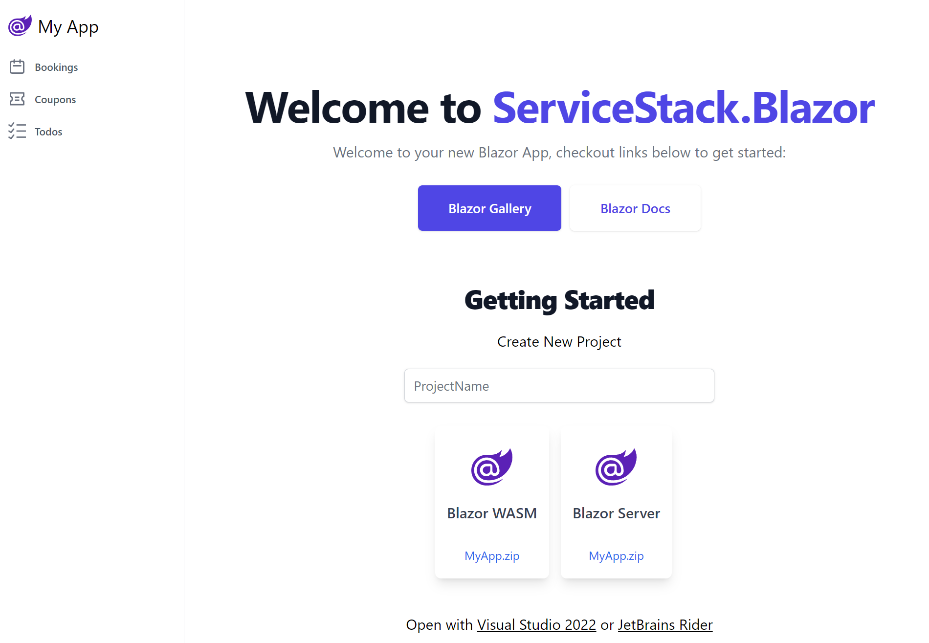
Blazor WASM Tailwind
Getting Started
Create a new Blazor WASM Tailwind App
Create a new Blazor WASM Tailwind project with your preferred project name:
Alternatively you can create & download a new Blazor Project with the x dotnet tool:
x new blazor-wasm ProjectName
The feature-rich Blazor WASM Tailwind template is ideal for teams with strong C# skills building Line Of Business (LOB) applications who prefer utilizing Tailwind's modern utility-first CSS design system to create beautiful, instant-loading Blazor WASM Apps.
Since the release of .NET 8, we have been upgrading our Blazor Templates and example applications to take advantage of some of the new features, including making use of static Server Side Rendering (SSR) for Blazor, which allows for faster initial page loads and better SEO, and our blazor-wasm template uses InteractiveAuto by default to provide a more Responsive UI.
What is InteractiveAuto?
Blazor for .NET 8 has four different rendering modes you can take advantage of:
- Static Server (static SSR)
- Interactive Server
- Interactive WebAssembly (WASM)
- Interactive Auto
For non-interactive pages, the static SSR mode is the fastest, as it renders the page on the server and sends the HTML to the client. However, when your page needs to be interactive, you need to use one of the interactive modes.
Prior to .NET 8, there was a trade-off between the two available render modes (static server rendering wasn't yet available).
The Interactive Server mode was faster to load, but the Interactive WASM mode was more responsive.
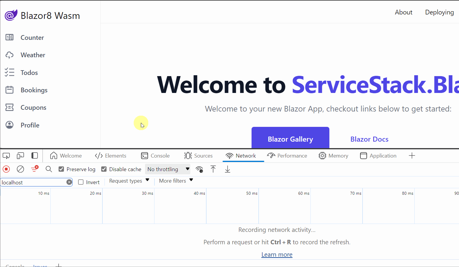
The initial load times for Interactive WASM could be quite slow, as the entire application and all its dependencies needed to be downloaded before the page could render most of the content.
The initial load time for the
Interactive WASMmode can be quite slow even for a minimal app
Our templates previously worked around this limitation with a custom Pre-Rendering solution, as the wait times were too long for a good user experience.
.NET 8's new Interactive Auto mode provides the best of both worlds as pre-rendering is now enabled by default.
When the page is first loaded, it uses the Interactive Server mode, which is faster than Interactive WASM as it doesn't need to download WASM resources.
So the user can start interacting with the page straight away, but with a slight delay for each of their interactions due to having to perform round-trips to the server for each interaction.
In the background, the WASM resources are downloaded which can then be used to render the site on the client for subsequent visits.
Using InteractiveAuto in your Blazor application
In Blazor for .NET 8, render modes can be set on both a per-page and per-component basis.
@page "/counter"
@rendermode InteractiveAuto

<Counter />
<Counter @rendermode="RenderMode.InteractiveAuto" />
ServiceStack.Blazor Components
The ServiceStack.Blazor Components have been updated for .NET 8 and work with the new InteractiveAuto render mode.
This means you can focus more on your application logic and less on the UI, as the components provide a high-productivity UI for common tasks such as CRUD operations.
AutoQueryGrid
The AutoQueryGrid component provides a full-featured data grid that can be used to display and edit data from an AutoQuery service. This is ideal for creating custom admin pages for your application. By integrating your admin screens into your application, you can optimize the user experience for specific workflows and get a huge amount of reuse of your existing AutoQuery services.
<AutoQueryGrid Model="Modifier" Apis="Apis.AutoQuery<QueryModifiers,CreateModifier,UpdateModifier,DeleteModifier>()" />
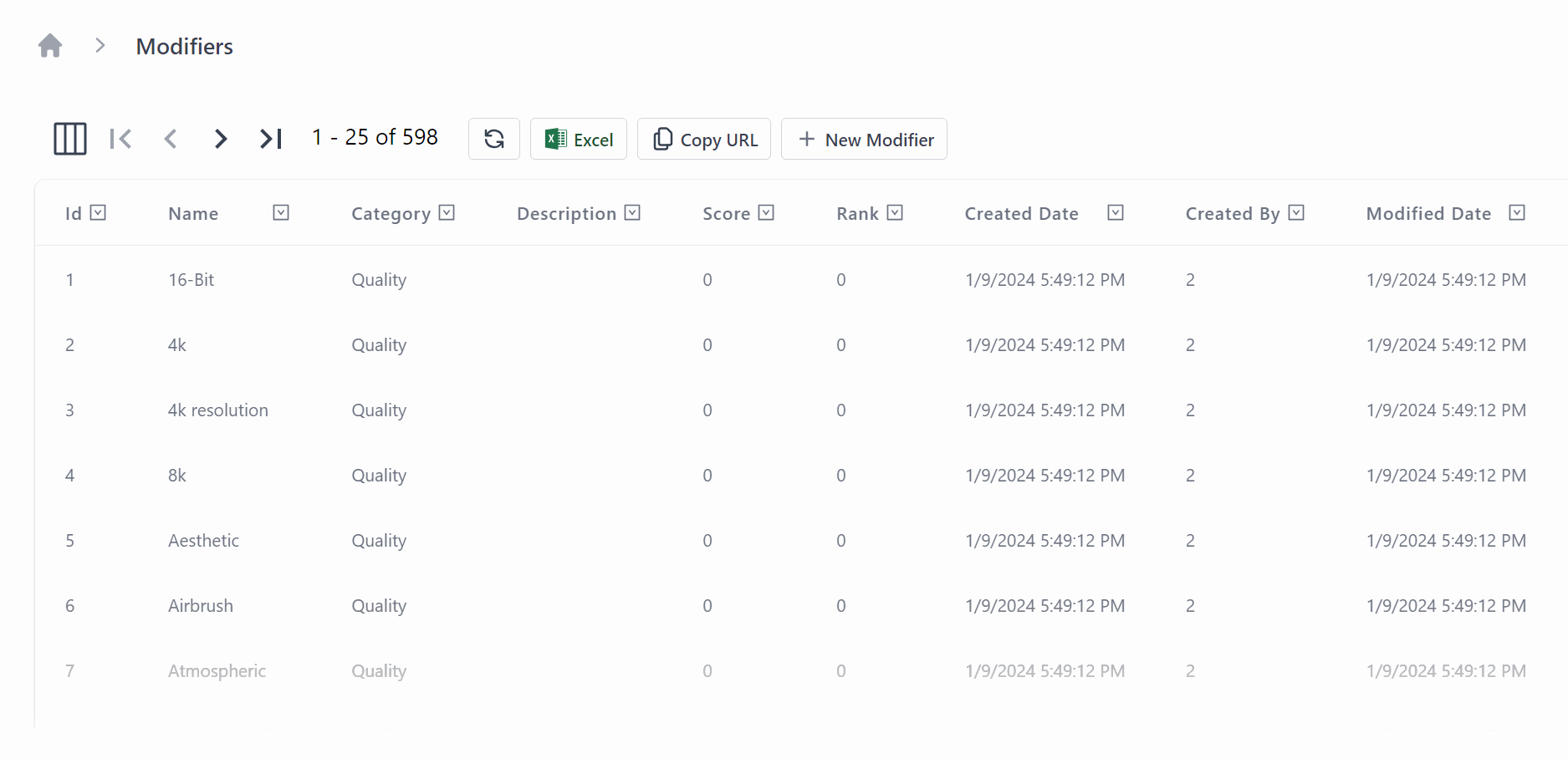
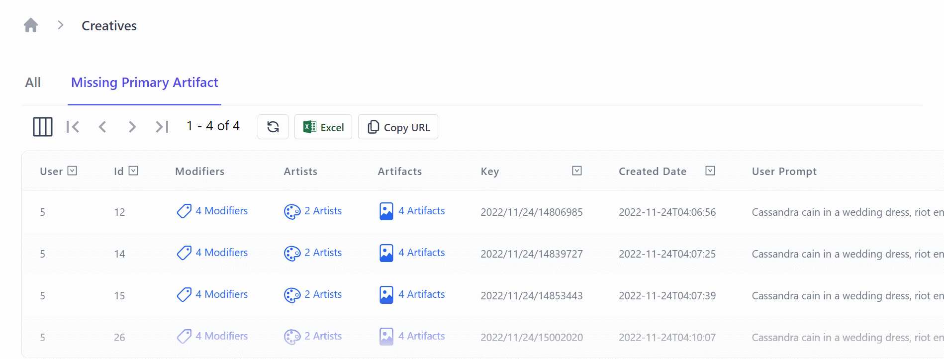
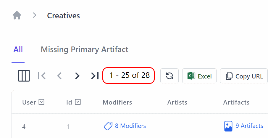
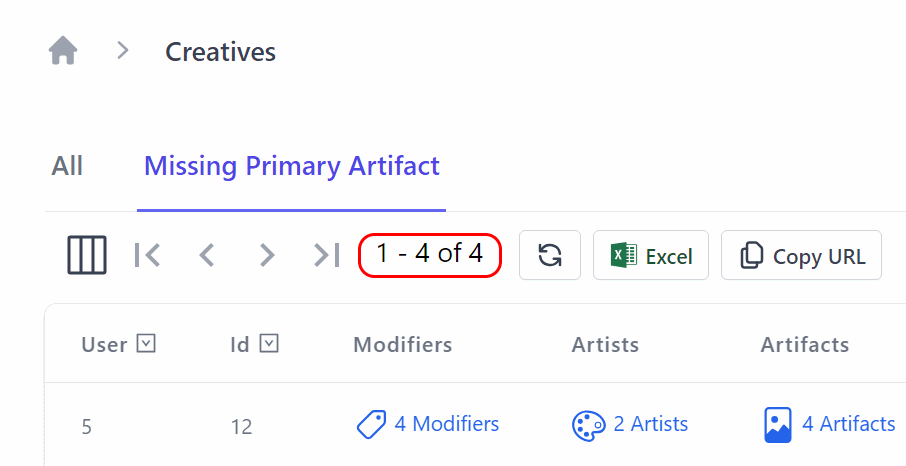
For BlazorDiffusion, our StableDiffusion example application, we used the AutoQueryGrid to create a custom admin page for managing the modifiers in the application.

This is the simplest and fastest use of the AutoQueryGrid component, but it can also be heavily customized for lots of different use cases.
In BlazorDiffusion we customize the grid to enable easy navigation contextually between separate customized admin screens for each Creative, linking to related table data.
<AutoQueryGrid @ref=@grid Model="Creative" Apis="Apis.AutoQuery<QueryCreatives,UpdateCreative,HardDeleteCreative>()"
               ConfigureQuery="ConfigureQuery">
    <EditForm>
        <div class="relative z-10" aria-labelledby="slide-over-title" role="dialog" aria-modal="true">
            <div class="pointer-events-none fixed inset-y-0 right-0 flex max-w-full pl-10 sm:pl-16">
                <CreativeEdit Creative="context" OnClose="grid.OnEditDone" />
            </div>
        </div>
    </EditForm>
    <Columns>
        <Column Title="User" Field="(Creative x) => x.OwnerId" />
        <Column Title="Id" Field="(Creative x) => x.Id" />
        <Column Field="(Creative x) => x.Modifiers">
            <Template>
                @if (context.Modifiers?.Count > 0)
                {
                <TextLink class="flex" href=@($"/admin/modifiers?Ids={string.Join(",", context.Modifiers.Select(x => x.ModifierId))}")>
                    <Icon class="w-6 h-6 mr-1" Image=@typeof(Modifier).GetIcon() />
                    @TextUtils.Pluralize("Modifier", context.Modifiers)
                </TextLink>
                }
            </Template>
        </Column>
        <Column Field="(Creative x) => x.Artists">
            <Template>
                @if (context.Artists?.Count > 0)
                {
                <TextLink class="flex" href=@($"/admin/artists?Ids={string.Join(",", context.Artists.Select(x => x.ArtistId))}")>
                    <Icon class="w-6 h-6 mr-1" Image=@typeof(Artist).GetIcon() />
                    @TextUtils.Pluralize("Artist", context.Artists)
                </TextLink>
                }
            </Template>
        </Column>
        <Column Field="(Creative x) => x.Artifacts">
            <Template>
                @if (context.Artifacts?.Count > 0)
                {
                <TextLink class="flex" href=@($"/admin/artifacts?CreativeId={context.Id}")>
                    <Icon class="w-6 h-6 mr-1" Image=@typeof(Artifact).GetIcon() />
                    @TextUtils.Pluralize("Artifact", context.Artifacts)
                </TextLink>
                }
            </Template>
        </Column>
        <Column Field="(Creative x) => x.Key" />
        <Column Field="(Creative x) => x.CreatedDate" Format="s" />
        <Column Field="(Creative x) => x.UserPrompt" />
    </Columns>
</AutoQueryGrid>
In the above example, we use the ConfigureQuery parameter to customize the query used by the AutoQueryGrid when displaying values.
This is ideal if you want to filter the data for specific workflows, for example, only showing the data that is relevant to the current user.
We combine this with a Tabs component to provide a navigation bar for the user to switch between the different filters on the same AutoQueryGrid.
<Tabs TabOptions="TabOptions" TabChanged="TabChangedAsync" />
We also use the EditForm parameter to customize the edit form for the AutoQueryGrid, so the workflow for editing a Creative is optimized using your own completely custom UI.
<AutoQueryGrid @ref=@grid Model="Creative" Apis="Apis.AutoQuery<QueryCreatives,UpdateCreative,HardDeleteCreative>()"
               ConfigureQuery="ConfigureQuery">
    <EditForm>
        <div class="relative z-10" aria-labelledby="slide-over-title" role="dialog" aria-modal="true">
            <div class="pointer-events-none fixed inset-y-0 right-0 flex max-w-full pl-10 sm:pl-16">
                <CreativeEdit Creative="context" OnClose="grid.OnEditDone" />
            </div>
        </div>
    </EditForm>
Upgrading to .NET 8
BlazorDiffusion was an example application we originally developed for .NET 6. We upgraded the production release of this application to use our blazor-vue template, which can be perfect for public-facing web applications and teams that don't mind including a JavaScript framework in their application.
However, to show the flexibility of Blazor for .NET 8, we also upgraded the whole application from our updated blazor-wasm template to take advantage of the new InteractiveAuto mode.
Component Compatibility
Since the ServiceStack.Blazor library has been updated for .NET 8, we just needed to bring over the shared components from the original application and update the references to the new library.
When upgrading your application pages and components, you will need to avoid any JavaScript interop that runs during the InitializeAsync lifecycle method, as this is not supported in the InteractiveAuto mode.
Running on both Server vs Client
When using the InteractiveAuto mode, first visits will be running on the server, so your pages and components need to be available to both projects, as well as have any required dependencies registered in both projects Program.cs files.
By placing your shared pages and components in a shared project like the .Client project in the blazor-wasm template, you can easily share them between the two projects.
Look for any of your pages or components that use the @injects directive, as these will need to be registered in both projects.
INFO
Avoid sharing sensitive information via dependency injection, as this will be available to the client at runtime which will be able to be decompiled and inspected.
Source code and live demo
The source code for the upgraded BlazorDiffusionAuto application is available on GitHub and you can view a live demo of the application at auto.blazordiffusion.com.
Conclusion
The new InteractiveAuto mode in Blazor for .NET 8 provides the best of both worlds for Blazor applications.
A built in pre-rendering solution means that you can have a fast initial load time, but still have a responsive UI for subsequent visits.
And since the ServiceStack.Blazor components have been updated for .NET 8, you can take advantage of the high-productivity UI components to quickly create customizable and professional-looking admin pages in a Blazor application.
Blazor Tailwind Components
Tailwind has quickly become the best modern CSS framework we've used to create scalable, mobile-first responsive websites built upon a beautiful expert-crafted constraint-based Design System that enabled effortless reuse of a growing suite of Free Community and professionally-designed Tailwind UI Component Libraries which has proven invaluable in quickly creating beautiful websites & docs that have benefited all our new modern jamstacks.net templates.

ServiceStack.Blazor Components
Many of Tailwind UI's popular components are encapsulated in ServiceStack.Blazor's righ high-level tailwind components to enable the rapid development of CRUD UIs in Blazor Server and WASM Apps:
Blazor Gallery
Discover ServiceStack.Blazor Rich UI Components and Integrated Features
ServiceStack.Blazor Components support both hosting models which sees Blazor Gallery running on both Blazor Server and WASM:
For a closer look at ServiceStack.Blazor Components in action, download & run them to see how good they'll run in your Environment:
Creating Beautiful Blazor Apps with Tailwind
Preview the highly productive development model of the new Blazor Tailwind template showing how easy it is to utilize beautifully designed components
Blazor Components
Rich, themable UI Component Library with declarative contextual Validation
To maximize productivity the template utilizes the ServiceStack.Blazor library containing integrated functionality for Blazor including an optimal JSON API HttpClient Factory, API-enabled base components and a rich library of Tailwind & Bootstrap UI Input components with integrated contextual validation support of ServiceStack's structured Error responses heavily utilized throughout each project template.
Blazor Tailwind UI Components
The Built-in UI Components enable a clean & productive dev model, which as of this release include:
| Component | Description |
|---|---|
<TextInput> |
Text Input control for string properties |
<DateTimeInput> |
Date Input control for Date properties |
<CheckboxInput> |
Checkbox Input control for Boolean properties |
<SelectInput> |
Select Dropdown for properties with finite list of values like Enums |
<TextAreaInput> |
Text Input control for large strings |
<DynamicInput> |
Dynamic component utilizing the appropriate above Input controls in Auto Forms |
<AlertSuccess> |
Displaying successful notification feedback |
<ErrorSummary> |
Displaying error summary message when no contextual field validation is available |
<FileUpload> |
Used with FilesUploadFeature and UploadTo attribute to upload files |
The Tailwind & Bootstrap components share the same functionally equivalent base classes that can be easily swapped when switching CSS frameworks by updating its namespace in your App's _Imports.razor.
@using ServiceStack.Blazor.Components.Tailwind
//@using ServiceStack.Blazor.Components.Bootstrap
Themable
Should it be needed, their decoupled design also allows easy customization by running the included README.ss executable documentation to copy each controls Razor UI markup locally into your project, enabling easy customization of all UI input controls.
Bookings CRUD Example
To demonstrate ServiceStack's clean & highly productive Blazor dev model, we'll walk through implementing the AutoQuery Bookings CRUD example in Blazor.
Since we're using AutoQuery CRUD we only need to define the Request DTO with the input fields we want the user to populate in our Booking RDBMS table in Bookings.cs:
[Tag("bookings"), Description("Create a new Booking")]
[Route("/bookings", "POST")]
[ValidateHasRole("Employee")]
[AutoApply(Behavior.AuditCreate)]
public class CreateBooking : ICreateDb<Booking>, IReturn<IdResponse>
{
    [Description("Name this Booking is for"), ValidateNotEmpty]
    public string Name { get; set; }
    public RoomType RoomType { get; set; }
    [ValidateGreaterThan(0)]
    public int RoomNumber { get; set; }
    [ValidateGreaterThan(0)]
    public decimal Cost { get; set; }
    public DateTime BookingStartDate { get; set; }
    public DateTime? BookingEndDate { get; set; }
    [Input(Type = "textarea")]
    public string? Notes { get; set; }
}
Where we make use of Declarative Validation attributes to define the custom validation rules for this API.
TIP
The [Tag], [Description] and [Input] attributes are optional to markup how this API appears in ServiceStack's built-in API Explorer and Locode UIs
Blazor WASM App
Thanks to ServiceStack's Recommended Project Structure no any additional classes are needed as we're able to bind UI Controls directly to our typed server CreateBooking Request DTO used to define the API in
BookingsCrud/Create.razor:
<form @onsubmit="_ => OnSubmit()" @onsubmit:preventDefault>
<CascadingValue Value=@api.Error>
<div class=@CssUtils.ClassNames("shadow overflow-hidden sm:rounded-md bg-white", @class)>
    <div class="relative px-4 py-5 bg-white sm:p-6">
        <CloseButton OnClose="close" />
        <fieldset>
            <legend class="text-base font-medium text-gray-900 text-center mb-4">New Booking</legend>

            <ErrorSummary Except=@VisibleFields />

            <div class="grid grid-cols-6 gap-6">
                <div class="col-span-6 sm:col-span-3">
                    <TextInput @bind-Value="request.Name" required placeholder="Name for this booking" />
                </div>

                <div class="col-span-6 sm:col-span-3">
                    <SelectInput @bind-Value="request.RoomType" Options=@(Enum.GetValues<RoomType>()) />
                </div>

                <div class="col-span-6 sm:col-span-3">
                    <TextInput type="number" @bind-Value="request.RoomNumber" min="0" required />
                </div>

                <div class="col-span-6 sm:col-span-3">
                    <TextInput type="number" @bind-Value="request.Cost" min="0" required />
                </div>

                <div class="col-span-6 sm:col-span-3">
                    <DateTimeInput @bind-Value="request.BookingStartDate" required />
                </div>
                <div class="col-span-6 sm:col-span-3">
                    <DateTimeInput @bind-Value="request.BookingEndDate" />
                </div>

                <div class="col-span-6">
                    <TextAreaInput @bind-Value="request.Notes" placeholder="Notes about this booking" />
                </div>
            </div>
        </fieldset>
    </div>
</div>
</CascadingValue>
</form>

@code {
    [Parameter] public EventCallback<IdResponse> done { get; set; }
    [Parameter] public string? @class { get; set; }

    CreateBooking request = new() {
        BookingStartDate = DateTime.UtcNow,
    };

    // Hide Error Summary Messages for Visible Fields which displays contextual validation errors
    string[] VisibleFields => new[] {
        nameof(request.Name),
        nameof(request.RoomType),
        nameof(request.RoomNumber),
        nameof(request.BookingStartDate),
        nameof(request.BookingEndDate),
        nameof(request.Cost),
        nameof(request.Notes),
    };

    ApiResult<IdResponse> api = new();

    async Task OnSubmit()
    {
        api = await ApiAsync(request);

        if (api.Succeeded)
        {
            await done.InvokeAsync(api.Response!);
            request = new();
        }
    }

    async Task close() => await done.InvokeAsync(null);
}
Calling ServiceStack APIs requires no additional code-gen or boilerplate where the populated Request DTO can be sent as-is using the
JsonApiClient Api methods which returns an encapsulated successful API or structured error response
in its typed ApiResult<T>.
The UI validation binding uses Blazor's <CascadingValue> to propagate any api.error responses down to the child Input components.
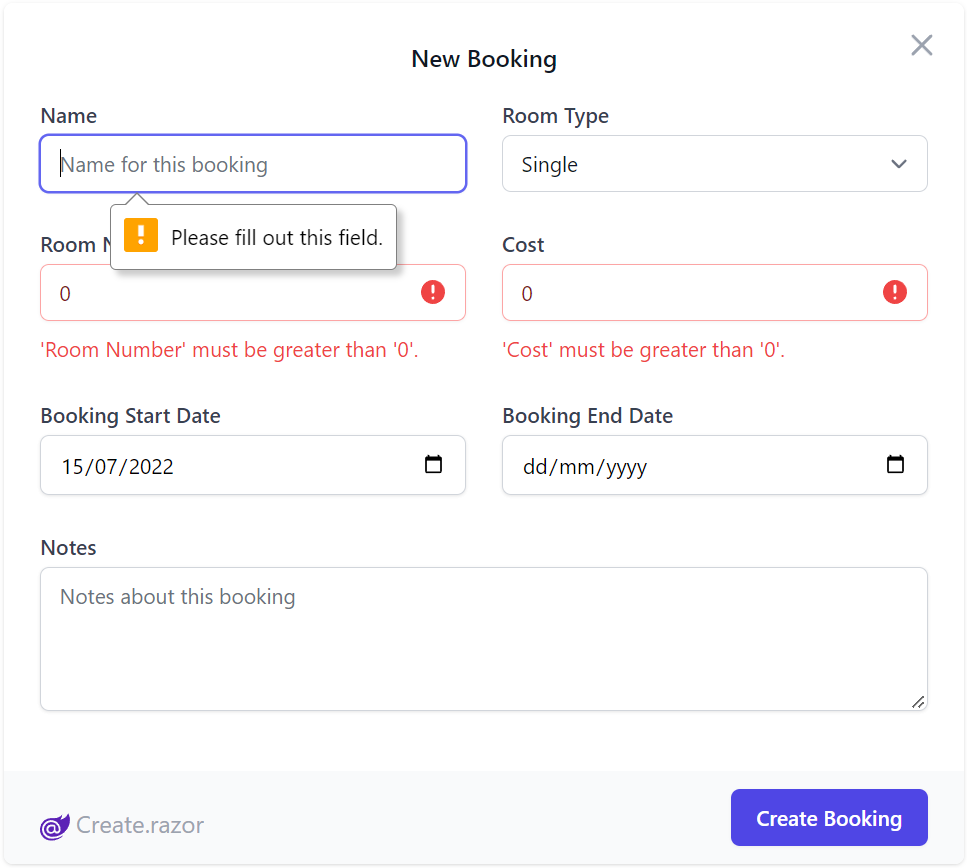
That's all there's to it, we use Tailwind's CSS Grid classes to define our UI layout which shows each control in its own row for mobile UIs or 2 fields per row in resolutions larger than the Tailwind's sm: responsive breakpoint to render our beautiful Bookings Form:
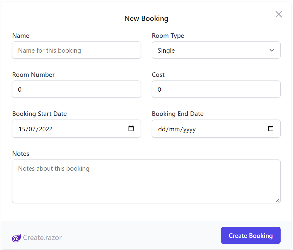
Which utilizes both client and server validation upon form submission, displaying UX friendly contextual errors under each field when they violate any server declarative validation or Client UI required rules:
Optimal Development Workflow
Utilizing Blazor WebAssembly (WASM) with a ServiceStack backend yields an optimal frictionless API First development model where UIs can bind directly to Typed DTOs whilst benefiting from ServiceStack's structured error handling & rich contextual form validation binding.
By utilizing ServiceStack's decoupled project structure, combined with Blazor enabling C# on the client, we're able to get 100% reuse of your APIs shared DTOs as-is to enable an end-to-end Typed API automatically free from any additional tooling or code-gen complexity.
Api and ApiAsync methods
.NET was originally conceived to use Exceptions for error control flow however there's been a tendency in modern languages & libraries to shun Exceptions and return errors as normal values, an approach we believe is a more flexible & ergonomic way to handle API responses.
The ApiResult way
The Api(Request) and ApiAsync(Request) APIs returns a typed ApiResult<Response> Value Result encapsulating either a Typed Response or a structured API Error populated in ResponseStatus allowing you to handle API responses programmatically without try/catch handling:
The below example code to create a new Booking:
CreateBooking request = new();

ApiResult<IdResponse> api = new();

async Task OnSubmit()
{
    api = await Client.ApiAsync(request);

    if (api.Succeeded)
    {
        await done.InvokeAsync(api.Response!);
        request = new();
    }
}
Which despite its terseness handles both success and error API responses, if successful it invokes the done() callback notifying its parent of the new Booking API Response before resetting the Form's data model with a new Request DTO.
Upon failure the error response is populated in api.Error which binds to the UI via Blazor's <CascadingValue Value=@api.Error> to propagate it to all its child components in order to show contextual validation errors next to their respective Input controls.
JSON API Client
The recommended way for configuring a Service Client to use in your Blazor WASM Apps is to use AddBlazorApiClient(), e.g:
builder.Services.AddBlazorApiClient(builder.Configuration["ApiBaseUrl"] ?? builder.HostEnvironment.BaseAddress);
Which registers a typed Http Client factory returning a recommended pre-configured JsonApiClient to communicate with your back-end ServiceStack APIs including support for CORS, required when hosting the decoupled UI on a different server (e.g. CDN) to your server.
If you're deploying your Blazor WASM UI to a CDN you'll need to specify the URL for the server, otherwise if it's deployed together with your Server App you can use the Host's Base Address.
Public Pages & Components
To reduce boiler plate, your Blazor Pages & components can inherit the templates local AppComponentBase.cs which inherits BlazorComponentBase which gets injected with the JsonApiClient and provides short-hand access to its most common APIs:
public class BlazorComponentBase : ComponentBase, IHasJsonApiClient
{
    [Inject]
    public JsonApiClient? Client { get; set; }

    public virtual Task<ApiResult<TResponse>> ApiAsync<TResponse>(IReturn<TResponse> request)  => Client!.ApiAsync(this, request);
    public virtual Task<ApiResult<EmptyResponse>> ApiAsync(IReturnVoid request) => Client!.ApiAsync(this, request);
    public virtual Task<TResponse> SendAsync<TResponse>(IReturn<TResponse> request) => Client!.SendAsync(this, request);
}
Protected Pages & Components
Pages and Components requiring Authentication should inherit from AppAuthComponentBase instead which integrates with Blazor's Authentication Model to provide access to the currently authenticated user:
public abstract class AppAuthComponentBase : AppComponentBase
{
    [CascadingParameter]
    protected Task<AuthenticationState>? AuthenticationStateTask { get; set; }

    protected bool HasInit { get; set; }

    protected bool IsAuthenticated => User?.Identity?.IsAuthenticated ?? false;

    protected ClaimsPrincipal? User { get; set; }

    protected override async Task OnParametersSetAsync()
    {
        var state = await AuthenticationStateTask!;
        User = state.User;
        HasInit = true;
    }
}
Benefits of Shared DTOs
Typically with Web Apps, our client is using a different language to C#, so an equivalent request DTOs need to be generated for the client.
TypeScript Example
For example, TypeScript generated DTOs still give us typed end-to-end services with the help of tooling like Add ServiceStack Reference
[Route("/hello/{Name}")]
public class Hello : IReturn<HelloResponse>
{
    public string Name { get; set; }
}

public class HelloResponse
{
    public string Result { get; set; }
}
Turns into:
// @Route("/hello/{Name}")
export class Hello implements IReturn<HelloResponse>
{
    public name: string;

    public constructor(init?: Partial<Hello>) { (Object as any).assign(this, init); }
    public getTypeName() { return 'Hello'; }
    public getMethod() { return 'POST'; }
    public createResponse() { return new HelloResponse(); }
}

export class HelloResponse
{
    public result: string;
    public responseStatus: ResponseStatus;

    public constructor(init?: Partial<HelloResponse>) { (Object as any).assign(this, init); }
}
When Request or Response DTOs changes during development, the client DTOs need to be regenerated using a command like x csharp.
Blazor WASM Example
Developing your Blazor WASM UI however, you just change your shared request/response DTO in the shared ServiceModel project, and both your client and server compile against the same request/response DTO classes.
This eliminates the need for any additional step.
In the ServiceModel project, we still have:
[Route("/hello/{Name}")]
public class Hello : IReturn<HelloResponse>
{
    public string Name { get; set; }
}

public class HelloResponse
{
    public string Result { get; set; }
}
Which the Blazor C# App can use directly in its .razor pages:
@code {
    Hello request = new()
    {
        Name = "Blazor WASM"
    };

    ApiResult<HelloResponse> api = new();

    protected override async Task OnInitializedAsync() => await submit();

    async Task submit() => api = await ApiAsync(request);
}
FileUpload Control
The File Upload UI component used in the File Blazor Demo has been extracted into a reusable Blazor component you can utilize in your own apps:
It's a simple control that takes advantage of ServiceStack's declarative Managed File Uploads support to effortlessly enable multiple file uploads that can be declaratively added to any Request DTO, which only requires setting 2 properties:
| Property | Description |
|---|---|
| Request | Request DTO object instance populated with into to be sent to your endpoint |
| FilePropertyName | The name of the property that is used to reference your file, used with the [UploadTo] attribute |
Example usage
Below is an AutoQuery CRUD API example that references an upload location defined when configuring the FileUploadFeature Plugin:
public class CreateMyDtoWithFileUpload : ICreateDb<MyDtoWithFileUpload>, IReturn<IdResponse>
{
    [Input(Type="file"), UploadTo("fs")]
    public string FilePath { get; set; }

    public string OtherData { get; set; }
}

public class QueryFileUpload : QueryDb<MyDtoWithFileUpload> {}

public class MyDtoWithFileUpload
{
    [AutoIncrement]
    public int Id { get; set; }

    public string FilePath { get; set; }

    public string OtherData { get; set; }
}
When calling this API, the Managed File Uploads feature will upload the HTTP File Upload included in the API request to the configured fs upload location and populate the uploaded path to the FilePath Request DTO property.
The Blazor FileUpload Control handles the C# File Upload API Request by providing the Request DTO instance to send and the DTO property the File Upload should populate:
@page "/file-upload"
<h3>FileUploadPage</h3>

<FileUpload Request="request" FilePropertyName="@nameof(CreateMyDtoWithFileUpload.FilePath)" />

@code {

    // Any additional values should be populated
    // on the request object before the upload starts.
    CreateMyDtoWithFileUpload request = new() {
        OtherData = "Test"
    };
}

The FilePropertyName matches the property name that is annotated by the UploadTo attribute. The Request is the instance of the Request DTO.
Existing Template Upgrade for 6.3
If you created a blazor-tailwind project using this template before the ServiceStack 6.4 release, you should run the following commands to upgrade your project to use components from ServiceStack.Blazor component library which should be run from your .Client project:
x mix -delete blazor-upgrade-clean
x mix blazor-upgrade