Quite simply Vuetify is a suite of rich high-level reusable Vue Components that makes it easy to develop beautiful Material designed applications. In many ways it realizes the promise that Web Components were meant to deliver by being able to quickly compose rich Applications from a pre-set of reusable high-level components which have often been marred by their poor integration with the premier JavaScript frameworks Apps are built with.
We believe Vuetify is one of the best UI Component libraries available which realizes this promise of increased productivity with its broad number of actively maintained and beautifully designed components that offers both a consistent development model and a consistent visual aesthetic that follows Google's Material Design. Behind the scenes Vuetify components are just Vue components that can be added to any existing Vue App where you can choose to use as much of or as little of Vuetify components as you'd like.
Given the productivity value Vuetify adds, we've created Vuetify templates for both Vue and Nuxt Single Page App templates for both .NET Core and .NET Framework projects:
Vue App
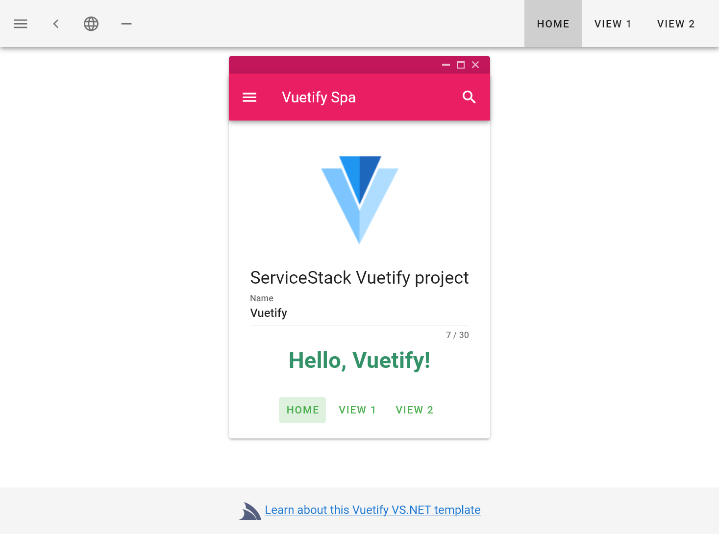
- vuetify-spa - .NET 8.0 Vuetify Material Webpack App
- vuetify-spa-netfx - .NET Framework Vuetify Material Webpack App
Vue Nuxt App
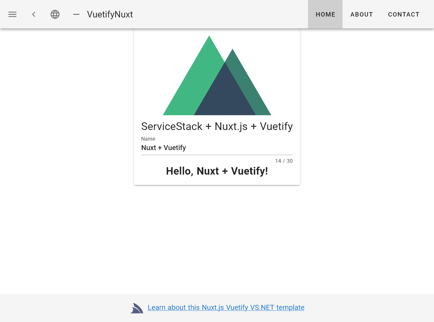
- vuetify-nuxt - .NET 8.0 Vuetify Material Nuxt.js SPA Web App
- vuetify-nuxt-netfx - .NET Framework Vuetify Material Nuxt.js SPA Web App
Client / Server Validation with Vuetify
One of the advantages of using Vuetify Form Components is that they provide is a consistent validation model across all their controls which supports validation rules in the form of an array of lambda expressions and an error-message property for manually assigning error messages.
We'll walk through the TechStack's CategoryEdit.vue as a simple example of a CRUD form built with Vue/Vuetify which is used to Update and Delete existing categories or Create new ones. Refer to the source code for the complete implementation, we'll highlight and document the main parts containing the functionality to validate the form and send the API Requests.
All forms follows the same approach where they each have a validation errorSummary to display any General Service Exceptions and Vuetify Input controls configured to show both client-side and server validation errors. The rules attribute is where client validation rules are assigned, they can be declared in-line within the template but as the same rules are shared across multiple components they're declared in /shared/utils.js.
Each validation rule is a lambda that returns either true if the rule is valid or the Error Message String to show attached to the control. Here are the three validation rules for slugRules:
export const slugCounter = 50;
export const slugRules = [
  v => !!v || "Required",
  v => (v && v.length <= slugCounter) || `Max ${slugCounter} characters`,
  v => (v && /^[a-z0-9\-]+$/.test(v)) || `Only lowercase letters, numbers or hyphens allowed`,
];
The counter attribute is a nice UX feature of Vuetify Text Input controls to show the current and maximum characters for each field. The errorResponse is a method in @servicestack/client which returns the error message or errorCode of a specific field in a ServiceStack Error Response. Any Errors that aren't covered by specific field errors are shown in the form's summary <v-alert/> component. Here's the Vue Template which utilizes all these features using declarative markup:
<template>
<v-form v-model="valid" ref="form" lazy-validation>
<v-container>
<v-alert outline color="error" icon="warning" :value="errorSummary">{{ errorSummary }}</v-alert>
<v-layout column>
<v-text-field
label="Name"
v-model="name"
required
:rules="nameRules"
:counter="nameCounter"
:error-messages="errorResponse('name')"
></v-text-field>
<v-text-field
label="Slug"
v-model="slug"
required
:rules="slugRules"
:counter="slugCounter"
:error-messages="errorResponse('slug')"
></v-text-field>
<v-text-field
label="Summary"
v-model="description"
:counter="summaryCounter"
multi-line
:rows="2"
:rules="summaryRulesOptional"
:error-messages="errorResponse('description')"
></v-text-field>
<v-select
label="Select Technologies"
autocomplete
:loading="loading"
multiple
chips
:error-messages="errorResponse('technologyIds')"
:items="technologySelectItems"
v-model="technologyIds"
></v-select>
</v-layout>
</v-container>
</v-form>
<v-layout>
<v-flex xs2>
<v-btn small @click="submit" color="primary" :disabled="!valid || loading">
{{category ? 'Update' : 'Add'}}
</v-btn>
</v-flex>
<v-flex xs2>
<v-btn small @click="reset()">Close</v-btn>
</v-flex>
<v-flex xs4></v-flex>
<v-flex>
<v-layout>
<v-checkbox small label="confirm" v-model="allowDelete"></v-checkbox>
<v-btn small @click="remove" :disabled="!allowDelete">
Delete
</v-btn>
</v-layout>
</v-flex>
</v-layout>
</template>
Which renders the UI for Updating or Adding new Categories that looks like:
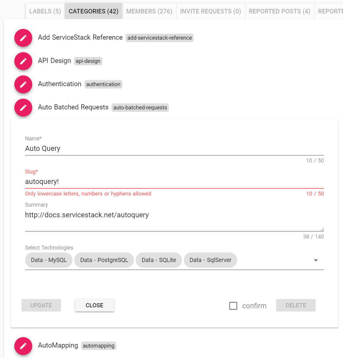
The documented implementation below explains the different parts of the component:
import { mapGetters } from "vuex";
import { toObject, errorResponse, errorResponseExcept } from "@servicestack/client";

const category = { // All fields to send to the gateway when Updating or Adding a new Category
  organizationId: null,
  id: null,
  name: "",
  slug: "",
  description: "",
  technologyIds: [],
};

export default {
  computed: {
    errorSummary(){ // Return any other error that isn't assigned to an Input Control in the Forms Alert Component
      return errorResponseExcept.call(this,'name,slug,description,technologyIds'.split(','));
    },
    isUpdate(){     // Whether this component is updating an existing category or creating a new one
      return this.category != null;
    },
    ...mapGetters(["loading", "isAuthenticated", "isAdmin", "user", "technologySelectItems"])
  },

  //...
  methods: {

    reset(changed, deleted) {                 // Reset form back to initial empty state
        this.responseStatus = this.name = this.slug = this.description = this.id = null;
        this.technologyIds = [];
        this.$emit('done', changed, deleted); // Fire @done callback allowing parent component to close this form
    },

    async submit() {
      if (this.$refs.form.validate()) {  // Validate any client-side validation rules before continuing
          try {
            this.$store.commit('loading', true); // Set global 'loading' state for the App & disable submit button

            // Create an object populated with all category property values in this Component
            const fields = toObject.call(this, Object.keys(category));

            const response = this.isUpdate       // Either Add a New or Update Existing Category
                ? await updateCategory(fields)
                : await addCategory(fields);

            this.reset(true); // Reset form back to initial empty state
          } catch(e) {
              this.responseStatus = e.responseStatus || e; // Bind ServiceStack's ErrorResponse to this Component
          } finally {
              this.$store.commit('loading', false); // Unset the 'loading' state
          }
      }
    },

    async remove() {
      try {
        this.$store.commit('loading', true);

        const response = await deleteCategory(this.organizationId, this.id);

        this.reset(true,true);
      } catch(e) {
          this.responseStatus = e.responseStatus || e;
      } finally {
          this.$store.commit('loading', false);
      }
    },

    errorResponse,          // Make the errorResponse method available to the template
  },

  mounted() {
      if (this.isUpdate) {  // If this component was called with an existing category, populate its fields
        Object.assign(this, this.category);
      } else {
        this.organizationId = this.orgId; // Assign which organization to add new Category to
      }
  },

  data: () => ({
      ...category,           // Make all properties in category reactive field in this component
      valid: true,           // Whether to show the user
      allowDelete: false,    // Unlock delete button when user checks 'Confirm' checkbox
      nameCounter, nameRules, slugCounter, slugRules, summaryCounter, summaryRulesOptional,
      responseStatus: null,  // placeholder for ServiceStack's structured Error Response
  }),
}
The functionality relevant to ServiceStack includes assigning this.responseStatus which is all that's required to bind the Services structured Error Response to the Form and Input Controls:
catch(e) {
    this.responseStatus = e.responseStatus || e; // Bind ServiceStack's ErrorResponse to this Component
}
The code that sends the API Requests for Updating and Adding a new Category is:
// Create an object populated with all category property values in this Component
const fields = toObject.call(this, Object.keys(category));

const response = this.isUpdate
    ? await updateCategory(fields)
    : await addCategory(fields);
Which calls the methods below defined in gateway.js which encapsulates all API access sent within the App. All the custom logic for Adding, Updating and Deleting categories is just:
export const addCategory = async(args) =>
  await client.post(Object.assign(new AddOrganizationCategory(), args));

export const updateCategory = async(args) =>
  await client.put(Object.assign(new UpdateOrganizationCategory(), args));

export const deleteCategory = async(organizationId, id) =>
  await client.delete(new DeleteOrganizationCategory(), { organizationId, id });
Which is just using the DTOs generated with npm run dtos with ServiceStack's generic JsonServiceClient.